You Can (and Definitely Shouldn't) Do Basic Statistics in Excel

- The EU signed an emergency free trade agreement with Ukraine in 2022 that it extended in 2024. (Hassan Ammar/AP)
Yeah, I know. Hear me out.
I’m co-teaching a second-level methods sequence at the bachelor’s level right now whose aim is to introduce students to some basic research methods (both qualitative and quantitative). The course itself occurs entirely within a month or so and has just 10 meetings, two of which pertain to quantitative methods. This will be the first remotely quantitative thing that students do in the department, barring the data-driven weirdness I bring to the intro-level courses on governance and security. However, they won’t have been introduced to the R programming language (yet) and we won’t ask them to download it for the sake of four hours of this course. However, we will ask them to do some kind of original analysis themselves for the sake of this course and the B-paper (i.e. pre-thesis) course that immediately succeeds it. So, students have to learn how to do something, and I have to teach them how to do something. But, what exactly that “something” is and how one should do it becomes quite the challenge in the four total hours I have to get the message across. What to do, what to do.
So, here goes. If I can’t assume a student has been introduced to this stuff before, or even knows what the R programming language is, I can assume they’re at least observing the world around them and have some kind of spreadsheet application like Microsoft Excel (or LibreOffice Calc, for us handsome Linux users and open-source enthusiasts). Spreadsheet software has some limited capacity for statistical inference that you can leverage for the sake of the assignment they have. I can show you how to do it, with the plea that Excel is misspent energy for serious statistics and runs the risk of ruining the lives of our friends in Greece.
But, you can do it, and let’s do it just to say we did it. There will be some stray R code in this post, though not much. Here are the R packages that will make an appearance.
library(tidyverse) # for most things
library(stevedata) # for the data
You can download the spreadsheet I created here to follow along.
An Example: a 2024 EU Free Trade Vote on Ukraine
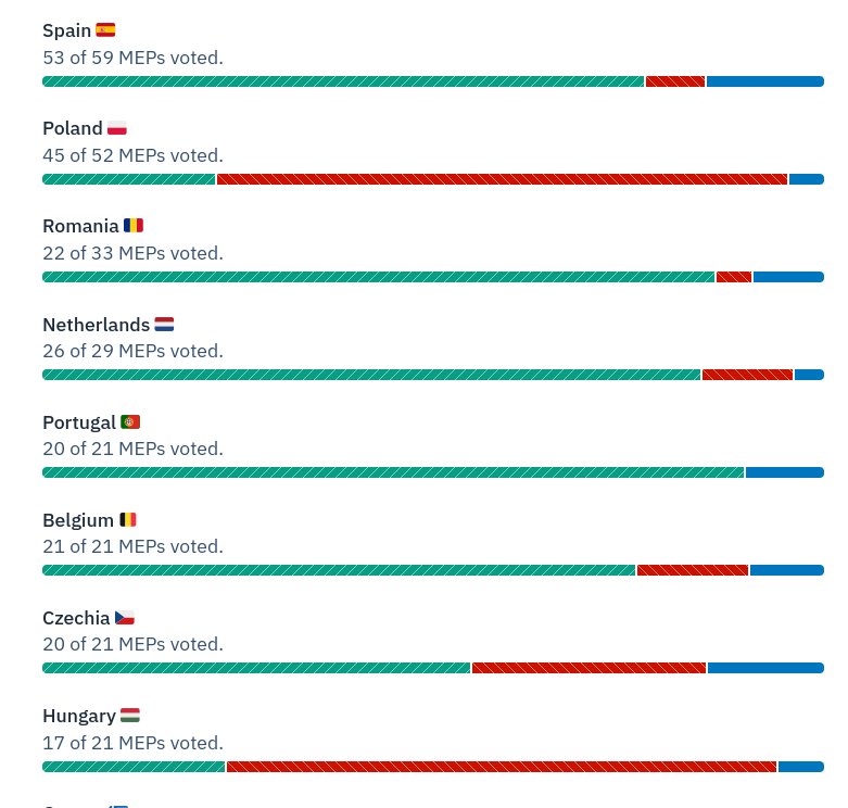
A student of mine in the B-paper course in the spring alerted me to an interesting European Parliament vote that happened in March 2024 on trade liberalization with Ukraine. I was aware of the 2022 emergency agreement, but did not know of this extension. The student also alerted me to this nifty website—HowTheyVote.eu—that summarizes the vote breakdown of MEPs by their political group and country of origin. There’s also the ability to download the raw data as a .csv file for exploration.
My student looked at this and immediately noticed something interesting.
His initial impression was that opposition to continued trade liberalization with Ukraine (i.e. the red you see) seems concentrated on the EU member states that border Ukraine. Sure, Romania’s MEPs had no reservation about extending the agreement. Only one MEP opposed it among 20 casting a vote. Generally, support for continued trade liberalization with Ukraine was broad (around 76%). However, only 4 of 16 Hungarian votes were in favor, 10 of 43 Polish votes were in favor, and just four of seven Slovakian votes were in favor. He reasoned there is probably something you can derive from Stolper-Samuelson to make sense of this. Countries that border Ukraine probably have similar endowments to Ukraine, and their agricultural sectors would be put at more of a disadvantage to Ukrainian exports than, say, the agricultural sectors in Spain or Italy. We may know the context here and caution “there’s more to it than that”, but it’s not a bad hypothesis to want to evaluate in these data.
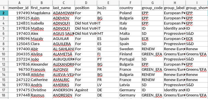
I recently downloaded these data from HowTheyVote.eu and put them into {stevedata} as eu_ua_fta24. You can see them here, in R.
eu_ua_fta24
#> # A tibble: 705 × 9
#>    member_id first_name last_name  position iso2c country group_code group_label
#>        <dbl> <chr>      <chr>      <chr>    <chr> <chr>   <chr>      <chr>
#>  1    197490 Magdalena  ADAMOWICZ  For      PL    Poland  EPP        European P…
#>  2    189525 Asim       ADEMOV     For      BG    Bulgar… EPP        European P…
#>  3    124831 Isabella   ADINOLFI   Did Not… IT    Italy   EPP        European P…
#>  4    197826 Matteo     ADINOLFI   Did Not… IT    Italy   ID         Identity a…
#>  5    197403 Alex       AGIUS SAL… Did Not… MT    Malta   SD         Progressiv…
#>  6    198096 Mazaly     AGUILAR    For      ES    Spain   ECR        European C…
#>  7    125045 Clara      AGUILERA   For      ES    Spain   SD         Progressiv…
#>  8    197400 Abir       AL-SAHLANI For      SE    Sweden  RENEW      Renew Euro…
#>  9    204335 Alviina    ALAMETSÄ   For      FI    Finland GREEN_EFA  Greens/Eur…
#> 10    237224 João       ALBUQUERQ… For      PT    Portug… SD         Progressiv…
#> # ℹ 695 more rows
#> # ℹ 1 more variable: group_short_label <chr>
You can download the spreadsheet at the link above. Note that I’ve already pre-processed these data slightly.
Using Basic ‘If’ Logic (or a Rat King of ‘If’ Statements) to Create Groups/Dummy Variables
If presented data like this, it’ll be in your interest to create a basic dummy variable that says whether a particular MEP is—in our case—in a neighboring state to Ukraine or is not in a neighboring state to Ukraine. In our data, this group would be MEPs in Hungary, Poland, Romania, or Slovakia.
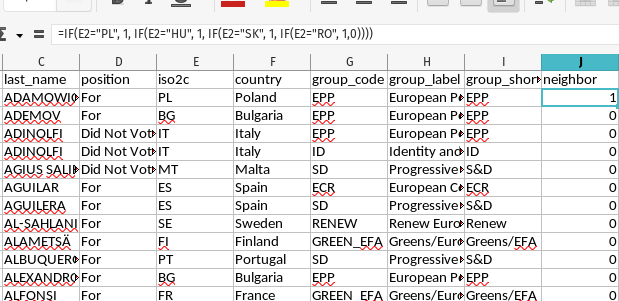
You could just as well go by manually and search for every instance of, say, “Hungary”, and manually enter new 1s for them (and then repeat for the three other neighbors). Then, after filling in the 1s, you can fill in the 0s. You could also do what I’m doing here and nest in a bunch of IF() statements to achieve this. I want to complain that this is really gaudy, and nested “if-else” statements borrow trouble. However, this will get the job done.
In the above image, you can see that the IF() rat king starts by checking if cell E2 (i.e. the two-character ISO code for the first MEP observed in the data) is “PL”. If so, it’s a 1. If not, there’s another IF() that will look for if that cell is “HU” (i.e. the MEP is Hungarian). If so, it’s a 1. If not, there’s another IF() that will check if the cell is “SK” (i.e. the MEP is Slovakian). If it is, it’s a 1. If not, we get the final IF() that will check if the cell is “RO” (for Romanian MEPs). If so, it’s a 1. If it is that anything else that doesn’t match these conditions, it is a 0.
Once you get that right for the first cell, you can copy-paste it for the remaining cells as I do to isolate which MEPs match the conditions of having ISO codes for Hungary (“HU”), Poland (“PL”), Romania (“RO”), or Slovakia (“SK”).
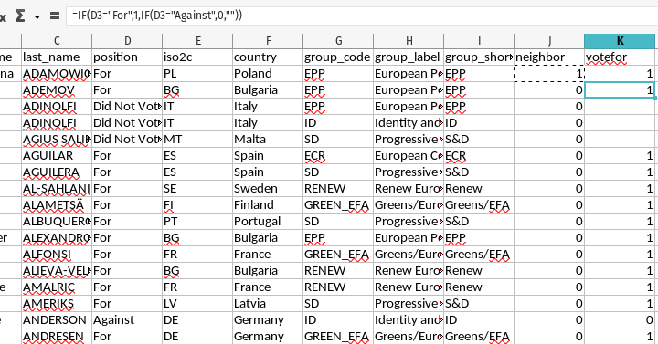
Extending this to the vote variable will be a fair bit simpler.
This new votefor column is also a nested IF() that scans the corollary cell on the same row in the D column. In our data, MEPs could either be “For” the resolution, “Against”, the resolution, “Abstain” from voting on the resolution, or did not show up to vote (“Did Not Vote”). We only want to look at the votes “For” or “Against”. Thus, the IF() function here will check if the adjacent cell in the D column is “For”. If so it’s a 1. If not, it will do another IF() to check if it’s “Against”. If so, it’s a 0. If it doesn’t match any of those conditions, the if-else logic ends with "" (for blank spaces).
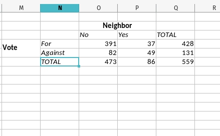
All told, we have two groups in our data now. One is the group of MEPs who live in a neighboring state to Ukraine and those that do not neighbor Ukraine. The other group is those that voted for the resolution or against the resolution. We can now create a 2x2 matrix to summarize this information.
Create a 2x2 Matrix of Observed Counts
Next, carve out some space on your spreadsheet to prepare a 2x2 matrix. Importantly, the convention is always that independent variables (so-called “causes”) are the columns and the dependent variables (i.e. the “effects” or the variation that you really want to explain) are the rows. The finished product is going to look like what you see to the right, but I’ll explain more about how you can automate it a bit with some basic spreadsheet functions. All you need to do to get started is create the headers you see (i.e. “For” or “Against” for the vote, and “No” and “Yes” for the neighbor information).
First, the number of MEPs who voted for the resolution (391) can be calculated with the SUMIF() function. In this spreadsheet, all you have to do is to take inventory of 1) the two columns (J and K) coinciding with the information on the vote and the group, and 2) the number of rows that correspond with all MEPs in the data. In our case, the first MEP is on the second row (after the row with the column names) and the last MEP is on the 706th row. The rest requires knowing how SUMIF() works and what a basic “if” statement resembles. In our case, this number is derived from inserting SUMIF(J2:J706,0,K2:K706) as a function in that particular cell. Converted to English, this function says, “if the range of J2:J706 (which has the neighbor variable) is 0, then it is not a neighbor of Ukraine. If so, sum up all the 1s we created in the range of K2:K706.” In the data, there were 391 votes in favor of the resolution for MEPs not neighboring Ukraine.
Moving over one cell to the right, it should be fairly clear how we sum up the “for” votes among Ukraine’s neighbors. This function is SUMIF(J2:J706,1,K2:K706). In plain English, if the range of J2:J706 (which has the neighbor variable) is 1, then it is a neighbor of Ukraine. If so, sum up all the 1s we created in the range of K2:K706. There were 37 “for” votes among MEPs in states neighboring Ukraine.
Moving one cell down, let’s collect all the “against” votes from MEPs in countries that neighbor Ukraine (49). Here, we’re going to flip the SUMIF() function a bit. Now it’s SUMIF(K2:K706,0,J2:J706). Here, we’re saying if all cells in the range of K2:K706 is 0 (i.e. the MEP voted against) the resolution, then sum up all the cells in the range of J2:J706 (i.e. the column with the neighbor indicator) that match that condition. This gives us the number of MEPs in countries that neighbor Ukraine that voted against the resolution.
Using basic cell logic, there are two ways we can calculate the total number of votes for the resolution (428). One is to do what I do in the spreadsheet: SUM(K2:K706). Since column K is either 1 (vote in favor), 0 (vote against), or missing (for abstentions and no-shows), this will have the effect of just adding all the 1s together. Alternatively, you can add together the two cells we just created to get the same number. In my spreadsheet, this is O4 + P4.
Next, let’s move over to the grand total of valid observations we have (559). Since the K column has the information we want for valid observations, we can use COUNT(K2:K706) to get this total.
Moving along, let’s fill in some blanks that will helps us fill out the rest of this 2x2 matrix with the limited functionality we have in our spreadsheet software.
- Total Number of ‘Against’ Votes: This is simply the total column we created (559) minus the total for votes we created (428). In the spreadsheet, this is
Q6-Q4. There were 131 total votes against. - Number of Against Votes in Non-Neighboring States: We just calculated this (131), but we previously used
SUMIF()to create the sum of against votes in neighboring states. 131 - 49 is 82. In the spreadsheet, this isQ5 - P5. - Total Number of Neighbors and Non-Neighbors: This is optional, but it fills out the 2x2 matrix. You can probably follow along with how they’re calculated. 391 + 82 = 473 and 37 + 49 = 86. In the spreadsheet, this is
O4 + O5(non-neighbors) andP4 + P5(neighbors).
Do that, and you have a full 2x2 matrix for what you’ll do next.
Do a Chi-Square Test of Independence
It bothers me to no end to do this in a spreadsheet. No matter, you can do it. Spreadsheet software doesn’t have a lot of statistical functionality, but it can do this.
Simply, there are several tests for looking for associations in a setting like this, but one common one is the Pearson’s chi-squared test for count data. This test compares observed frequencies in data to the frequencies that would be expected if there were no association between the variables. You might occasionally see this called “independence”, which is where the language you’ll see in Excel comes from. There is behind-the-scenes calculation of observed counts vs. expected counts that produces a chi-square statistic. In as many words, this statistic measures the discrepancy between what you observe and what you would expect to observe is there was no difference between the two groups. Higher values = more difference and more of a relation between the variables being compared. Higher values benchmarked to a particular critical value come with lower p-values. If a p-value is sufficiently small for your liking, you’d reject the null hypothesis of the independence of the two categorical variables.
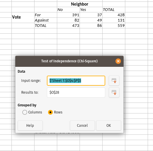
In your spreadsheet software, go to Data > Statistics > Chi-square Test. Fire it up, and you’ll see something like this. I’ve already filled in some of the options.
For the input range, click to initialize the cells you want and grab just the 2x2 matrix. In the case above, this selects the four cells with the numbers of 391, 82, 37, and 49. For the “results to” field, just put something somewhere that’s far removed from where your data actually are. Statistics in spreadsheet software is clumsily done and risks overwriting where your data actually are. Finally, toggle that “grouped by” option to “rows”, and select “OK”.
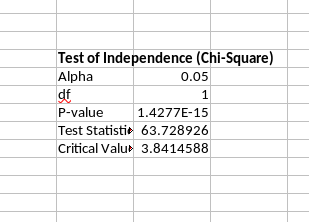
The output you get will look like what I showed above. The test statistic is 63.72, which far exceeds the critical value necessary for rejecting the null hypothesis of the independence of the two groups. We would instead assert there is a statistically significant association between these two variables. 82% of MEPs not neighboring Ukraine voted in favor of the resolution. 43% of MEPs neighboring Ukraine voted in favor of the resolution. The difference between the two is highly unlikely if there was no association between neighbor status and the vote. It would at least be suggestive of my student’s hypothesis that MEPs in states that neighbor Ukraine have agricultural sectors that are particularly sensitive to Ukrainian goods flooding their markets as well as the common market.
You Can Also Do this in R
Just do this in R…
# library(tidyverse)
# library(stevedata)

eu_ua_fta24 %>%
  mutate(neighbor = ifelse(iso2c %in% c("PL", "HU", "RO", "SK"), 1, 0),
         vote = case_when(position == "For" ~ 1,
                          position == "Against" ~ 0)) %>%
  na.omit -> Data

Data %>%
  summarize(n = n(),
            .by = c(neighbor, vote)) %>%
  arrange(neighbor, -vote) %>%
  pivot_wider(names_from = neighbor, values_from = n)
#> # A tibble: 2 × 3
#>    vote   `0`   `1`
#>   <dbl> <int> <int>
#> 1     1   391    37
#> 2     0    82    49

# chisq.test defaults to Yates' continuity correction = TRUE.
# Excel/Calc is FALSE
chisq.test(matrix(c(391, 82, 37, 49), nrow=2),
           correct = FALSE)
#>
#> 	Pearson's Chi-squared test
#>
#> data:  matrix(c(391, 82, 37, 49), nrow = 2)
#> X-squared = 63.729, df = 1, p-value = 1.428e-15

# You can also do it this way. Same basic thing.
prop.test(c(391, 37), c(391 + 82, 37 + 49),
          correct = FALSE)
#>
#> 	2-sample test for equality of proportions without continuity
#> 	correction
#>
#> data:  c(391, 37) out of c(391 + 82, 37 + 49)
#> X-squared = 63.729, df = 1, p-value = 1.428e-15
#> alternative hypothesis: two.sided
#> 95 percent confidence interval:
#>  0.2863447 0.5064672
#> sample estimates:
#>    prop 1    prop 2
#> 0.8266385 0.4302326

# A probit model would be fine here too if you'd like to read about it.
# https://svmiller.com/blog/2024/02/interpreting-probit-models/
summary(M1 <- glm(vote ~ neighbor, Data, family=binomial(link='probit')))
#>
#> Call:
#> glm(formula = vote ~ neighbor, family = binomial(link = "probit"),
#>     data = Data)
#>
#> Deviance Residuals:
#>     Min       1Q   Median       3Q      Max
#> -1.8721   0.6171   0.6171   0.6171   1.2988
#>
#> Coefficients:
#>             Estimate Std. Error z value Pr(>|z|)
#> (Intercept)  0.94096    0.06793   13.85  < 2e-16 ***
#> neighbor    -1.11675    0.15194   -7.35 1.98e-13 ***
#> ---
#> Signif. codes:  0 '***' 0.001 '**' 0.01 '*' 0.05 '.' 0.1 ' ' 1
#>
#> (Dispersion parameter for binomial family taken to be 1)
#>
#>     Null deviance: 608.72  on 558  degrees of freedom
#> Residual deviance: 553.81  on 557  degrees of freedom
#> AIC: 557.81
#>
#> Number of Fisher Scoring iterations: 3
# The proportion of "for" votes in non-neighbor states. Should look familiar.
pnorm(pull(broom::tidy(M1)[1,2]))
#> [1] 0.8266385
# The proportion of "for" votes in neighbor states. Should look familiar.
pnorm(pull(broom::tidy(M1)[1,2]) + pull(broom::tidy(M1)[2,2]))
#> [1] 0.4302326
Please just learn R.
Conclusion
Students I teach in their second semester in my program will almost assuredly have no programming experience or exposure to quantitative methods by time I start teaching them about these methods. It’s not something they’ll get in the first semester, except for the data-driven weirdness I give them about the distribution of conflict or regional/temporal patterns of global governance (i.e. IGOs). Further, I can’t make them install R for the sake of a class like this. No matter, I have to get them thinking about doing something. At this stage, there’s nothing else I can plausibly expect them to do in four hours than to do something simple in a spreadsheet application like Microsoft Excel (or its open-source alternative, LibreOffice Calc).
It goes without saying that the use of spreadsheet software for statistics is a misuse of spreadsheet software. You should not ever do this for serious analyses, unless ruining Greece and rewarding bad-faith talking points is your goal. The benign way of putting this is that Excel is just not designed for statistical analyses, even if it can do some basic stuff much like how SQL can do some statistical analyses. It can do it, but only some of it (and not particularly well). Use the right tool for the right job, even if learning the “right tool” will come a bit later in our curriculum.
Disqus is great for comments/feedback but I had no idea it came with these gaudy ads.
