Revisiting Reinhart and Rogoff, Ten Years Later

- Paul Ryan getting pumped for some hamhanded austerity.
My grad class this week is getting a discussion of ethics and replication in the social sciences. God knows there are any number of cases to discuss here across the social sciences. Psychology is getting crunched on all sides by replication crises, the extent to which psychological research involves situations where replication is difficult and incentives for various forms of misconduct are high (i.e. low-powered experimental designs, often with high levels of complexity, where even accidental forked paths are possible). Sociology/criminology just got hit with a wild one. Five papers, all co-authored but all featuring Eric A. Stewart (Florida State), were retracted with recurring themes ranging from not knowing how to calculate a standard deviation to potentially outright fabricating data. Some of those scandalous themes featured prominently in political science’s biggest replication/misconduct scandal. Michael J. Lacour (formerly a Ph.D. candidate at UCLA) and Donald P. Green (Columbia) published the results of an experiment in Science, one of the most prestigious scientific periodicals in the United States, that were seemingly a function of faked data and a lazy use of rnorm() in R.
My go-to though is from economics. Carmen Reinhart and Kenneth Rogoff (both at Harvard) assembled an exhaustive list of macroeconomic statistics for countries around the world, even dating to the 18th century in some cases, to explore the financial consequences of accrued government expenditures over time. The important findings they communicated came concurrent with the Great Recession happening at the same time. Therein, they put forward what they euphemistically call a set of “stylized facts” that advanced economies (i.e. Western Europe + Australia, Canada, Japan, and New Zealand) for which central government debt is at least 90% of GDP, on average, experience economic contractions. This finding took off. Reinhart and Rogoff were afforded numerous op-eds at the most prestigious newspapers to promote their findings. Their findings even became the basis for much of the austerity measures in Western Europe and the United States that still loom large after 10 years. It was explicitly cited in Paul Ryan’s proposed budget in 2012 and it was cited by European Union Economic and Monetary Affairs Commissioner Olli Rehn in defense of efforts to drive down budget deficits in the Eurozone. Paul Krugman, more an economist than I am, could well be right when he said Reinhart and Rogoff “may have had more immediate influence on public debate than any previous paper in the history of economics.”
It was a graduate student at the University of Massachusetts-Amherst who found how exactly Reinhart and Rogoff produced their findings. Namely, the underlying data were well-documented and collected by Reinhart and Rogoff, but the academic workflow in Microsoft Excel led to a slew of errors that produced the findings that Reinhart and Rogoff published in the American Economic Review, had discussed by Congress and in numerous op-eds and TV interview opportunities, and which became the foundation for austerity in Western Europe and the United States during and after the Great Recession. Calling it the Microsoft Excel error that “tanked the global economy” and “destroy(ed) the economies of the Western world” might be bold, but it’s in orbit of the magnitude of the error and how we’re all still living in its afterglow.
With that in mind, I wanted to revisit the data and the analysis in this post. My primary audience here is my grad-level methods class since we’ll be talking about replication and academic workflow this week. Here are the R packages we’ll be using.
library(tidyverse)
library(stevemisc)
library(knitr)
library(kableExtra)
library(mgcv)
library(brms)
library(modelr)
library(tidybayes)
The Data
I want to give a shoutout to Michael Ash, one of the co-authors of the study, whom I emailed on Nov. 9, 2014 for the data perhaps mistakenly thinking he was the corresponding author.1 He was gracious in sending his code to me for my POSC 3410 class that semester. I cleaned the data (per how he and his co-authors did it) and gave a primitive version of what I will do here for my undergrad methods class that semester. I created a repository on Github for it as well. Let’s load the data here. Let’s also create the four debt categories that mimic what Reinhart and Rogoff do in their AER article and corrollary NBER working paper.
data <- RCurl::getURL("https://raw.githubusercontent.com/svmiller/reinhart-rogoff/master/RR-processed.csv")
RR <- read.csv(text = data)  %>% tbl_df() %>% rename_all(tolower)

RR %>%
  mutate(dgcat = case_when(debtgdp > 0 & debtgdp < 30 ~ "0-30%",
                           debtgdp >= 30 & debtgdp < 60 ~ "30-60%",
                           debtgdp >= 60 & debtgdp < 90 ~ "60-90%",
                           debtgdp >= 90 ~ "90% and above")) %>%
  mutate(dgcat = as.factor(dgcat)) %>%
  select(country, year, dgcat, debtgdp, drgdp) -> RR
For clarity, we’ll only consider two variables in these data. The first is the dependent variable of interest: the change in real GDP as percentage change from the previous year. The first is the independent variable that Reinhart and Rogoff suggest is exogenous to real GDP growth: the ratio of central government debt to GDP as a percentage.
We’ll also leave aside important questions about whether both are endogenous, even though they likely are. In other words, advanced economies since the Great Depression and World War II often adopt a Keynes-inspired approach to economic downturns that increase government expenditures and lower taxes to stimulate demand. The lesson learned from the Great Depression, which followed the Roaring ’20s, was a countercyclical fiscal policy may curtail growth but it minimizes the negative effects of recessions that can be naturally occurring phenomena. This fell out of favor by the end of the 1970s but themes of it have been recurring since the late 1990s. No matter, a government that is experiencing high levels of debt in a given year might be printing money because of an ongoing financial crisis it is trying to minimize. It should be no surprise that debt accumulates during economic downturns; it was kind of the whole goddamn point.2 Alas…
A First Glance at the Data and Main Findings
Reinhart and Rogoff’s first paragraph previews the main findings of importance, though the main findings of contention here are its application to advanced economies (i.e. Western Europe + Australia, Canada, Japan, and New Zealand).
Our main result is that whereas the link between growth and debt seems relatively weak at “normal” debt levels, median growth rates for countries with public debt over roughly 90 percent of GDP are about one percent lower than other-wise; average (mean) growth rates are several percent lower.
The AER paper doesn’t have the descriptive statistics to clarify this but the NBER working paper does. This is the top third of Table 1 in the appendix, which I transcribe below.
| Measure | Period | Below 30% | 30% to 60% | 60% to 90% | 90% and Above |
|---|---|---|---|---|---|
| Average | 1946-2009 | 4.1 | 2.8 | 2.8 | -0.1 |
| Median | 1946-2009 | 4.2 | 3.0 | 2.9 | 1.6 |
This table did not make it in the AER article, but Figure 2 purports to contain that information. However, stare at Figure 2 long enough and you’ll see that the bars don’t match the table. For example, the average and median growth rates are comfortably above 3% for that 60-90 category but the table suggests they are below 3%. There is already some confusion as to what are the precise statistics of major policy importance here.
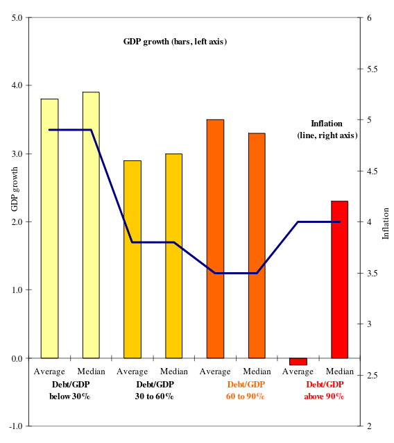
- Figure 2 from the NBER working paper version.
The nature of the AER article suggests what Reinhart and Rogoff provided was more illustrative than definitive. I don’t have a keen insight on how the AER operates but the editor’s introduction suggests the edition in which it appeared was a special issue of papers presented at the 122nd annual meeting of the American Economic Association. Therein, Reinhart and Rogoff were selected for this presentation, it seems, largely on the backs of their impressive résumés as Harvard economists with a timely book in print. The editor’s introduction notes the paper did not go through a formal peer review process.
Had it, I suspect these descriptive statistics would have been a jumping-off point for three reasons. First, the descriptive statistics in the figure do not correspond with the descriptive statistics in the table. Second, there is no estimate of uncertainty around those statistics of central tendency. Third, and perhaps more importantly, the discrepancy between the median and the mean suggests that a measure of “average” isn’t so average and that there could be a major problem of skew in the data. It would suggest the authors’ findings as “stylized facts” are so stylized to the point they might be misleading. At the least, it’s worth exploring more than what Reinhart and Rogoff provide in Table 1 in the version that made it to print in AER. In that Table 1, only the United States reports negative growth (i.e. contraction) at that debt category but that Table 1 includes all observations going back to the earliest data on record. Thus, the U.S. data are no doubt influenced by the Great Depression and various other economic downturns that characterized the U.S. as a relatively poor and indebted country through the 1800s.
Here would be the actual summary statistics for the data from 1946 to 2009, which Reinhart and Rogoff say they used in Figure 2 in the same article. This table clearly does not align with what Reinhart and Rogoff reported in Figure 2 of their AER article or in Table 1 in the appendix of their NBER working paper.
RR %>%
  group_by(dgcat) %>%
  summarize(median = median(drgdp),
            mean = mean(drgdp)) %>%
  mutate_if(is.numeric, ~round(.,2))
| Debt/GDP Category | Median Real GDP Growth | Average Real GDP Growth |
|---|---|---|
| 0-30% | 4.15 | 4.17 |
| 30-60% | 3.11 | 3.12 |
| 60-90% | 2.90 | 3.22 |
| 90% and above | 2.34 | 2.17 |
To make matters worse, Reinhart and Rogoff purportedly created these statistics they report from a workflow derived entirely in Microsoft Excel. This is, to be clear, terrible practice that no enterprising young scholar should do. Microsoft Excel, a WYSIWYG spreadsheet software, reduces workflow to clicks that are immediately forgotten once they are executed. Nevertheless, Herndon et al. (2014) were able to figure out what exactly Reinhart and Rogoff did in their Microsoft Excel workflow. The errors range from the silly to the outright bizarre case exclusions.
Replicating Reinhart and Rogoff
Herndon et al. (2014) summarize the steps that went into recreating the statistic that Reinhart and Rogoff report in their AER article and NBER working paper. These are a selective omission of post-WWII observations, the infamous Excel spreadsheet error that led to the wholesale elimination of observations from Australia, Austria, Belgium, Canada, and Denmark, and the decision to weight means equally by country rather than by country-year. I’ll discuss these in turn.
Selective Omission of Post-WWII Observations
The Microsoft Excel mistakes commanded a lot of attention in how news media reported the failure to replicate their AER findings, but the case exclusion decisions are the bigger deal here. Namely, Reinhart and Rogoff appear to engage in a conscious decision to omit cases at the highest debt category that are inconsistent with their main finding. Per Herndon et al. (2014, p. 262), Reinhart and Rogoff exclude Australia (1946-1950), New Zealand (1946-1949), and Canada (1946-1950) from their analysis and never fully explain that they did this. The closest they come to acknowledging they did this at all is on page 11 of the NBER working paper.
Of course, there is considerable variation across the countries, with some countries such as Australia and New Zealand experiencing no growth deterioration at very high debt levels. It is noteworthy, however, that those high-growth high-debt observations are clustered in the years following World War II.
There are several things odd about this decision. First, it should be unsurprising that post-war demobilizations coincide with economic contractions because they are also typically large-scale terminations of government spending, at least from the American perspective. Before the advent of the professional standing military in the United States, war demobilizations led to supply shocks of the civilian labor force as soldiers tried to reintegrate into an economy that did not have the demand for them. So, it should be no surprise that economic contractions historically followed major wars like World War II. Reinhart and Rogoff use that as justification for excluding Australia and New Zealand (and apparently Canada too) shortly after World War II while also acknowledging their growth remained robust, but they make no similar accommodation for the United States that had a large-scale economic contraction shortly after World War II.
Here, for context, are the average GDP growths for all observations between 1946 and 1950 along with the average level of central debt/GDP in this window. I also report if there are gaps in this window as well, which would explain Austria’s observations.
RR %>% filter(year < 1950) %>% group_by(country) %>%
  summarize(meandrgdp = mean(drgdp),
            meandebt = mean(debtgdp),
            n=n()) %>% arrange(-meandrgdp)
| Country | Average Real GDP Growth | Average Central Debt/GDP | Number of Years in Data |
|---|---|---|---|
| Austria | 23.12 | 30.83 | 2 |
| Belgium | 8.45 | 83.71 | 3 |
| Norway | 8.35 | 52.28 | 4 |
| Sweden | 6.15 | 42.14 | 4 |
| Finland | 6.11 | 47.21 | 4 |
| New Zealand | 5.13 | 120.78 | 4 |
| Ireland | 4.00 | 23.05 | 3 |
| Australia | 2.99 | 160.62 | 4 |
| Canada | 1.85 | 120.54 | 4 |
| Spain | 1.60 | 56.45 | 4 |
| UK | 0.63 | 224.29 | 4 |
| US | -1.99 | 103.85 | 4 |
Incidentally, there are five countries whose average central debt/GDP is above 90%. Australia, Canada, and New Zealand are excluded from the analysis in these years despite modest to robust growth shortly after World War II. The United Kingdom and United States, which had weak growth to almost outright contractions, are included in the analysis. Pay careful attention to Belgium too. Belgium, incidentally, had a debt/GDP ratio of ~98.6% in 1947 and had robust real GDP growth that year as well (~15.2%). Keep that in mind in the next section.
The Microsoft Excel Error
The error that commanded the most media attention is also the one directly attributable to the decision to have a workflow done entirely in Microsoft Excel. In this case, Reinhart and Rogoff’s cell-based workflow in Microsoft Excel has the unfortunate side effect of eliminating Australia, Austria, Belgium, Canada, and Denmark from the analyses entirely. Functionally, this is not a systematic bias because there is no a priori reason to believe that a coding error that is alphabetical in nature is systematically targeting those countries that have high debt and also high levels of growth.
Incidentally, though, that’s what happened.
RR %>%
  # filter the five countries
  filter(country %in% c("Australia", "Austria", "Belgium", "Canada", "Denmark")) %>%
  group_by(country, dgcat) %>% # group by
  summarize(meanrgdp = mean(drgdp),
            n = n(), # how many observations for that country in that category?
            meanrgdp = paste0(round(meanrgdp, 2), " (",n,")")) %>% # add the years to meanrgdp for categorical variable
  select(-n) %>%
  spread(dgcat, meanrgdp)
| Country | Below 30% | 30% to 60% | 60% to 90% | 90% and Above |
|---|---|---|---|---|
| Australia | 3.21 (37) | 4.95 (13) | 4.04 (9) | 3.77 (5) |
| Austria | 5.21 (34) | 3.39 (25) | ||
| Belgium | 4.19 (17) | 3.08 (21) | 2.57 (25) | |
| Canada | 2.52 (3) | 3.53 (42) | 4.52 (14) | 2.96 (5) |
| Denmark | 3.52 (23) | 1.7 (16) | 2.39 (17) |
Notice Belgium, in particular. There are 25 Belgian observations in that 90% and above category. That would be roughly 40% of all years for Belgium in the sample and about 22% of all observations in that 90% and above category in the data. Under those conditions, Belgium still reported a robust real GDP growth but those observations were not included at all in the analysis.
Weighting Means by Country Rather Than Country-Year
The final coding peculiarity is another one that is not as obvious, but it is just as influential as the selective post-WWII case exclusions when you understand what it’s doing. Reinhart and Rogoff chose to weight means equally by country rather than by how many years a country is in a given debt category.
For example, the United States had four years in the highest debt category. All four are incidentally the first four observations in the data coinciding with the post-WWII economic contraction. Therein, the U.S. real GDP growth those four years averages to -1.99%. The United Kingdom, however, had 19 years in the highest debt category, spanning every year from 1946 to 1964. Its average GDP growth rate was 2.4%. However, the UK’s 19 years of growth in that debt category are equal to the U.S. four years in that debt category because each mean is weighted equally by country rather than weighted by incidence in the particular debt category.
Observe the full effect. Correcting even this particular weighting device is enough to entirely change the findings Reinhart and Rogoff report for the highest debt category even considering the other case exclusions and errors.
`%nin%` <- Negate(`%in%`)

RR %>%
  # Omit post-WWII cases for these three countries
  filter(!( year < 1950 & country == "New Zealand")) %>%
  filter(!( year < 1951 & country == "Australia")) %>%
  filter(!( year < 1951 & country == "Canada")) %>%
  # Omit first five countries alphabetically
  filter(country %nin% c("Australia", "Austria", "Belgium", "Canada", "Denmark")) %>%
  group_by(country, dgcat) %>%
  summarize(meanrgdp = mean(drgdp),
            n = n()) %>%
  # Incidentally, there's one more error: a transcription error.
  # New Zealand's average will be about -7.64. RR reported it as -7.9
  mutate(meanrgdp = ifelse(country == "New Zealand" & dgcat == "90% and above", -7.9, meanrgdp)) %>%
  # create some weights
  group_by(dgcat) %>%
  mutate(countryweight = 1/n_distinct(country),
         debtcatweight = n/sum(n)) %>%
  # Calculate the weighted means
  mutate(countrywmean = meanrgdp*countryweight,
         debtcatwmean = meanrgdp*debtcatweight) %>%
  group_by(dgcat) %>%
  summarize(countrywmean = sum(countrywmean),
            debtcatwmean = sum(debtcatwmean))
| Debt Category | Equal Country-Weighted Mean | Country-Year-Weighted Mean |
|---|---|---|
| 0-30% | 4.09 | 4.24 |
| 30-60% | 2.87 | 2.98 |
| 60-90% | 3.40 | 3.16 |
| 90% and above | -0.06 | 1.69 |
We can note that these descriptive statistics for the equal country-weighted means do not match the table above but they seem to be in line with Figure 2 from the AER article. Herndon et al. (2014, Table 5) make that apparent and all errors combined seem to be explaining that negative average GDP growth for the highest debt category. Ultimately, we’ve (that is: Herndon et al.) approximated the workflow that resulted in the findings that Reinhart and Rogoff reported in their AER article, with all the policy implications that followed from it.
What Does the Relationship Between Debt and GDP Growth “Look Like?”
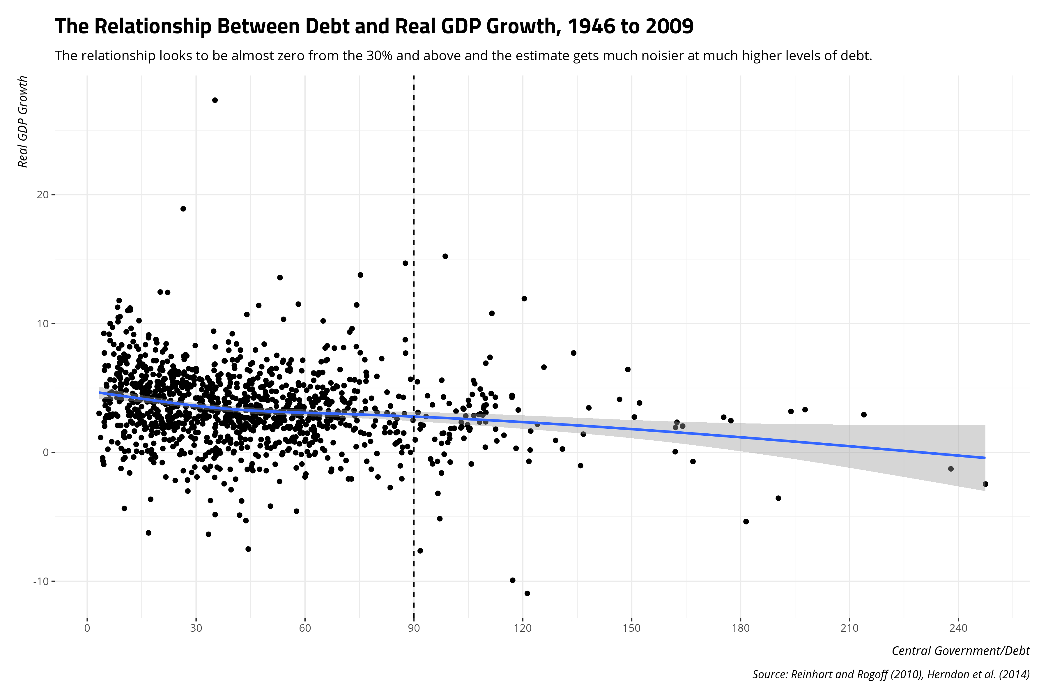
There is another lament from the Reinhart and Rogoff article because their short paper in the AER gives no attention to what the effect looks like. Had they done this, they might have been able to diagnose some problems in their presentation of the data.
Herndon et al. (2014, Figure 4) note a simple generalized additive model would have done well to show what the relationship between debt and GDP looks like more generally. Had they done that, it would’ve been evident that there is no clear relationship across all data points and that there is not a lot of information in the “90% and above” categories to make strong inferences.
RR %>%
  ggplot(.,aes(debtgdp, drgdp)) +
  theme_steve_web() +
  geom_point() +
  geom_smooth(method=gam, formula= y ~ s(x, bs = "cs")) +
  geom_vline(xintercept = 90, linetype = "dashed") +
  scale_x_continuous(breaks=seq(0,240,30)) +
  labs(x = "Central Government/Debt",
       y = "Real GDP Growth",
       caption = "Source: Reinhart and Rogoff (2010), Herndon et al. (2014)",
       title = "The Relationship Between Debt and Real GDP Growth, 1946 to 2009",
       subtitle = "The relationship looks to be almost zero from the 30% and above and the estimate gets much noisier at much higher levels of debt.")
Herndon et al.’s (2014, pp. 275-77) comment about the historical wrinkles in the data—especially how the largest booms and bust are post-World War II peculiarities and how the relationship between debt and real GDP growth seems to have softened over time—provides an opportunity to think of a mixed effects solution. It’s any wonder you don’t see mixed effects models more in time-series cross-sectional data like this because they’re novel ways of modeling the data. My approach here will be minimal since we’re dealing with “stylized facts.” I’ll eschew random effects for years and countries and instead offer a simple random effect for decade that pools countries and years within them.
We’ll need to prep the data a little. First, I’m going to create a random effect for decade that is a simple integer division of the year. Second, I’m going to right-censor the debt variable at 120% of GDP. Thereafter, the tail gets longer as it incorporates the post-WWII UK and Australian observations and the 21st century Japanese observations. We’re dealing with “stylized facts” so I don’t think this is terribly problematic. Further, I want to communicate quantities of interest that are for exact levels of debt (i.e. I don’t want to have to standardize the debt variable knowing there is likely no corresponding observation where, for example, debt is exactly 30% of GDP).
RR %>%
  mutate(decade = paste0((year %/% 10) * 10,"s"),
         debtgdp2 = ifelse(debtgdp >= 120, 120, debtgdp)) -> RR
Next, we’ll run a simple mixed effects model in brms that has just the random effect for the decade and a random slope for the debt variable. Do note that Stan models take a while, especially when you need to adjust controls in light of diagnostic warnings, so I ran this on a personal Docker image. However, the seed is reproducible.
M1 <- brm(drgdp ~  debtgdp2 + (1 + debtgdp2 | decade),
          seed = 8675309, # Jenny, I got your number...
          data=RR, family="gaussian",
          control=list(adapt_delta = .99), chains = 6, iter = 2000)
Then, let’s create a hypothetical data frame for some predictions. Here, for each decade, we’ll set hypothetical debt levels at 0% of GDP, 30% of GDP, 60% of GDP, 90% of GDP, and 120% of GDP. This recoded debt variable is right-censored so 120% of GDP is the maximum. We should also note some of these observations are technically never observed. For example, the lowest debt levels in the data are generally around 3% of GDP and observed in Northern Europe in the 1970s. No observation in the data had debt levels more than 90% of GDP in the 1970s as well. However, that won’t preclude us getting predictions on hypotheticals.
RR %>%
  data_grid(.model = M1,
            decade = unique(decade),
            debtgdp2 = c(0, 30, 60, 90, 120)) -> newdat
Now, let’s use the {tidybayes} package to add some predicted draws and plot the intervals. I’m going to use 80% intervals because everything is going to be diffuse anyway.
newdat %>%
  add_predicted_draws(M1, seed=8675309) %>% # Jenny, I got your number...
  ungroup() %>%
  mutate(debtgdp2 = fct_inorder(paste0(debtgdp2, "%"))) %>%
  group_by(decade, debtgdp2) %>%
  # We'll do simple 80% intervals. Everything will be diffuse anyway.
  summarize(mean = mean(.prediction),
            lwr = quantile(.prediction, .1),
            upr = quantile(.prediction, .9)) %>%
  ggplot(.,aes(debtgdp2, mean, ymin=lwr, ymax=upr)) +
  theme_steve_web() +
  geom_hline(yintercept = 0, linetype="dashed") +
  geom_pointrange() +
  facet_wrap(~decade) + coord_flip() +
  labs(title = "The Relationship Between Central Government Debt and GDP Growth, by Decade",
       subtitle = "A simple mixed effects model suggests Reinhart and Rogoff's (2010) main findings are mostly the peculiarities of post-WWII economies and the Great Recession.",
       y = "Simulated GDP Growth (with 80% Intervals)",
       x = "Central Government Debt/GDP Levels",
       caption = "Data: Reinhart and Rogoff (2009, 2010). Model details: svmiller.com/blog/2020/04/reinhart-rogoff-ten-years-later-replication/")
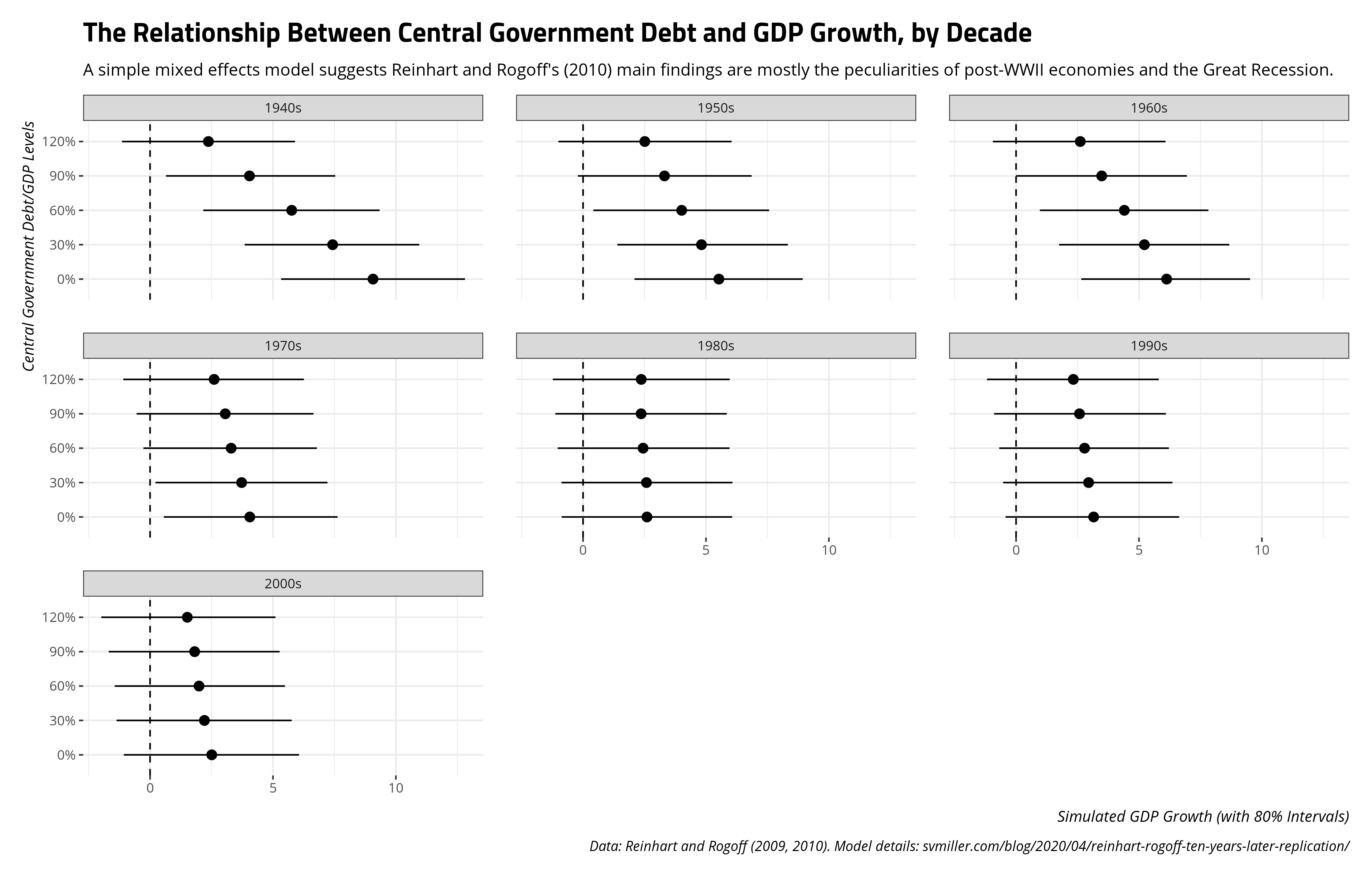
I think this squares nicely with the main takeaways that Herndon et al. (2014) communicate in their replication of Reinhart and Rogoff (2010). Namely, the main relationship that Reinhart and Rogoff argue seems derivative of two things. First, the greatest difference in growth levels as a function of debt is observed shortly after World War II. However, these 1940s observations are sui generis and atypical. They include those countries with massive recoveries after World War II (e.g. Austria). They include robust peacetime growth as an externality for countries that did not participate in World War II (e.g. Ireland, Sweden). They also include the unique case of the United States, for whom economic contractions following war were commonplace. Indeed, the end of World War II meant a drastically reduced global demand for one of the biggest parts of the American economy by that point: American weapons. The United States, which had used sovereign debt to finance itself through the Great Depression and World War II, unsurprisingly had an economic contraction at this point. The relationship between debt and GDP growth for the U.S. at this point is entirely incidental.
Second, advanced economies everywhere experienced lowered growth in the 2000s (i.e. 2000-2009, in these data). The Great Recession hit hard for many countries in the data. Some countries always had high levels of debt and experienced negative growth by 2009 (e.g. Belgium). Some countries resorted to acquiring more debt to minimize what was already a crisis in their country (e.g. Italy). However, more and more countries had acquired sovereign debt over time to have softened the overall relationship between central government debt and real GDP growth. By the 1980s, expected GDP growth at these various levels of debt were almost identical, ignoring for the moment how diffuse the predictions are. Herndon et al. (2014) rightly noted that looking at the underlying data and modeling temporal variation accordingly could tease this out. Their approach of using averages by debt category for incremental decade subtractions (e.g. 1950-2009, 1960-2009, 1970-2009, etc.) show that. A mixed effects model with a random effect for decade and random slopes for debt levels will highlight that as well.
Conclusion
The Reinhart and Rogoff replication crisis is both a sad case and a teachable moment. There is a sadness that we are still living in the afterglow of their AER article and corollary NBER working paper. Austerity politics still loom large among advanced economies; just ask Greece. Reinhart and Rogoff have since acknowledged their error, but that hasn’t undone the damage. Krugman may have been right that no paper in the history of economics had as big of an immediate effect than Reinhart and Rogoff’s AER paper. It was that influential. This is a common lament for those who take replication seriously because fabricated or p-hacked findings typically outpace the correction. Indeed, Google Scholar suggests that Reinhart and Rogoff’s paper has been cited about three times as much as the Herndon et al. (2014) replication.3 Reinhart and Rogoff published an errata to their 2010 AER paper, but you wouldn’t know that unless you went looking for that errata. A young student with a naive research question on the relationship between debt and GDP growth will likely find Reinhart and Rogoff’s paper first and would not immediately gather from the journal that the main findings are functions of various forms of coding error and case exclusions. That’s a shame.
Beyond that, it’s a teachable moment for graduate students on the issue of ethics and replication in social science. Per Andrew Heiss’ great lecture slides on this topic, accidental evil is still evil. A quiet errata won’t undo what’s already been done in Southern Europe and the United States. This is not a comment on Reinhart and Rogoff’s motives. It’s just a comment on what followed. Students can minimize the risk this happens to them, and importantly to others, by making their research reproducible. Certainly, never do anything important in Microsoft Excel.
-
In my defense, I think he may have been a lead author on a blog post on the topic that I read and it’s why I contacted him. ↩
-
I’ll note that I have not read Reinhart and Rogoff’s book to see how exactly they contextualize this point, but I highly doubt people like Paul Ryan read it either. People with a narrow-minded focus on the upward redistribution of wealth typically don’t read things in good faith nor engage in a dialectic method that approximates Hegel’s thesis-antithesis-synthesis triad. ↩
-
I offer this humbly because I don’t want to dig into the weeds of collating corollary citations in calculating impact. ↩
Disqus is great for comments/feedback but I had no idea it came with these gaudy ads.