Correlating Democracy and Per Capita Income: A Simple Introduction to an Old Finding

- We typically credit Seymour Martin Lipset for first noting this correlation.
I’m teaching an undergraduate class on quantitative methods where I’ve been cautioned—repeatedly—the students are not super eager to go as hard and fast as I’d like on this material. It’s already going to be an interesting experience breaking the traditional link to Stata on the curriculum in favor of R.1 Toward that end, students will get basic univariate statistics, bivariate statistics, and get to play with a simple linear model. Hopefully, everyone has a good time.
Students will have to learn about Pearson’s r as the most ubiquitous measure of correlation between two variables, but the challenge (for me, at least) is giving students something substantive around which to learn Pearson’s r. I want it to be something that they could discern from scholarship they might be asked to read for a more substantive course at the bachelor’s level. The issue is this can be challenging in ways you don’t initially expect because contemporary scholarship does not feature Pearson’s r (at least in simple ways). It might have a casual reference somewhere in the paper as a minor, technical matter, but not as the main matter. Much of that is the limitation of what Pearson’s r can tell us. We practitioners already know Pearson’s r outright does not care what is x and what is y, even though we often care a great deal about what is x and what is y when we argue for causal relationships. The extent to which a practitioner uses Pearson’s r, they’re probably interested in collinearity issues in their model. However, that’s not something we get to cover in the course.
The hope is to introduce students to correlation by acknowledging one of the most well-known relationships without a clear causal direction in our field: democracy and development (which prominently manifests in measures of per capita national income or GDP per capita). There are poor democracies and rich autocracies, but the relationship between the two as some kind of equilibrium is fairly robust. The problem is we disagree a great deal about what causes what. Does democracy precede economic development? Does economic development precede democracy? There have been a lot of trees felled for paper to argue these points, and both have prima facie convincing explanations that students can intuitively see. Here, we get to sidestep those questions altogether and focus on just the thing for which we agree: the two things correlate. I’ll be teaching that in R around Lipset’s (1959) well-known article that first made a comment of this empirical relationship.
Here are the R packages I’ll be using in this post.
library(tidyverse)     # for most things
library(stevemisc)     # for toy functions
library(kableExtra)    # for tables
library(stevethemes)   # for theme elements
library(ggdist)        # for fancy distribution plots
library(ggrepel)       # for labeling observations on a plot
The Background
I focus on the relationship between democracy and per capita income (alternatively: “economic development”) because it’s a tractable example of a correlation that does well to emphasize correlation’s most basic limitation: it’s symmetrical. Correlating democracy with per capita income is equivalent to correlating per capita income and democracy. We cannot use it to say that one causes the other (even if that’s precisely what Lipset (1959) did in his article). It would be fitting in this particular application because there is a lot of disagreement about what exactly causes what.
We have Seymour Martin Lipset (1959) to thank for discovering this empirical relationship, at least in its modern form with current measures. His cross-section of 48 countries from around 1949/1950 suggested a particularly strong relationship between democracy and economic development; even the poorest stable democracies in Europe were almost always richer than the European dictatorships. His argument is one of “modernization” and his particular flavor of it contends modernization (viz, economic development/per capita income) decreases a major source of political conflict: income inequality. The poor get richer and a middle class emerges that is a moderating force in domestic politics. Democracy is more likely to emerge as a system of governance in the absence of violent conflict to settle questions of redistribution.
There are any number of reasons to be skeptical about what Lipset (1959) argued, certainly with the benefit of hindsight and over 60 years of social science research. Even someone like Guillermo O’Donnell (1973) was too happy to point to developments in his native Argentina (and also Brazil) from around the time of Lipset’s publication to argue this modernization argument was simple to the point of simplistic. However, let’s stick in the confines of this “modernization” argument for the moment. Lipset (1959) may have been the first to make this kind of argument of correlation-masked-as-causation but modernization arguments to follow have not been wedded to the mechanism he offered. Cutright (1963) seems to be the first (of which I know) to take a different track and, with it, a different interpretation of the mechanism by which this relationship exists. Without discounting the kind of correlation Lipset (1959) observed, Cutright’s telling of this relationship talks more about democratic institutions that precede economic development. He acknowledges the relationship and acknowledges the “modernization”, but cannot shake a causal effect of democracy on development in his analysis. Others have made this argument with greater conviction. My particular background in international relations gives considerable weight to Douglass North on a lot of interesting questions. North (1990, for example) builds on this point of departure by arguing democratic protections in the form of property rights are almost sine qua non conditions for economic development. The actors responsible for economic development are unlikely to invest if autocrats can cheaply appropriate property.
We have a kind of chicken-or-egg problem here, which is a fitting metaphor because of how much ambiguity there also is in answering that particular question after you start getting into the weeds of evolution and amniote ancestors. Modernization scholarship of any kind would not discount that democracy and economic development are a long-term, basically stable equilibrium. However, the path to that outcome—and what exactly “causes” what—is imprecise and unconvincing in most of these classics. Lipset (1959) has a pretty clear take that economic development precedes democracy when he contends that economic development makes society too complex for any set of lightweight autocratic institutions to handle. Yet, economic development in the absence of institutional protections for private actors (i.e. “democracy”) is somewhat far-fetched. That tilts the causal arrow to democracy. No one would doubt—a la Przeworski and Limongi (1997)—that the two things correlate so strongly. They do. But even Przeworski and Limongi’s (1997) caveats about the basic introduction of democratic measures preceding economic development (which then consolidates democracy) challenges the boilerplate modernization thesis. What Burkhart and Lewis-Beck (1994) try to do is admirable, but even a basic resort to an application of Granger causality just keeps spinning the wheel that they’re still spinning in 2020. The question of causality is important, but answering it requires more command of the historical mechanisms generating the data they start to observe for the referent year of 1972. Again: the chicken or the egg? We might actually answer that causal sequence before we can confidently say what causes what in the relationship between democracy and economic development.
This is far from the most complete literature review on all the scholarship on this topic. In fact, it’s barely a literature review at all. For students, though, let it serve as a simple (but important) case where almost no one would question a relationship (by way of a simple correlation) exists. However, there are plenty of reasons to be unsure about what causes what, whether any of these conditions are filtered through intermediaries, whether autocrats “learn” from past mistakes toward consolidating their regime, and so on. Let us focus on the kind of correlation that Lipset (1959) first observed and worry about the issue of causality for another day.
The Data
I created a simple data set that serves as way of exploring the correlation that Lipset (1959) first described, using the countries from around the same time that Lipset (1959) said he used. There are 48 countries observed in 1949/1950 that Lipset groups, somewhat clumsily, into four categories. These are Europe and English-speaking countries (EE) that are either stable democracies or are unstable democracies/dictatorships. There are also Latin American Nations (LAN) that are democracies/unstable dictatorships or stable dictatorships. Lipset has per capita income data from the United Nations Statistical Division, for which I was not able to retrieve a copy here in Sweden.2 To make due, I used GDP and population simulations generated by Anders et al. (2020) and available in {peacesciencer}, for which a GDP per capita variable (in 2011 USD) is an easy creation. For simplicity’s sake, I also use democracy data available in {peacesciencer} and focus here on Xavier Marquez’ extension of the Unified Democracy Scores (UDS) data. I love this variable for coding democracy because it is a continuous estimate generated by a graded response model that has the added side effect of communicating the underlying probability of how convinced we are at the observation is a democracy based on the inputs to the graded response model. Students who don’t want to think about these hard details should just internalize that higher values = more democracy and/or greater belief that the thing in question is a democracy. The estimates are for 1950 and the simple data set we’ll be working with looks like this.
read_csv("http://svmiller.com/extdata/democracy-income-1950.csv") %>%
  mutate(wbgdppc = wbgdp2011est/wbpopest) %>%
  select(country:cat, wbgdppc, xm_qudsest) -> Data
| Country | Lipset (1959) Category | Est. GDP per Capita (2011 USD) | Marquez Democracy Estimate |
|---|---|---|---|
| Australia | EE: Stable Democracies | 13,919 | 1.87 |
| Belgium | EE: Stable Democracies | 9,358 | 1.85 |
| Canada | EE: Stable Democracies | 13,413 | 1.52 |
| Denmark | EE: Stable Democracies | 11,384 | 1.58 |
| Ireland | EE: Stable Democracies | 6,192 | 1.20 |
| Luxembourg | EE: Stable Democracies | 14,589 | 1.75 |
| Netherlands | EE: Stable Democracies | 9,633 | 1.71 |
| New Zealand | EE: Stable Democracies | 13,602 | 1.85 |
| Norway | EE: Stable Democracies | 10,916 | 1.71 |
| Sweden | EE: Stable Democracies | 11,755 | 1.79 |
| Switzerland | EE: Stable Democracies | 16,188 | 1.01 |
| United Kingdom | EE: Stable Democracies | 11,696 | 1.90 |
| United States | EE: Stable Democracies | 17,171 | 1.27 |
| Austria | EE: Unstable Democracies and Dictatorships | 6,330 | 1.79 |
| Bulgaria | EE: Unstable Democracies and Dictatorships | 3,245 | -0.46 |
| Czechoslovakia | EE: Unstable Democracies and Dictatorships | 6,242 | -0.50 |
| Finland | EE: Unstable Democracies and Dictatorships | 7,503 | 1.58 |
| France | EE: Unstable Democracies and Dictatorships | 8,769 | 1.58 |
| West Germany | EE: Unstable Democracies and Dictatorships | 6,933 | 1.69 |
| Greece | EE: Unstable Democracies and Dictatorships | 3,432 | 0.61 |
| Hungary | EE: Unstable Democracies and Dictatorships | 4,670 | -0.48 |
| Iceland | EE: Unstable Democracies and Dictatorships | 9,339 | 1.74 |
| Italy | EE: Unstable Democracies and Dictatorships | 5,558 | 1.78 |
| Poland | EE: Unstable Democracies and Dictatorships | 4,713 | -0.41 |
| Portugal | EE: Unstable Democracies and Dictatorships | 3,519 | -0.63 |
| Romania | EE: Unstable Democracies and Dictatorships | 2,276 | -0.48 |
| Spain | EE: Unstable Democracies and Dictatorships | 4,040 | -0.59 |
| Yugoslavia | EE: Unstable Democracies and Dictatorships | 2,893 | -0.51 |
| Argentina | LAN: Democracies and Unstable Dictatorships | 5,750 | 0.27 |
| Brazil | LAN: Democracies and Unstable Dictatorships | 2,485 | 0.80 |
| Chile | LAN: Democracies and Unstable Dictatorships | 5,825 | 0.69 |
| Colombia | LAN: Democracies and Unstable Dictatorships | 3,835 | -0.12 |
| Costa Rica | LAN: Democracies and Unstable Dictatorships | 3,809 | 1.01 |
| Mexico | LAN: Democracies and Unstable Dictatorships | 4,827 | -0.16 |
| Uruguay | LAN: Democracies and Unstable Dictatorships | 7,669 | 0.83 |
| Bolivia | LAN: Stable Dictatorships | 3,020 | -0.13 |
| Cuba | LAN: Stable Dictatorships | 3,726 | 0.78 |
| Dominican Republic | LAN: Stable Dictatorships | 2,173 | -0.72 |
| Ecuador | LAN: Stable Dictatorships | 2,805 | 0.67 |
| El Salvador | LAN: Stable Dictatorships | 1,527 | -0.19 |
| Guatemala | LAN: Stable Dictatorships | 3,156 | 0.61 |
| Haiti | LAN: Stable Dictatorships | 1,918 | -0.10 |
| Honduras | LAN: Stable Dictatorships | 2,525 | 0.05 |
| Nicaragua | LAN: Stable Dictatorships | 3,648 | -0.55 |
| Panama | LAN: Stable Dictatorships | 2,928 | 0.28 |
| Paraguay | LAN: Stable Dictatorships | 2,689 | -0.18 |
| Peru | LAN: Stable Dictatorships | 3,191 | 0.05 |
| Venezuela | LAN: Stable Dictatorships | 9,750 | -0.12 |
We could use these data to offer a basic replication of some of what you see in Table 2 in Lipset (1959). That second part of Table 2 shows, as you see here, that the ranges of per capita income overlap considerably for the Latin American states but there appears to be a substantial difference in Europe. In Europe at this time, the poorest democracy would be among the wealthiest unstable democracies or dictatorships.
Data %>%
  summarize(min = min(wbgdppc),
            median = median(wbgdppc),
            mean = mean(wbgdppc),
            max = max(wbgdppc), .by=cat)
#> # A tibble: 4 × 5
#>   cat                                           min median   mean    max
#>   <chr>                                       <dbl>  <dbl>  <dbl>  <dbl>
#> 1 EE: Stable Democracies                      6192. 11755. 12294. 17171.
#> 2 EE: Unstable Democracies and Dictatorships  2276.  4713.  5297.  9339.
#> 3 LAN: Democracies and Unstable Dictatorships 2485.  4827.  4886.  7669.
#> 4 LAN: Stable Dictatorships                   1527.  2928.  3312.  9750.
A graph might better show this. This graphs leverages {ggdist} for making distribution plots, and {stevethemes} for aesthetics, though I’ll suppress the code here for presentation.
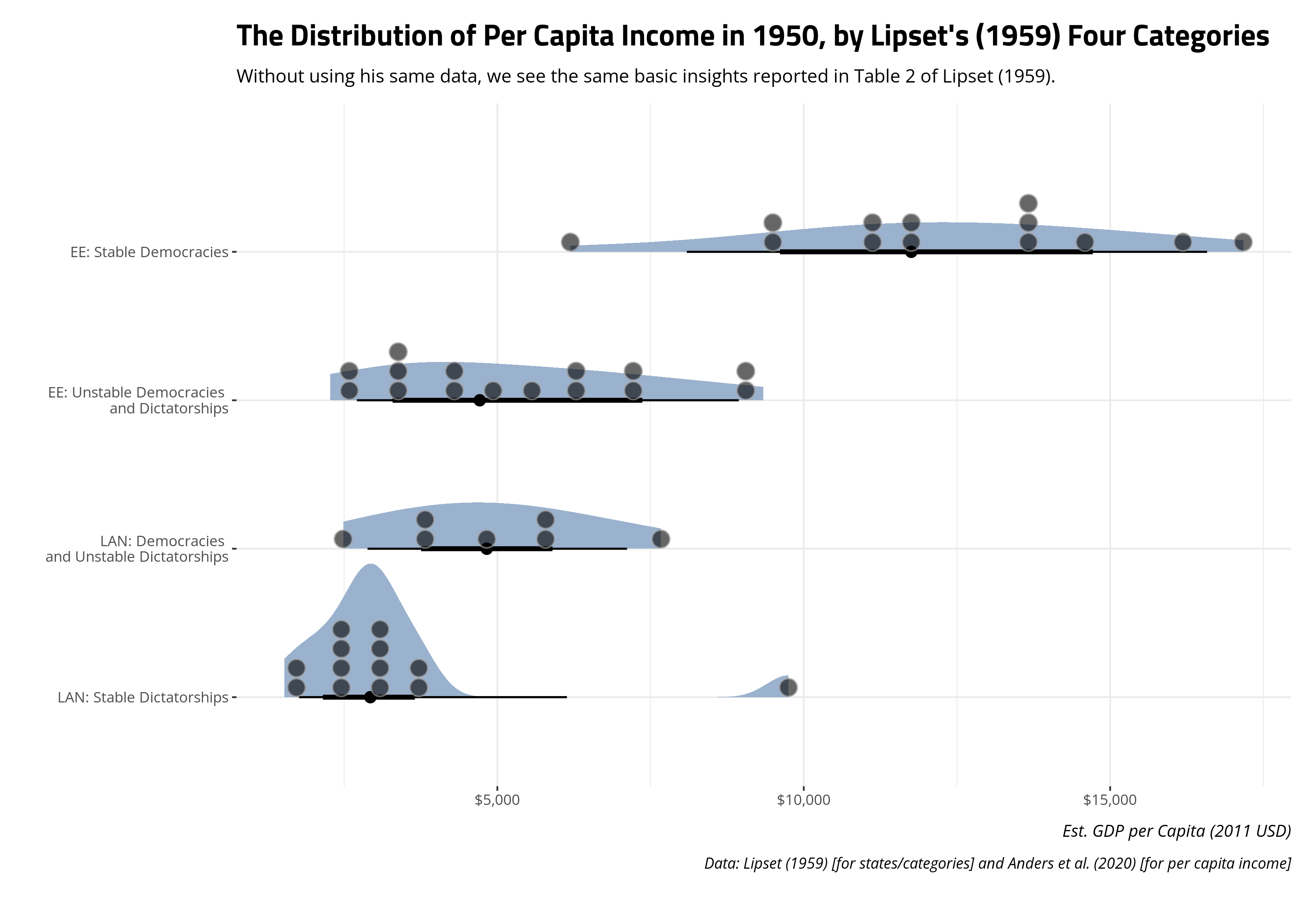
Here, we can see only one country that Lipset (1959) considers a stable democracy in Europe and the English-speaking world is poorer than the richest unstable democracy/dictatorship in the same region. Perhaps unsurprisingly, that country is Ireland. Among the Latin American states, we can see that the center of the distribution of democracies/unstable dictatorships has higher levels of per capita income than the center of the distribution for the stable dictatorships. There is only one obviously anomalous observation (Venezuela) here among those stable dictatorships. Even though the data we have are not identical to what Lipset (1959) said he used, we are at least able to basically see what he saw. If anything, we can see it in greater detail through the use of half-eye plots that communicate more about the shape of the data beyond the simple range.
Correlating Democracy and Per Capita Income
Now that we can see a basic replication of what Lipset (1959) observed, let’s insert our measure of democracy to see how highly democracy and per capita income correlate in this sample.
Data %>%
  summarize(cor = cor(xm_qudsest, wbgdppc))
#> # A tibble: 1 × 1
#>     cor
#>   <dbl>
#> 1 0.701
I’m always quick to note that there is no formal classification of a correlation, beyond direction, perfection, and zero. Correlations can be positive or negative, completely perfect in either direction, or zero. Beyond that, you are left to your own devices to describe what you see.3 Here, we can see it’s not 0 and it’s not 1 or -1. A correlation coefficient of .701, however, is what I would call a strong, positive correlation. It has anomalous observations (e.g. Ireland and Venezuela), but even removing those two observations would not materially change the correlation coefficient observed here.
Here, it’s worth noting for students that putting democracy as the x variable in the cor() function and putting per capita income as the y variable in the cor() function is just a judgment call on my end (even if it might give away how close I am to the North (1990) interpretation). I could reverse the two and get the exact same correlation coefficient because correlation is symmetrical.
# With x and y reversed
Data %>%
  summarize(cor = cor(wbgdppc, xm_qudsest))
#> # A tibble: 1 × 1
#>     cor
#>   <dbl>
#> 1 0.701
No matter, let’s use {ggplot2} to create a scatterplot that is roughly communicating the correlation coefficient we observe.
Data %>%
  ggplot(.,aes(xm_qudsest, wbgdppc)) +
  theme_steve() +
  geom_point() +
  geom_smooth(method = 'lm') +
  scale_y_continuous(labels = scales::dollar_format()) +
  labs(x = "Latent Democracy Estimate",
       y = "Est. GDP per Capita in 2011 USD",
       title = "A Scatterplot of Democracy and Per Capita Income, 1950",
       subtitle = "The scatterplot is not earth-shattering, but illustrative of the kind of positive correlation Lipset (1959) observed in these countries.",
       caption = "Data: Marquez (2016) [democracy], Anders et al. (2020) [for GDP per capita]")
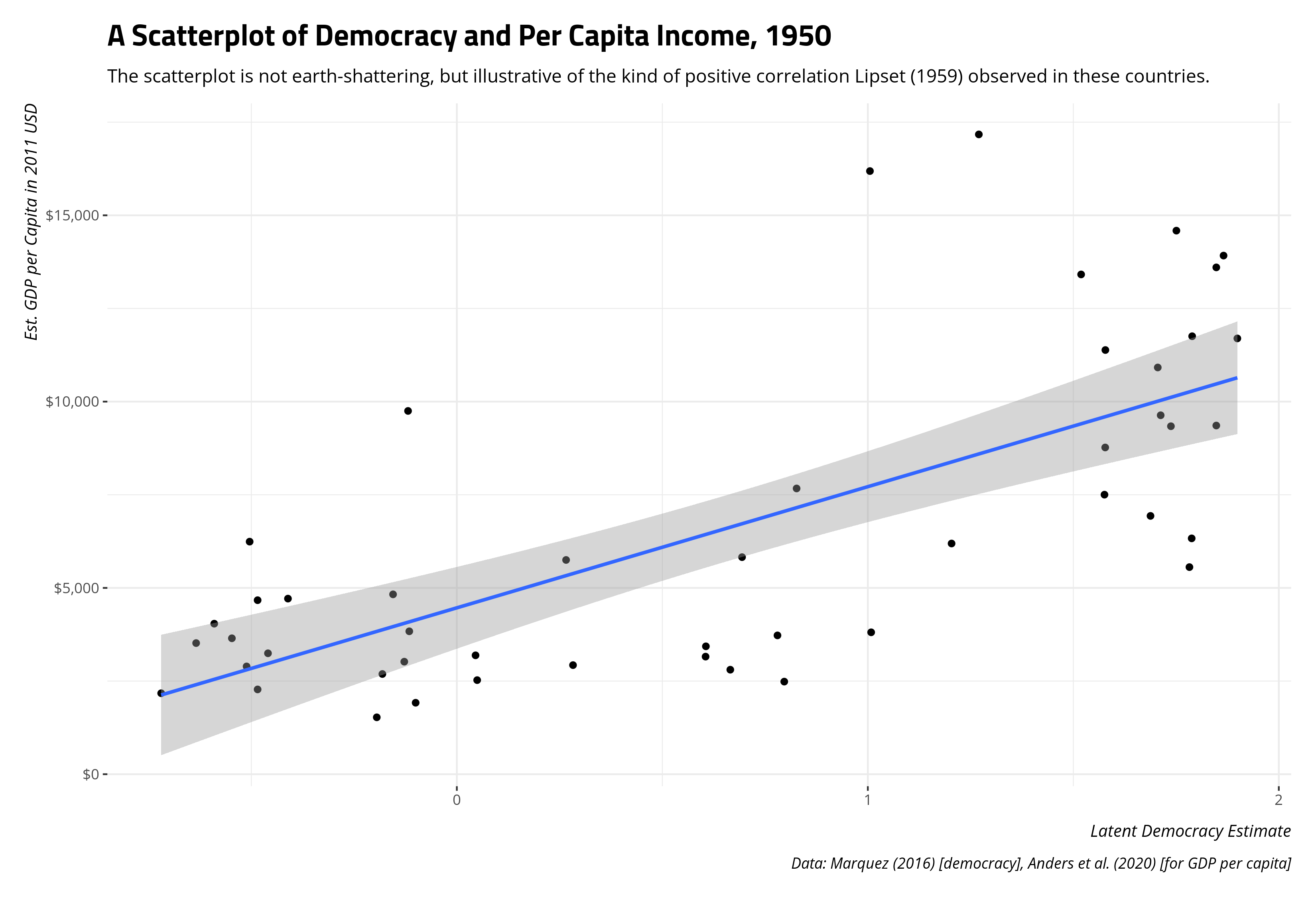
A scatterplot here is useful the extent to which it’s critical to show what a correlation coefficient “looks like.”4 Here, a correlation coefficient of .701 is suggesting a pretty strong, positive relationship. As the estimate of democracy increases, so should the estimated per capita income even if we must be absolutely agnostic about what is causing what. A clear “rise over run” should emerge, which is basically what we see here. It’s obviously not a perfect correlation, and there is some noise, but the “rise over run” is at least honest with those caveats in mind.
Unpacking the Standardization of the Correlation Coefficient
I impart three things about the correlation coefficient (Pearson’s r) on students who are absolutely new to this. The first is the aforementioned caveat that the correlation coefficient is symmetrical and is ultimately agnostic about any causal relationship generating the data it gets. Correlating x with y is equal to correlating y with x and even using the language of “association” can be tenuous if your use of “association” implies a direction (as one might do in a Lambda test). I alluded briefly to the second thing about the correlation coefficient that’s important to internalize. It’s hard-bound between -1 (perfect negative correlation) and +1 (perfect positive correlation), so any correlation coefficient the student may calculate out of those bounds is an error on their part.
The third thing is kind of interesting because it usually follows a sequence in which I’ve introduced students to the standard normal distribution. The correlation coefficient involves standardization of both x and y, creating z-scores from their product for all observations (summed and divided over the number of observations [minus 1]). z-scores communicate distance from the mean, also indicating that a z-score of exactly 0 is the mean (with absolute precision).
Let’s use r1sd_at() in {stevemisc} to scale our democracy and per capita income variables (by one standard deviation) to create these z-scores and take a peek at the data to see what they imply.
Data %>%
  r1sd_at(c("wbgdppc", "xm_qudsest"))
#> # A tibble: 48 × 7
#>    country     iso3c cat               wbgdppc xm_qudsest s_wbgdppc s_xm_qudsest
#>    <chr>       <chr> <chr>               <dbl>      <dbl>     <dbl>        <dbl>
#>  1 Australia   AUS   EE: Stable Democ…  13919.       1.87    1.73          1.32
#>  2 Belgium     BEL   EE: Stable Democ…   9358.       1.85    0.651         1.30
#>  3 Canada      CAN   EE: Stable Democ…  13413.       1.52    1.61          0.944
#>  4 Denmark     DNK   EE: Stable Democ…  11384.       1.58    1.13          1.01
#>  5 Ireland     IRL   EE: Stable Democ…   6192.       1.20   -0.0948        0.600
#>  6 Luxembourg  LUX   EE: Stable Democ…  14589.       1.75    1.88          1.20
#>  7 Netherlands NLD   EE: Stable Democ…   9633.       1.71    0.716         1.16
#>  8 New Zealand NZL   EE: Stable Democ…  13602.       1.85    1.65          1.30
#>  9 Norway      NOR   EE: Stable Democ…  10916.       1.71    1.02          1.15
#> 10 Sweden      SWE   EE: Stable Democ…  11755.       1.79    1.22          1.24
#> # ℹ 38 more rows
In the above console output, the s_ prefix precedes the name of the variable that was standardized into a new column. We know our correlation coefficient is .701, suggesting a pretty strong, positive relationship. We are expecting to see that most of the standardized variables share the same sign. If it’s above the mean in democracy, we expect it to be above the mean in per capita income. If it’s below the mean in democracy, we expect it to be below the mean in per capita income. Looking at just the first 10 observations, incidentally all in Europe, we see exactly that. Nine of these 10 states are consistent with this positive correlation, with just the one obvious exception of Ireland. We kind of expected to observe that, and we did.
It’s helpful to unpack what this mean visually by way of our scatterplot. We know that correlation creates z-scores of x and y underneath the hood, so let’s draw a vertical line at the mean of democracy and a horizontal line at the mean of per capita income to gather more information about our data.
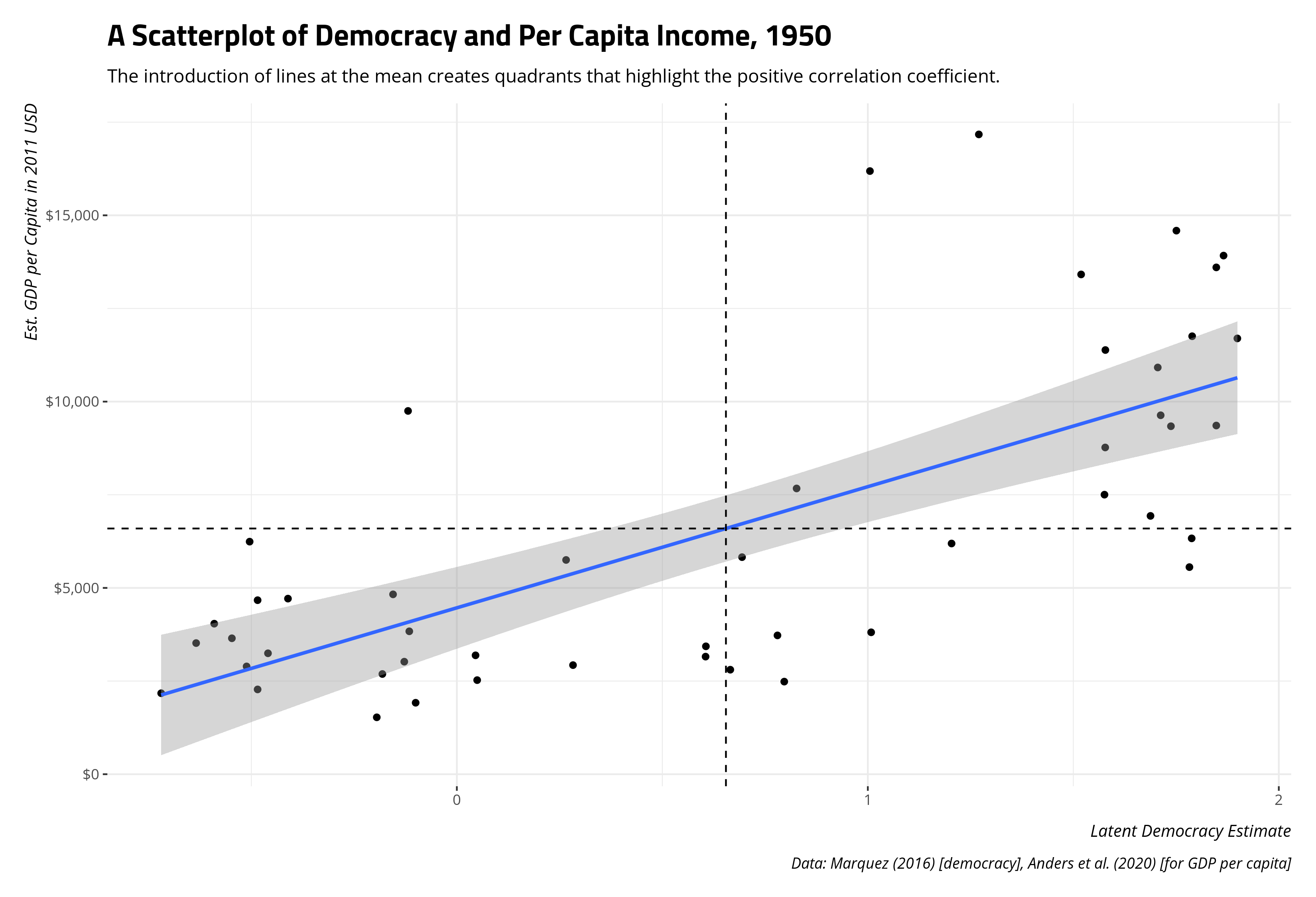
This is effectively breaking our bivariate data into quadrants. The bottom-left and top-right quadrants are so-called positive correlation quadrants. They are above (below) the mean in x and above (below) the mean in y and their placement in this quadrant is consistent with a positive correlation. The top-left and bottom-right quadrants are so-called negative correlation quadrants. They are above (below) the mean in x and below (above) the mean y, so observations here are inconsistent with a positive correlation and consistent with a negative correlation.5 The correlation coefficient we get implies that we should expect to see the bulk of observations in the top-right and bottom-left quadrants, which we incidentally do.
You would need to care about the subject matter and understand the standardization component to identify who are the off-correlation observations from 1950 that are poorer than we’d expect, given their democracy (or are richer than we’d expect, given their non-democratic regime). You can identify them in R like this.
Data %>%
  r1sd_at(c("wbgdppc", "xm_qudsest")) %>%
  filter((s_wbgdppc > 0 & s_xm_qudsest < 0) |
          (s_wbgdppc < 0 & s_xm_qudsest > 0))
#> # A tibble: 9 × 7
#>   country    iso3c cat                 wbgdppc xm_qudsest s_wbgdppc s_xm_qudsest
#>   <chr>      <chr> <chr>                 <dbl>      <dbl>     <dbl>        <dbl>
#> 1 Ireland    IRL   EE: Stable Democra…   6192.      1.20    -0.0948       0.600
#> 2 Austria    AUT   EE: Unstable Democ…   6330.      1.79    -0.0624       1.24
#> 3 Italy      ITA   EE: Unstable Democ…   5558.      1.78    -0.244        1.23
#> 4 Brazil     BRA   LAN: Democracies a…   2485.      0.797   -0.968        0.155
#> 5 Chile      CHL   LAN: Democracies a…   5825.      0.694   -0.181        0.0428
#> 6 Costa Rica CRI   LAN: Democracies a…   3809.      1.01    -0.656        0.386
#> 7 Cuba       CUB   LAN: Stable Dictat…   3726.      0.780   -0.676        0.137
#> 8 Ecuador    ECU   LAN: Stable Dictat…   2805.      0.665   -0.893        0.0116
#> 9 Venezuela  VEN   LAN: Stable Dictat…   9750.     -0.119    0.743       -0.845
A niftier tactic to communicate the same basic information is to create a label for them after identifying them and using geom_label_repel() in {ggrepel} to communicate those observations on the scatterplot. The code that does this is suppressed for presentation, but you can see the end result below.

Again, you would need to care about the subject matter to contextualize some of what you see here. Ireland’s historical deprivation is familiar to those with even a passing familiarity with the island. That poverty persisted well after the national revolution and through the mid-to-late 20th century even as the republic’s economic standing has changed considerably over the past 10 or so years. Venezuela’s economic fortunes were buoyed in the 1950s by oil exploration, notwithstanding its military despotism and corruption. It was even the largest exporter of petroleum around this time. Because the discovery of oil in Venezuela’s territorial jurisdiction was somewhat new around this time, the country was able to attract a lot of foreign investment as speculators wanted to be on the ground floor. I don’t think it takes too much effort to internalize Italian and Austrian democracy are arguably artifacts of a devastating war and the course of the war had large economic consequences as well. These are far from exhaustive answers, but may they contextualize the observations the scatterplot and correlation point out. Students may not be too eager to explore the quantitative side of things, but there is always a qualitative component to the story as well.
Conclusion
The bulk of this is going to be a lab session in which I go over the correlation coefficient, how to implement it in R, and how to make sense of what is being communicated here. Seasoned practitioners will find nothing new here, and will also caution that there is much more scholarship available that explores the relationship between democracy and economic development in greater detail than what I offer here. You should read those—especially Boix (2003) and Acemoglu and Robinson (2006). However, we all have to start somewhere, even my undergraduates who are getting their first real exposure to quantitative methods. May replicating an old finding from around this time be at least tractable and informative, certainly of correlation’s properties and limitations.
-
I never got a straight answer but was indirectly told that students have a license for Stata but faculty do not. It was already going to be an issue installing it on my Linux operating system (and that’s been an issue that has apparently affected students in the past). So, R it is. ↩
-
Fingers crossed that I can get that from an inter-library loan here because it’d be a nifty resource. ↩
-
You could also test for “significance” from 0, but I’ve never found a substantive use for that (beyond humoring ourselves about exclusion restrictions), so I don’t belabor it to students. ↩
-
If just those observations in the top-left and bottom-right quadrants were included for a correlation, the ensuing Pearson’s r would be -.211. I might show this to the students in the lab session, though I don’t want to belabor it here. ↩
Disqus is great for comments/feedback but I had no idea it came with these gaudy ads.