The Normal Distribution, Central Limit Theorem, and Inference from a Sample

- Carl Friedrich Gauss, who discovered the normal distribution, honored on the 10-Deutsche Mark.
Last updated: 7 May 2022. These simulations were done originally on Microsoft R Open 3.5.3. R changed its random seed generator with the update to version 4.0. The estimate I provide are from a cached version of those original simulations and newer simulations will result in slightly different results. That doesn’t change the underlying principles communicated here.
I write this to formalize how I teach students about statistical inference (i.e. inferring from a sample of the population to the population itself).1 Namely, it’s convenient to show how this works in simulation, when the population parameters are known, to ease social (political) science students into inference in the real world. In the real world, the population parameter (e.g. how much ~250 million American adults approve of the president) is unknowable but we tell students we can learn a great deal from that population through a random sample of it.
However, there are some important assumptions that underpin why we say we can do this. This means a discussion of a normal distribution, central limit theorem, and how to approach inference from a sample of the population when there is often just one random sample to analyze. Given that all my travel plans for the spring fell through because of the ongoing pandemic, I thought I’d take some time to write this out.
Here are the R packages I’ll be using in this post.
library(tidyverse) # for everything
library(stevemisc) # my toy package, for formatting and the normal_dist() function
library(post8000r) # my grad-level R package, which mostly has data sets.
library(patchwork) # for combining plots
library(knitr) # for tables
library(kableExtra) # fancy table formatting
library(dqrng) # for much faster sampling than base R
Here’s a table of contents.
- The Normal Distribution
- Central Limit Theorem
- Random Sampling Error, or: An Ideal Sample Size When Infinity Trials are Impossible
- Inference from a Sample, or: The Probability of Observing the Sample Statistic Given a Population Parameter
- How This Works in the Real World
The Normal Distribution
There are several important probability distributions in statistics as they extend to social scientific applications. However, the normal distribution might be the most important. A normal distribution is the familiar “bell curve” and it’s a way of formalizing a distribution where observations cluster around some central tendency. Observations farther from the central tendency occur less frequently. Others had danced around this distribution. Indeed, Galileo informally described a normal distribution in 1632 when discussing the random errors from observations of celestial phenomena. However, Galileo existed before the time of differential equations and derivatives. We owe its formalization to Carl Friedrich Gauss, which is why the normal distribution is often called a Gaussian distribution.
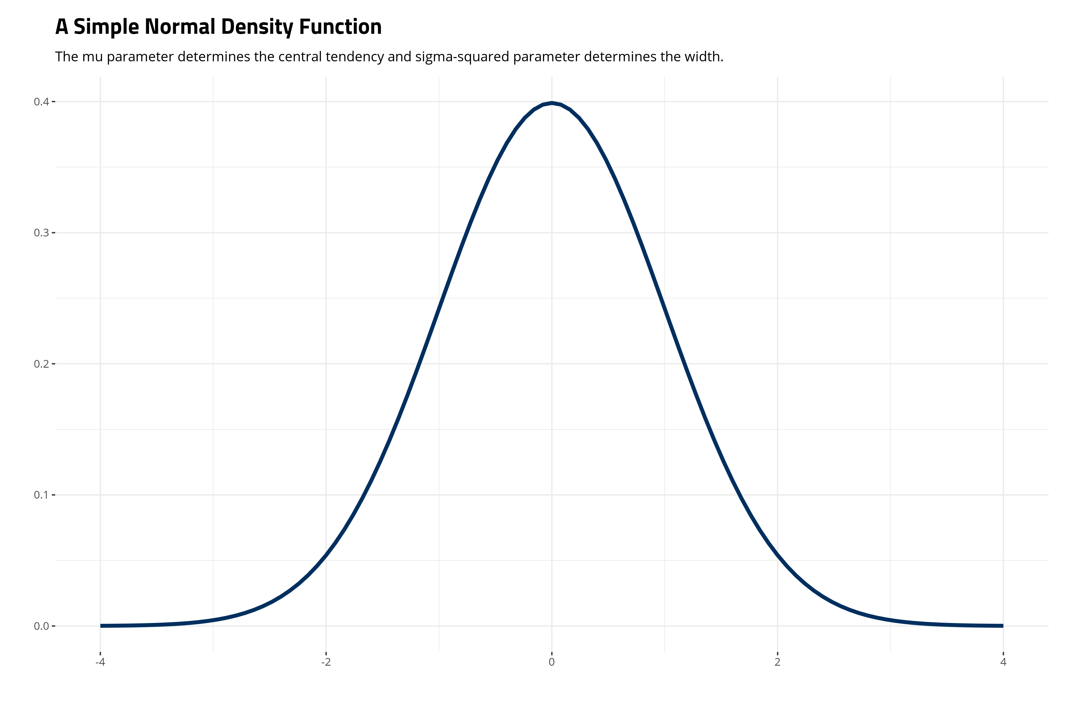
Gauss’ normal distribution, technically a density function, is a distribution defined by two parameters, \(\mu\) and \(\sigma^2\). \(\mu\) is a “location parameter”, which defines the central tendency. \(\sigma^2\) is the “scale parameter”, which defines the width of the distribution and how short the distribution is. It’s formally given as follows.
\[f(x | \mu, \sigma^2) = \frac{1}{\sqrt{2\pi\sigma^2}}e \thinspace \{ -\frac{(x -\mu)^2}{2\sigma^2} \}\]The ensuing distribution will look like this in a simple case where \(\mu\) is 0 and \(\sigma^2\) is 1.
ggplot(data.frame(x = c(-4, 4)), aes(x)) +
  theme_steve_web() + # from {stevemisc}
  stat_function(fun = dnorm, color="#002F5F", size=1.5) +
  labs(title = "A Simple Normal Density Function",
       subtitle = "The mu parameter determines the central tendency and sigma-squared parameter determines the width.",
       x = "", y="")
There are a lot of moving pieces in the normal distribution, which is why I like to dedicate some time in lecture to “demystifying” the normal distribution. This involves breaking down its individual components and belaboring them until they seem more accessible.
First, notice the tails in the above graph are asymptote to 0. “Asymptote” is a fancier way of saying the tails approximate 0 but never touch or surpass 0. One way of thinking about this as we build toward its inferential implications is that deviations farther from the central tendency are increasingly unlikely, but, borrowing Kevin Garnett language, “anything is possible.” Consider the case of height for adult women as illustrative here. Height is one of those naturally occuring phenomena that approximates a normal distribution very well.2 In the American case, the typical adult woman is 5 ft 3.5 inches (161.5cm) tall. The actress Jane Lynch is a rarity among American women, measuring around 6 feet tall. The probability of this height is rare, even if she has some company among adult women. Someone like Brittney Griner is one of a kind among American women, measuring around 6 ft 8 inches (203 cm) tall. In a distribution of heights among American women, this is clearly possible, but highly improbable. That’s why the tails are asymptote to zero, but never include it.
Second, the “kernel” is that thing inside the exponent, which is surrounded by the curly brackets in the notation above (i.e. \(-\frac{(x -\mu)^2}{2\sigma^2}\)). If you stare at it carefully enough, you’ll see it’s a basic parabola (notice the square term in the numerator). Making it negative just flips the parabola downward. Exponentiating it is what makes it asymptote to 0. Observe, for a simple case where \(\mu\) is 0 and \(\sigma^2\) is 1:
parab <- function(x) {-x^2/2}
expparab <- function(x) {exp(-x^2/2)}

ggplot(data.frame(x = c(-4, 4)), aes(x)) +
  stat_function(fun = parab, color="#002F5F", size=1.5) +
  theme_steve_web() +
  labs(title="A Basic Parabola",
       subtitle = "Notice the height is at 0 because the negative part flipped the parabola downward.",
       x = "", y="") -> p_parab

ggplot(data.frame(x = c(-4, 4)), aes(x)) +
  stat_function(fun = expparab, color="#002F5F", size=1.5) +
  theme_steve_web() +
  labs(title="An Exponentiated Negative Parabola",
       subtitle = "Exponentiating squeezes the parabola, adjusts the height, and makes the tails asymptote to 0.",
       x = "", y="") -> p_expparab

# library(patchwork)
p_parab + p_expparab
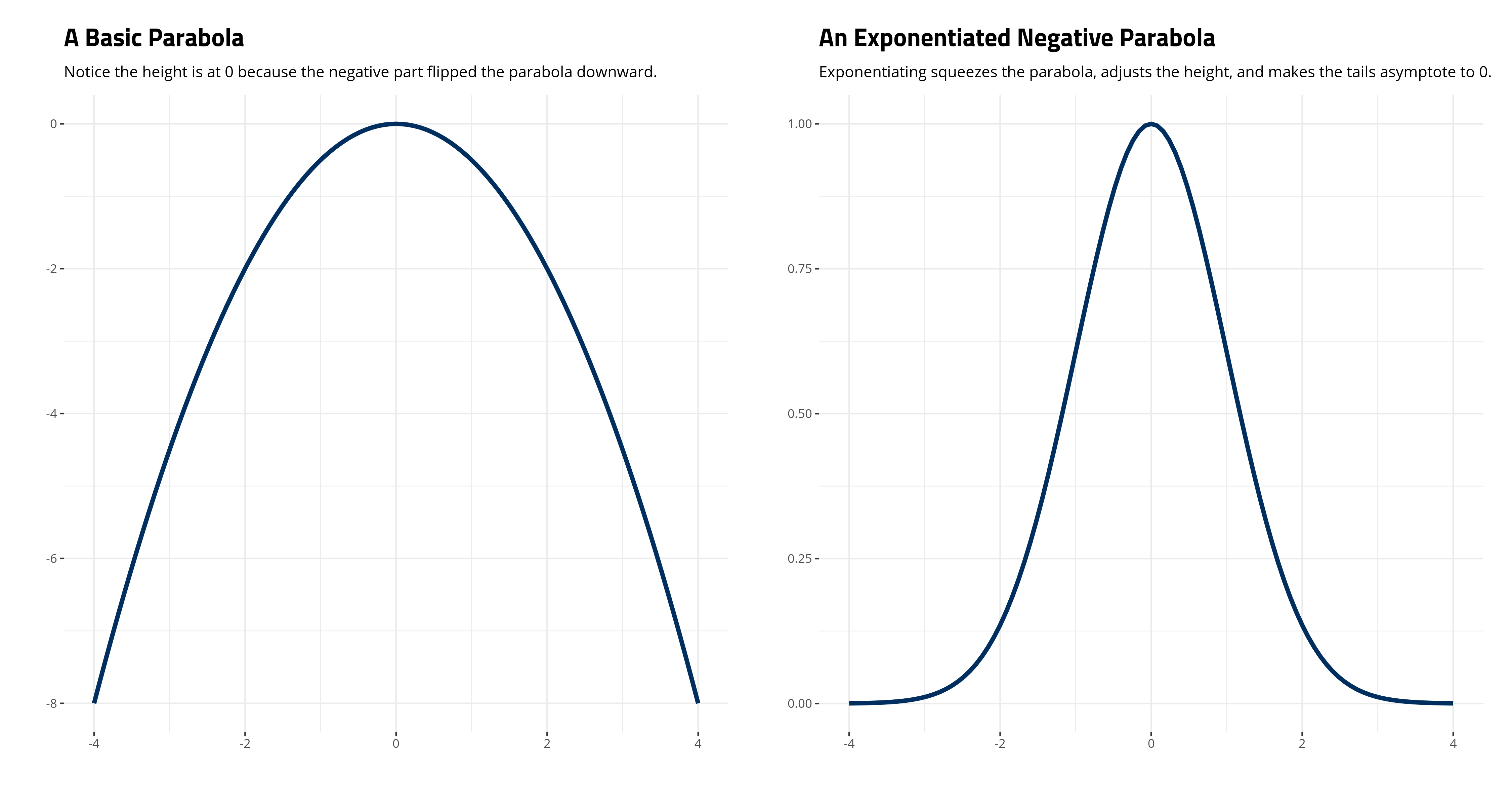
Third, and with the above point in mind, it should be clear that \(\frac{1}{\sqrt{2\pi\sigma^2}}\) will scale the height of the distribution. Observe that in our simple case where \(\mu\) is 0 and \(\sigma^2\) is 1, the height of the exponentiated parabola is at 1. That gets multiplied by \(\frac{1}{\sqrt{2\pi\sigma^2}}\) to equal about .398. Some basic R code will show this as well.
# Are these two things identical?
identical(1/sqrt(2*pi), dnorm(0, mean=0, sd=1))
#> [1] TRUE
Fourth, the distribution is perfectly symmetrical. \(\mu\) determines the location of the distribution as well as its central tendency. All three measures of central tendency—the mode (most frequently occurring value), the median (the middlemost value), and the mean (the statistical “average”)—will be the same. It also means a given observation of \(x\) will be as far from \(\mu\) as \(-x\).
Fifth, and this is a bit obtuse for beginners to grasp, do note that we noted the normal distribution as a “function” and not a probability because the probability of any one value is effectively zero. Contrast this with how we communicate other common distributions in statistics and social (political) science, like the Poisson distribution for counts or the binomial distribution for “successes” in a given set of “trials.” Both of those distributions are “discrete”, meaning they have only a set number of possible values. In the Poisson case, the ensuing values for counts cannot be negative and must be integers. In the binomial case, the number of successes cannot be negative nor can they exceed the number of trials.
By contrast, the normal density function is technically unbounded. It has just the two parameters that define its location and scale and the tails are asymptote to 0 no matter what the values of \(\mu\) and \(\sigma^2\) are. This makes the distribution “continuous” since \(x\) can range over the entire line from \(-\infty\) to \(\infty\). Thus, the function does not reveal the probability of \(x\), unlike the Poisson and binomial distributions, and the probability of any one value is effectively 0. However, the area under the curve is the full domain of the probability space and sums to 1. The probability of selecting a number between two points on the x-axis equals the area under the curve between those two points.
Consider the special, or “standardized”, case of the normal distribution when \(\mu\) is 0 and \(\sigma\) is 1 (and thus \(\sigma^2\) is also 1). The ensuing normal distribution becomes a lot simpler.
\[f(x | \mu, \sigma^2) = \frac{1}{\sqrt{2\pi}}e \thinspace \{ -\frac{x^2}{2} \}\]The areas underneath the curve become a lot simpler to summarize as well. It gives way to things like the 68–95–99.7 rule on how to summarize areas underneath the normal curve. I reproduce this below with my normal_dist() function.
normal_dist("#002F5F","#002F5F", "Open Sans") +
  theme_steve_web() +
  # ^ all from {stevemisc}
    labs(title = "The Area Underneath a Normal Distribution",
       subtitle = "The tails extend to infinity and are asymptote to zero, but the full domain sums to 1. 95% of all possible values are within about 1.96 standard units from the mean.",
       y = "Density",
       x = "")
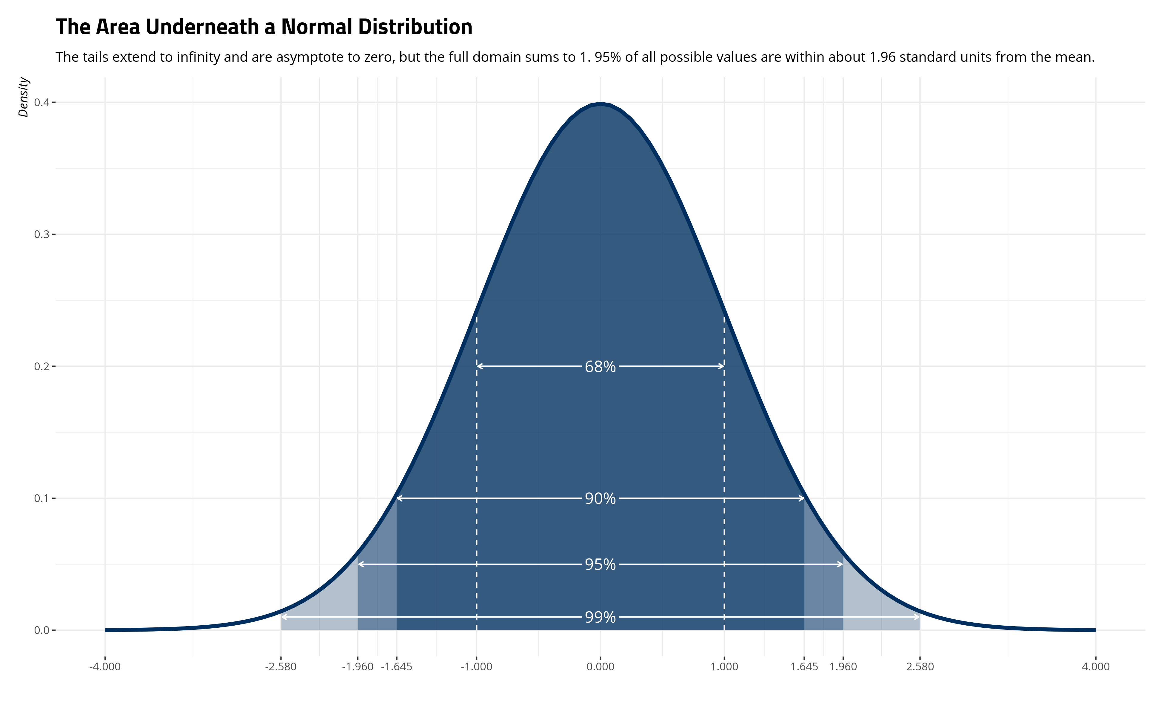
Importantly, around 68% of the distribution is between one standard unit of \(\mu\). Around 90% of the distribution is between 1.645 standard units on either side of \(\mu\). Around 95% of the distribution is between about 1.96 standard units on either side of \(\mu\). About 99% of the distribution is between 2.58 standard units on either side of \(\mu\). So, the probability that \(x\) is between 1 on either side of the \(\mu\) of 0 is effectively .68.3 The ease of this interpretation is why researchers like to standardize their variables so that the mean is 0 and the standard deviation (i.e. the scale parameter) is 1.
The normal distribution appears as a foundation assumption for a lot of quantitative approaches to social (political) science. It is the foundation for ordinary least squares (OLS) regression and even for some generalized linear models. It is also an important distribution in some statistical theory. Importantly, central limit theorem, itself a foundation of a lot of classical statistical testing, states that sampling distributions are effectively normal as well. I’ll belabor this one next.
Central Limit Theorem
The central limit theorem is a novel proposition in statistical testing that proposes a description of sampling distributions from a known population. In plain English, central limit theorem’s five important points are 1) infinity samples of any size \(n\) 2) from a population of \(N\) units (where \(N >n\)) will 3) have sample means (\(\bar{x}\)) that are normally distributed. 4) The mean of sample means converges on the known population mean (\(\mu\)) and 5) random sampling error would equal the standard error of the sample mean (\(\frac{\sigma}{\sqrt{n}}\)).
The cool thing about central limit theorem is that this works no matter the underlying distribution of the population data. The underlying population data could be noisy as hell and central limit theorem will still hold. To illustrate this, let’s draw some thermometer rating data from the 2018 ANES pilot study for Donald Trump. I have this as the Therms18 data frame in my {post8000r} package, which has the thermometer ratings for both Trump and Obama. We’ll stick with the current president for this exercise.
It should be unsurprising that these data are ugly as hell, on the balance (and without any consideration for how these evaluations are conditioned by partisanship). The thermometer rating takes on any value from 0 to 100, with higher values indicating more “warmth” (approximating more favorability/approval). However, there are three clumps that are going to appear. There’s going to be a clump at 0 for people who despise Donald Trump. There’s going to be a clump at 100 for those that revere him. There’s going to even be a clump right in the middle for those who don’t know what to think of him. Here’s what the data look like.
Therms18 %>%
  group_by(fttrump) %>%
  tally() %>%
  ggplot(.,aes(fttrump, n)) + geom_bar(stat="identity", fill="#619cff",color="black") +
  theme_steve_web() +
  scale_x_continuous(breaks = seq(0, 100, by=10)) +
  labs(x = "Thermometer Rating for Donald Trump",
       y = "Number of Observations with This Particular Rating",
       caption = "Data: ANES Pilot Study, 2018. Number of observations: 2,471.",
       title = "The Thermometer Ratings for Donald Trump from the ANES' 2018 Pilot Study",
       subtitle = "It should be unsurprising that this thermometer rating, even on a granular 101-point scale, looks anything other than ''normal.''")
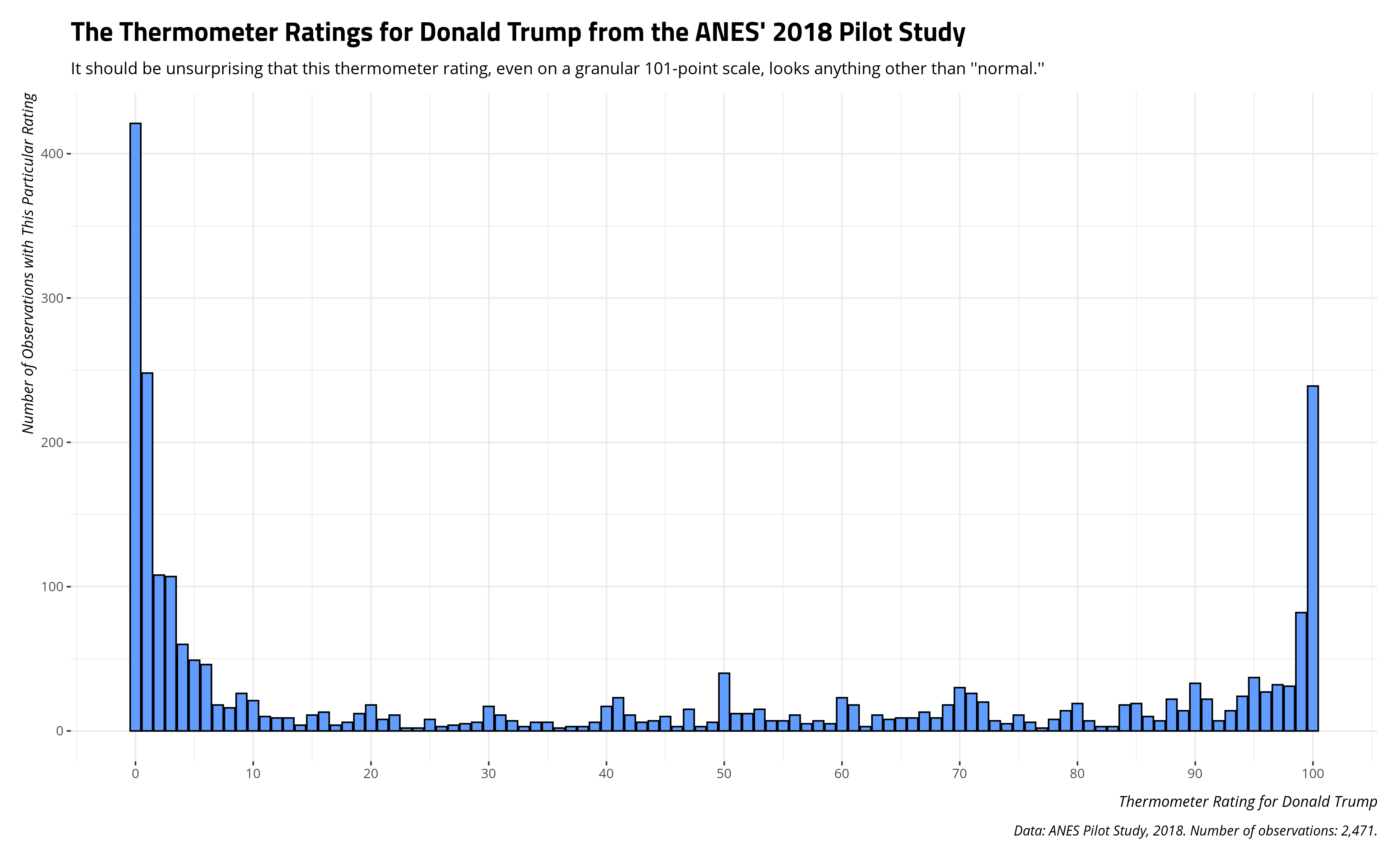
Here are some descriptive statistics to drive home how ugly these data are. If you knew nothing else from the data other than the descriptive statistics below, you would likely guess the data would look anything other than “normal” no matter how many different values there are. Undergraduates who first learn about variables would see a clear bimodality problem in these data. Namely, that “average” (i.e. the mean) doesn’t look “average” at all. It’d be a stretch to say that the typical American adult, in a country with around 250 million adults, has a thermometer rating of about 40 for Donald Trump.
| Minimum | Maximum | Mode | Median | Mean | Standard Deviation |
|---|---|---|---|---|---|
| 0 | 100 | 0 | 23 | 40.01578 | 40.24403 |
However, let’s see if we can illustrate central limit theorem even with ugly data like these. I’ll use the rbnorm() function in my {stevemisc} package to generate 250,000 observations (paired down for ease of computation) from a scaled beta distribution (euphemistically called “bounded normal” by me). The data will have the above characteristics and will serve as the entire population of data from which we can sample.
Population <- rbnorm(250000, mean =40.01578, sd = 40.24403,
                     lowerbound = 0,
                     upperbound = 100,
                     round = TRUE,
                     seed = 8675309) # Jenny, I got your number...
The descriptive statistics will nicely coincide with the above parameters of the Trump thermometer rating. However, if you were to look at the distribution of the data, you’ll see it doesn’t quite have the “fuzz” in the middle that you get from something that occurs naturally in the wild.
| Minimum | Maximum | Mode | Median | Mean | Standard Deviation |
|---|---|---|---|---|---|
| 0 | 100 | 0 | 23 | 40.01178 | 40.27655 |
Knowing well that these data are ugly, they nevertheless constitute the population of data from which we could sample. No one would say a random sample of 10 observations from a target population is anything other than borrowing trouble. The smaller the sample size, the more likely the sample statistic (here: the sample mean) is a fluke. We could do that, though.
set.seed(8675309)
a_sample_mean <- mean(sample(Population, 10, replace=F))
## a_sample_mean
#> 65.8
Indeed, the ensuing sample mean is nowhere close to the actual population mean. However, what if we were to get a million samples, each sample consisting of just 10 observations, and save the means of those samples? Here’s the code that will do that.
set.seed(8675309) # Jenny, I got your number...
# Note {dqrng} offers much faster sampling at scale
Popsamples <- tibble(
  samplemean=sapply(1:1000000,
           function(i){ x <- mean(
             dqsample(Population, 10,
                    replace = FALSE))
           }))
And here’s the distribution of sample means. Notice the distribution of sample means (as a histogram) converges on a normal distribution where the provided location and scale parameters are from the one million sample means. Further, the center of the distribution is converging on the known population mean. The true population mean is 40.011776. The mean of the one million sample means is 40.0247569. They’re clearly not identical, but I also technically did not do infinity samples either. The principle is still clear from what emerges.
Popsamples %>%
  ggplot(.,aes(samplemean)) + geom_histogram(binwidth=.5,aes(y=..density..),alpha=0.7) +
  theme_steve_web() +
  geom_vline(xintercept = mean(Population), linetype="dashed") +
  stat_function(fun=dnorm,
                color="#522d80", size=1.5,
                args=list(mean=mean(Popsamples$samplemean),
                          sd=sd(Popsamples$samplemean))) +
  labs(x = "Sample Mean", y = "Density",
       title = "The Distribution of 1,000,000 Sample Means, Each of Size 10",
       subtitle = "Notice the distribution is normal and the mean of sample means converges on the known population mean (vertical line).",
       caption = "Data: Simulated data from blog post at svmiller.com.")
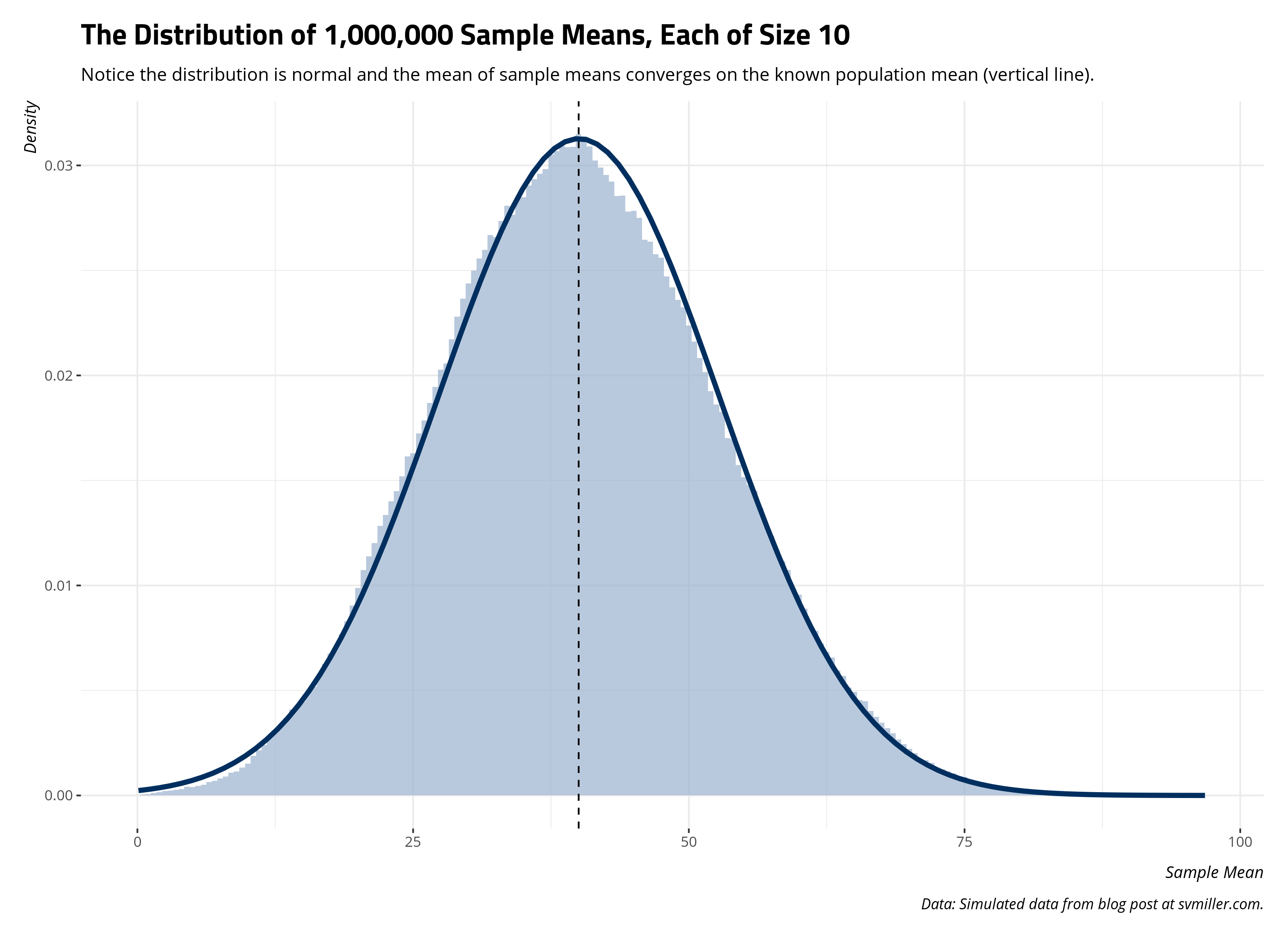
Per central limit theorem, infinity samples of any size result in a distribution of sample statistics that converge on the known population parameter. That one sample mean of 65.8 from the first sample of 10 is clearly an anomaly. It’s a cautionary tale of what may result from 1) a one-off sample that is small in size from 2) a population distribution in which the spread is large. Nevertheless, a million samples of that size will produce a distribution of sample statistics that, at the limit, capture the true population parameter. To be clear, the “true” population parameter is a mean, a statistical “average”, that doesn’t look so “average.” Nonetheless, central limit theorem shows how we can capture it through a sampling distribution of it. Even if the underlying population distribution is far from “normal”, the sampling distribution of it is and converges on the population mean.
Random Sampling Error, Or: An Ideal Sample Size When Infinity Trials are Impossible
The real world doesn’t approximate the ideal conditions of central limit theorem. Namely, samples from the population are expensive and the underlying population parameter (e.g. a thermometer rating of Donald Trump) isn’t time-invariant. Ostensibly, attitudes may change from week to week, even day to day. Central limit theorem says infinity random samples (of any size) will get us the population parameter. However, that’s in simulation, not the real world.
This will bring us to the topic of random sampling error. The tl;dr on random sampling error is that it’s an unavoidable component of trying to infer properties of the population given a sample of it. Indeed, random sampling purposely introduces random sampling error to our estimate since there will always be differences in the sample from the population that occur just by the chance sample we obtained. This may seem bad, but statisticians and social scientists will note that random sampling error is always the lesser evil to systematic error. In the survey context, it’s why we hold George Gallup to be the Gallant to the Goofus of the 1936 Literary Digest Poll.
We conceptualize random sampling error as having two components. The first is the amount of variation in the population parameter. We can’t do anything about this. Real world data can be noisy as hell, like the thermometer ratings for divisive public officials in the United States. The second component of random sampling error is the sample size component. We can do something about this: increase the number of observations in the sample. However, we should be cautious about what The Literary Digest poll did, which amounted to a large-scale non-random sampling of a subset of the American population that hated Franklin Delano Roosevelt. Further, the effect of the sample size component on random sampling error is non-linear. It’s the square root of the sample size, which suggests diminishing returns from an increased sample size that careens into non-random sampling territory if the researcher is not careful. Formally, random sampling error is defined as \(\frac{\sigma}{\sqrt{n}}\), where the variation component (\(\sigma\)) is the standard deviation inherent in the population and the sample size component (\(\sqrt{n}\)) is the square root of the sample size.
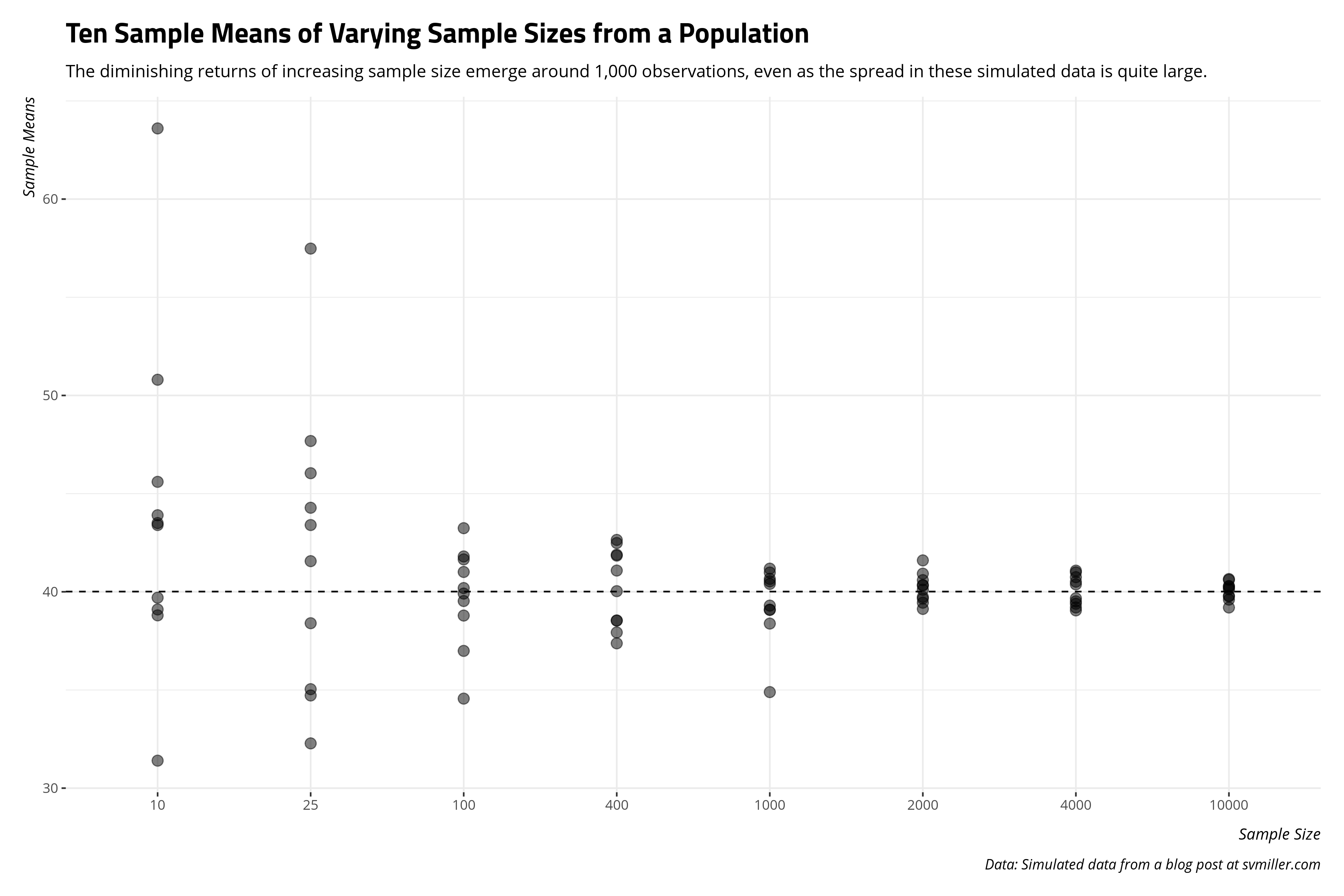
With this in mind, what is an ideal sample size in a situation like this (and likely other cases in a social scientific application) where there is high variation in the population and infinity trials—or even multiple trials—are not possible? In the case of the Population data we simulated above, let’s get 10 sample means from samples of varying sizes: 10, 25, 100, 400, 1000, 2000, 4000, and 10000 from this population of 250,000 observations. The following code will both execute that code and chart the 10 different sample means for each different sample size noted on the x-axis.
sample_sizes <- c(10, 25, 100, 400, 1000, 2000, 4000, 10000)

Samps = list()
set.seed(8675309)
for (j in sample_sizes) {
   Samps[[paste0("Sample size: ", j)]] = data.frame(sampsize=j, samp=sapply(1:10, function(i){ x <- sample(Population, j, replace = TRUE) }))
}

Samps %>%
  map_df(as_tibble) %>%
  gather(samp, value, samp.1:samp.10) -> Samps

Samps %>%
  group_by(sampsize, samp) %>%
  summarize(sampmean = mean(value)) %>%
  ggplot(., aes(as.factor(sampsize),sampmean)) +
  geom_point(size=3, color="black", alpha=0.5) +
  theme_steve_web() +
  geom_hline(yintercept = mean(Population), linetype="dashed") +
  labs(x = "Sample Size",
       y = "Sample Means",
       title = "Ten Sample Means of Varying Sample Sizes from a Population",
       subtitle = "The diminishing returns of increasing sample size emerge around 1,000 observations, even as the spread in these simulated data is quite large.",
       caption = "Data: Simulated data from a blog post at svmiller.com")
We can also approach this from another angle. We know random samples introduce random sampling error (by design). How well do larger samples do in not just converging on the true population mean, but getting uncertainty estimates that at least include the population mean? This is why surveys like to at least be in the “margin of error” when doing some horse-race predictions about an election outcome. In this case, this means collecting a 95% confidence interval for each of those samples along with the standard error of the sample mean. The 95% confidence interval is the range of which 95% of all possible sample means would fall by chance, given what we know about the normal distribution. The standard error of the sample mean we previously defined as the standard deviation as \(\frac{\sigma}{\sqrt{n}}\).
Samps %>%
  group_by(sampsize, samp) %>%
  mutate(sampmean = mean(value),
         se = sd(Population)/sqrt((sampsize)),
         lb95 = sampmean - 1.96*se,
         ub95 = sampmean + 1.96*se) %>%
  distinct(sampsize, samp, sampmean, se, lb95, ub95) %>%
  ungroup() %>%
  mutate(sampsize = fct_inorder(paste0("Sample Size: ", sampsize)),
         samp = as.numeric(str_replace(samp, "samp.", ""))) %>%
  ggplot(.,aes(as.factor(samp), sampmean, ymax=ub95, ymin=lb95)) +
  theme_steve_web() +
  facet_wrap(~sampsize) +
  geom_hline(yintercept = mean(Population), linetype="dashed") +
  geom_pointrange() + coord_flip() +
  labs(y = "Sample Mean (with 95% Intervals)",
       x = "Sample Number [1:10]",
       title = "Ten Sample Means of Varying Sizes (with 95% Intervals) from a Population",
       caption = "Data: Simulated data from a blog post at svmiller.com",
       subtitle = "Increasing sample size not only converges the sample statistic on the population parameter (dashed line) but decreases the uncertainty around the estimate.")
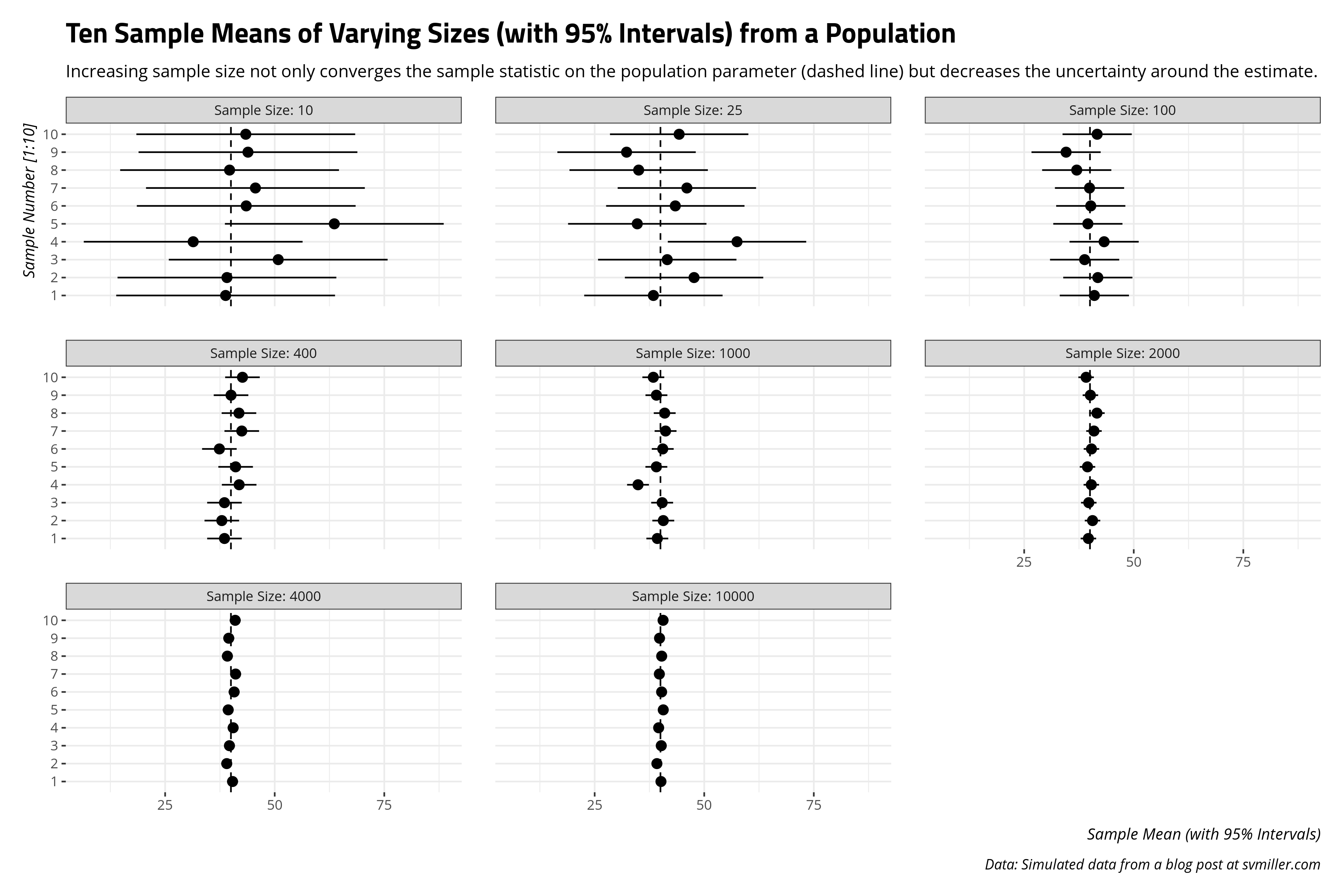
The takeaway I like to communicate from this exercise is the diminishing returns of increased sample size emerge after around 1,000 observations. It’s clear a random sample of 10 people or 25 people will result in sample means that are all over the place in the case of a high-spread data (like the simulated Population data). Things are still scattered at 100 observations. The 1,000 observations group is where the sample means start to hover around the actual population mean. This is why most surveys that get reported, at least in the American context, have that “sweet spot” around 1,000 observations.4 Since the sample size component of random sampling error is non-linear (i.e. \(\sqrt{n}\)), the same proportional reduction of random sampling error one would get from increasing the sample size from 25 to 100 is the same one would get from increasing the sample size from 1,000 to 4,000. The former is a case of finding 75 more observations. The latter is a case of finding 3,000 more observations. Survey administrators like Qualtrics charge by the respondent, not by the proportional reduction of random sampling error. The costs of both time and money add up more if you’re doing a survey over the phone. It’s more cost for not a whole lot of payoff.
Basically, if you can’t get infinity samples and have only one shot at a random sample of a target population, aim for about 1,000 respondents.
Inference from a Sample, or: The Probability of Observing the Sample Statistic Given a Population Parameter
That island sample mean in the 1,000 category offers both pause and an instructional moment that will lead us to inference.5 Here, for clarity, are the sample means for each sample from the above graph.
| Sample No. | Size: 10 | Size: 25 | Size: 100 | Size: 400 | Size: 1000 | Size: 2000 | Size: 4000 | Size: 10000 |
|---|---|---|---|---|---|---|---|---|
| Sample #1 | 38.8 | 38.40 | 41.01 | 38.54 | 39.30 | 39.65 | 40.38 | 40.13 |
| Sample #2 | 39.1 | 47.68 | 41.80 | 37.93 | 40.66 | 40.59 | 39.05 | 39.20 |
| Sample #3 | 50.8 | 41.56 | 38.79 | 38.53 | 40.40 | 39.74 | 39.67 | 40.20 |
| Sample #4 | 31.4 | 57.48 | 43.24 | 41.89 | 34.89 | 40.32 | 40.51 | 39.60 |
| Sample #5 | 63.6 | 34.72 | 39.53 | 41.08 | 39.08 | 39.44 | 39.39 | 40.65 |
| Sample #6 | 43.5 | 43.40 | 40.19 | 37.38 | 40.53 | 40.35 | 40.75 | 40.28 |
| Sample #7 | 45.6 | 46.04 | 39.91 | 42.48 | 41.18 | 40.92 | 41.08 | 39.76 |
| Sample #8 | 39.7 | 35.04 | 36.99 | 41.84 | 40.98 | 41.60 | 39.20 | 40.29 |
| Sample #9 | 43.9 | 32.28 | 34.56 | 40.03 | 39.09 | 40.11 | 39.51 | 39.80 |
| Sample #10 | 43.4 | 44.28 | 41.65 | 42.64 | 38.38 | 39.13 | 40.99 | 40.61 |
That fluke sample mean in the 1,000-sample group is the fourth sample mean. In this case, the sample mean from the Population data was ~34.89. This is nowhere close to the other sample means, which all hover close to the actual population mean of 40.011776. This leads to an interesting question: what was the probability we got that fluke sample from the Population data, knowing in advance the true population mean is 40.011776?
This will circle us back to the first part of this post that talked about the normal distribution. Recall that the probability of any one value in the normal distribution is close to 0 since the normal distribution is a continuous function. However, the area underneath the curve constitutes the full domain of probabilistic observations and sums to 1. Thus, the question can be reframed to “what is the probability we observed something at least that far from the true mean?” and can be answered by the standardized derivation of the normal distribution (i.e. where \(\mu\) is 0 and \(\sigma\) is 1).
Toward that end, we’ll need to get a z-score, which is simply defined in this case as the sample mean of interest to us (\(\bar{x}\) = 34.89), minus the true population mean (\(\mu\) = 40.011776), divided over the standard error of the sample mean (which we previously defined as (\(\frac{\sigma}{\sqrt(n)}\)).
sem <- sd(Population)/sqrt(1000)
zscore <- (34.89 - mean(Population))/sem
zscore
#> [1] -4.021317
Each negative z-score coincides with an area left of the curve in the normal distribution, often called a p-value. Statistics students typically get an entire table of these and are told to find the corresponding p-value. You could do that, or do it in R.
pval <- 1-pnorm(abs(zscore))
pval
#> [1] 2.893683e-05
Here’s how you would interpret this information. Knowing in advance the true population mean is 40.011776 and the standard deviation (\(\sigma\)) inherent in the population is 40.2765505, the probability of us observing that sample mean of 34.89 from a random sample of 1,000 observations is 0.000029. Look at how many zeroes precede the first number. Informally, it’s a chance sample mean that would occur roughly 29 times in 1,000,000 trials, on average. That’s quite a fluke occurrence! It’s any wonder I got it with this reproducible seed.
So, keep the following in mind. We know what the true population mean is. We’re not going to argue that one-off sample mean of 34.89 is the population mean. Instead, we are communicating the probability of observing a sample statistic that far from some proposed population parameter. It should be no surprise, then, that it stands out as improbable in that group of 1,000-unit-large samples.
How This Works in the Real World
I encourage students to keep the following in mind. We make inferences from samples to the population based on what we know from simulations. In other words, we know central limit theorem holds in simulation. From central limit theorem and the underlying normal distribution, we know what is the likelihood of observing sample statistics from a known population. We use these as tools to infer from a sample of the population to the population itself in the real world despite the fact the population parameter is fundamentally unknowable. In the American context, we could never know with certainty what ~250 million American adults think of Donald Trump. However, these tools show us how we can know more about the population parameter even if it means the type of inference that follows comes in dismissing counterclaims as unlikely.
Let’s assume, for convenience’s sake, that the Population data we generated is a population of 250,000 people evaluating some divisive public official on a 0-100 scale. Higher values indicate more “warmth”, approximating things like “approval” and “favorability.” There are more people who loathe this divisive public official than there are people who revere him and relatively few people are between these ends. If it helps, your brain can impute “Donald Trump” as this “divisive public official” if it would help understand what follows. I don’t think it’s a stretch to say Donald Trump is more reviled than he is revered in the American context. Almost every poll has shown that.
Recall the Population data frame is a “population”, or a universe of cases, in which the true mean thermometer rating is 40.011776 even if there is a lot of variation in the data. Let’s grab a random sample of 1,000 observations and see if we can approximate it.
set.seed(8675309) # Jenny, I got your number
Samp1k <- sample(Population, 1000)
#> [1] 40.453
This isn’t bad at all. The true population mean is 40.011776. We’re guessing 40.453. We’re definitely in the ballpark, even if our sample mean is technically wrong.
Let’s assume two situations. First, we don’t know the true population mean (\(\mu\)). We only have an estimate of it (\(\bar{x}\)) from our random sample of 1,000 observations but we’ll assume, for the moment, that we know the population standard deviation (\(\sigma\)). Second, let’s assume we encounter a devout partisan of this hypothetical divisive public official. This devout partisan is suspicious of our—shall we say—“fake” estimate of 37.986 and instead suggests the “true” population mean is 73.88. If you’re curious, this is the percentage of the vote that Trump got in Pickens County, South Carolina (my home county) in the 2016 presidential election. Basically, this person is doing a “hasty generalization”, which is one of my favorite teachable moments for students learning about inference. S/he is making assumptions about the population based on a non-representative part of it.
We can evaluate this much like we did above by reframing the counterclaim from this devout partisan to “what is the probability of us observing our sample mean if the true population mean is what this person said it is?” We can calculate a z-score, assuming, for the moment, that we know the population standard deviation (\(\sigma\)) if not the true population mean (\(\mu\)).
sem <- sd(Population)/sqrt(1000) # our sample size was 1000
zscore <- (mean(Samp1k) - 73.88)/sem # likelihood of our mean if mean were truly 73.88
zscore
#> [1] -28.18186
pval <- 1-pnorm(abs(zscore))
pval
#> [1] 0
If the true population mean were 73.88, the probability of us observing the sample mean that was -28.18 standard errors away from 73.88 is effectively an impossibility. So, we reject the claim the true population mean is 73.88 and suggest our sample mean of 40.453 is closer to what it truly is. In our case, we know this is true.
Of course, it’s a bit unrealistic to assume we know the population standard deviation (\(\sigma\)) if not the population mean (\(\mu\)). You have to know the mean to calculate the standard deviation after all. So, what happens if we don’t know anything about the population?
The answer here is simple: it’s the same process, except inference is done via Student’s t-distribution. Student’s t-distribution is another symmetrical distribution that has fatter tails for fewer degrees of freedom. Degrees of freedom is defined as the number of observations (here: 1000) minus the number of parameters to be estimated (i.e. 1, because we’re asking for a simple mean). We can do the exact same thing and, indeed, get an almost identical takeaway.
sem <- sd(Samp1k)/sqrt(1000) # notice the numerator change.
tstat <- (mean(Samp1k) - 73.88)/sem # likelihood of our mean if mean were truly 73.88
tstat
#> [1] -28.36088
pval <- 2*pt(-abs(tstat),df=1000-1)
pval
#> [1] 2.812527e-130
Notice what’s happening in a case like this. We incidentally know the population mean. Indeed, we created the data. However, if we play blind for the moment, we learn our random sample of 1,000 observations produces a sample mean that reasonably approximates the true population mean. We can also dismiss counterclaims as highly unlikely to be the true population mean, given the sample we collected. That’s sample inference in a nutshell. In the real world, the true population parameter is fundamentally unknowable. However, we can know more about what it likely is (plus and minus some random sampling error) and say more about what it is highly unlikely to be.
That’s the process of inference. It begins with assuming some hypothetical claim to be correct for the moment. We can use what we learned about the normal distribution and central limit theorem to evaluate the likelihood we got our sample statistic if this hypothetical claim were “true.” If it’s highly unlikely we got the sample statistic we got—recall the 68–95–99.7 rule—we dismiss the hypothetical claim and propose our sample statistic is closer to what the population parameter truly is. This works in simulation, when we know the population parameter (\(\mu\)). It’s how we approach inference in the real world, in which the population parameter (\(\mu\)) is unknowable. The population parameter in the real world may be unknowable with 100% certainty, but we can learn more about what the population parameter is by determining what the population parameter is highly unlikely to be.
-
Also, in the interest of full disclosure, I write this to experiment with MathJax. ↩
-
To be clear, it makes sense to separate height by sex because men are typically taller than women. Adding those distributions together typically converges on a “mixture.” ↩
-
I do love to reiterate that these are imprecise, and technically incorrect. For example, 68% of the distribution is within about 0.9944579 standard units from zero in a normal distribution, 90% of the distribution is within about 1.6448536 standard units from zero, 95% of the distribution is within about 1.959964 standard units while 99% of the distribution is within about 2.5758293 standard units from zero in the normal distribution. Thus, these thresholds approximate the rule. It’s good to be conservative but it’s important to be honest. Just be mindful of that. ↩
-
This market research firm argues (reasonably) that it’s actually 400. My only critique of that claim, from experience, is the heterogeneity of subgroups in the population (in the American context) is so large and so important that a researcher should strive for more observations than 400. For example, African Americans are an important voting bloc in the United States, especially in Democratic primary polling. However, they are only about 13% of the U.S. population. A random sample of 1,000 people from the U.S. that is representative of race/ethnicity categories would have 130 black respondents in it. A random sample of 400 people from the U.S. would have just around 52 black respondents if it were representative of race/ethnicity categories. Information on that subgroup would lean heavily on a tiny portion of the data. Further, 1,000 observations provide more precision at a small cost, all things considered. Type II error is the lesser evil than Type 1 error, but we like to avoid Type II error if we can. ↩
-
I only now realize that I wrote that script with
replace = TRUEwhen I wantedreplace = FALSE. Oops. To be clear, that is immaterial to the basic takeaways I communicate here even though sampling without replacement better approximates sampling in the real world (at least from a survey perspective). ↩
Disqus is great for comments/feedback but I had no idea it came with these gaudy ads.