Permutations and Inference with an Application to the Gender Pay Gap in the General Social Survey

- Most analyses show real wage disparities between men and women, even when matching/controlling for important confounders
Last updated: 26 October 2024. Some things got lost in transition behind the scenes. These include a move from R version 3.5 to 4, a transition from working directories, and some function changes in {stevemisc}.
I’m teaching my quantitative methods class this semester for the first time in three and a half years, an exigency brought on by both a hiring/spending freeze and a faculty departure. The impromptu nature of teaching this class along with the COVID-19 fog that has consumed us all mean I’m basically teaching the same class, with just a few updates, that I last taught three and a half years ago. My quantitative skills have improved greatly since then, as have my computational skills. It’s led me to think of ways I can improve what I teach should I have to teach it again soon.
I stumbled across this tweet from Grant McDermott. It’s from last year and I missed it entirely when he first posted it, but it appeared in my timeline again amid some other ongoing conversation. The link is to a keynote speech from John Rauser. Rauser’s main point in the keynote, echoed by McDermott, is that computational means to inference are more accessible and better illustrate the underlying point we try to teach students than doing something like calculating standard errors of sample means, calculating t-values or z-values, and finding the approximate area underneath a Student’s t-distribution or normal distribution that corresponds with that score. McDermott’s comment is that it’s only for outdated pedagogy that we don’t teach what computational power has made more practical and accessible. I’ll stop short of saying that here. After all, bootstrapping was ultimately Bradley Efron’s (1979) answer to his own question of what the jackknife was trying to approximate (i.e. a random sampling distribution better done via bootstrap). There is—at least I’m thinking right now—more value in understanding what things like bootstrapping and permutations are trying to approximate before showing how the computational implementations can provide nifty answers to the questions we may have. That said, there might be a missed opportunity that I’m not seeing yet, especially for instructors who teach quantitative methods by reference to smaller-n experiments or something like that.
There might be some value in getting students to think about computational means to inference and showing them how to do it. I already have a blog post on how to bootstrap, so I’m going to use this post for showing how to do random permutations as a means to making some inferential statements.
First, here are the R packages I’ll be using in this post.
library(tidyverse) # for all things workflow
library(stevemisc) # my toy R package, via devtools::install_github("svmiller/stevemisc")
library(stevedata) # my toy data package with various functions, via devtools::install_github("svmiller/stevedata")
library(modelr) # for ther permutations
library(knitr) # for tables
library(kableExtra) # for prettier tables
And here’s a table of contents.
- The Data and the Application
- Why Permutations?
- Permutation and Linear Regression
- Permutation and Group Comparisons
- Conclusion
The Data and the Application
The data I’ll be using come from the General Social Survey (GSS) and are available in my {stevedata} package as the gss_wages data. These are individual-level wage data for Americans from 1974 to 2018. I’ve long been interested in finding good individual-level data that can be used to teach about the gender pay gap and provide some quantifiable information about it. The gender pay gap is a big part of how I start a quantitative methods class by cautioning students to avoid hasty generalizations. However, individual-level income measures are not exactly easy to obtain in your canned American public opinion data sets. The GSS, though, appears to have that and I take a subset of the data and include it in my {stevedata} package.
Briefly, the data I provide in {stevedata} have the respondent’s self-reported base income in constant 1986 USD (realrinc). I’m kind of astonished the GSS has this. For example, I could not tell you how much my income is to the dollar, though I can land in the hundreds (or so). Asking usually leads to larger amounts of missingness as people either don’t know their base income or withhold saying it. Surveys that have a temporal scope may not want the hassle of having to standardize dollars across time, which leads to more accessible measures of income by reference to a self-reported “scale” or “ladder” of incomes (usually a 1:10 metric). No matter, the GSS has these data along with some documentation about it. I’ll only add the caveat that I’ll be using these data “as is”, offering takeaways for illustration about permutation more so than the underlying problem itself (i.e. the gender pay gap).
I’ll also make some use of some factors that could be influencing the differences between men and women on self-reported income in the GSS data, though I again caution these will not be all exhaustive. In addition to the respondent’s self-reported gender in the data (gender), I have the respondent’s age (age), marital status (maritalcat), highest degree obtained (educcat), and the prestige of the respondent’s occupation (prestg10). You can read more about how the GSS assesses prestige and socioeconomic scores if you’d like, but, for now, higher values indicate more prestigious occupations that should result in higher pay.
For simplicity’s sake, I’m going to keep the analyses to just the 2012, 2014, 2016, and 2018 waves. I’ll also do some light recoding thinking ahead to a regression and grouped comparisons I’m going to do. The condensed version of the prestige scale I create floors a variable otherwise on a 16-80 scale to a 1:8 scale. I’m ultimately going to drop the 1s (10-19) and 8s (80-89) because there are not many observations at the tail ends of the occupational prestige spectrum.
gss_wages %>%
  mutate(married = ifelse(maritalcat == "Married", 1, 0),
         collegeed = ifelse(educcat %in% c("Bachelor", "Graduate"), 1, 0),
         female = ifelse(gender == "Female", 1, 0),
         prestgf = floor((prestg10)/10)) %>%
  mutate(prestgf = case_when(
    prestgf == 2 ~ "20-29",
    prestgf == 3 ~ "30-39",
    prestgf == 4 ~ "40-49",
    prestgf == 5 ~ "50-59",
    prestgf == 6 ~ "60-69",
    prestgf == 7 ~ "70-79",
  )) %>%
  filter(year >= 2012) -> wages12
Why Permutations?
My first exposure to permutations wasn’t terribly well-explained and apparently my experience isn’t unique on that front. I’ve seen some videos and tutorials that purport to explain permutations in a readily accessible way, but actually fumble a bit on some of the details. So, here’s how I think students should think about permutations.
Assume a simple data set of 10 people, randomly assigned into treatment and control, to be evaluated on some criteria (\(y\)). The criteria could be anything. It could be a level of pain after receiving a treatment (or a placebo if it’s the control group). It could be a level of happiness after watching some feel-good video (or not watching a feel-good video, if it’s the control group). On average, the five people in the treatment group are, say, a full five units or so different than the control group.
Let’s assume the data look like this.
jenny() # set.seed(8675309) for reproducibility in stevemisc, with message
#> Jenny, I got your number...
tibble(group = c(rep("Treatment", 5), rep("Control", 5)),
       e = rnorm(10, 0, 1),
       y = ifelse(group == "Treatment", 50 + e, 45 + e)) -> Example

Example
#> # A tibble: 10 × 3
#>    group           e     y
#>    <chr>       <dbl> <dbl>
#>  1 Treatment -0.997   49.0
#>  2 Treatment  0.722   50.7
#>  3 Treatment -0.617   49.4
#>  4 Treatment  2.03    52.0
#>  5 Treatment  1.07    51.1
#>  6 Control    0.987   46.0
#>  7 Control    0.0275  45.0
#>  8 Control    0.673   45.7
#>  9 Control    0.572   45.6
#> 10 Control    0.904   45.9
The difference in means between both groups is going to come out to about 5 and it should be no surprise that a t-test is going to suggest a discernible difference between both treatment and control. Further, it is going to suggest that the difference between treatment and control is highly unlikely to have arisen by chance if the true difference between treatment and control is zero. This strongly implies a systematic difference between treatment and control that we of course built into the generation of the data.
broom::tidy(t.test(y ~ group, data=Example))
| estimate | estimate1 | estimate2 | statistic | p.value | parameter | conf.low | conf.high | method | alternative |
|---|---|---|---|---|---|---|---|---|---|
| -4.81 | 45.63 | 50.44 | -8.28 | 0 | 4.73 | -6.33 | -3.29 | Welch Two Sample t-test | two.sided |
Notice the peculiar language of “by chance.” The “by chance” language refers to what we know about sampling distributions from central limit theorem and what we know about a normal distribution, all things I riffed on elsewhere on my blog (and have already mentioned by this point in a semester for the quantitative methods students). The inference here is fundamentally theoretical by reference to these foundation assumptions. One way of mimicking this is through permutation.
Simply, permutation leans on the idea that it’s possible that we could randomly shuffle the data in a myriad of ways and observe the sample statistic of interest (i.e. a t-test, a regression coefficient, a mean) as a plausible outcome. In the simple Example data I introduced above, the shuffling or “permuting” process would look something like this for just a few permutations. Notice the treatment/control variable is the same, but the outcomes are shuffled.
Example %>%
  mutate(y1 = sample(y), y2 = sample(y),
         y3 = sample(y), y4 = sample(y),
         y5 = sample(y), y6 = sample(y))
#> # A tibble: 10 × 9
#>    group           e     y    y1    y2    y3    y4    y5    y6
#>    <chr>       <dbl> <dbl> <dbl> <dbl> <dbl> <dbl> <dbl> <dbl>
#>  1 Treatment -0.997   49.0  46.0  46.0  45.7  50.7  45.7  50.7
#>  2 Treatment  0.722   50.7  45.9  52.0  45.6  45.0  52.0  51.1
#>  3 Treatment -0.617   49.4  45.6  45.7  45.9  49.4  45.0  49.4
#>  4 Treatment  2.03    52.0  45.7  45.9  52.0  46.0  50.7  52.0
#>  5 Treatment  1.07    51.1  49.4  45.0  50.7  51.1  49.4  45.0
#>  6 Control    0.987   46.0  51.1  49.0  51.1  45.7  49.0  45.6
#>  7 Control    0.0275  45.0  52.0  50.7  46.0  49.0  45.9  46.0
#>  8 Control    0.673   45.7  45.0  49.4  49.4  45.9  46.0  49.0
#>  9 Control    0.572   45.6  49.0  51.1  45.0  52.0  51.1  45.9
#> 10 Control    0.904   45.9  50.7  45.6  49.0  45.6  45.6  45.7
This process of permutation is repeatable for, in most applications, more permutations than the researcher would plausibly need or want. The more observations, the more plausible permutations in order to generate a null distribution to approximate hypothetical repeated sampling of the population. This process seems like it’s akin to random measurement error, but the underlying distribution of results from permutation amounts to a distribution of plausible results against which to compare the actual results. There are a variety of permutation packages, but, as a {tidyverse} partisan, I’m drawn to {modelr}’s permute() function and will use it in the analyses below.
Permutation and Linear Regression
Let’s assume I wanted to explain real income by reference to gender and some other factors that may confound that relationship for all observations since 2012 in the GSS. A simple linear model would produce the following results for unmarried women. Notice I’m giving no comment on my typical rallying cries (e.g. checking for heteroskedasticity or standardizing non-binary inputs), though a researcher should definitely do this with an analysis they might want to submit for peer review.
M1 <- lm(realrinc ~ female + age + prestg10 + collegeed, data=subset(wages12, married == 0))
| term | estimate | std.error | statistic | p.value |
|---|---|---|---|---|
| (Intercept) | -7132.067 | 1974.783 | -3.612 | 0.0003093 |
| female | -6001.767 | 928.464 | -6.464 | 0.0000000 |
| age | 243.878 | 31.573 | 7.724 | 0.0000000 |
| prestg10 | 370.775 | 38.475 | 9.637 | 0.0000000 |
| collegeed | 12264.834 | 1133.011 | 10.825 | 0.0000000 |
It suggests that, controlling for other sources of potential confounding, there is a difference between unmarried men and unmarried women on their real income that amounts to about 6,001 dollars in 1986 USD. Unmarried men—considering age, occupational prestige, and education levels—make about 6,001 1986 USD more than women, on average. There is something important to be said about causal inference and careful causal identification, but this isn’t the venue for it.
Observe that the t-statistic is about -6. This suggests, given what we know about central limit theorem and a normal distribution, it is almost a statistical impossibility that there are no differences between unmarried men and unmarried women in the four most recent GSS waves given the coefficient and standard error we observed. However, the statement is more theoretical than empirical. Permutation allows an empirical means to basically the same end.
Using the permute() function in {modelr}, I create 10,000 random permutations of the wages12 data, shuffling the order only of the dependent variable. Thereafter, using {purrr} (as called in {tidyverse}), I run 10,000 regressions on these permuted data, tidy the output, and pull the results.
jenny() # I got your number
wages12 %>%
  filter(married == 0) %>%
  permute(10000, realrinc) -> Perms

Perms %>%
  mutate(lm = map(perm, ~lm(realrinc ~ female + age + prestg10 + collegeed,
                     data = .)),
         tidy = map(lm, broom::tidy)) %>%
  pull(tidy) %>%
  map2_df(.,seq(1, 10000),
          ~mutate(.x, perm = .y)) -> lmPerms
Here are the summary statistics for the 10,000 coefficients for the gender dummy variable of interest. I summarize them by reference to the minimum estimate, the mean estimate, the median estimate, the standard deviation (which is obviously going to be large), the maximum estimate, as well as the observations that comprise the 5th and 95th percentile. Notice that the regression coefficient from the actual data is in no instance replicated across the 10,000 permutations that randomly shuffled the data along the dependent variable. In fact, the observed coefficient from the actual data suggesting about a $6,001 difference between unmarried men and unmarried women is about $2,000 lower than the minimum coefficient obtained through a random permutation. It strongly suggests that the observed finding is highly unlikely to be a chance outcome. Perhaps: no permutation, other than the exact ordering of the data as they are, would produce this result.
| Minimum Estimate | 5th Percentile | Mean Estimate | Median Estimate | Standard Deviation | 95th Percentile | Maximum Estimate |
|---|---|---|---|---|---|---|
| -$4,179.50 | -$2,100.05 | -$22.83 | -$9.29 | $1,038.99 | $1,950.53 | $3,847.76 |
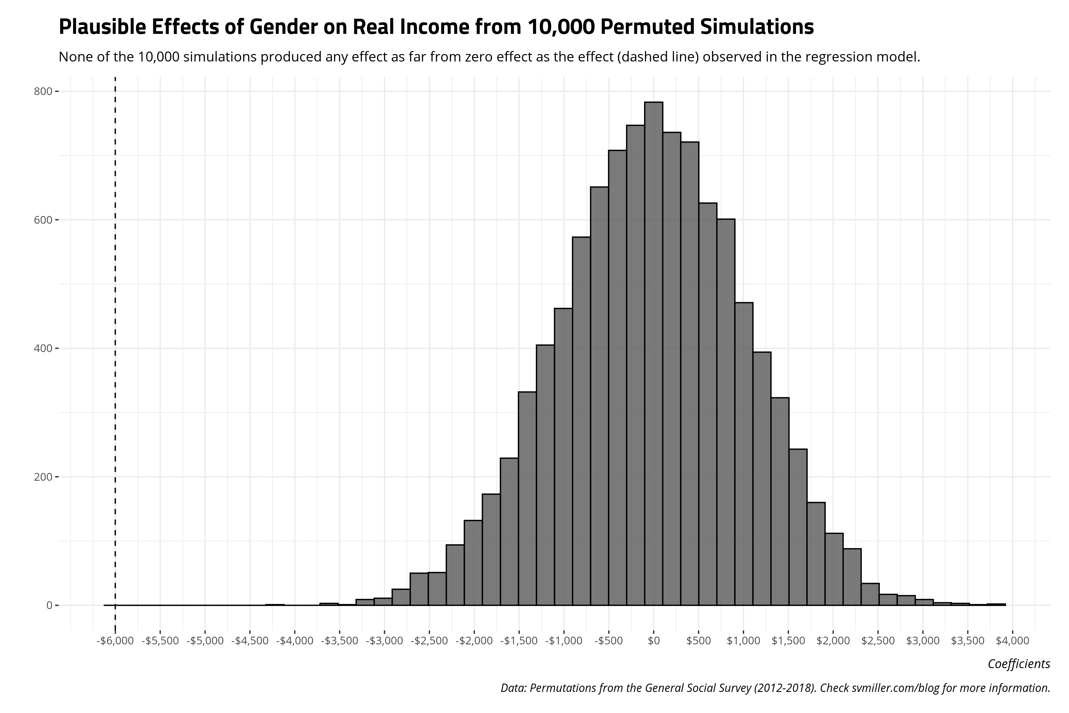
The benefit of approaching inference this way is the student does not have to engage in the academic task of dividing a regression coefficient over a standard error to obtain a t-value or z-score, finding the corresponding p-value to make a statement of the long-run relative probability of obtaining the statistic against some counterclaim (i.e. typically zero in the null hypothesis testing framework). Instead, the student can reasonably approximate a null distribution through permutation and see it for themselves.
Permutation and Group Comparisons
Permutations may also be useful in making some comparisons among groups outside the regression context. I’m going to note there’s only so much that I can do with the (basically) limited data available in the GSS, but let’s make a (perhaps) reasonable assumption about occupational prestige. We know there any number of mitigating factors in the United States that can explain systematic differences between men and women in their wages. The rubbish parental leave policies in the United States serve as real barriers in a woman’s career path. Married women historically–and even in the present—assume more house duties than men in a marriage, which can reasonably influence career trajectories even for figurative “breadwinners.” It’s only in the past few years have women surpassed men in their level of educational attainment. All are going to influence the relationships above in their own way, which is why I select on unmarried men and women for the regression above and run a simple regression that tries to “control” for that. Ideally, I’d have an exhaustive set of covariates (and plenty of statistical power) to “match” men and women on all of them (except for the systematic difference of gender). Alas, the data aren’t well tailored toward that end.
What if the prestige groupings serve as a decent stand-in for that, absent the ability for a more exhaustive matching analysis with better data? Let’s assume, for the task at hand, that occupational prestige effectively accounts for the imbalance in educational attainment and how child-rearing responsibilities can set back women in their careers, and how women have only just surpassed men in their rate of college diplomas.1 Basically, what do the mean incomes look like by those occupational prestige groups? And what are the differences in the mean incomes, by gender?
Here’s how you can calculate those.
wages12 %>%
  filter(married == 0) %>%
  group_by(prestgf, gender) %>%
  summarize(n = n(),
            mean = mean(realrinc, na.rm=T)) %>%
  na.omit %>%
  arrange(prestgf, desc(gender)) %>%
  mutate(diff = mean - lag(mean),
         perc = mean/lag(mean)) %>%
  mutate_at(vars("mean", "diff"), ~round(., 2)) %>%
  mutate_at(vars("mean", "diff"), ~scales::dollar(.)) %>%
  # mround is in stevemisc
  mutate(perc = ifelse(!is.na(perc), paste0(mround2(perc),"%"), NA))
And here’s what they would look like. You can see a clear positive relationship between prestige grouping and mean income in 1986 USD. More prestigious occupations coincide with more income. That much is unsurprising. However, there are clear discrepancies in mean income between men and women for similar levels of occupational prestige. These differences do decrease for the higher prestige groupings.2
| Prestige Grouping | Gender | Number of Observations | Mean Income (1986 USD) | Difference | % (Women/Men) |
|---|---|---|---|---|---|
| 20-29 | Male | 404 | $11,482.04 | ||
| 20-29 | Female | 434 | $7,468.73 | -$4,013.31 | 65.05% |
| 30-39 | Male | 768 | $16,545.37 | ||
| 30-39 | Female | 922 | $12,807.02 | -$3,738.35 | 77.41% |
| 40-49 | Male | 524 | $23,952.84 | ||
| 40-49 | Female | 732 | $15,526.74 | -$8,426.10 | 64.82% |
| 50-59 | Male | 227 | $30,698.47 | ||
| 50-59 | Female | 362 | $23,010.93 | -$7,687.54 | 74.96% |
| 60-69 | Male | 208 | $35,809.26 | ||
| 60-69 | Female | 367 | $25,851.12 | -$9,958.13 | 72.19% |
| 70-79 | Male | 83 | $36,970.38 | ||
| 70-79 | Female | 52 | $33,925.07 | -$3,045.31 | 91.76% |
We can get t-tests to assess whether the differences between men and women by occupational prestige grouping are likely to have occurred by chance. Rounding the p-values from these results to zero (for convenience on the formatting end) suggests the probability of observing these differences if there were truly no differences between incomes for unmarried men and unmarried women is small. It’s effectively zero for the 20-29 group and the 40-49 group. It’s less than .05 for the 30-39 and 60-69 group. It’s less than .1 for the 50-59 group. The highest occupational prestige groups may well be at income parity for unmarried men and unmarried women in that group.
wages12 %>%
  filter(married == 0) %>%
  group_by(prestgf) %>%
  do(broom::tidy(t.test(realrinc ~ gender, data =.))) %>%
  # Omit the NAs in the prestige grouping.
  na.omit
| Prestige Grouping | Difference | Mean Income (Women) | Mean Income (Men) | t-Statistic | p-Value | Lower Bound Estimate | Upper Bound Estimate |
|---|---|---|---|---|---|---|---|
| 20-29 | -$4,013.31 | $7,468.73 | $11,482.04 | -3.54 | 0.00 | -$6,243.65 | -$1,782.98 |
| 30-39 | -$3,738.35 | $12,807.02 | $16,545.37 | -2.72 | 0.01 | -$6,437.90 | -$1,038.81 |
| 40-49 | -$8,426.10 | $15,526.74 | $23,952.84 | -4.66 | 0.00 | -$11,981.10 | -$4,871.11 |
| 50-59 | -$7,687.54 | $23,010.93 | $30,698.47 | -1.81 | 0.07 | -$16,080.02 | $704.93 |
| 60-69 | -$9,958.13 | $25,851.12 | $35,809.26 | -2.38 | 0.02 | -$18,218.98 | -$1,697.29 |
| 70-79 | -$3,045.31 | $33,925.07 | $36,970.38 | -0.41 | 0.69 | -$18,099.91 | $12,009.30 |
We can use permutations to assess what are the range of plausible differences between men and women that would arise by chance. Here, we’ll do some grouped permutations, first splitting the data by prestige grouping before permuting the data by income. The end result is a list object (splits) that contains six data frames corresponding to the six unique occupational prestige groups in the truncated data.
# Let's subset to just what we want.
# I'm thinking ahead to naming the group_split list.
wages12 %>%
  filter(married == 0 & between(prestg10, 20, 79)) -> wages12

wages12 %>%
  # reorder the columns for ease of looking at things
  select(prestgf, everything()) %>%
  # group_by/split the data
  group_split(prestgf) %>%
  # rename the list elements to correspond with the group splits
  setNames(unique(sort(wages12$prestgf))) -> splits
Some {purrr} magic will then create 2,000 permutations of each of these six data frames (corresponding to the six occupational prestige groupings we have). After shuffling each of the six data frames, I’ll get grouped summaries for all of them, with some assistance from Vincent Arel-Bundock. The end results is a single data frame that contains the mean income in 1986 USD, by gender and occupational prestige, for all these permutations.
# https://stackoverflow.com/questions/64471217/grouped-summarizing-in-a-nested-tibble-with-permutations
gendermean <- function(x) {
  x %>% as.data.frame %>%
    group_by(gender) %>%
    summarize(meanrrinc = mean(realrinc, na.rm=T),
              n = n(),
              .groups = 'drop') %>%
    na.omit
}


jenny()
splits %>%
  # permute
  map(~permute(.x, 2000, realrinc)) %>%
  # get means and n, grouped by gender, for each of these permutations
  map(~mutate(., means = lapply(.$perm, gendermean))) %>%
  # select just what I want
  map(~select(., .id, means)) %>%
  # coerce to data frame, adding new column for prestige grouping
  map2_df(., names(.), ~mutate(.x, prestgf = .y)) %>%
  # unnest the listed permuted means
  unnest(means) -> prestgfmeans
The benefit of this group-split approach to permutation is it can allow us a computational method to explore whether some of those grouped means and difference in means by gender and occupation category came by chance. Below, you can see the grouped permutations suggest that the mean incomes we observed for unmarried men across all occupational prestige groups were unlikely to have come by chance. The dashed line contains the mean income observed in the data for each combination of occupational prestige group and gender and is not included in the distribution of the permutations for all the groups of unmarried men. For all but the 70-79 occupational prestige group (i.e. plausibly the top-income earners), the true mean incomes are rarely if ever observed and are unlikely to have been observed by chance as implemented through random permutation.
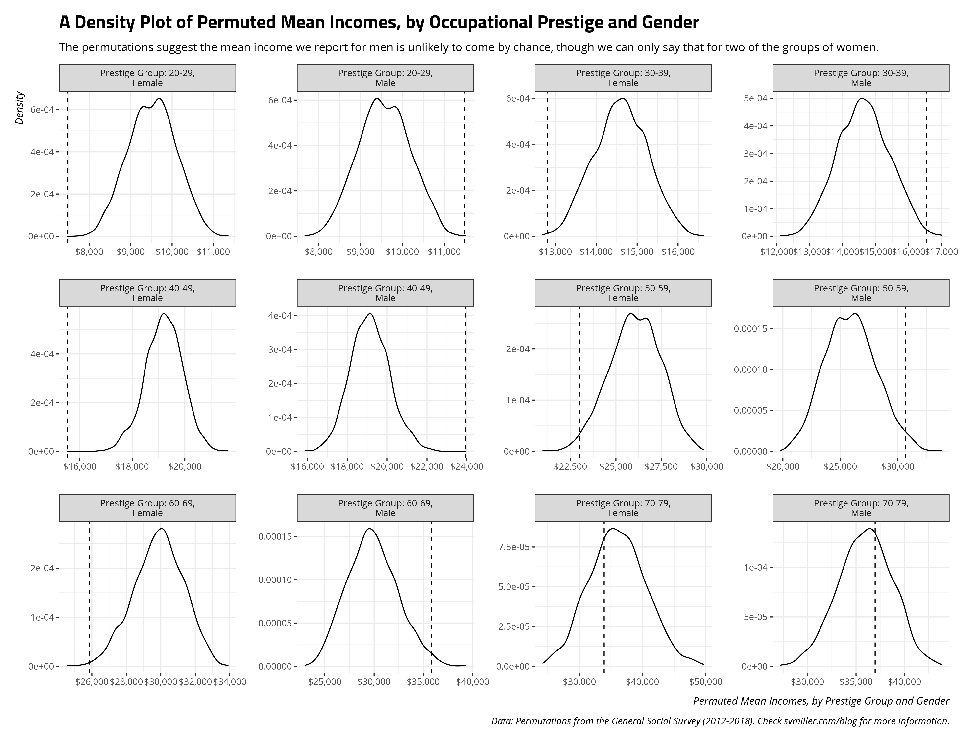
The plot above leads to a question that is empirically answerable by the permutations. What percentage of the permutations contained a mean income for the unmarried women in that occupational prestige group that was at or below the actual mean? The code below will answer that. Briefly, across 10,000 permutations spanning all but the highest occupational prestige group, only 43 permutations resulted in a permutation at or below the observed mean. That suggests it’s highly unlikely to have arisen by chance. However, the income we observed for unmarried women in the highest occupational prestige group seems like a plausible result. An extreme result like it appeared in about 32% of the 2,000 permutations for that group.
wages12 %>%
   filter(married == 0) %>%
    group_by(prestgf, gender) %>%
    summarize(actualmean = mean(realrinc, na.rm=T))  %>%
  na.omit %>%
  left_join(prestgfmeans, .) %>%
  filter(gender == "Female") %>%
  mutate(below = ifelse(meanrrinc <= actualmean, 1, 0)) %>%
  group_by(prestgf, gender) %>%
  summarize(sumbelow = sum(below),
         percbelow = sumbelow/n())
| Prestige Grouping | Gender | Number of Observations Below Mean | Proportion of 2,000 Permutations |
|---|---|---|---|
| 20-29 | Female | 0 | 0.000 |
| 30-39 | Female | 3 | 0.002 |
| 40-49 | Female | 0 | 0.000 |
| 50-59 | Female | 32 | 0.016 |
| 60-69 | Female | 8 | 0.004 |
| 70-79 | Female | 642 | 0.321 |
I’m on the fence about whether permutation is an acceptable substitute for other means of simulation for assessing the plausibility of the group means, but it’s doable. What about the differences between men and women in their mean incomes by these prestige groups? One option here is to treat each permutation as a simulation and get the first difference of those. The results of these first differences of the permutations can then be compared to the observed first differences between men and women by prestige group to assess the likelihood the observed first difference is a chance result.
wages12 %>% group_by(prestgf, gender) %>%
  filter(married == 0) %>%
  summarize(mean = mean(realrinc, na.rm=T)) %>%
  na.omit %>% arrange(prestgf, desc(gender)) %>%
  mutate(actualdiff = mean - lag(mean)) %>% na.omit -> actualdiffs

prestgfmeans %>%
  arrange(prestgf, .id, desc(gender)) %>%
  group_by(prestgf, .id) %>%
  mutate(diff = meanrrinc - lag(meanrrinc, 1)) %>%
  na.omit %>%
  left_join(., actualdiffs %>% select(prestgf, gender, actualdiff)) %>%
  ungroup() %>%
  mutate(below = ifelse(actualdiff >= diff, 1, 0)) %>%
  group_by(prestgf) %>%
  summarize(mean = mean(diff),
            min = min(diff),
            max = max(diff),
            numbelow = sum(below),
            prop = numbelow/2000,
            actualdiff = mean(actualdiff)) %>%
  mutate_at(vars(-prestgf, -numbelow, -prop), ~round(., 2)) %>%
  mutate(prop = round(prop, 3)) %>%
  mutate_at(vars(-prestgf, -numbelow, -prop), ~scales::dollar(.))
| Prestige Grouping | Mean Permuted Difference | Minimum Permuted Difference | Maximum Permuted Difference | Number of Permutations Below Actual Difference | Proportion of Total Permutations | Actual Difference |
|---|---|---|---|---|---|---|
| 20-29 | -$45.19 | -$3,696.40 | $3,674.63 | 0 | 0.000 | -$4,013.31 |
| 30-39 | -$35.48 | -$4,258.10 | $4,506.19 | 4 | 0.002 | -$3,738.35 |
| 40-49 | $57.98 | -$5,617.45 | $5,710.81 | 0 | 0.000 | -$8,426.10 |
| 50-59 | $127.07 | -$12,827.07 | $9,685.60 | 36 | 0.018 | -$7,687.54 |
| 60-69 | $2.66 | -$14,636.35 | $10,895.68 | 14 | 0.007 | -$9,958.13 |
| 70-79 | $102.20 | -$19,579.19 | $21,308.74 | 678 | 0.339 | -$3,045.31 |
The results are substantively similar to the group means. Across 2,000 permutations each, we failed to observe a difference as extreme as the actual difference between unmarried men and unmarried women in the 20-29 and 40-49 occupational prestige group. We observe only four such permutations in the 30-39 group, 36 permutations in the 50-59 group, and 14 permutations in the 60-69 group, each across 2,000 permutations. Only for the most prestigious occupations do we observe gender differences that may have come by chance. Substantively, my admittedly naive/crude analysis suggests there is possible income parity only for women and men who are unmarried and with the most prestigious jobs. That’s still a selection effect of a kind: the most prestigious occupations (and, one assumes, the ones that pay the most). Unmarried women earn less than unmarried men across all other occupational prestige groups.
Conclusion
I wrote this after seeing a well-reasoned contention that permutations might be the better pedagogical tool to get students to think about statistical inference. Curious, I thought about how I might discuss permutations in lieu of inference under the normal distribution or t-distribution, hacked at some R code, and wrote this. My takeaway from this exercise is there are benefits and drawbacks to teaching inference through permutation rather than the normal/t-distribution.
The biggest benefit I see is that it encourages students to think about a data-generating process and simulate it. It applies much of what we assume but do not belabor. Overall, I think our quantitative methods instruction for our social/political science students should lean more on application and computation, which are marketable skills to include on a CV when a student finishes the degree program and looks for gainful employment. The question of inference changes in a more interesting way as well. It goes from “what is the long-run relative probability of observing this result, given some other hypothetical central tendency, assuming what we know about central limit theorem?” to “how many simulations/permutations would I need to replicate a result like this, given some other central tendency?” The inability to reliably reproduce a result like we observe in income discrepancies between men and women implies the actual result we do observe is unlikely to be a chance result. There’s an added benefit when the permutations can be understood on the original raw scale of the data. Thus, students in this application can learn to make inferential claims based on a scale of conceivable dollar differences or possible average incomes without having to think about a standard normal distribution.
For drawbacks, I’m not 100% convinced this approach is worth doing over teaching inference by reference to more theoretical topics like central limit theorem, p-values, and so on. My misgivings here are multiple. I’m not sure it scales well. It may work well dealing with smaller data sets in which students aren’t tempted to permute forever to see if there is some other combination of data, other than the actual combination, that can reproduce a test result. For super simple data sets, especially experimental designs with just the focus on treatment and control means, I can see this being a useful teaching experience. For larger data sets with other complexities (e.g. random effects), this is just too computationally demanding to write and implement with ultimately not that much of a payoff. I get the argument that it is very much a 20th century thing to have students flip to the end of the textbook to find a z-score table. It’s as “20th century” as still demanding our high school students learn calculus with the same damn TI-83/84 calculator I had in high school over 20 years ago. But the 21st century path forward might be understanding how to use pnorm() and pt() in R. Permutation is fine as a means to teaching about statistical inference, but I think we should be teaching around implementation anyway. You don’t need permutation for that.
That said, you could do it, and it’d be kind of cool for students to see it to understand what it’s trying to mimic. This guide offers how to think about doing it with {modelr} and an application to the gender pay gap as approximated in 2012-2018 waves of the GSS.
-
Lord knows that’s not really what the occupational prestige category is, but this is more a thought experiment than a claim I’m making on solid ground. ↩
-
Sub out the mean for the median and the differences between men and women get even smaller for the more prestigious occupations. The use of means is necessary for doing t-tests and comparing permutation to them even if people who study income caution about the importance of using the median as an estimate of central tendency. ↩
Disqus is great for comments/feedback but I had no idea it came with these gaudy ads.