Some Parlor Tricks with Survey-Type Analyses in R

- California Department of Education Headquarters
This is a set of things I had been wanting to teach myself in some detail for some time. Survey analysis is mostly at the heart of what I do as a researcher. Look at my research: if it’s not MIDs, it’s survey data. But the survey data with which I deal are mostly pre-scrubbed and canned to be representative of a target population. Some of those topics that you’d get in a dedicated class on survey analyses are things are not really an issue of interest in the survey data I have, are not things that a peer-reviewer cares to see when I submit manuscripts, or are things for which we instinctively throw a mixed effects model at the problem and proceed from there. However, these are topics I want to teach myself a little bit more and demonstrate that I know in some detail and can do, given the current pandemic and threats to higher education in the United States. What follows are some tools and tricks to do some of the basics in survey analysis, patterned off what I remember teaching myself with the {survey} package in R several years ago.
First, here are the R packages I’ll be using in this post.
library(survey) # workhorse for survey stuff
library(srvyr) # tidy-friendly add-ons to survey
library(tidyverse) # the workhorse for workflow
library(stevemisc) # my toy R package
library(stevedata) # for the data
And here’s a table of contents.
- The Data
- Different Sampling Methods
- Different Summary Methods
- A Comparison of Population Means
- A Comparison of Subpopulation (School Type) Means
- Recapturing Systematic Effects on API
- Conclusion
The Data
The data I’ll be using are patterned off the apipop data that comes in the {survey} package in R. I think everyone who learned this stuff learned it via the apipop data. Briefly, these data contain measures of academic performance in 1999 and 2000 in California for all elementary (E), middle (M), and high (H) schools with at least 100 students.1 I could use these data, but I’d rather simulate my own.
The fakeAPI data in my {stevedata} package is a hypothetical universe of schools in a hypothetical territorial unit patterned off this apipop data. First, I limited my inputs to just three factors from the apipop data. The first is the meals variable. This is the percentage of students eligible for subsidized meals. It conceptually ranges from 0% to 100% but a density plot of the data suggest the variable mostly follows a uniform distribution. The second variable is colgrad, patterned off the col.grad variable, which also has a theoretical range from 0% (i.e. no parent of a child at the school has a college degree) to 100% (i.e. every parent of a child at the school has a college degree), but there’s a clear right skew in the density plot with a mean of about 20.73 and a standard deviation of 14.14. The third variable, fullqual, is patterned off the full variable in apipop. This variable captures the percentage of teachers at the school that are “fully qualified.” This has a clear right skew. Intuitively, given the state of California (or our hypothetical territorial unit), there are rigorous qualifications a teacher needs in order to teach at a school. Thus, there is a mean of about 87.52 with a standard deviation of about 12.93 in the apipop for that data.
Further, there should be some correlation between those variables. Leaving some ecological issues aside, a school where a lot of parents have college diplomas will also likely be a school where fewer students are eligible for subsidized meals and where more of the teachers are fully qualified. Thus, the trick I wanted to pull off here is to generate correlated data with different distributions. I already have a function that can generate correlated data all on a shared standard normal distribution, but that’s not what I wanted here. Fortunately, I found something in this no-longer-supported R package that allows me to generate correlated data with pre-defined correlations on different scales. I grabbed that underlying code and rechristened the correlate() function as corvectors(), in {stevemisc}, to generate this fake population of 10,000 schools.
Thereafter, I generate some additional variables. First, there are typically more elementary school than there are middle schools and high schools. This is evident in the apipop data as well. So, I randomly generate elementary (E), middle (M), and high (H) schools where the breakdown is roughly 75% elementary schools, 15% middle schools and 10% high schools. I also generated 68 counties—patterned from a list of Ohio State All-Americans—whereby county size is relative to the number of Ohio State All-American honors. Thus, “Wes Fesler County”, “Charles (Chic) Harley County” nad “James Laurinaitis County” are the most populous counties in the data (and thus have more schools). I also create a community “cluster”, randomly assigning the school to be in an rural, suburban, or urban community with the probability of assignment coinciding with this Pew report. The “cluster” is worth belaboring in this context because I do not build in an assumption of any heterogeneity between clusters, only within them. That means each county will have a baseline effect (randomly drawn from a uniform distribution) and each school type will have a baseline effect (which is derived from the api00 variable, where elementary schools generally score higher in their academic performance than middle schools, which are in turn better than high schools). Yet, there is no systematic difference among the communities. That was at least how I generated the data though I don’t do much with it in this post.
After running a linear model regressing the api00 variable on the three inputs I derive from the apipop data, I create an academic performance variable (api) that is a linear function of that model’s corresponding coefficients + the baseline differences + some random errors with a mean of 0 and a standard deviation of 2. For context later in the post, the effect of a unit increase in meals on the outcome is set at -2.7, the effect of a unit increase in colgrad on the outcome is 1.21, and the effect of a unit increase in fullqual on the outcome is set at 2. If you have my {stevedata} package loaded, ?fakeAPI will return the manual describing the code used to create the data. You can also see it here.
And here are some descriptive statistics for some extra context. I’m mostly pleased with the fake data I generated and they’ll serve as the “population” from which we can sample and do some other things.
| Variable | Mean | Standard Deviation | Median | Minimum | Maximum |
|---|---|---|---|---|---|
| Academic Performance Index | 680.94 | 114.32 | 684.12 | 336.75 | 958.51 |
| % Parents With College Degrees | 20.85 | 14.18 | 18.13 | 0.06 | 86.48 |
| % of Teachers at School That Are Fully Qualified | 87.51 | 13.07 | 91.82 | 15.12 | 100.00 |
| % of Students Eligible for Subsidized Meals | 49.76 | 28.77 | 49.41 | 0.01 | 99.99 |
Here are the baseline means for school type.
| School Type | Mean Academic Performance Index |
|---|---|
| Elementary School | 686.86 |
| Middle School | 673.58 |
| High School | 647.12 |
Finally, here are the county means for academic performance index, subset to the top five and bottom five counties. Malcolm Jenkins County stands out on top while Lecharles Bentley County emerges as having the lowest (fake) academic performance index means across all schools in this hypothetical territorial unit. It’s a shame to see Terry Glenn County near the bottom in this totally-not-real data because his 1995 season was the most absurdly dominant seasons for a wide receiver I had ever seen. Even with his (I think it was) abdominal injury late in the season against Minnesota, which reduced him to about 60% capacity for November, he was still unguardable.
| County Rank | County | Mean Academic Performance Index |
|---|---|---|
| 1 | Malcolm Jenkins | 758.47 |
| 2 | Vic Janowicz | 749.10 |
| 3 | Mike Vrabel | 745.06 |
| 4 | Dave Foley | 743.26 |
| 5 | Tom Cousineau | 740.76 |
| 64 | Terry Glenn | 612.69 |
| 65 | Gaylord Stinchcomb | 610.97 |
| 66 | Jack Dugger | 601.29 |
| 67 | Marcus Marek | 597.33 |
| 68 | Lecharles Bentley | 589.77 |
Different Sampling Methods
I am going to consider four different sampling methods to see how well they perform in capturing population and subgroup means and how well they capture the systematic determinants of the (fake) academic performance index (API) in the regression context. I’ll eschew more philosophical discussion of sample inference to a population since I’ve already written about this in some detail in March of this year. I showed, by simulation, how to approximate central limit theorem with a million random samples of n = 10. I also showed how to do some statistical inference from British survey data to the population of the United Kingdom regarding attitudes about immigrants. Here, I’ll proceed with just a simple random sample to see how well.
However, I want to mention one quirk about sampling size relative to a population that I did not discuss in those posts. How big the sample a researcher obtains should depend on two things. One, the researcher should ideally strive to eliminate random sampling error. Random sampling error goes down with larger samples. However, larger samples relative to the population, when sampling without replacement, stress some of the assumptions of central limit theorem. These are not issues a researcher has to think about when sampling from the population of the United States (N ~330 million) or the United Kingdom (N ~67 million), but they’ll appear here with a smaller population of 10,000 (fake) schools. Briefly, a researcher should not sample without replacement where the sample size is greater than 5% of the population. So, I’m going to roll with a sample size of 400 schools, following advice from this market firm.
That said, we’ll obtain the following sample types. First, we’ll get a simple random sample where each unit of the population has an equal probability of inclusion versus exclusion in the sample. Second, we’ll get a systematic sample where we’ll grab every 25th observation to get a sample of 400. Third, we’ll get a stratified sample, stratifying on school type. Fourth, we’ll get a cluster sample of the county-community.2
jenny() # my set.seed wrapper, in stevemisc, always got your number
# simple random sample
fakeAPI %>%
  sample_n(400) %>%
  mutate(method = "Simple Random Sample") -> SRS

#jenny()  # I got your number...
# systematic
fakeAPI %>%
  # The data were effectively generated without order
  # but let's reshuffle just in case
  sample_frac(1L) %>%
  slice(seq(0, 1e4, 25)) %>%
  mutate(method = "Systematic Sample") -> Systematic


# stratified, kinda cornball, but mimics the apistrat data in survey
#jenny() # I got your number...
fakeAPI %>%
  group_by(schooltype) %>%
  filter(schooltype == "E") %>%
  sample_n(200) %>%
  bind_rows(., fakeAPI %>% filter(schooltype != "E") %>% group_by(schooltype) %>% sample_n(100)) %>%
  arrange(uid) %>% ungroup() %>%
  mutate(method = "Stratified Sample (School Type)") -> Strat

# cluster sample of county-community. Let's grab 10.
#jenny()
fakeAPI %>%
  group_by(county, community) %>%
  tally() %>% ungroup() %>%
  sample_n(10, replace=F) %>%
  select(-n) %>%
  mutate(clusterselect = 1) %>%
  left_join(fakeAPI, .) %>%
  filter(clusterselect == 1) %>%
  mutate(method = "Cluster Sample (County-Community)") -> Cluster

bind_rows(SRS, Systematic) %>%
  bind_rows(., Strat) %>%
  bind_rows(., Cluster) -> Samples
Different Summary Methods
There are three things I want to see if I can get with these sampling methods. The first is to see how close I get to the overall API mean in the population based on the sample. The second is how close I can get to the school type API means based on the sample. The third is how well I can capture the true systematic effects of fully qualified teachers, college-educated parents, and eligibility for subsidized meals on API. Toward that end, I’m going to try the following four approaches.
First, I’ll do a “naive” approach. This will be the simplest approach of calculating means and regressing API on the three systematic inputs of interest. It’ll basically be mean() and lm() go brrr. The second approach will use the tools from the {survey} package (assisted with {srvyr}’s tidy-friendly syntax) that are designed to be applied to complex sampling designs beyond the simple random sample. The third approach will be a bootstrapping approach that acknowledges differences in sample composition vis-a-vis the known population and tries an adjustment and sampling-with-replacement workaround. The fourth, only of interest to the regression component, is a mixed effects model.
The second and third approaches require some declarations and data adjustments before proceeding. First, a researcher dealing with something like a stratified sample or a cluster sample will want to take inventory of a few things. They’ll want to make explicit the cluster and/or source of stratification and known attributes about these vis-a-vis the population in order to calculate some weights. These emerge as four arguments of interest in {survey} functions in R: the cluster (ids), the strata (strata), the finite population correction (fpc), and the sampling weights (weights). The ids and strata variables are simple to identify and the researcher will (certainly should) already have it in their data. The other two require some calculation, but they’re not hard.
The finite population correction is typically of greater interest in cases where the size of the sample is greater than 5% of the underlying population and the sampling frame is without replacement. Under those conditions, the standard error of the estimate of interest (e.g. a proportion or mean) is too big. However, it’s also something worth calculating in the context of a stratified or clustered sample. In most applications in {survey}, you can specify it as the total population size in each stratum or as the fraction of the total population that has been sampled and the underlying functions in the package will do the calculation for you. I prefer the former. That information is easy to get from the population data we have available. The finite population correction, calculated this way, is also required to calculate the weights. Namely, the weights equal the finite population correction (or total population size of the strata) over the number of sample observations in the strata. For clustered samples, the researcher can declare the finite population correction as the number of clusters in the population with a weight equal to the the number of clusters over the number of clusters randomly selected for inclusion in the sample.
Here would be how to calculate some of these things. First, the simple random sample has a simple fpc and weight calculation. You can impute fpc as the size of the population with a weight equal to the population over the size of the sample. While this formally assumes simple random sampling without replacement of primary sampling units, and not a whole lot of people seriously belabor systematic sampling, you can make the same calculation for the systematic sample as well. Calculating these for the stratified (on school type) sample requires knowing more about the distribution of the stratum in the population. Fortunately, this isn’t hard to get in our data either.
SRS %>%
  mutate(fpc = 1e4,
         w = fpc/n()) -> SRS

Systematic %>%
  mutate(fpc = 1e4,
         w = fpc/n()) -> Systematic

fakeAPI %>%
  group_by(schooltype) %>%
  summarize(fpc = n()) %>%
  left_join(Strat, .) %>%
  group_by(schooltype) %>%
  mutate(w = fpc/n()) -> Strat

Cluster %>%
  mutate(cname = paste0(county,"-",community),
         fpc = n_distinct(fakeAPI$county),
         w = fpc/10) -> Cluster
Next, we’ll use {srvyr} syntax to declare these as survey designs.
SRS %>%
  as_survey_design(ids = 1, fpc = fpc, weight = w) -> survSRS

Systematic %>%
  as_survey_design(ids = 1, fpc = fpc, weight = w) -> survSys

Strat %>%
  as_survey_design(ids = 1, strata = schooltype, fpc = fpc, weight = w) -> survStrat

Cluster %>%
  as_survey_design(ids = cname, fpc = fpc, weight = w) -> survClus
My approach to bootstrapping different sample types requires understanding the sampling process when the sample is not SRS. For example, I know that the stratified sampling process oversampled high schools and middle schools relative to elementary schools. School type was the stratum, but that may mostly have been a device to make sure enough middle schools and high schools appeared in the sample. If I know what the true proportion of the stratum is relative to the sample, I think I can resample around it. I’ve done this before with stratified samples though I’m curious if this will work in the cluster sample. These bootstrapping approaches appear as code later in the document.
The actual bootstrapping will come later in this post.
A Comparison of Population Means
First up, let’s see how well these methods capture the population mean on these three different samples. I show the code to generate the pertinent information but suppress the code that helps create the summary graph.
# Naive stuff first
Samples %>%
  group_by(method) %>%
  summarize(mean = mean(api),
            se = sd(api)/sqrt(n()),
            lb = mean-p_z(.05)*se,
            ub = mean+p_z(.05)*se) %>%
  mutate(cat = "Naive Summary") -> popmeansNaive

# There's surely a fancier loop I could write here, but enh...
survSRS %>%
  summarize(mean = survey_mean(api, vartype = c("se","ci"))) %>%
  mutate(method = "Simple Random Sample") %>%
  bind_rows(., survSys %>%
  summarize(mean = survey_mean(api, vartype = c("se","ci"))) %>%
  mutate(method = "Systematic Sample") ) %>%
  bind_rows(., survStrat %>%
  summarize(mean = survey_mean(api, vartype = c("se","ci"))) %>%
  mutate(method = "Stratified Sample (School Type)")) %>%
  bind_rows(., survClus %>%
  summarize(mean = survey_mean(api, vartype = c("se","ci"))) %>%
  mutate(method = "Cluster Sample (County-Community)") ) %>%
  rename(se = mean_se,
         lb = mean_low,
         ub = mean_upp) %>%
  mutate(cat = "Survey Design") -> popmeansSurv

# fine, I'll do it this way...
popmeansBoot <- tibble()

jenny() # I got your number...
for (i in 1:1000) {
  SRS %>%
    sample_n(400, replace=T) %>%
    summarize(meanapi = mean(api),
              method = "Simple Random Sample")  -> meanapiSRS

  Systematic %>%
    sample_n(400, replace=T) %>%
    summarize(meanapi = mean(api),
              method = "Systematic Sample") -> meanapiSys

  Strat %>%
  mutate(prop = fpc/1e4) %>%
  group_by(schooltype) %>%
  mutate(per_prob = prop/n()) %>%
  ungroup() %>%
  sample_n(400, replace=T, weight = per_prob) %>%
    summarize(meanapi = mean(api),
              method = "Stratified Sample (School Type)") -> meanapiStrat


  # Cluster sampling is a bit more convoluted
  Cluster %>%
    #mutate(cname = paste0(county,"-",community)) %>%
    group_by(cname) %>%
    mutate(csize = n()) %>%
    ungroup() %>%
    mutate(cprop = csize/sum(csize)) %>%
    distinct(cname, csize) %>%
    sample_n(10, replace=T)  -> bootselect

  Cluster %>%
    filter(cname %in% bootselect$cname) %>%
    group_by(cname) %>%
    mutate(prop = n()/1e4) %>%
    group_by(cname) %>%
    mutate(per_prob = prop/n()) %>%
    ungroup()  %>%
    sample_n(n(), replace=T, weight = per_prob) %>%
    summarize(meanapi = mean(api),
              method = "Cluster Sample (County-Community)") -> meanapiClus

  rbind(meanapiSRS, meanapiSys, meanapiStrat, meanapiClus) %>%
    mutate(iter = i) -> hold_this

  popmeansBoot <- bind_rows(popmeansBoot, hold_this)

}
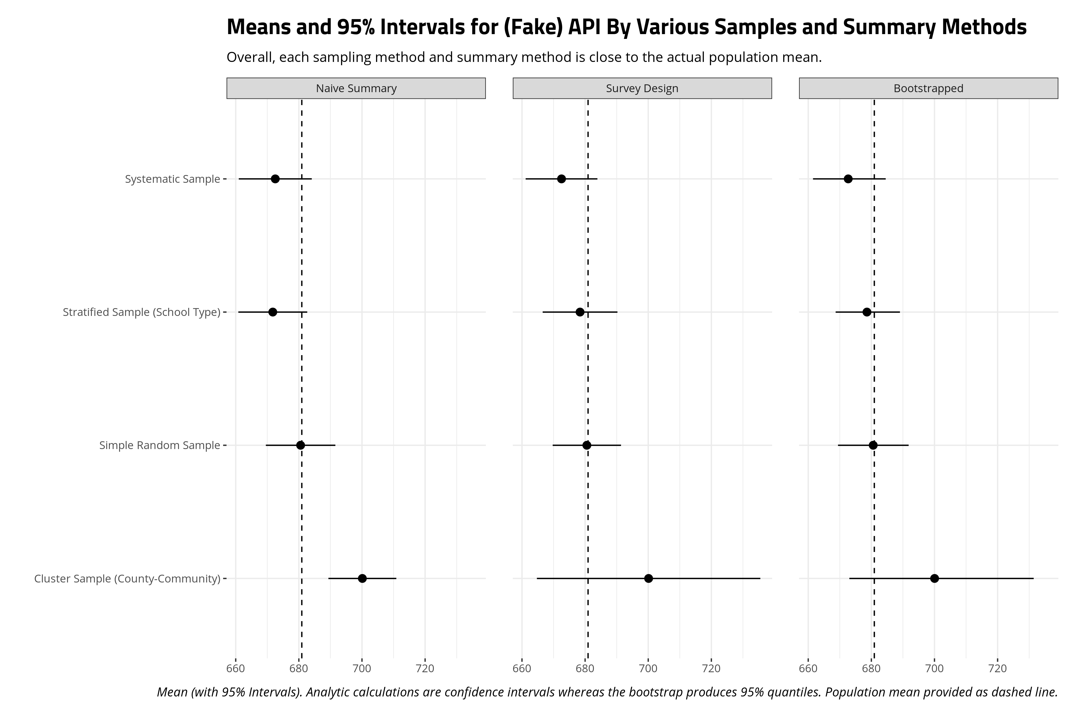
Overall, there is no real difference among these three different summary methods, for these three different sampling methods, in capturing the population mean. The 95% intervals in every occasion includes the true population mean. However, there are good reasons to think about different techniques for dealing with different kinds of survey data, no matter the results here. Indeed, an application to the api data in the {survey} package will surely show how different sampling methods have implications for the sampling means that emerge from them.
A Comparison of Subpopulation (School Type) Means
There will likely be some interesting differences that emerge in calculating subpopulation (school type) means. This is because the a simple random sample and a systematic random sample—a more glorified but more potentially problematic version of the simple random sample every time I’ve done it in simulation—is going to have far more elementary schools than middle schools or high schools. The differences between middle and high schools in the sample from the target population should in theory be random but the fewer number of these school types in the sample means the estimates around them are going to be considerably more diffuse.
Samples %>% group_by(method, schooltype) %>%
  tally() %>% ungroup() %>% spread(method,n)
| School Type | Cluster Sample (County-Community) | Simple Random Sample | Stratified Sample (School Type) | Systematic Sample |
|---|---|---|---|---|
| Elementary School | 336 | 298 | 200 | 301 |
| Middle School | 50 | 56 | 100 | 62 |
| High School | 37 | 46 | 100 | 37 |
I duplicate the code above for population means, only adding group_by(schooltype) into relevant sections of the code to get school type means. There are a lot of school type means so the plot below is faceted by summary method and by school type. I add dashed lines to communicate the actual population mean by school type.
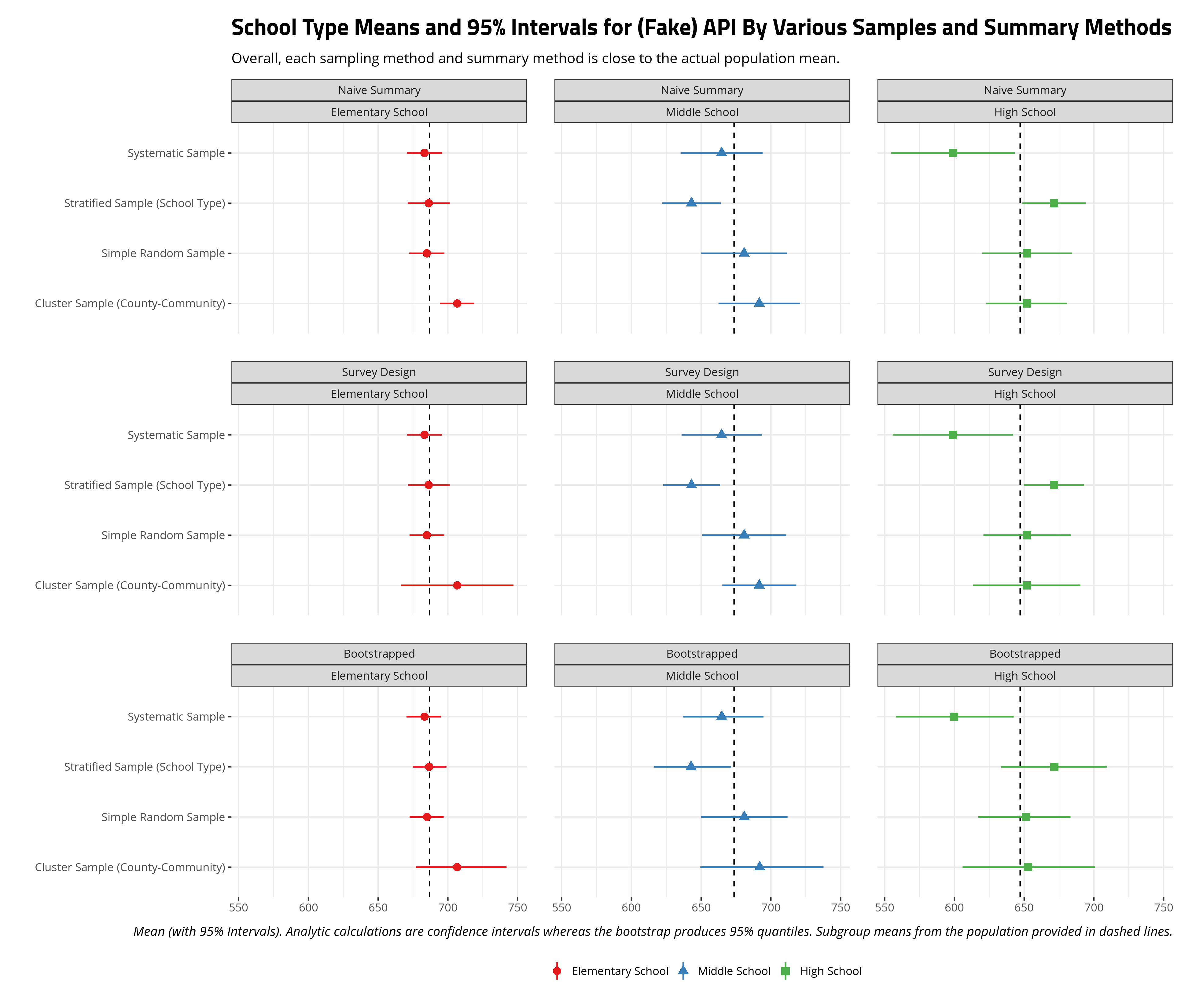
The results here are multiple but I want to highlight a few things of importance. First, all methods do well in approximating the true mean for elementary schools. Elementary schools are the clear modal category among school types in the data and there are enough sampled elementary schools to not only approximate the true mean, but routinely have narrow intervals around the sample mean for elementary schools. The survey design and bootstrapped means and intervals for elementary schools are considerably wider, but the sample mean that emerges is almost the population mean.
Notice the intervals are wider for middle school and high schools because there are generally fewer of these observations in these samples than elementary schools. Notice, however, that sample stratification on school type has more observations for these schools and thus the intervals around the sample mean are smaller. No matter the sampling method, the sample mean does well to approximate the true population mean and the intervals certainly include it. The only standout is the sample mean for high schools from a simple random sample. Therein, no matter the fact that high schools score lower in API in our data, the random draw we got has a higher sample mean. The simple random sample, with just 37 high schools, produced a draw where the mean was discernibly higher than the actual mean.
One thing that stands out (to me, at least) is my bootstrapping approach almost perfectly mimics the results from a declared survey design. For stratified samples, a bootstrapping approach simply needed to resample (with replacement) while considering the sources of oversampling (i.e. middle schools and high schools). For the cluster sample, it was a matter of randomly selecting the clusters that were themselves randomly sampled and again resampling (with replacement) from that (often times smaller) sample while also considering potential oversampling. It is true that the bootstrapped intervals are a bit wider than the survey design intervals, but that’s also a natural byproduct of bootstrapping. Namely, unless you’re dealing with high-dimensional data with myriad complex clusters (in which case you may encounter some problems), a bootstrap gives more flexibility over how you summarize the data and can even easily extend into the regression context.
Recapturing Systematic Effects on API
How well do these methods capture the systematic effects of subsidized meal eligibility, fully qualified teachers, and college-educated parents on the school’s API score? To this point, a comparison of methods has focused on just sample means. Here, we’ll compare 1) linear models (naive approach), 2) survey GLMs, 3) regressions on bootstrapped data, and 4) a linear mixed effects model with random effects for school type and county. The code here is super convoluted, so I suppress it here and present just a visual summary of these regressions. Check the underlying code in the associated .Rmd file in the _rmd directory for my blog.
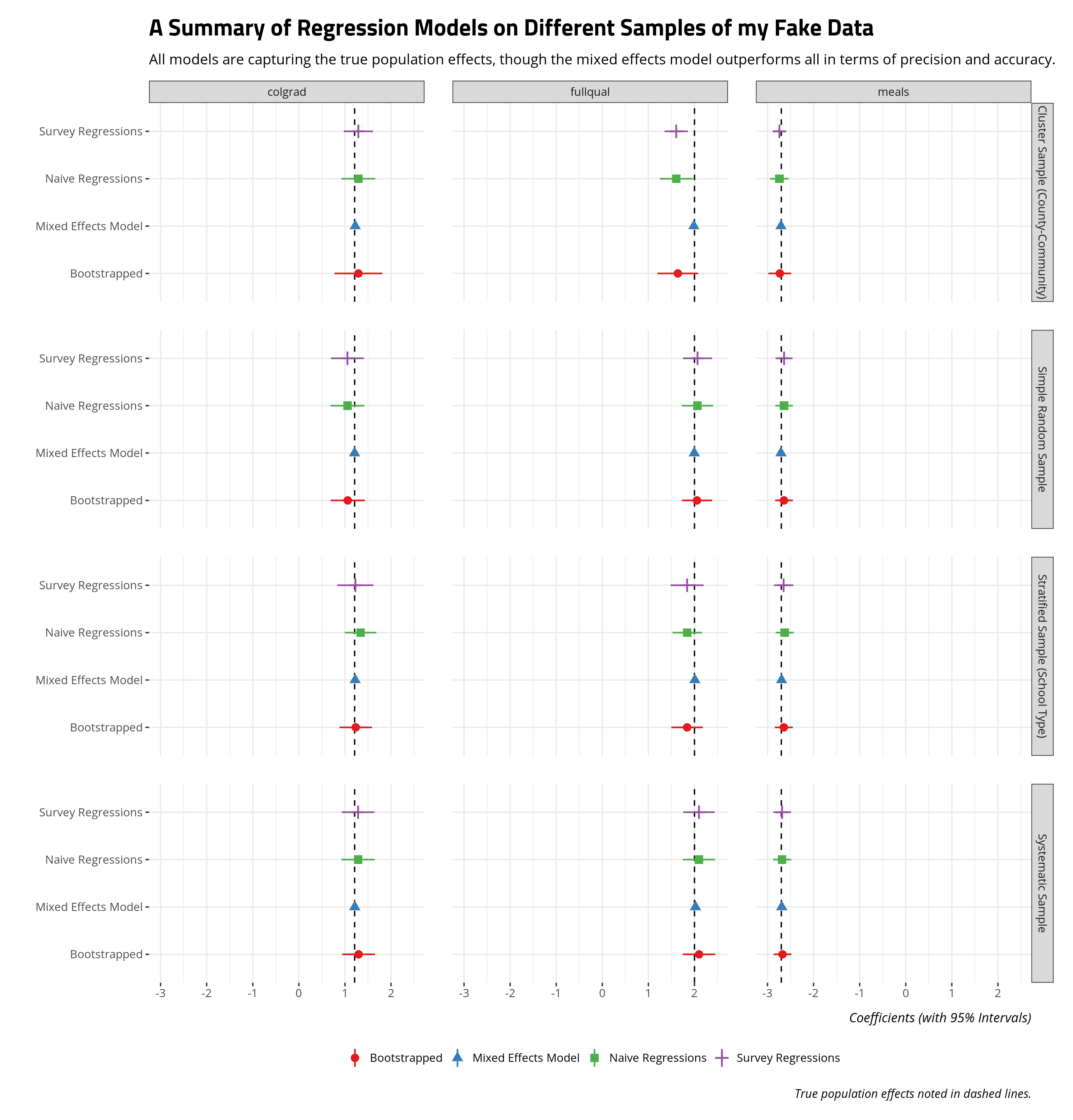
All told, all regression models are doing well enough to capture the true systematic effects, though two things are worth emphasizing. First, the mixed effects model outperforms all other regression approaches (naive, survey, bootstrapped) in precision and accuracy. Where there are clusters are strata in the data that create important grouping effects, a mixed effects model will do well to model that in order to emphasize important fixed/systematic effects of interest. Second, the bootstrapped approach is doing well to mimic the survey regression (and, to a lesser extent, the naive regression approach). The benefit of bootstrapping, though, is the researcher has greater control over the process and bootstrapping permits more flexible summaries of the regression procedure (including quantities of interest).
A reader may balk at this statement based on the fake data I generated, but you can get a similar takeaway using the api data in the {survey} package. Again, this code is convoluted as hell so check the _rmd directory for my blog for the full code for this post. These are just for the cluster sample (on school district), simple random sample, and stratified sample (on school type). The mixed models have random effects for school district, county, and school type.
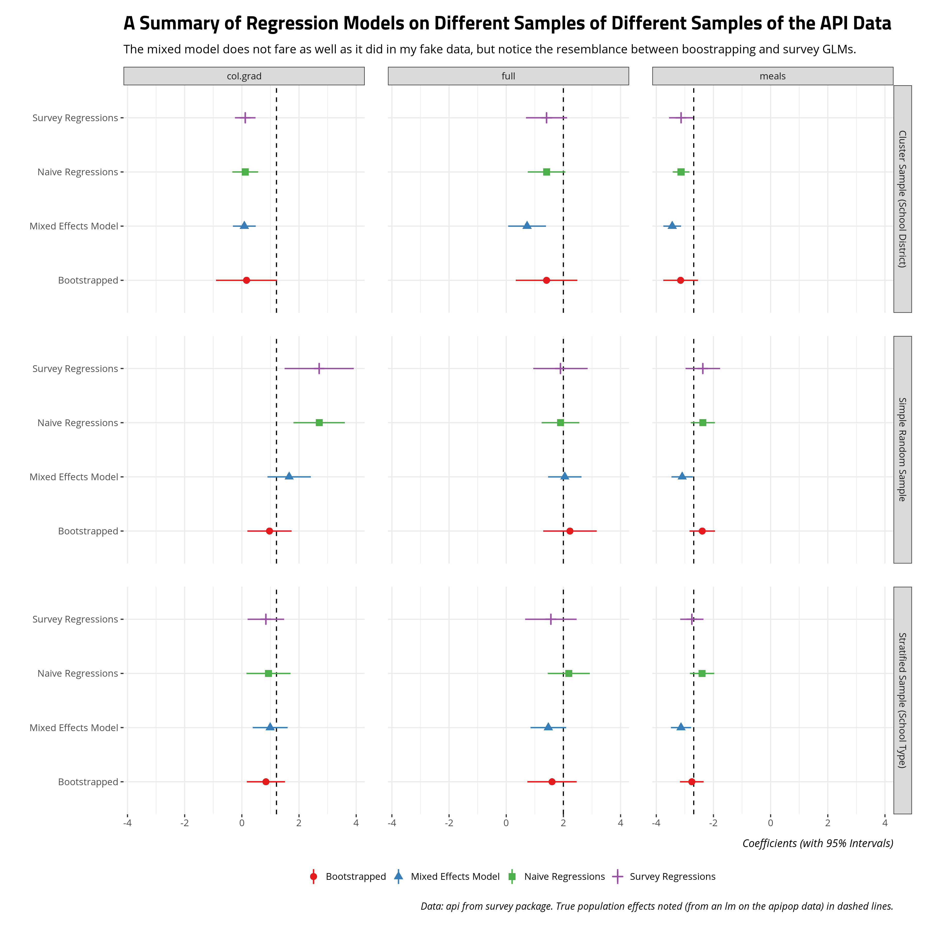
The results on these apipop data suggest more interesting divergences, and all models are struggling with the clustered sample, but the same two takeaways emerge. The mixed model does better than the naive regression or survey regression (for the simple random sample on 200 observations). Further, the bootstrapped approach I employ basically mimics the survey regressions. Bootstrapping has the added advantage of greater flexibility over the modeling procedure (and quantities of interest from them).
Conclusion
I wrote this mostly to have something to which I can point to show that I can do this stuff. It’s not exactly information that’s discerned from an academic CV. But, they are some parlor tricks for how I approach modeling survey data. First, while I’m flexible with declared survey designs, I find most of the canonical stuff on sampling methods, especially stratification, can be approximated well by bootstrapping. The sample means I can summarize from a survey design will be substantively the same as what I can get by bootstrapping. The wider confidence intervals emerge as well to communicate important uncertainty from the nature of the sample. Second, my approach to survey-type data is that if it can be a mixed effects model, it probably should be a mixed effects model. The mixed effects model performs well, often better in my experience, than survey GLMs. Further, a bootstrapping approach can approximate the survey GLM as well with the added benefit of more flexibility over the procedure (and quantities of interest). In my current line of work, these aren’t something researchers or reviewers care to belabor but they’re important in other disciplines, polling firms, and perhaps the private sector, more generally. They’re important things to make explicit.
-
I was incidentally a California high school student at this time my rinky-dink Evangelical Christian K-12 school I attended is excluded from these data. ↩
-
It’s easy to conflate stratification with clustering. Stratification refers to cases where there are differences between strata but differences within strata are low. Cluster samples are cases where differences between clusters are low but differences within clusters are high. I’ll note that the canonical R package for this stuff,
{survey}, only stratifies by school type in their example and that is what I’m trying to mimic here. I’ll also note I’ve seen cluster sampling defined in numerous ways. These include randomly selecting set clusters and then getting all data within the cluster or randomly selecting clusters and then randomly selecting within those clusters. I’ll be doing the former since that is how I saw it in the{survey}data. ↩
Disqus is great for comments/feedback but I had no idea it came with these gaudy ads.