The COVID-19 Initial Unemployment Claims Spike in Context

- A woman walks wearing a mask to protect herself from the novel coronavirus (COVID-19) in front of a closed theater in Koreatown, Los Angeles, on March 21, 2020. (AFP, GETTY IMAGES)
Last updated: 2 April 2020
The U.S. Employment and Training Administration released its weekly update on initial unemployment claims, giving us the first glimpse of the economic implications of the COVID-19 pandemic beyond the fluctuation we’re observing in the stock market. And… yikes.
The data are grisly and some R code will illustrate that. First, here are the packages necessary to put this unemployment claims spike in context. {tidyverse} comes at the fore of my workflow. {stevemisc} is my toy R package and {stevedata} has a data set on U.S. recessions (recessions) for added context. It should be no surprise that unemployment climbs during these periods. Finally, {fredr} interacts with the Federal Reserve Economic Data maintained by the research division of the Federal Reserve Bank of St. Louis. The API is the easiest and most flexible of any I’ve used and I wish the IMF’s API were as simple. {lubridate} will help us play with dates.
library(tidyverse)
library(stevemisc)
library(stevedata)
library(fredr)
library(lubridate)
The {fredr} call is simple. The initial unemployment claims data has a series id of “ICSA” and the data extend to January 1967. Let’s grab everything we can.
fredr(series_id = "ICSA",
        observation_start = as.Date("1967-01-01")) -> ICSA
Here’s what the data looked like before today.
ICSA %>%
  filter(date <= ymd("2020-03-14")) %>%
  ggplot(.,aes(date, value/1000)) +
  theme_steve_web() +
  scale_x_date(date_breaks = "2 years",
               date_labels = "%Y",
               limits = as.Date(c('1965-01-01','2020-04-01'))) +
  geom_rect(data=filter(recessions,year(peak)>1966), inherit.aes=F,
            aes(xmin=peak, xmax=trough, ymin=-Inf, ymax=+Inf), fill='darkgray', alpha=0.8) +
     geom_line() +
    geom_ribbon(aes(ymin=-Inf, ymax=value/1000),
              alpha=0.3, fill="#619CFF") +
  labs(title = "Initial Unemployment Claims From January 7, 1967 to March 14, 2020",
       subtitle = "Unemployment claims clearly rise during economic contractions with peaks observed during the early 1980s global recession and the Great Recession from 2007-2009.",
       x = "", y = "Unemployment Claims (in Thousands)",
       caption = "Data: U.S. Employment and Training Administration (initial claims), National Bureau of Economic Research (recessions).")
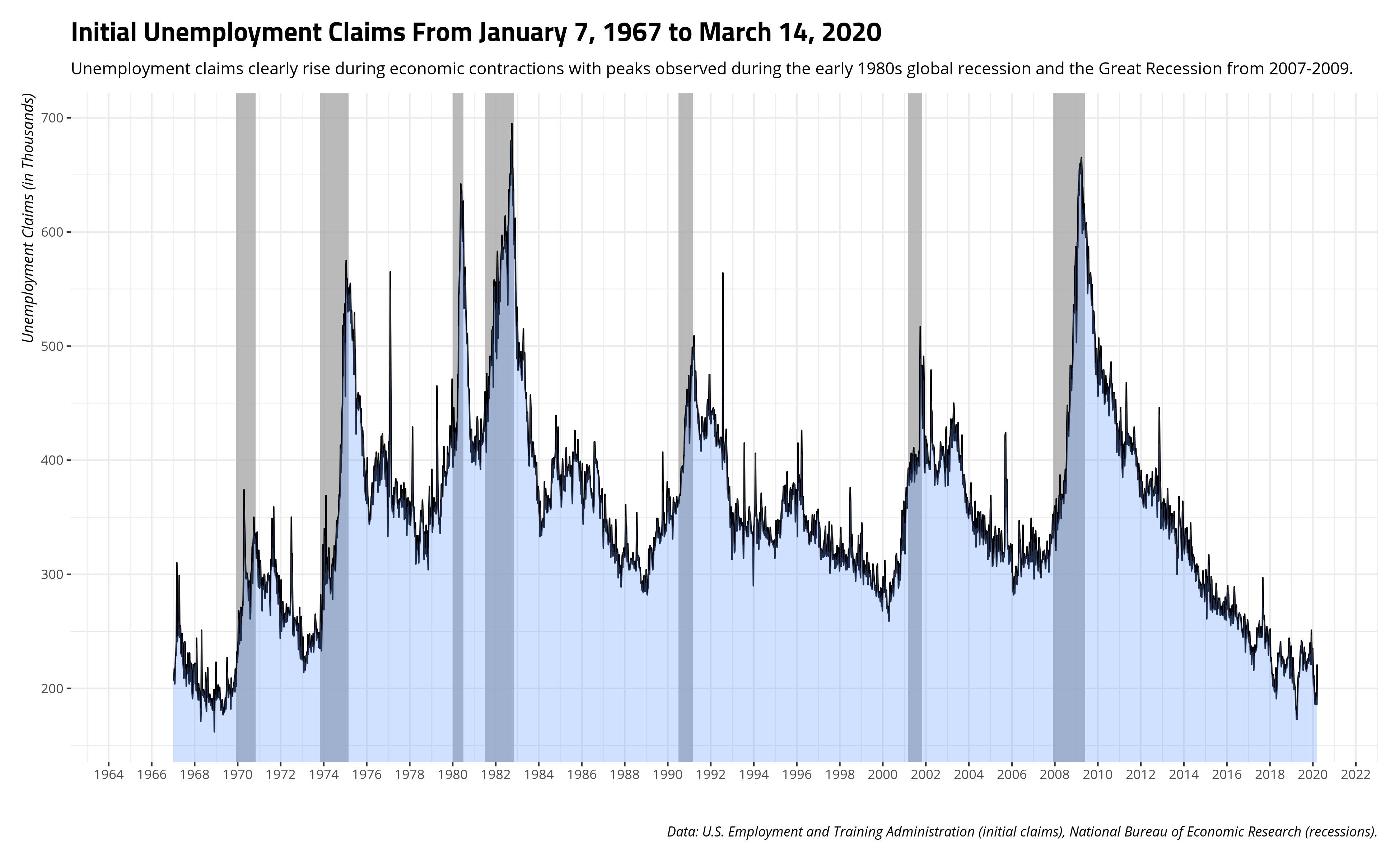
The peaks in the early 1980s and from 2007 to 2009 are immediately evident. Those periods coincided with global recessions in which the unemployment rate in the U.S. (calculated monthly) exceeded 10% of the civilian labor force.
Now, here’s what the data look like as of today.
ICSA %>%
  # change just one line
  filter(date <= ymd("2020-03-21"))  %>%
  ggplot(.,aes(date, value/1000)) +
  theme_steve_web() +
  scale_x_date(date_breaks = "2 years",
               date_labels = "%Y",
               limits = as.Date(c('1965-01-01','2020-04-01'))) +
  geom_rect(data=filter(recessions,year(peak)>1966), inherit.aes=F,
            aes(xmin=peak, xmax=trough, ymin=-Inf, ymax=+Inf), fill='darkgray', alpha=0.8) +
     geom_line() +
    geom_ribbon(aes(ymin=-Inf, ymax=value/1000),
              alpha=0.3, fill="#619CFF") +
  scale_y_continuous(labels = scales::comma) +
  labs(title = "Initial Unemployment Claims From January 7, 1967 to March 21, 2020",
       subtitle = "The almost 3.3 million unemployment claims dwarfs the unemployment effects of the major recessions in the data.",
       x = "", y = "Unemployment Claims (in Thousands)",
       caption = "Data: U.S. Employment and Training Administration (initial claims), National Bureau of Economic Research (recessions).")
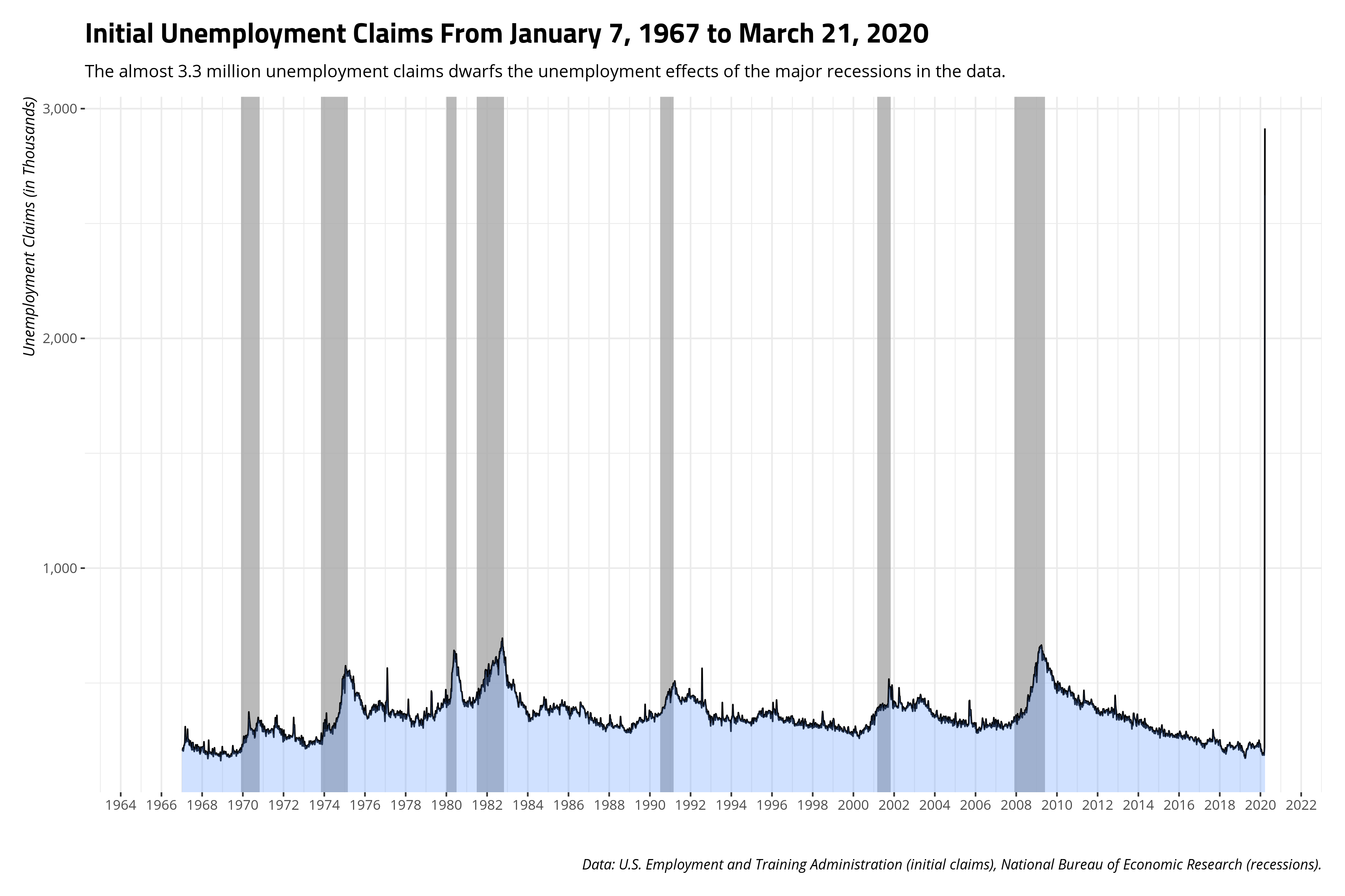
I’ll come back and update this when the states roll out their updates, but it does have me thinking about this dire warning from the President of the Federal Reserve Bank of St. Louis.
JUST IN: Fed's Bullard says U.S. unemployment rate may hit 30% in the second quarter https://t.co/kdy6npXQAS
— Bloomberg (@business) March 22, 2020
Standardizing initial claims to the (growing) civilian labor force of the United States lends to some worry that estimate might be too low. Basically, the initial claims as a proportion of the civilian labor force, right now, is four times what it was at the peak of the Great Recession and the early 1980s recession. Therein, the unemployment rate was between 10-11%. The extent to which initial claims is a sneak peek of the monthly unemployment rate, 30% might be too low an estimate.
Alas, I’ll defer to the President of the FRED’s division in St. Louis. He’ll know more than me. I just know how to play with the data that his research division releases.
Update for April 2, 2020
Gulp.
ICSA %>%
  # Omit the filter
  #filter(date <= ymd("2020-03-21"))  %>% # Commenting out just one line.
  ggplot(.,aes(date, value/1000)) +
  theme_steve_web() +
  scale_x_date(date_breaks = "2 years",
               date_labels = "%Y",
               limits = as.Date(c('1965-01-01','2020-04-01'))) +
  geom_rect(data=filter(recessions,year(peak)>1966), inherit.aes=F,
            aes(xmin=peak, xmax=trough, ymin=-Inf, ymax=+Inf), fill='darkgray', alpha=0.8) +
     geom_line() +
    geom_ribbon(aes(ymin=-Inf, ymax=value/1000),
              alpha=0.3, fill="#619CFF") +
  scale_y_continuous(labels = scales::comma) +
  labs(title = "Initial Unemployment Claims From January 7, 1967 to the Present",
       subtitle = "The ongoing COVID-19 pandemic makes the initial claims spikes of the early 1980s and mid-2000s almost invisible.",
       x = "", y = "Unemployment Claims (in Thousands)",
       caption = "Data: U.S. Employment and Training Administration (initial claims), National Bureau of Economic Research (recessions).")
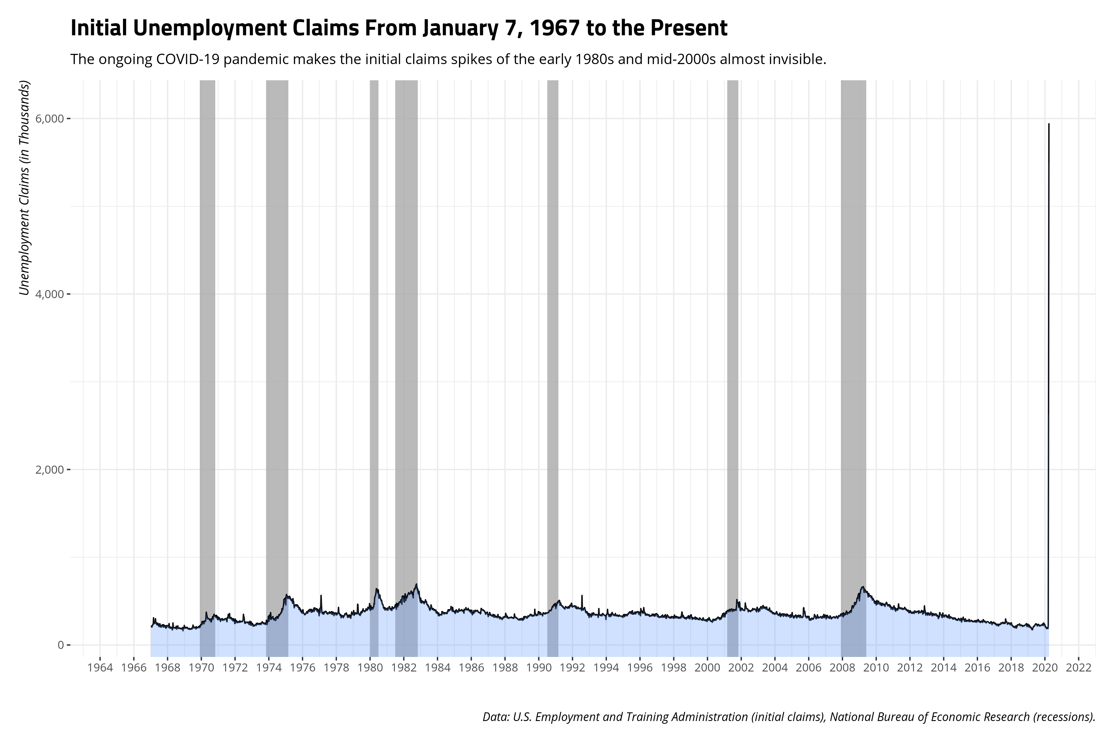
The state-level initial claims data also offer an insight to what COVID-19 has done to unemployment. These indicators seem to lag a week behind the national figures so the most recent national update for today (gulp) also comes with more insight to the jarring statistics released last week.
This script will grab the most current data for initial claims for all 50 states.
# Initial claims data
stateclaimsabbs <- paste0(c(state.abb),"ICLAIMS")

sclaims <- tibble()

for (i in 1:length(stateclaimsabbs)) {
  fredr(series_id = stateclaimsabbs[i],
        observation_start = as.Date("1986-01-01")) -> hold_this
    bind_rows(sclaims, hold_this) -> sclaims
}
This will show which states were hit the hardest by the spate of unemployment claims starting last week.
sclaims %>%
  mutate(state = str_sub(series_id, 1, 2)) %>%
  group_by(state) %>%
  mutate(l1_value = lag(value, 1),
         diff = (value - l1_value)/l1_value,
         diff = diff*100) %>%
  slice(n()) %>%
  arrange(-diff)
| Rank | State | Initial Claims (March 21, 2020) | Initial Claims (March 14, 2020) | % Change |
|---|---|---|---|---|
| 1 | NH | 29,379 | 642 | 4476.17% |
| 2 | ME | 21,459 | 634 | 3284.7% |
| 3 | RI | 35,847 | 1,108 | 3135.29% |
| 4 | LA | 72,438 | 2,255 | 3112.33% |
| 5 | MN | 115,773 | 4,010 | 2787.11% |
| 6 | OH | 196,309 | 7,046 | 2686.11% |
| 7 | NC | 94,083 | 3,533 | 2562.98% |
| 8 | MI | 128,006 | 5,338 | 2298.01% |
| 9 | PA | 363,000 | 15,439 | 2251.19% |
| 10 | IN | 59,755 | 2,596 | 2201.81% |
| 11 | DE | 10,776 | 472 | 2183.05% |
| 12 | NM | 18,105 | 869 | 1983.43% |
| 13 | MA | 148,452 | 7,449 | 1892.91% |
| 14 | NE | 15,861 | 819 | 1836.63% |
| 15 | MT | 15,349 | 817 | 1778.7% |
| 16 | IA | 40,952 | 2,229 | 1737.24% |
| 17 | KY | 49,023 | 2,785 | 1660.25% |
| 18 | VA | 46,277 | 2,706 | 1610.16% |
| 19 | SC | 31,826 | 2,093 | 1420.59% |
| 20 | UT | 19,690 | 1,305 | 1408.81% |
| 21 | NV | 92,298 | 6,356 | 1352.14% |
| 22 | TN | 38,077 | 2,702 | 1309.22% |
| 23 | ND | 5,662 | 415 | 1264.34% |
| 24 | ID | 13,586 | 1,031 | 1217.75% |
| 25 | NJ | 115,815 | 9,467 | 1123.35% |
| 26 | OK | 21,926 | 1,836 | 1094.23% |
| 27 | FL | 74,313 | 6,463 | 1049.82% |
| 28 | IL | 126,716 | 11,305 | 1020.88% |
| 29 | MD | 42,982 | 3,864 | 1012.37% |
| 30 | KS | 19,356 | 1,755 | 1002.91% |
| 31 | MO | 42,246 | 4,016 | 951.94% |
| 32 | WI | 51,031 | 5,190 | 883.26% |
| 33 | TX | 155,426 | 16,176 | 860.84% |
| 34 | SD | 1,761 | 190 | 826.84% |
| 35 | WA | 129,909 | 14,240 | 812.28% |
| 36 | CO | 19,774 | 2,321 | 751.96% |
| 37 | AZ | 29,348 | 3,844 | 663.48% |
| 38 | CT | 25,100 | 3,440 | 629.65% |
| 39 | WY | 3,653 | 517 | 606.58% |
| 40 | OR | 30,054 | 4,269 | 604.01% |
| 41 | AK | 7,847 | 1,120 | 600.62% |
| 42 | AR | 9,275 | 1,382 | 571.13% |
| 43 | AL | 10,892 | 1,819 | 498.79% |
| 44 | VT | 3,784 | 659 | 474.2% |
| 45 | NY | 79,999 | 14,272 | 460.53% |
| 46 | HI | 8,817 | 1,589 | 454.88% |
| 47 | MS | 5,519 | 1,147 | 381.17% |
| 48 | WV | 3,536 | 865 | 308.79% |
| 49 | CA | 186,333 | 57,606 | 223.46% |
| 50 | GA | 12,140 | 5,445 | 122.96% |
Basically, every state was rocked, some more than others. New Hampshire saw the largest increase from March 14 to March 21. Only 642 people in New Hampshire filed a new jobless claim in the March 14 update. That number skyrocketed to 29,379 in the March 21 update. That is a change of over 4,476 percent. There are four curious states at the bottom: Mississippi, West Virginia, California, and Georgia. To be clear, all four had massive increases from the previous week, all at least doubling from the previous week. West Virginia and Mississippi even tripled. However, California stands out as taking more proactive measures quicker than the other three states, which might suggest worse is yet to come for states like Mississippi and Georgia. For example, Mississippi’s governor rejected calls for a lockdown on March 23 by claiming the state will “never be China” on the COVID-19 front. Now, it has the country’s highest hospitalization rate for COVID-19. Georgia’s governor similarly downplayed COVID-19 before finally rolling out a shelter-in-place order. The economic consequences of these later measures we’re seeing in the Deep South may manifest in subsequent updates.
Disqus is great for comments/feedback but I had no idea it came with these gaudy ads.