Reading a Regression Table: A Guide for Students
- Consider Reading This Post Instead ⤵️
- This post is by far the most widely read post on my blog and I appreciate that it's been so useful to so many people. However, this post is from 2014 and I've learned a great deal over time on how to communicate regression and inference to students. I think this post to which I am redirecting you does not only a better job in explaining (linear) regression, but provides a better and more timely example. The same information is there; indeed I copy-pasted a fair bit from this post. I just think it's a better answer to the motivating question that led you here (i.e. "how do I interpret a regression table?").
- What Do We Know About British Attitudes Toward Immigration? A Pedagogical Exercise of Sample Inference and Regression
What explains British attitudes toward immigration? Here is a pedagogical example from the European Social Survey in 2018-19 that's more useful in teaching students about inference from a sample and how to read a regression table. 23 Mar 2020
I believe that the ability to read a regression table is an important task for undergraduate students in political science. All too often, the actual analysis in an assigned article becomes a page-turner for a student eager to say s/he “read” the assignment without actually reading it, understanding it, and evaluating it. This can be perilous in my field. Sometimes, regression tables, ostensibly presented as definitive proof in favor of some argument, can be misleading. The proof is not as convincing as it seems. A student capable of reading and evaluating a regression table is better able to evaluate competing empirical claims about important topics in political science. I also believe that learning this tool makes a student a better prospect on the job market after graduation and may make the student a better democratic citizen in a world moving toward quantification.
However, students can go from freshmen to seniors without acquiring this ability. I never learned this stuff when I was an undergraduate, which, granted, was many years ago. Quantitative methods classes are often specialty classes in political science. Only a motivated few self-select into acquiring this tool though a more widespread knowledge among political science students would be beneficial.
What follows is a guide for undergraduate students in reading a regression table. Where it is just one blog post, this guide will be “quick and dirty” and will leave a more exhaustive discussion of core concepts and theories to a quantitative methods class (that you could also take with me!). My audience for this post consists of my students in more general topic courses that nonetheless feature an emphasis on quantitative research.
Step One: Know the Data
Some of the biggest errors of misinterpretation of a regression table come from not knowing what is being tested and what the author is trying to do with even a basic linear or logistic regression. In short, there is no shortcut for beginners in not reading the research design of an article as well. Knowing what the variables are and how they are distributed have some implications for how to read the regression table in the results section.
To illustrate this step, I am going to call in a simple data set in R. This is the voteincome data set that comes standard with the Zelig package.1 I’ll start by discussing the data set and its purpose.
Let’s say we want to know what explains whether someone is a registered voter. This is our goal and this is the phenomenon we want to explain. We believe that we can explain who is a registered voter by reference to a person’s age, the income level, education, and gender. This is all rather basic sociodemographic stuff, but we believe they give us leverage over the variation in who is a registered voter.
We obviously can’t get data on the 300 million or so Americans in this country. We can, however, get a random sample of that population and infer from the sample to the population. If our sample is truly random, our sample statistic (plus/minus sampling error) is our best estimate of the population parameter of interest. This is the process of inferential statistics (i.e. inferring from a sample of a population to the population itself).
We obtained data from 1,500 Americans in November 2000 from the 2000 Current Population Survey. 500 respondents are from Arkansas and 1,000 respondents are from South Carolina. The dependent variable (i.e. the variation of which we want to explain) is called vote. It takes on two values (0 = not a registered voter, 1 = registered voter). age is, intuitively, the age of the respondent in years. The youngest is 18 and the oldest is 85. income is an ordered variable between 4 and 17. In this variable, a 4 captures a person who makes less than $5,000 a year. A 17 codes a person who makes more than $75,000 a year. education takes on values of 1 (did not complete high school), 2, 3, and 4 (has more than a college education). female is another binary variable where 0 = men and 1 = women. A summary of the data follows.
##  state          year           vote            income        education          age
##  AR: 500   Min.   :2000   Min.   :0.0000   Min.   : 4.00   Min.   :1.000   Min.   :18.00
##  SC:1000   1st Qu.:2000   1st Qu.:1.0000   1st Qu.: 9.00   1st Qu.:2.000   1st Qu.:36.00
##            Median :2000   Median :1.0000   Median :13.00   Median :3.000   Median :49.00
##            Mean   :2000   Mean   :0.8553   Mean   :12.46   Mean   :2.651   Mean   :49.26
##            3rd Qu.:2000   3rd Qu.:1.0000   3rd Qu.:16.00   3rd Qu.:4.000   3rd Qu.:62.00
##            Max.   :2000   Max.   :1.0000   Max.   :17.00   Max.   :4.000   Max.   :85.00
##      female
##  Min.   :0.0000
##  1st Qu.:0.0000
##  Median :1.0000
##  Mean   :0.5593
##  3rd Qu.:1.0000
##  Max.   :1.0000
This summary is an illustration for the purpose of this blog post. When the student reads her/his article assignment, the student’s job should include reading the research design to get a sense, however general, of what the author is trying to do and what the data look like.
Step Two: Understanding What the Regression Table is Saying
This section will omit a more comprehensive discussion of the logic of regression and fitting a regression itself. Long story short, a regression is a tool for understanding a phenomenon of interest as a linear function of some other combination of predictor variables. The regression formula itself has a strong resemblance to the slope-intercept equation (y = mx + b) that students should remember from high school.
In our illustration, we believe we can model whether someone is a registered voter as a linear equation of the person’s age, gender, education level, and income. In short: vote = age + female + education + income in our data set. When we do this, we get output that looks like this.
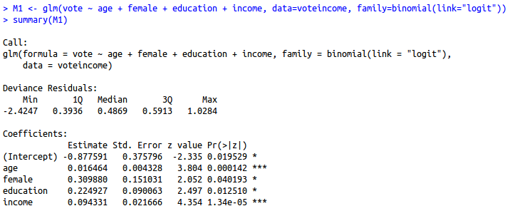
summary(M1 <- glm(vote ~ age + female + education + income,
          data=voteincome,
          family=binomial(link="logit")))
##
## Call:
## glm(formula = vote ~ age + female + education + income, family = binomial(link = "logit"),
##     data = voteincome)
##
## Deviance Residuals:
##     Min       1Q   Median       3Q      Max
## -2.4247   0.3936   0.4869   0.5913   1.0284
##
## Coefficients:
##              Estimate Std. Error z value Pr(>|z|)
## (Intercept) -0.877591   0.375796  -2.335 0.019529 *
## age          0.016464   0.004328   3.804 0.000142 ***
## female       0.309880   0.151031   2.052 0.040193 *
## education    0.224927   0.090063   2.497 0.012510 *
## income       0.094331   0.021666   4.354 1.34e-05 ***
## ---
## Signif. codes:  0 '***' 0.001 '**' 0.01 '*' 0.05 '.' 0.1 ' ' 1
##
## (Dispersion parameter for binomial family taken to be 1)
##
##     Null deviance: 1240.0  on 1499  degrees of freedom
## Residual deviance: 1185.6  on 1495  degrees of freedom
## AIC: 1195.6
##
## Number of Fisher Scoring iterations: 5
A polished result would resemble this table, though this particular rendering requires the stargazer package in R.
| Dependent variable: | |
| Is Respondent a Voter? | |
| Age | 0.016*** |
| (0.004) | |
| Female | 0.310** |
| (0.151) | |
| Education | 0.225** |
| (0.090) | |
| Income | 0.094*** |
| (0.022) | |
| Constant | -0.878** |
| (0.376) | |
| Observations | 1,500 |
| Note: | *p<0.1; **p<0.05; ***p<0.01 |
Data come from voteincome data in Zelig package. | |
The student who first encounters a regression table will see three things.
- The numbers inside parentheses next to a variable.
- The numbers not in parentheses next to a variable.
- Some of those numbers not in parentheses have some asterisks next to them.
The Regression Coefficient
We will discuss these now, starting with the second item. The number you see not in parentheses is called a regression coefficient. The regression coefficient provides the expected change in the dependent variable (here: vote) for a one-unit increase in the independent variable.
I encourage students new to regression to observe two elements of the regression coefficient. Namely, is it positive or negative? A positive coefficient indicates a positive relationship. As the independent variable increases, the dependent variable increases. Also, the dependent variable decreases as the independent variable decreases.
A negative coefficient indicates a negative relationship. As the independent variable increases, the dependent variable decreases. A negative relationship also indicates that the dependent variable increases as the independent variable decreases.
The Standard Error
The number in parentheses is called a standard error. For each independent variable, we expect to be wrong in our predictions. It’s intuitive that older respondents are more likely to be registered voters, that women are more likely to be registered voters, and that more educated and wealthier people are likely to be registered voters. However, predictions are rarely 100%. Many women don’t vote. Many educated people opt to not register as voters. The standard error is our estimate of the standard deviation of the coefficient.
However, the standard error is not a quantity of interest by itself. It depends on the relationship with the regression coefficient. This leads us to the third item of interest.
The Asterisks
The asterisks in a regression table correspond with a legend at the bottom of the table. In our case, one asterisk means “p < .1”. Two asterisks mean “p < .05”; and three asterisks mean “p < .01”. What do these mean?
Asterisks in a regression table indicate the level of the statistical significance of a regression coefficient. The logic here is built off the principle of random sampling. If there truly is no difference between (for example) men and women in their proclivity to be registered voters, then how likely would we get the “draw” we got that suggested such a difference?
The answer here is “unlikely”, assuming a random sample. The rule of thumb in our discipline privileges p < .05. In our case, a random sample resulting in the regression coefficient and standard error that we observed—if there was truly no difference between men and women—would occur in five random draws of 100, on average. Or, to be more technical, given the null hypothesis of zero relationship in the population (i.e. no difference between men and women in the population from which we obtained the sample), the probability of obtaining a result as extreme in which we saw gender differences is at or less than .05. Put another way, we would expect to see the same positive, non-zero effect of gender 95 times of 100 samples. That is a lot “confidence” one can have in the estimate.2
p values are determined by dividing the regression coefficient over the standard error to get a t (or z) statistic. That statistic will coincide with a p value used to determine statistical significance and the rule of thumb in our field is the a p value under .05 is an indicator of “statistical significance.” However, those intermediate things are more information than necessary for an undergraduate student trying to evaluate a regression table. Thus, I think “stargazing” (i.e. looking for asterisks) as undergraduates is acceptable. Just look for the “stars.”
In our case, we would conclude that age, gender, education, and income independently all have a “statistically significant” relationship with the likelihood of being a registered voter. Further, all have a positive relationship with the likelihood of voting that is unlikely to be zero.
Step Three: Understanding What the Regression Table isn’t Saying
This section concludes with some cautions and warnings about interpreting regression output based off common errors I have seen students make in my years of teaching.
Mind the Distribution of the Dependent Variable
Regression coefficients in linear regression are easier for students new to the topic. In linear regression, a regression coefficient communicates an expected change in the value of the dependent variable for a one-unit increase in the independent variable. Linear regressions are contingent upon having normally distributed interval-level data. Students will see linear regressions more often in political economy research using data like trade, national income, and so on.
In a logistic regression that I use here—which I believe is more common in international conflict research—the dependent variable is just 0 or 1 and a similar interpretation would be misleading. To be more precise, a regression coefficient in logistic regression communicates the change in the natural logged odds (i.e. a logit) of the dependent variable being a 1. These are closely related with the more familiar term “probability”, which is bound between 0 and 1. Basically, the regression coefficient can be exponentiated as an odds ratio to get a probability.
Mind the Distribution of the Independent Variable
Put another way: statistically significant is not itself “significant”. One of the most common mistakes I see students make with interpreting regression results is mistaking “statistically significant” with “large” or “very important”. Whether this was R.A. Fisher’s intention to conflate “statistically significant” with “large effect” to promote his method is not my concern for now. Suffice to say, “statistically significant” is one word that made a recent list of terms that scientists wish the general public would stop misusing.
“Statistically significant” is one of those phrases scientists would love to have a chance to take back and rename. “Significant” suggests importance; but the test of statistical significance, developed by the British statistician R.A. Fisher, doesn’t measure the importance or size of an effect; only whether we are able to distinguish it, using our keenest statistical tools, from zero. “Statistically noticeable” or “Statistically discernible” would be much better.
On a related note, it would be misleading to think that gender has the largest effect in explaining who is a registered voter. female, the independent variable for gender, can only be 0 or 1. This will increase the size of the regression coefficient, but it will increase the standard error as well. Meanwhile, education has four categories and income has 12 different values. All else equal, this drives down the effect of a one-unit change in the regression coefficient.
None of the four independent variables in the regression share a common scale so a quick comparison of regression coefficient sizes as a determinant of effect size would be incorrect.
Prior to post-estimation simulation, one way around this is standardization, especially by two standard deviations instead of one. Dividing by two standard deviations allows continuous predictors to be roughly similar in scale to binary variables. When we do this (with the arm package in R), the effect of female doesn’t seem so large relative to the other predictors.
| Is Respondent a Voter? | ||
| Unstandardized Coefficents | Standardized Coefficients | |
| (1) | (2) | |
| Age | 0.016*** | 0.575*** |
| (0.004) | (0.151) | |
| Female | 0.310** | 0.310** |
| (0.151) | (0.151) | |
| Education | 0.225** | 0.459** |
| (0.090) | (0.184) | |
| Income | 0.094*** | 0.739*** |
| (0.022) | (0.170) | |
| Constant | -0.878** | 1.706*** |
| (0.376) | (0.110) | |
| Observations | 1,500 | 1,500 |
| Note: | *p<0.1; **p<0.05; ***p<0.01 | |
Data come from voteincome data in Zelig package. | ||
The Intercept is not an Independent Variable
The constant (i.e. y-intercept) is not an independent variable but rather our estimate of the dependent variable when all predictors in the model are set to 0. In most cases, it’s not a quantity of interest. However, I still take it seriously in modeling.
Look at the summary statistics at the beginning of the post for our example and look at the first regression table. The intercept is -.877. Basically, our estimate of the likelihood of being a registered voter for a person who is zero-years-old(!) male with education of 0 on a 1-4 scale and income of 0 on a 4-16 scale is -.877 in the logged odds of being a voter. This is obviously silly. It also rounds to a predicted probability of .293 under those conditions. Given our data, this is unreasonable. However, the computer will still fit an unreasonable intercept if you ask it.
Standardization (or centering at the least) is a useful way to get meaningful intercepts. In the raw regression output just shown using standardized variables, the male of average age, income, and education has a predicted probability of .845 of being a registered voter (intercept: 1.7055). Given our summary statistics, this is a much more reasonable intercept.
More Asterisks do not Mean More “Significance”
Greater levels of statistical significance suggest more precise estimates, but do not themselves suggest one independent variable is “more important” or “greater” than another independent variable that is also statistically discernible from zero.
To Conclude
Students new to reading regression tables are encouraged to do the following in order to make sense of the information presented to them.
- Read the research design section to get a sense of what the variables are, how they are coded, what the author is trying to explain, and what predictor(s) the author believes explains it.
- Look at the regression coefficient and determine whether it is positive or negative. A positive coefficient indicates a positive relationship and a negative coefficient indicates a negative relationship.
- Divide the regression coefficient over the standard error (i.e. the number in parentheses). If the absolute value of that division is “about two” (technically: 1.96), we conclude that the effect is “statistically significant” and discernible from zero. These significant relationships are usually denoted in asterisks.
-
I also have a beginner’s guide to using R if the reader is interested in which I also discuss that data set. ↩
-
That said, there is still considerable confusion among even social scientists as to what a confidence interval communicates in the frequentist framework from which it comes. This paragraph also takes some liberties with the precision of what p values communicate in order to relay a more basic point to a wider audience beyond those interested in more advanced topics in statistical methodology. There are definitely classes that allow a student to dig into these weeds, though. ↩
Disqus is great for comments/feedback but I had no idea it came with these gaudy ads.