Taming the Poisson Model: A Tutorial

- The Kent State shooting was the proximate cause, but the Vietnam War protest and counter-demonstration at the University of New Mexico was comparably violent. 11 people were stabbed with New Mexico Army National Guard bayonets during the melee.
Consider this a tutorial for second-year MA class on the Poisson model. It’s a busy time of the year for me, juggling two MA classes solo, supervising BA theses, and preparing for the next semester’s classes (which starts immediately after the fall term ends).1 Part of the challenge this year has been overhauling the advanced MA class on quantitative methods to make it less about time series and as much about models students in international relations or economic history might encounter in their travels. On deck: regression models for the analysis of variables that “count”. These are a unique case of discrete dependent variables that are left-bound at 0, can only be integers, and have only an informal bound on the right by probability. However, they present a unique opportunity because, if you were patient and diligent, you can extract some cool information from these models. If the knee-jerk reaction to count data is to plus+1 and log, the details of the Poisson model will point to you how many opportunities you’re missing to model the actual kind of data you have.
The topic for this post will be the Poisson model, which is kind of the “default” count model. There are others—i.e. negative binomial, hurdle, quasi-poisson, zero-inflated varieties—but we’re going to be focused on the Poisson for this exercise. Consider this tutorial a means to understand the Poisson model, tame it, and make it work for you. We’ll start with a discussion of the origins of this distribution and what it does in regression form. I’ll give a simple example using simulated data before going to a (kind-of) real-world case analyzing the cross-national correlates of violent riots against the government. This is a code-heavy post, though some will be suppressed for presentation. This mostly concerns tables and graphs.
Here’s a table of contents.
- What is the Poisson Distribution?
- A Simple Example with Fake Data
- An Actual Example: Anti-Government Riots and the “Youth Bulge”
- Getting Quantities of Interest from the Poisson Model
- The Problem of Overdispersion
- Conclusion
Here are the R packages we’ll be using. {MASS} makes a cameo, but I won’t directly load it.
library(tidyverse)     # for most things
library(stevemisc)     # for helper functions
library(kableExtra)    # for tables
library(stevedata)     # for the data
library(modelsummary)  # for tables
library(stevethemes)   # for graph formatting
library(modelr)        # for prediction grids
library(lmtest)        # for on-the-fly SE corrections
library(sandwich)      # ^ see above.
What is the Poisson Distribution?
The Poisson distribution has an interesting origin story. Its name owes to Simeon Denis Poisson because he introduced its basic theoretical intuition on a paper about wrongful convictions. In this application, Poisson was interested in a process for which the probability of an event occurring in a fixed time or space interval is small, but the number of trials is so large that the event occurs at least a few times. It was this same paper that Poisson coined the term “law of large numbers” to describe the phenomenon that interested him.
The distribution is named after Poisson but the academic interest in the phenomenon he described (as a kind of probability distribution) has a more immediate cause that I find more interesting. The Prussian (German) military had a particularly frustrating problem with their cavalry units suffering casualties by way of friendly fire. The “friendly fire”, in this case, was the horse itself. From 1875 to 1894, the Prussian military incurred 196 fatalities across 14 cavalry units caused by a horse kicking the cavalryman to death. In an 1898 paper, Ladislaus Bortkiewicz found these deaths follow a Poisson distribution. Reproduced later by luminaries in the United Kingdom like John Maynard Keynes and Harold Jeffreys, the Poisson distribution has become a pedagogical staple for modeling phenomena that are basic “counts” of “events”. The distribution itself is flexible but the intuition is for modeling a count of events that are somewhat rare, discrete in nature (can only be integers and not reals), hard-bound at the left by 0, and only informally bound on the right by what is conceivable/probable. In the Prussian horse-kicking example, most cavalry units, most of the time, don’t experience death by horse-kicking. In a given year, some units may have 1 or 2. The 14th unit apparently had 4 in 1882. You don’t ever expect to observe something like 30 horse-kicking deaths in a given year, given this kind of “rate” of occurrence.
The Poisson distribution itself is deceptively simple. For any proposed integer \(y\) between 0 and, I suppose, \(\infty\), the probability of realizing \(y\) as \(Y\) is a function of just one parameter: \(\lambda\). \(\lambda\) determines both the mean of the counts and the variance as well. It’s formalized as follows:
\[Pr(Y = y) = \frac{e^{-\lambda}\lambda^{y}}{y!}\]You can use rpois() in R to simulate the kind of data that assorted \(\lambda\)s would produce.
n <- 10000
set.seed(8675309)
tibble(`lambda = .1` = rpois(n, .1),
       `lambda = 1` = rpois(n, 1),
       `lambda = 3` = rpois(n, 3),
       `lambda = 5` = rpois(n, 5),
       `lambda = 10` = rpois(n, 10),
       `lambda = 100` = rpois(n,100))
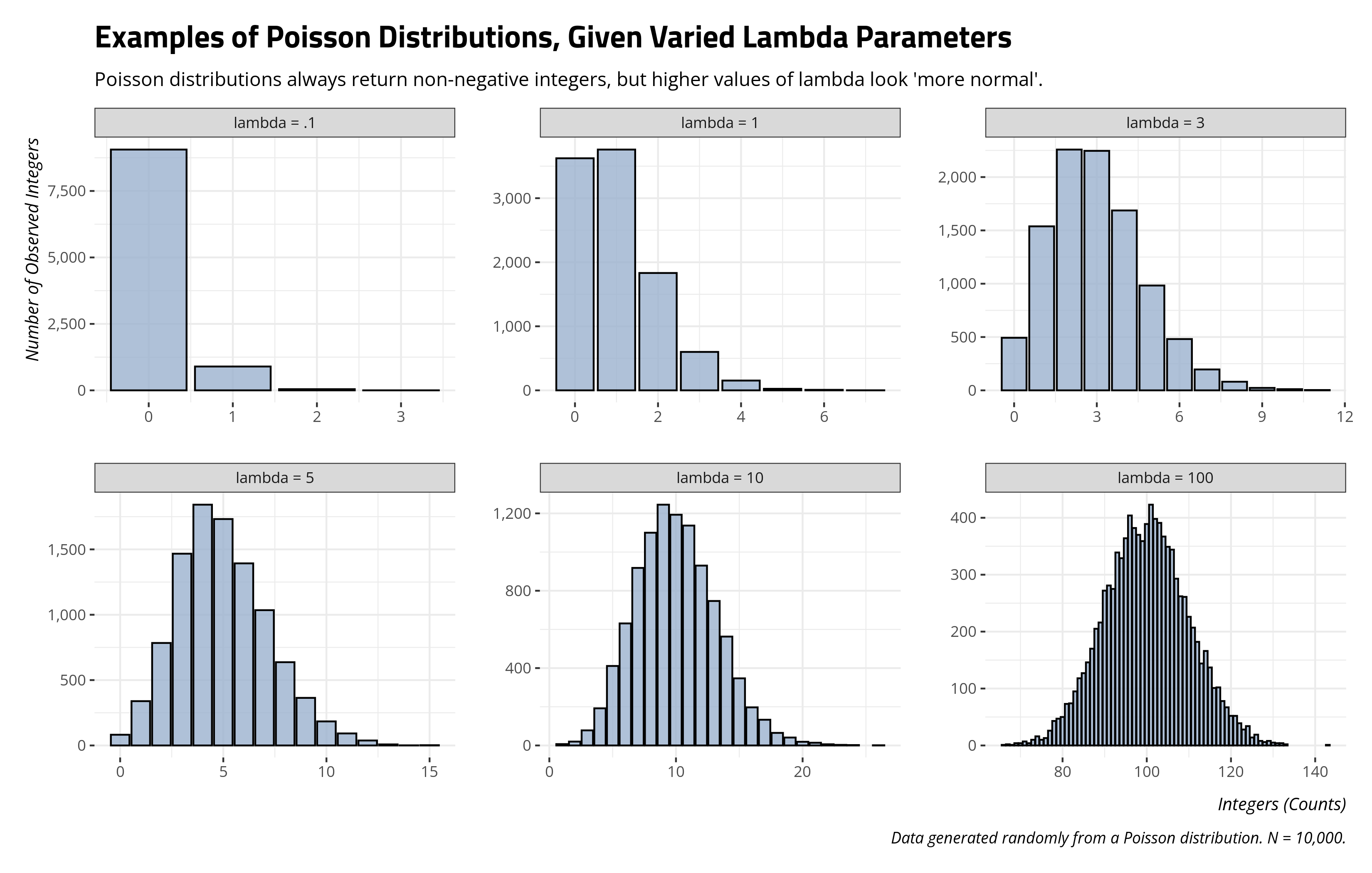
\(\lambda\) in this formulation is a kind of “intensity” parameter determining the number of events that occur and its baseline rate of occurrence. However, we don’t have access to this parameter directly and can only model it based on the count of events it produces. This is what the Poisson regression is trying to accomplish: modeling the intensity parameter that produces the count of events. Because counts are hard-bound at the left by 0, \(\lambda\) can only be positive. To ensure that \(\lambda\) is positive in the regression form, we typically represent it as \(\lambda = exp(X\beta)\). If you want to “undo” that exponential term on the right-hand side of the equation, you’d take a natural logarithmic transformation of it. However, that makes \(\lambda\) to be a log-transformed expected value that is at linear in its regression form.
A Simple Example with Fake Data
You can simulate fake data to underscore the intuition as to what the Poisson regression model is doing here. Example is a simple data set we’re going to create where there is just one independent variable (x, a binary variable). \(\lambda\), the “intensity” parameter, is simulated as exp(1 + .5x) and the outcome y is going to be a simulated count of events that this \(\lambda\) would produce. The data would look like this.
tibble(x = sample(c(0:1), 100, replace=TRUE),
       lambda = exp(1 + .5*x),
       y = rpois(100, lambda)) -> Example

Example
#> # A tibble: 100 × 3
#>        x lambda     y
#>    <int>  <dbl> <int>
#>  1     1   4.48     5
#>  2     0   2.72    11
#>  3     1   4.48     2
#>  4     0   2.72     4
#>  5     1   4.48     4
#>  6     0   2.72     1
#>  7     0   2.72     1
#>  8     0   2.72     4
#>  9     0   2.72     6
#> 10     1   4.48    10
#> # ℹ 90 more rows
Example %>% count(y)
#> # A tibble: 12 × 2
#>        y     n
#>    <int> <int>
#>  1     0     2
#>  2     1    15
#>  3     2    11
#>  4     3    19
#>  5     4    17
#>  6     5    17
#>  7     6     7
#>  8     7     6
#>  9     8     2
#> 10     9     2
#> 11    10     1
#> 12    11     1
You could faithfully capture this data-generating process with the glm() function in R. You might be accustomed to this function for the case of simpler binary logistic regressions, but it’s a simple matter of changing one argument in the function (the family argument).
M1 <- glm(y ~ x, Example,
          family = poisson())
summary(M1)
#>
#> Call:
#> glm(formula = y ~ x, family = poisson(), data = Example)
#>
#> Deviance Residuals:
#>     Min       1Q   Median       3Q      Max
#> -3.1127  -0.9020  -0.0313   0.5161   3.5067
#>
#> Coefficients:
#>             Estimate Std. Error z value Pr(>|z|)
#> (Intercept)  1.11663    0.07715  14.473  < 2e-16 ***
#> x            0.46120    0.10266   4.492 7.04e-06 ***
#> ---
#> Signif. codes:  0 '***' 0.001 '**' 0.01 '*' 0.05 '.' 0.1 ' ' 1
#>
#> (Dispersion parameter for poisson family taken to be 1)
#>
#>     Null deviance: 133.58  on 99  degrees of freedom
#> Residual deviance: 113.17  on 98  degrees of freedom
#> AIC: 420.29
#>
#> Number of Fisher Scoring iterations: 5
Let’s walk through what this output is telling us, beyond the obvious matter of whether the coefficient for x is significantly different than 0. First, let’s take a look at this summary of the data set we created. Briefly, this code is creating the mean of y by x, which is convenient and easy here because x is binary. After calculating the mean of y, we’ll take a log-transformation of it, get differences of the log transformations, and create a kind of percentage change of them by taking the difference of the means, divided over the mean of counts where x is 0. Hopefully you can spot some things that look familiar.
Example %>%
  summarize(mean_y = mean(y),
            log_my = log(mean_y),
            .by = x) %>%
  arrange(x) %>%
  mutate(d_log_my = log_my - lag(log_my),
         irr = ifelse(row_number() == 1,
                      ((lead(mean_y)-mean_y)/mean_y)+1,
                      exp(d_log_my)),
         pc = irr*mean_y[1]) %>%
  data.frame
#>   x   mean_y   log_my  d_log_my      irr       pc
#> 1 0 3.054545 1.116631        NA 1.585979 4.844444
#> 2 1 4.844444 1.577833 0.4612018 1.585979 4.844444
See the y-intercept in the regression equation? It’s the log-transformed mean of events when all right-hand side variables are 0. There is only one right-hand side variable here (x), and it’s helpfully binary for ease of illustration. Thus, the mean of y when x is 0 doubles as our (exponentiated) y-intercept. The mean of y is 3.054 and its natural logarithm is 1.116 (i.e. the y-intercept in the Poisson model).
See the difference in the logged means? That’s the regression coefficient for x in this context. It’s the difference in logged mean of events for a one-unit increase in x. Because x in this simple example is binary, and it’s the only x in the model, the quantity returned in this transformation is straightforward. There is nothing else to look at, so the regression coefficient from the Poisson model is also easily derived from a difference of logged means of y for the two values of x.
Notice the irr variable? Here is where things start to wiggle a little bit in the Poisson model. My code here is a little clumsy, but it’s pointing to two paths toward the same value. In the second row, it’s simply exponentiating the difference in logged means (which doubles as our Poisson regression coefficient). In the first row, it’s more literally telling you what this means in this simple model (and what it effectively means in a more general case). The exponentiated Poisson regression coefficient is equal to the first difference in the mean of y, divided over the mean of y when x (in this simple case) is 0. Where the effect is positive, add 1 to it. Where the effect is negative, subtract it from 1. You may sometimes see as something called an “incidence rate ratio”. All else equal, you can use this as a multiplicative factor roughly communicating the percent change in the response for a unit change in x.
Finally, notice the pc variable? This is taking the incidence rate ratio and multiplying it by the baseline mean of y (i.e. when x is 0). Again, this is the multiplicative factor that produces the change in the mean value of y for a unit change in x. In our simple case, the mean of y when x is 0 is 3.054. Multiply that by the incidence rate ratio in our simple model and you get the mean of y when x is 1. That’s about 4.844. Alternatively, the effect of x going from 0 to 1 is to increase the mean of expected counts by about 58.59%.
An Actual Example: Anti-Government Riots and the “Youth Bulge”
The example above is a simple toy example to get you acclimated to the Poisson model. Now, it’s owl-drawing time. Preparing for this class I’m teaching right now reminded me of the Cross-National Time Series (CNTS) Database, which I know fairly well for its data on domestic conflict events. I’ve used them before for stuff in my younger days. Every year for which it is available, for all territorial units it covers, CNTS records the number of assassinations, general strikes, incidences of guerrilla warfare, government crises, purges, riots, revolutions, and anti-government demonstrations. I select the data here to 2012 as part of the DCE12 that is forthcoming in {stevedata}. For 2012, they look something like this.
DCE12 %>%
  select(assassinations:agd) %>%
  gather(var, val) %>%
  ggplot(.,aes(as.factor(val))) +
  geom_bar() +
  facet_wrap(~var, scales='free')
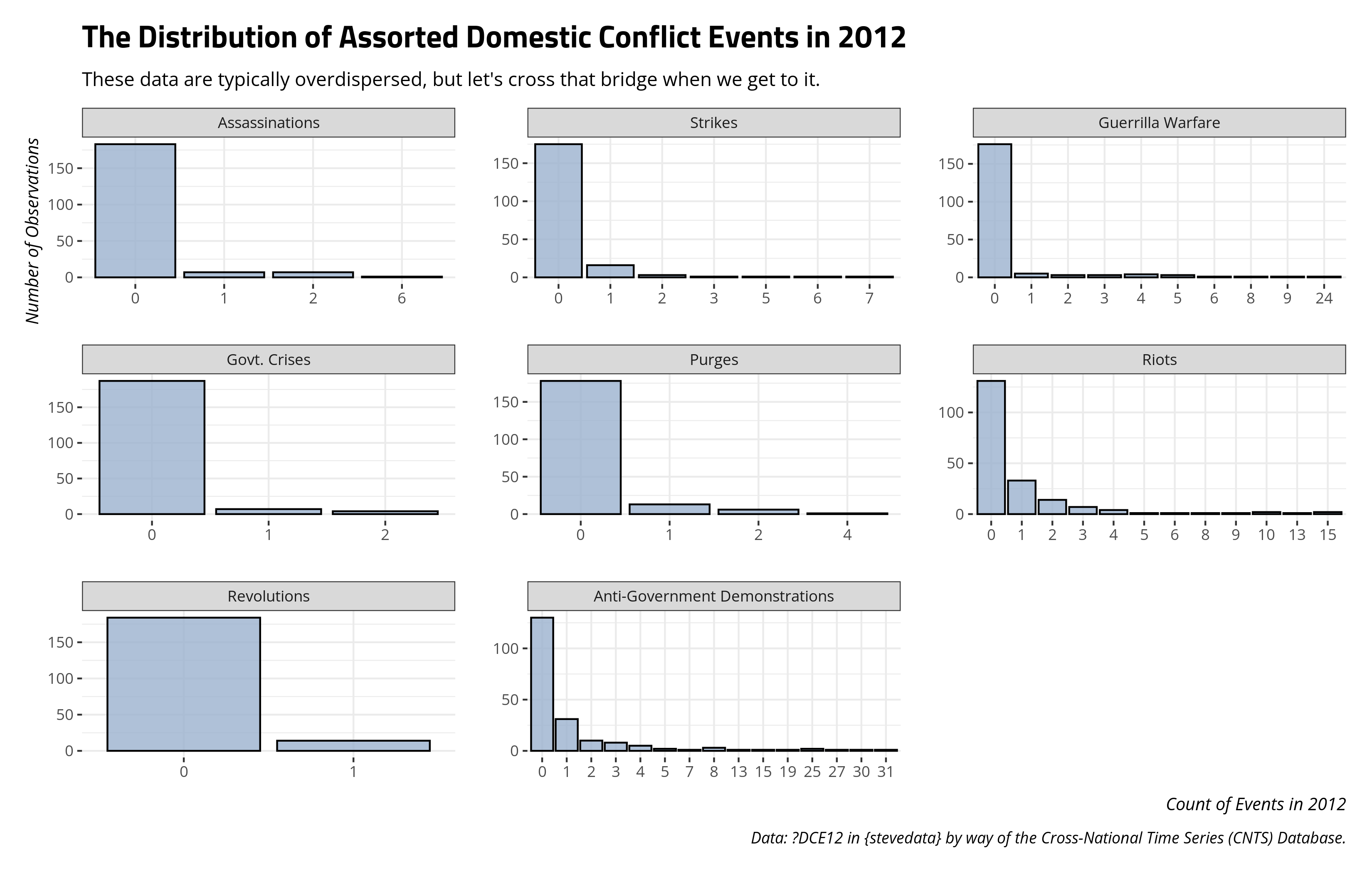
They look like the kind of count data you’d teach around, minus some polite concerns about overdispersion I’ll deal with later. It’s why I’m using them here.
Let’s evaluate an argument I came across preparing for this class. What explains the incidence of anti-government demonstrations and riots? Let’s treat, for now, anti-government demonstrations as strictly peaceful and riots as strictly focused toward the government in this application. Sawyer et al. (2022) propose a theoretical model that emphasizes the importance of the “youth bulge” and urbanization as important correlates of both peaceful demonstrations against the government (anti-government demonstrations) and violent demonstrations against the government (riots). Their model of choice is a two-way fixed effects—which, groan—panel model with the particular GLM link being the negative binomial. I’m going to explore this in a simple cross-sectional case because the goal is just about unpacking the Poisson model and not about questioning whether their findings are robust or not.
Let’s prepare DCE12 for analysis in light of the information that Sawyer et al. (2022) also included in their model. I’m going to focus on just the riots variable here to minimize an issue I know I’ll have to deal with anyway (i.e. overdispersion). I’m going to model the youth bulge as they do, which is the proportion of the population aged 15-29 over the total adult population. I’m going to multiply that by 100 to convert a proportion to a percentage. It’s immaterial for inference but useful for coefficient legibility. Otherwise, this becomes a min/max effect of going from a country where there are no youths at all to a country where every adult is 15-29 years old. I’m going to include a variable that is the percentage of the population of the territorial unit living in urban areas. Another variable of interest here is the percentage of tertiary school-aged population enrolled in tertiary school, which comes by way of Barro and Lee (2015). I might intermittently call this a “university enrollment rate” because that’s what it’s basically measuring, in as many words, and to the best of its ability. One assumes: more university-aged people in university, the more riots (a la the classic stories we tell about the United States during the Vietnam War). Other variables: Varieties of Democracy’s electoral democracy index (“polyarchy”), and the natural logarithmic transformations of total population size and GDP per capita. I’m going to subset the data to just complete cases to make this easier for me.
DCE12 %>%
  mutate(youth_bulge = (youthpop/adultpop)*100) %>%
  select(iso2c, country, riots,
         youth_bulge, gdppc, urbanshare, polyarchy,
         perctser, tpop) %>% na.omit %>%
  log_at(c("gdppc", "tpop")) -> Data

# Simple lookie-loo.
Data %>%
  select(-iso2c, -country, -tpop, -gdppc) %>%
  summary()
#>      riots         youth_bulge      urbanshare       polyarchy
#>  Min.   : 0.000   Min.   :17.47   Min.   : 15.67   Min.   :0.0940
#>  1st Qu.: 0.000   1st Qu.:25.37   1st Qu.: 43.15   1st Qu.:0.4163
#>  Median : 0.000   Median :37.31   Median : 60.97   Median :0.6205
#>  Mean   : 1.462   Mean   :36.10   Mean   : 59.39   Mean   :0.6034
#>  3rd Qu.: 2.000   3rd Qu.:46.17   3rd Qu.: 77.87   3rd Qu.:0.8592
#>  Max.   :15.000   Max.   :56.11   Max.   :100.00   Max.   :0.9230
#>     perctser        ln_gdppc         ln_tpop
#>  Min.   : 1.00   Min.   : 6.007   Min.   : 5.619
#>  1st Qu.:11.77   1st Qu.: 7.337   1st Qu.: 8.724
#>  Median :35.54   Median : 8.601   Median : 9.606
#>  Mean   :38.41   Mean   : 8.653   Mean   : 9.622
#>  3rd Qu.:62.69   3rd Qu.: 9.839   3rd Qu.:10.608
#>  Max.   :95.08   Max.   :11.564   Max.   :14.112
Now, let’s run a simple Poisson regression model. The code snippet below returns the pertinent information, though I’m going to quietly format this into a handsome regression table with {modelsummary}.
summary(M2 <- glm(riots  ~ youth_bulge + urbanshare +
            perctser + polyarchy +
            ln_tpop +
            ln_gdppc, Data, family='poisson'))
| Poisson | Poisson (IRR) | |
|---|---|---|
| Youth Bulge | 0.004 | 1.004 |
| (0.017) | (0.017) | |
| % Urban | −0.007 | 0.993 |
| (0.008) | (0.008) | |
| Rate of Students in Tertiary School | 0.018** | 1.018** |
| (0.006) | (0.006) | |
| Electoral Democracy Index (Polyarchy) | −0.774* | 0.461* |
| (0.340) | (0.157) | |
| Total Population (Logged) | 0.608*** | 1.836*** |
| (0.054) | (0.098) | |
| GDP per Capita (Logged) | −0.054 | 0.947 |
| (0.167) | (0.158) | |
| Intercept | −5.482** | 0.004** |
| (1.776) | (0.007) | |
| Num.Obs. | 106 | 106 |
| + p < 0.1, * p < 0.05, ** p < 0.01, *** p < 0.001 |
Okay, let’s walk through what this model is telling you, with respect to the inputs. First, I try to caution students to be kind to your intercept, but I was not here. Thus, my formal interpretation of the y-intercept is that the expected, log-transformed mean of counts for a given observation where there is no youth population whatsoever, no one lives in an urban area, no one of university age is enrolled in university, the country is a maximum non-democracy, the logged population size is 0 (i.e. the territorial unit has just 1,000 people because the variable is in the 1000s), and the average GDP per capita is 0, comes out to -5.482. Exponentiating that suggests the mean of events for that hypothetical hellscape is .004 or so. Hey, you asked for it, and we can always fix it in post. Had you centered your variables, you could’ve returned something usable here.
“Significance” is done as usual. In this simple model, we don’t see any “youth bulge” effect, nor do we see a discernible effect of the percentage of the population living in urban areas. The GDP per capita variable also has no noticeable effect on the expected count of riots in 2012. We do, however, see significant effects of the tertiary school rate variable, the democracy variable, and the population size variable.
But, let’s talk how you should interpret the outputs for the stuff that is significant. The rate of students in tertiary school (i.e. university) is positive and significant. All else equal, a unit increase in this variable (e.g. going from 50% of the tertiary school-aged population enrolled in tertiary school to 51%) increases the expected log counts of riots by .018. This effect is “statistically significant” and thus unlikely to be 0. Should you exponentiate that regression coefficient, you get back the incidence rate ratio. Multiply the incidence rate of ratio by some mean of expected counts and you get an adjusted mean of counts following a unit increase in the tertiary school (university) enrollment rate variable here. For example, the mean of y in the data is 1.462. Multiply that number by the incidence rate ratio and you get 1.488, which is the new expected mean count of events following a unit-increase in this tertiary school (university) enrollment rate variable. That multiplicative effect following a unit increase would follow across the data, all else equal. Just be mindful that because it “looks small” belies the large scale here. You shouldn’t be making that mistake anyway.
The democracy variable is negative and statistically significant, suggesting that more democratic states are less likely to have violent riots. What’s unique about this variable is that the unit change of 0 to 1 is also a min/max effect. It’s the hypothetical effect of going from, say, a hyper North Korea to a Sweden on steroids (or something hyperbolic to that effect). That effect is to decrease the logged counts of riots by -.774. The incidence rate ratio is .461. If, for example, the rate of riots is 1.462, then the adjusted rate in light of this min/max effect is now about .674 (i.e. \(1.462*exp(-.774) = .674\)). Because this effect is negative, you can approximate this by taking 1 - the incidence rate ratio, and multiply that by 100, to get the percentage change. In other words, \((1.462 - .674)/1.462 = .538\). That, multiplied by 100, approximates 1 - the incidence rate ratio, also multiplied by 100.
Let’s round home by looking at the total population variable. This variable is itself logged, so I’m going to be careful here. A unit change on the log scale of the total population variable (i.e. multiplying it by Leonhard Euler’s constant) coincides with an estimated change in the logged number of riots by .608. Exponentiated as an incidence rate ratio, this is 1.836. So, let’s walk it back and do it again. If our expected mean rate of riots was 1.462, we’d multiply that by 1.836 to get a new expected mean rate of riots following a unit increase in logged population size (which, again, think proportionally here). That comes out to 2.684. That percentage change would be about 83.6%, which is also what the incidence rate ratio is basically telling you.
Getting Quantities of Interest from the Poisson Model
You’d be forgiven for not having a lot of fun with interpreting the Poisson model on its own terms, so let’s have some fun with it. We see that the tertiary school rate variable is significant and positive, suggesting at least something in spirit of the Sawyer et al. (2022) argument and my crude gesturing toward the violent, student-led riots in the United States against the Vietnam War (see also my more thorough analysis of this from the terrorism perspective). We also saw some interesting variation in these data from the summary output above. The 25th percentile is 11.77% (about where Lesotho is) and the 75th percentile is 62.69% (about where the United Kingdom or Uruguay are). What is the expected number of riots for the 25th percentile and the 75th percentile, holding everything else at some fixed value, given the partial effects communicated in the model? Do note this simple exercise is going to ignore estimation uncertainty—topic for another time and place, if I ever had the goddamn time—though we can do this quickly with the predict() function alongside assistance from the wonderful {modelr} package.
First, let’s create a hypothetical prediction grid, holding everything else at the median, and allowing the tertiary school enrollment rate variable to assume the 25th and 75th percentile.
Data %>%
  data_grid(.model = M2,
            perctser = c(
              quantile(perctser, .25),
              quantile(perctser, .75)
            )) -> newdat


newdat # let's take a look at our grid
#> # A tibble: 2 × 6
#>   perctser youth_bulge urbanshare polyarchy ln_tpop ln_gdppc
#>      <dbl>       <dbl>      <dbl>     <dbl>   <dbl>    <dbl>
#> 1     11.8        37.3       61.0     0.620    9.61     8.60
#> 2     62.7        37.3       61.0     0.620    9.61     8.60
Now, let’s use the predict() function to estimate the mean of expected counts, given the model input. Remember from our treatment above: this is the model’s estimate of \(\lambda\).
newdat %>%
  mutate(pred = predict(M2,
                        newdata=newdat, type='response')) -> Pred

Pred %>% pull(pred) -> lambdas

lambdas
#>         1         2
#> 0.5189463 1.2877346
Here, the estimated \(\lambda\) for the 25th percentile (fixing everything else at the median) is .518. The estimated \(\lambda\) for the 75th percentile is 1.287. If you had an eagle eye, you could potentially see that the difference between the 75th and 25th percentile (i.e. about 50.92) is being multiplied by the coefficient for this variable (i.e .018). That product is then exponentiated and multiplied by the \(\lambda\) of the 25th percentile to produce the \(\lambda\) of the 75th percentile. In other words:
lambdas[1]*exp(coef(M2)[4]*as.vector(diff(newdat$perctser)))
#>        1
#> 1.287735
I’m not asking you to enjoy looking at that, just to understood generally what’s happening. tl;dr. have the computer do it for you, but this is what it’s doing.
Okie doke, let’s now create a tibble of a hypothetical prediction grid, leveraging what we’ve done so far and what I kind of know about Poisson distributions can generate given the \(\lambda\)s I got. We’re going to use dpois() to calculate the probability of observing 0, 1, 2, 3, 4, or 5 riots in a given year (2012) with the \(\lambda\)s we got. Code, suppressed for presentation, will make a pretty plot.
tibble(x = 0:5,
       p_25 = dpois(x, lambdas[1]),
       p_75 = dpois(x,lambdas[2]))
#> # A tibble: 6 × 3
#>       x     p_25    p_75
#>   <int>    <dbl>   <dbl>
#> 1     0 0.595    0.276
#> 2     1 0.309    0.355
#> 3     2 0.0801   0.229
#> 4     3 0.0139   0.0982
#> 5     4 0.00180  0.0316
#> 6     5 0.000187 0.00814
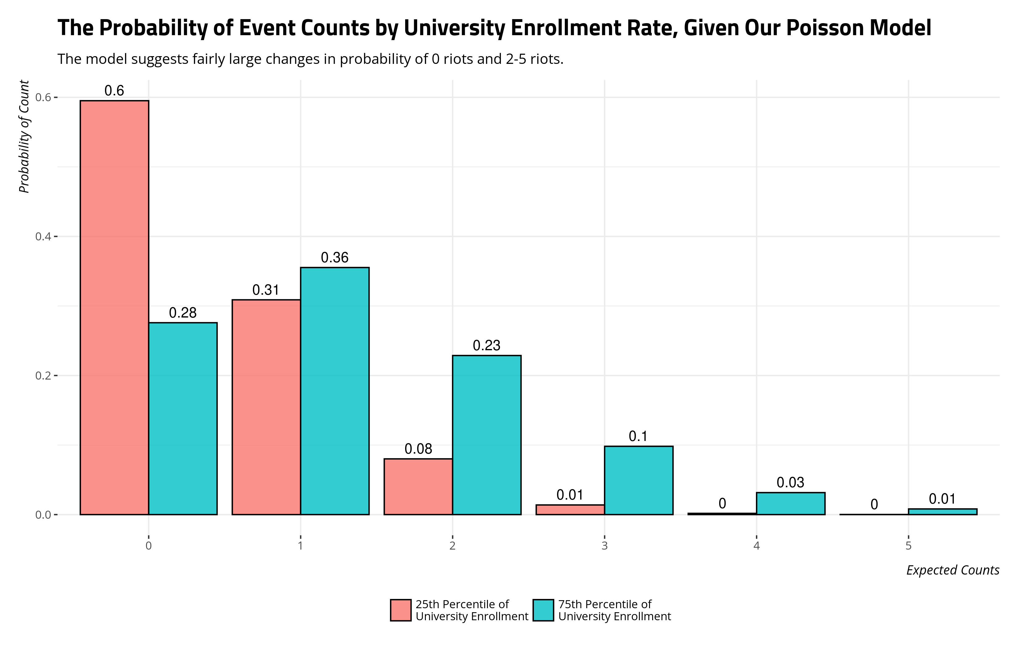
The Poisson regression coefficient communicates the estimated change in logged mean counts for a unit change in the independent variable. The incidence rate ratio exponentiates that to return a multiplicative effect for a unit change with respect to some baseline mean rate. You can also extract the percentage change from the mean rate with that information as well. You can always see what the effect “looks like” with respect to the probability of some count. But in this case, the change from the 25th percentile to the 75th percentile decreases the probability of no riots from .595 to .276, a change in probability of .319 and a percentage change in probability of 53.6%. The change in probability of one riot doesn’t change much, but change in probability of two riots changes considerably. The probability of two riots for the 25th percentile is .08. For the 75th percentile, it’s .229. That is a change in probability of .149, and a percentage change in probability of about 186%. All told, the probability of more than one riot changes from about .096 to .369, a percentage change in probability of about 284%. That’s perhaps pertinent information for you to know in your research (if you had this exact topic), and again subject to faithfully modeling uncertainty.
The Problem of Overdispersion
Beyond all the other things you should think about in your model (e.g. independence of observations, strict exogeneity), the Poisson model has one major assumption that you should check. In the Poisson case, there is just the one parameter (\(\lambda\)) that is both the mean and the variance. The assumption here is typically called “equidispersion”, and it might be easier to spot potential issues by looking at clear instances of over- or underdispersion. Overdispersed data have large tails, kind of like the anti-government demonstration variable. Underdispersed data are far skinnier than they should be. In the Poisson distribution examples above, imagine the case where \(\lambda\) was 100 but the minimums and maximums were between 90 and 110 to be an instance of underdispersion. In this case, the variance is smaller than the mean. In the case where \(\lambda\) was 3, imagine seeing a tail that included 15-25. In that case, the variance is greater than the mean.
If I’m being honest, I started exploring this model in greater detail because I’m having to teach an around an econometrics textbook and I found it kind of fascinating that this appears to be the one boilerplate GLM that econometricians seem to really love. It’s the same people for whom you’ll grimace your way through a discussion of the “linear probability model” but the Poisson gets an honest treatment and a vigorous defense. Jeff Wooldridge really loves it, even if it comes with this (on paper) really rigid assumption about equidispersion. It comes with a juxtaposition to the more general negative binomial model (among a few others that I really don’t want to get into at the moment). The negative binomial model has a different variance parameter than its mean parameter, and another way of thinking about it is that the Poisson distribution is a special case of the negative binomial distribution where the dispersion parameter goes to 0. Without saying too much about it, you can think of the negative binomial distribution as a hook-up between a Gamma distribution and a Poisson distribution at a house party. It’s a go-to—but not the only option—for dealing with count data that don’t neatly conform to a Poisson distribution.
There is an overdispersion test (in the {AER} package) that you can do, but honestly, just estimate the negative binomial model anyway and compare it to the Poisson. Extract the log-likelihood of the negative binomial and subtract from it the log-likelihood of the Poisson model. You can calculate a likelihood ratio test statistic as equal to twice the absolute difference in log-likelihoods. Cross-referenced to a \(\chi\)-squared distribution with a degree of freedom (i.e. because of the addition of the dispersion parameter, \(\theta\), in the negative binomial model), it can tell you if the negative binomial model is fitting the data as well as the Poisson or better. If it’s fitting the data better, it’s strongly implied it’s because of the dispersion parameter. It is, after all, the major difference between the negative binomial model and the Poisson model.
lrtest() in {lmtest} will do all this for you.
M3 <- MASS::glm.nb(riots  ~ youth_bulge + urbanshare + perctser + polyarchy +
            ln_tpop +
            ln_gdppc, Data)

lrtest(M3, M2)
#> Likelihood ratio test
#>
#> Model 1: riots ~ youth_bulge + urbanshare + perctser + polyarchy + ln_tpop +
#>     ln_gdppc
#> Model 2: riots ~ youth_bulge + urbanshare + perctser + polyarchy + ln_tpop +
#>     ln_gdppc
#>   #Df  LogLik Df  Chisq Pr(>Chisq)
#> 1   8 -144.62
#> 2   7 -162.19 -1 35.158   3.04e-09 ***
#> ---
#> Signif. codes:  0 '***' 0.001 '**' 0.01 '*' 0.05 '.' 0.1 ' ' 1
What you do with this is up to you. The econometricians who love the Poisson model will tell you—and they have a point—that this concerns the variance and not the mean, per se. Saying you can’t use the Poisson model because of the variance is analogous to saying you can’t use the linear model and the OLS estimator because of heteroskedasticity. Since the assumption is conditional and not marginal, eye-balling the distribution of the raw dependent variable can only suggest it for you (and not prove it to you). So, you can slap on a standard error correction based on dicking around the variance-covariance matrix to make the standard errors “robust”. Something like this would do.
coeftest(M2, vcov=sandwich)
{modelsummary} can do this for you automatically underneath the hood. For what it’s worth, I lose track of all these assorted on-the-fly standard error corrections pretty quickly so you should explore your options here. I’m also of the mentality that if it can be bootstrapped, it should be bootstrapped. But, again, topic for another day.
| Poisson | Poisson (IRR) | Neg. Bin. | Poisson (Robust) | |
|---|---|---|---|---|
| Youth Bulge | 0.004 | 1.004 | −0.006 | 0.004 |
| (0.017) | (0.017) | (0.029) | (0.024) | |
| % Urban | −0.007 | 0.993 | 0.008 | −0.007 |
| (0.008) | (0.008) | (0.012) | (0.011) | |
| Rate of Students in Tertiary School | 0.018** | 1.018** | 0.019+ | 0.018+ |
| (0.006) | (0.006) | (0.011) | (0.010) | |
| Electoral Democracy Index (Polyarchy) | −0.774* | 0.461* | −1.418* | −0.774 |
| (0.340) | (0.157) | (0.690) | (0.549) | |
| Total Population (Logged) | 0.608*** | 1.836*** | 0.631*** | 0.608*** |
| (0.054) | (0.098) | (0.100) | (0.069) | |
| GDP per Capita (Logged) | −0.054 | 0.947 | −0.207 | −0.054 |
| (0.167) | (0.158) | (0.271) | (0.257) | |
| Intercept | −5.482** | 0.004** | −4.585 | −5.482+ |
| (1.776) | (0.007) | (2.951) | (2.799) | |
| Num.Obs. | 106 | 106 | 106 | 106 |
| + p < 0.1, * p < 0.05, ** p < 0.01, *** p < 0.001 |
What you do with the differences in significance is your call. In the case of the democracy variable, I already know it’s because that should be a square term (c.f. “more violence in the middle”).
Conclusion
This post is not exhaustive of all count models, and God help me if I had to think about this and prior distributions in the Bayesian context. There are really nifty things you can do with hurdle models, in particular. However, there’s real value in starting with the Poisson given its relative simplicity. Just understand that that Poisson model is conceptualizing an “intensity” parameter (\(\lambda\)) that is generating the events in a given fixed time/space and the quantities returned by the Poisson model are logged estimates of \(\lambda\) and what accounts for unit changes in it. You can exponentiate the coefficients as incidence rate ratios, which also communicate percentage changes in the mean of the events. It’s easier to see what this does in simple cases. In more general cases, you want quantities of interest that correspond with the output of the Poisson model. Toward that end, get the most out of your regression before and after the regression itself. You should be doing that anyway.
-
This is one of the largest culture shocks if you move to Swedish higher ed from the United States. You don’t get a break unless you get bought out by external money. As a new hire, I don’t have that yet, and the Swedes work all the way through Christmas. ↩
Disqus is great for comments/feedback but I had no idea it came with these gaudy ads.