How to Make the Most of Regression: Standardization and Post-Estimation Simulation

- Demonstrators hold up a piñata of Republican Presidential candidate Donald Trump during a protest on October 12, 2015 in Chicago, Illinois. (GETTY IMAGES)
Reading quantitative articles from 20-30 years is a treat because it highlights how little was required of authors conducting and reporting statistical analyses. There are exceptions, of course; Dixon’s (1994) article linking democratic peace with peaceful conflict resolution is an exemplar on this front and others for someone versed in IR scholarship. However, it used to be enough to run a garden variety linear model (or generalized linear model, if you were feeling fancy), interpret the statistical significance of the results as they pertained to a pet hypothesis of interest, and call it a day.
This is no longer minimally adequate. King et al. (2000) come to mind as pushing the discipline to the fore of what I learned as the “quantities of interest” movement in quantitative political science. The argument here is straightforward, even if a lot of what follows here is my language as I internalized what King et al. (2000) were trying to do. Regression modeling is also storytelling. Traditionally, null hypothesis significance testing is the protagonist of this “story” but that story by itself is both 1) kinda boring and 2) only a part of what the audience wants to hear. “Significance”, as we hopefully all know by now, is better understood as “discernibility” of a parameter from some counterclaim (traditionally zero, or “null effect”). It says nothing of the scope of the effect or its magnitude. It says little of what the effect “looks like.”
Fortunately, this has become much easier over time. King’s group at Harvard made sure to roll out software to assist researchers in getting quantities of interest from the model. This was Clarify for Stata users or Zelig for R users. Not long after King and company’s AJPS article, Gelman and Hill (2007) were also arguing that you should do this while providing another software package {arm}. In the background, Bayesians have been waving their hands wildly about posterior distributions and simulation for model summaries for decades.
Much of what I do in light of these works lean more toward Gelman’s techniques. Gelman’s techniques don’t require a full application suite like Zelig. Once you understand what’s happening, it becomes a lot easier to play with the underlying code to serve your own ends. This post will be lengthy, much like my other recent posts. Here are the R packages I’ll call into this post, though I will only note you should also install the {arm} package even as I won’t directly call it.1
library(tidyverse) # for everything
library(stevemisc) # for get_sims() and r2sd()
library(stevedata) # for the TV16 data
library(lme4) # for mixed effects models
library(stargazer) # for HTML regression tables
library(modelr) # for data_grid
library(knitr) # for tables
library(kableExtra) # for pretty tables
Here’s a table of contents as well.
- The Data and the Model(s)
- The Problem of Coefficient Comparison and the Constant
- A Quick Solution: Scale Inputs by Two Standard Deviations
- Post-Estimation Simulation: Getting “Quantities of Interest”
The Data and the Model(s)
The data for this exercise will greatly resemble this 2017 post of mine. Herein, I took the 2016 Cooperative Congressional Election Study (CCES) data and modeled the individual-level Trump vote. I recreated this analysis for my grad-level methods class and saved the data in {stevedata} as the TV16 (Trump vote, 2016) data. The data frame has 64,600 rows and 22 columns.
Let’s do something simple for this exercise. We’ll subset the data to just the white respondents in Indiana, Michigan, Ohio, Pennsylvania, and Wisconsin. These are five conspicuous states in the Midwest that Barack Obama won in 2008 but Donald Trump won in 2016. We’ll estimate two generalized linear models from this subset of the data. The first is a pooled logistic regression modeling the trumpvote as a function of the respondent’s age, gender, whether the respondent has a college diploma, household income, partisanship (D to R on a seven-point scale), ideology (L to C on a five-point scale), whether the respondent says s/he is a born-again Christian, and two latent estimates of the respondent’s racism. I explain these in the 2017 post as new estimates of “cognitive” racism (i.e. a respondents’ awareness of racism, or lack thereof) and the respondent’s “empathetic” racism (i.e. sympathy [or lack thereof] for the experiences of racial minorities). We owe this conceptualization to work from Christopher D. DeSante and Candis W. Smith.
I’ll start with the simple logistic regression first because I already know the first model improvement trick will improve the estimation of the mixed effects model later.
TV16 %>%
  filter(racef == "White") %>%
  filter(state %in% c("Indiana","Ohio","Pennsylvania","Wisconsin","Michigan")) -> Data

M1 <- glm(votetrump ~ age + female + collegeed + famincr +
            pid7na + ideo + bornagain + lcograc + lemprac,
          data = Data, family=binomial(link="logit"), na.action=na.exclude)
The Problem of Coefficient Comparison and the Constant
Here is a simple summary of that result by way of the {stargazer} package. This is the kind of regression table a novice researcher would create and present to the reader of a manuscript.
| Dependent variable: | |
| Did Respondent Vote for Donald Trump? | |
| Age | 0.017*** |
| (0.003) | |
| Female | 0.097 |
| (0.091) | |
| College Educated | -0.693*** |
| (0.105) | |
| Household Income | -0.013 |
| (0.016) | |
| Partisanship (D to R) | 0.749*** |
| (0.027) | |
| Ideology (L to C) | 0.643*** |
| (0.062) | |
| Born-Again Christian | 0.342*** |
| (0.104) | |
| Cognitive Racism | 1.172*** |
| (0.075) | |
| Empathetic Racism | 0.705*** |
| (0.098) | |
| Constant | -6.027*** |
| (0.277) | |
| Observations | 5,803 |
| Note: | *p<0.1; **p<0.05; ***p<0.01 |
| Sample: white respondents in the CCES (2016) residing in IN, MI, OH, PA, and WI. | |
The takeaways here aren’t terribly novel or surprising. Everything is in the expected direction and most everything is significant. The only null effects are for whether the respondent is a woman and the household income variable. Informally, we don’t observe a statistically discernible difference between white men and white women in these five Midwestern states in their proclivity to have voted for Donald Trump, all else equal. Likewise, we see no discernible effect of increasing income as well. Generally speaking, and hewing the language to the covariates in the model: older white people were more likely than younger white people to say they voted for Donald Trump in these five Midwestern states. Those without a college diploma were more likely to vote for him than those with a college diploma. Those whose self-reported ideology is closer to conservative than liberal were more likely to have voted for him (duh) as were those whose political affinities gravitate toward the GOP relative to the Democratic party (again, duh). Being a born-again Christian raises the natural logged odds of voting for Donald Trump by .342 (also, duh). Increasing levels of cognitive racism and empathetic racism also raise the natural logged odds of a respondent saying they voted for Donald Trump.
Nothing here is terribly surprising or novel in this model, yet the summary of the model has two unsatisfactory components. First, the constant is an important component of the model but right now it’s a useless parameter. Recall: the “constant” or “\(y\)-intercept” is not a coefficient, per se. It is only an estimate of \(y\) (to be clear: the natural logged odds of voting for Donald Trump in this sample) when all other parameters in the model are zero. In this context, assume the following person in the sample. This person is a zero-years-old(!) male without a college diploma. He has a household income of 0 on a 1 to 12 scale(!). Politically, he has an ideology of 0 on a 1 to 5 scale(!) and a partisanship of 0 on a 1 to 7 scale(!). He’s not a born-again Christian and his attitudes on racism are set to 0 (which is the middle of the distribution). The natural logged odds of that person voting for Donald Trump is -6.026, which amounts to a predicted probability of .002.
This person clearly cannot exist. No one is zero-years-old in a survey of adults. The partisanship and ideology estimates are outside the bounds of the scale. However, the model is still trying to find an estimate for this hypothetical person because the constant/\(y\)-intercept is part of the model. You can choose to suppress this parameter, either in the model or in the presentation of it. More often than not, though, it’s there and the lay reader will want to interpret it. Think of this as the regression modeler’s equivalent of Chekhov’s gun. Regression modeling is also storytelling. If you’re going to include it, you damn well better prepare yourself to explain it.
A related limitation emerges in trying to compare coefficients. The largest coefficient in the model is the cognitive racism variable, but is that truly the largest “effect?” On absolute terms, is the negative effect of college education equivalent to partisanship? The answer here should be clearly “no, of course not.” Partisanship is invariably going to be the largest effect in any model of partisan vote choice in the U.S. Racism may have played an outsized role in the 2016 presidential election, but partisanship is still going to be the biggest mover here. However, almost all variables have different scales. Age ranges from 18 to 92. The college education variable can only be 0 and 1. You can’t compare coefficients under these circumstances even as you may really want to do this.
A Quick Solution: Scale Inputs by Two Standard Deviations
Gelman and Hill (2007) (see also: Gelman (2008)) propose a novel modeling hack here. Take any non-binary input and scale it by two standard deviations instead of just one. Scaling by one standard deviation creates the familiar z-score where an individual observation is subtracted from the mean and divided by a standard unit (here: the standard deviation). This rescales the variable to have a mean of 0 and a standard deviation of 1. Dividing by two standard deviations creates a scaled variable where the mean is 0 and the standard deviation is .5. The benefits of this approach are multiple.
First, coefficients no longer communicate the effect of a raw, one-unit change in \(x\) on \(y\). Instead, the coefficients are magnitude effects. They communicate the effect of a change across approximately 47.7% of the distribution of the independent variable. Sometimes this is what you want. In other words, do you care about the change in the natural logged odds of voting for Donald Trump for going from a 20-year-old to a 21-year-old? Or the effect of going from a 33-year-old Millennial (roughly a standard deviation below the mean) to a 66-year-old Boomer (roughly a standard deviation above the mean)? For me, it’d be the latter and scaling by two standard deviations can help you get a glimpse of that from the model summary.
Second, the constant/\(y\)-intercept is now meaningful. It becomes, in this case, the natural logged odds of voting for Donald Trump for what amounts to a plausible “typical” case. In our model, this is the white respondent without a college diploma of average age, income, social/political values, and who is not a born-again Christian. This person will actually exist.
Third, not only is it the case that anything that’s scaled can be directly compared to something that also shares the scale, but this scale will approximate the unscaled binary inputs as well. For example, assume a dummy independent variable that has a 50/50 split. Gender typically looks like this even as there are a few more women than men. If the dummy variable has a 50/50 split, then \(p(dummy = 1) = .5\). Further, the standard deviation would also equal .5 because \(\sqrt{.5*.5} = \sqrt{.25} = .5\). We can compare the coefficient of this dummy variable with our new standardized continuous/ordinal input variables. We can clarify that almost no independent variable is truly 50/50, but the nature of calculating standard deviations for binary variables means this will work well in most cases except when \(p(dummy = 1)\) is really small. For example, when \(p(dummy = 1) = .25\), then the standard deviation is\(\sqrt{.25*.75} = .4330127\).
It doesn’t take much effort to calculate this. Here’s a tidy-friendly approach that leans on the r2sd() function in my {stevemisc} package along with a re-estimation of the model.
Data %>%
    mutate_at(vars("age", "famincr","pid7na","ideo","lcograc","lemprac"),
              list(z = ~r2sd(.))) %>%
    rename_at(vars(contains("_z")),
              ~paste("z", gsub("_z", "", .), sep = "_") ) -> Data

M2 <- glm(votetrump ~ z_age + female + collegeed + z_famincr +
            z_pid7na + z_ideo + bornagain + z_lcograc + z_lemprac,
          data = Data, family=binomial(link="logit"), na.action=na.exclude)
Here’s a table that directly compares the coefficients when they’re standardized to when they’re not standardized.
| Did Respondent Vote for Trump? | ||
| Unstandardized Coefficents | Standardized Coefficients | |
| (1) | (2) | |
| Age | 0.017*** | 0.552*** |
| (0.003) | (0.099) | |
| Female | 0.097 | 0.097 |
| (0.091) | (0.091) | |
| College Educated | -0.693*** | -0.693*** |
| (0.105) | (0.105) | |
| Household Income | -0.013 | -0.078 |
| (0.016) | (0.098) | |
| Partisanship (D to R) | 0.749*** | 3.191*** |
| (0.027) | (0.117) | |
| Ideology (L to C) | 0.643*** | 1.400*** |
| (0.062) | (0.135) | |
| Born-Again Christian | 0.342*** | 0.342*** |
| (0.104) | (0.104) | |
| Cognitive Racism | 1.172*** | 1.787*** |
| (0.075) | (0.114) | |
| Empathetic Racism | 0.705*** | 0.676*** |
| (0.098) | (0.094) | |
| Constant | -6.027*** | -0.230*** |
| (0.277) | (0.083) | |
| Observations | 5,803 | 5,803 |
| Note: | *p<0.1; **p<0.05; ***p<0.01 | |
| Sample: white respondents in the CCES (2016) residing in IN, MI, OH, PA, and WI. | ||
Standardizing the coefficients will offer preliminary evidence that partisanship is the largest predictor of voting for Donald Trump in this sample. The second largest effect might indeed be that cognitive racism variable, which might have a stronger effect than the respondent’s reported ideology. The constant becomes more meaningful too. This “typical white male” has an estimated natural logged odds of voting for Donald Trump of -.230. This is a predicted probability of about .442, far more plausible than the probability of .002 for the implausible person first described above.
Further, it’s worth reiterating that this form of standardization does not change the shape of the data like a logarithmic transformation would do. It only changes its summary properties you’d see on the axes of a graph of the data. Thus, the coefficient changes and the standard error changes. However, the corollary z-values and p-values don’t change from M1 to M2. Further, this standardization does not change anything that wasn’t standardized as well (see: the dummy variables). The only parameter in the model that does completely change is the \(y\)-intercept. Not only do the estimate and standard error change into something much more meaningful, but there is greater precision in the estimate as well. The z-value generally gets bigger (in absolute terms) and the p-value will decrease as well because the model has more confidence in a parameter describing an observation that is much more likely to exist. Again, that materially changes nothing from a null hypothesis significance testing standpoint when the other parameters in the model are of greater interest.
One potential drawback of this approach, especially for beginners, is that it’s easy to lose track of the original scale of the raw variables. That is why you should always rescale your variables into new variables, never overwriting the original variables.
Post-Estimation Simulation: Getting “Quantities of Interest”
The most common thing to do as a researcher is tell the audience what an effect of interest “looks like” through post-estimation simulation from the regression model’s parameters. King et al. (2000) emphasize that the way this had been done prior to that point had typically not communicated the underlying uncertainty in the regression model’s parameters. Thus, even someone like Dixon (1994), who provided predicted probabilities of peaceful conflict resolution at varying levels of democracy, previous hostilities, and alliances, did so as deterministic functions of the model output. There was no estimate of uncertainty around the predictions. Per King et al. (2000), statistical presentations should convey precise estimates of quantities of interest, with reasonable estimates of uncertainty around those estimates, spare the reader from superfluous information, and require little specialized knowledge to understand the presentation.
King et al.’s (2000) approach connects the concept of uncertainty to King, Keohane, and Verba’s (1994) discussion of systematic and stochastic components of a data-generating process. They note a statistical model has a stochastic component, conceptualized as the data-generating process for an outcome, with a systematic component represented akin to a design matrix. This seems daunting for beginners, but it’s not that hard to grasp. For example, the simple case of OLS regression has a stochastic component represented as \(Y_i = N(\mu_i, \thinspace \sigma^2)\) and a systematic component represented as \(\mu_i = X_i\beta\). For too long, researchers, the extent to which they cared about quantities of interest, ignored the estimation uncertainty (i.e. we have fewer than infinity degrees of freedom) and the fundamental uncertainty that come from trying to systematically model changes in a stochastic process. The simulation approach that King et al. (2000) offer leans on central limit theorem to argue that with a large enough sample of simulations and a bounded variance, a quantity of interest derived from a regression will follow a multivariate normal distribution.
Gelman and Hill (2007, chp. 7) make a similar case and I prefer both their method and their language. Their approach again leans on the multivariate normal distribution to offer an approach that is pseudo-Bayesian (or “informal Bayesian”, as they describe it). Subject to approximate regularity conditions and sample size, the conditional distribution of a quantity of interest, given the observed data, can be approximated with a multivariate normal distribution with parameters derived from the regression model. The pseudo-Bayesian aspect of it is there really is no prior distribution on the model parameters; prior distributions are sine qua non features of Bayesian analysis. Indeed, this approach papers over this issue of prior distributions because the dependence on prior assumptions fades through large enough posterior samples. 1,000 simulations of the model parameters are typically adequate for drawing posterior predictive samples.
You can take your pick of different software approaches but my approach is indebted to Gelman’s {arm} package. In particular, {arm} has a sim() function that runs simulations of the model parameters from a multivariate normal distribution given the model output. From there, I derived the get_sims() function in my {stevemisc} package for obtaining posterior predictive samples for a particular quantity of interest..
Let’s do a few things here. First, I’m going to re-run M2 as a mixed effects model with a random effect for state. The results are not going to substantively change at all from this; all the covariates are at the individual-level and the real differences between pooled models and a partially pooled model—like a mixed effects model—are the contextual influences (e.g. state-level unemployment rate, had I included it). Further, I waited to do this until after the standardization discussion because mixed effects models have convergence issues in the absence of naturally occurring zeroes. Finally, I wanted to show that my get_sims() function works well with both pooled models (i.e. regular ol’ linear models and generalized linear models) and the mixed effects models (for which I primarily wrote the function).
M3 <- glmer(votetrump ~ z_age + female + collegeed + z_famincr +
               z_pid7na + z_ideo + bornagain + z_lcograc + z_lemprac + (1 | state),
             data = Data, na.action=na.exclude,family=binomial(link="logit"))
Now, let’s create a hypothetical set of observations for which we wanted a quantity of interest. Here’s one: for M3, what is the likelihood of voting for Donald Trump for a typical white male who is a born-again Christian versus a typical white male who is not a born-again Christian. The data_grid() function from {modelr} will help us with this.
Data %>% # Note: I could recode the scaled stuff to be 0 but modelr will just return medians
  data_grid(.model = M3, state=0, female = 0, votetrump=0, bornagain=c(0,1)) -> newdatM3

newdatM3 %>%
        kable(., format="html", # make HTML table
        table.attr='id="stevetable"',
        caption = "A Row of Hypothetical Data",
        align=c("c"))
| state | female | votetrump | bornagain | z_age | collegeed | z_famincr | z_pid7na | z_ideo | z_lcograc | z_lemprac |
|---|---|---|---|---|---|---|---|---|---|---|
| 0 | 0 | 0 | 0 | 0.0517654 | 0 | 0.0021988 | 0.0253688 | -0.0392981 | 0.0149647 | 0.0123015 |
| 0 | 0 | 0 | 1 | 0.0517654 | 0 | 0.0021988 | 0.0253688 | -0.0392981 | 0.0149647 | 0.0123015 |
Thus, we have two types of male respondents who are identical/typical in almost every way, except one is a born-again Christian and the other is not. Note: I typically suppress the random effects in model simulations to focus on just the fixed effects, which is why I set state here to 0 (which isn’t observed). I do this for two reasons. First, no reviewer in my research experience has given me the opportunity to explore these things and they typically balk when I do. Second, there is an interesting debate on how exactly to do this even if the likely result of whatever method you choose just means more diffuse predictions. Again, I’m just showing you how to do this more generally.
From there, my get_sims() function will ask for, in order, the statistical model, the new data frame you just created, the number of simulations you want (standard recommendation is 1,000) and, optionally, a reproducible seed (that I always like to set). Do that, and you’ll get an output that looks like this.
SimsM3 <- get_sims(M3, newdatM3, 1000, 8675309)

SimsM3
#> # A tibble: 2,000 × 2
#>           y   sim
#>       <dbl> <dbl>
#>  1 -0.156       1
#>  2  0.200       1
#>  3 -0.00213     2
#>  4  0.401       2
#>  5 -0.173       3
#>  6  0.175       3
#>  7 -0.0559      4
#>  8  0.364       4
#>  9  0.00337     5
#> 10  0.324       5
#> # … with 1,990 more rows
Observe that the column y is, importantly, the natural logged odds of voting for Donald Trump. The simulations will always return quantities of interest on their original scale (here: a logit). The sim column refers to the simulation number, which is maxed at 1,000 (because we asked for 1,000 simulations). Notice that each unique value in the sim column appears twice because that’s how many rows there are in newdatM3. Stare carefully enough at it and you’ll see the first row for the first simulation is the natural logged odds of voting for Donald Trump for someone who is not a born-again Christian. The second row in the first simulation is the natural logged odds of voting for Donald Trump for someone who is a born-again Christian.
If you’d like, for the sake of knowing what exactly you’re looking at, you can do some tidy magic to make your simulation data frame more informative. While we’re at it, let’s convert those natural logged odds to probabilities.
newdatM3 %>%
  # repeat this data frame how many times we did simulations
  dplyr::slice(rep(row_number(), 1000)) %>%
  bind_cols(SimsM3, .) %>%
  # convert logit to probability
  mutate(y = plogis(y)) -> SimsM3

SimsM3 %>%
  dplyr::select(y, sim, bornagain)
#> # A tibble: 2,000 × 3
#>        y   sim bornagain
#>    <dbl> <dbl>     <dbl>
#>  1 0.461     1         0
#>  2 0.550     1         1
#>  3 0.499     2         0
#>  4 0.599     2         1
#>  5 0.457     3         0
#>  6 0.544     3         1
#>  7 0.486     4         0
#>  8 0.590     4         1
#>  9 0.501     5         0
#> 10 0.580     5         1
#> # … with 1,990 more rows
From here, you can summarize the data any way you’d like. For example, here are simulated first differences of being born-again on voting for Donald Trump among white people in these states.
SimsM3 %>%
  # group by sim
  group_by(sim) %>%
  # create first difference, as mutate
  mutate(fd = y - lag(y)) %>%
  # drop NAs, which are basically the bornagain = 0
  # we have what we need anyway
  na.omit %>%
  # select just what we need
  dplyr::select(y, sim, fd) %>%
  # ungroup
  ungroup() %>%
  # Create mean first difference with 95% intervals around the simulations
  summarize(meanfd = mean(fd),
            lwr = quantile(fd, .025),
            upr = quantile(fd, .975),
            neg = sum(fd < 0)) %>%
  mutate_all(~round(.,3)) %>%
  # summarize through table
          kable(., format="html", # make HTML table
        table.attr='id="stevetable"',
        col.names = c("Mean First Difference", "Lower Bound", "Upper Bound", "Number of Negative First Differences"),
        caption = "First Differences of Being Born Again on Voting for Donald Trump Among Midwestern White Voters ",
        align=c("c"))
| Mean First Difference | Lower Bound | Upper Bound | Number of Negative First Differences |
|---|---|---|---|
| 0.086 | 0.036 | 0.136 | 0 |
Basically, the mean of first differences is .086, suggesting that being born again increases the probability of voting for Donald Trump, on average, by .086. 95% of the distribution of first differences is between .036 and .136, which does not overlap 0. Indeed, none of the first differences were negative. Negative first differences would be inconsistent with a hypothesis that being a born-again Christian raises the probability of voting for Donald Trump. All of this is surely intuitive, but here’s a way of presenting that information that acknowledges both estimation uncertainty and fundamental certainty in both a creative and flexible way.
You can also summarize the probability of voting for Donald Trump at different values of a given independent variable. Here, let’s return to the simple logistic regression (M2) and use data_grid() in {modelr} to create a new data frame where everything is set to the typical value, but 1) the partisanship variable ranges from the minimum to the maximum and, 2) for each value of partisanship, the cognitive racism variable alternates between 0 (i.e. the mean) and 1 (i.e. a two standard deviation increase from the mean).
Data %>% # Note: I could recode the scaled stuff to be 0 but modelr will just return medians
  data_grid(.model = M2, female = 0, votetrump=0,
            z_pid7na = unique(z_pid7na),
            z_lcograc = c(0, 1)) %>%
  na.omit %>% arrange(z_lcograc) -> newdatM2

SimM2 <- get_sims(M2, newdatM2, 1000, 8675309)
SimM2
#> # A tibble: 14,000 × 2
#>          y   sim
#>      <dbl> <dbl>
#>  1 -2.53       1
#>  2 -1.74       1
#>  3 -0.951      1
#>  4 -0.160      1
#>  5  0.631      1
#>  6  1.42       1
#>  7  2.21       1
#>  8 -0.845      1
#>  9 -0.0538     1
#> 10  0.737      1
#> # … with 13,990 more rows
This SimM2 object will obviously be much more complex than the SimM3 object. But some tidy magic will help make more sense of it.
newdatM2 %>%
  # repeat this data frame how many times we did simulations
  dplyr::slice(rep(row_number(), 1000)) %>%
  bind_cols(SimM2, .) %>%
  # convert logit to probability
  mutate(y = plogis(y)) %>%
  dplyr::select(y, sim, z_pid7na, z_lcograc) -> SimM2

SimM2
#> # A tibble: 14,000 × 4
#>         y   sim z_pid7na z_lcograc
#>     <dbl> <dbl>    <dbl>     <dbl>
#>  1 0.0736     1  -0.679          0
#>  2 0.149      1  -0.444          0
#>  3 0.279      1  -0.209          0
#>  4 0.460      1   0.0254         0
#>  5 0.653      1   0.260          0
#>  6 0.806      1   0.495          0
#>  7 0.901      1   0.730          0
#>  8 0.301      1  -0.679          1
#>  9 0.487      1  -0.444          1
#> 10 0.676      1  -0.209          1
#> # … with 13,990 more rows
However, there is still some confusion here. Namely, where are the “strong Democrats”? What value of z_pid7na is a pure independent? The answer is actually in there if you look carefully. Recall that I arranged the data frame by the z_lcograc variable in newdatM2. This means the partisanship variable counts up from its minimum to its maximum, twice (for different values of z_lcograc), multiplied 1,000 times. I also remember from the codebook and my previous analysis on the topic. Thus, I can just count from 1 to 7 2,000 times to match the standardized partisanship variable to the raw partisanship variable. I can also add some labels to them as well.
SimM2 %>%
  mutate(pid7na = rep(seq(1:7), 2000),
         pidcat = recode(pid7na,
                         `1` = "Strong Democrat",
                         `2` = "Not a Strong Democrat",
                         `3` = "Ind., Lean Democrat",
                         `4` = "Independent",
                         `5` = "Ind., Lean Republican",
                         `6` = "Not a Strong Republican",
                         `7` = "Strong Republican"),
         pidcat = fct_inorder(pidcat)) -> SimM2

SimM2
#> # A tibble: 14,000 × 6
#>         y   sim z_pid7na z_lcograc pid7na pidcat
#>     <dbl> <dbl>    <dbl>     <dbl>  <int> <fct>
#>  1 0.0736     1  -0.679          0      1 Strong Democrat
#>  2 0.149      1  -0.444          0      2 Not a Strong Democrat
#>  3 0.279      1  -0.209          0      3 Ind., Lean Democrat
#>  4 0.460      1   0.0254         0      4 Independent
#>  5 0.653      1   0.260          0      5 Ind., Lean Republican
#>  6 0.806      1   0.495          0      6 Not a Strong Republican
#>  7 0.901      1   0.730          0      7 Strong Republican
#>  8 0.301      1  -0.679          1      1 Strong Democrat
#>  9 0.487      1  -0.444          1      2 Not a Strong Democrat
#> 10 0.676      1  -0.209          1      3 Ind., Lean Democrat
#> # … with 13,990 more rows
The cool thing about post-estimation simulation is the considerable flexibility the researcher has in summarizing these quantities of interest. The previous example looked at simulated first differences for a typical white man and reported those first differences in a table. Here, let’s summarize these simulations as expected probabilities (with uncertainty) of voting for Donald Trump across the range of the data.
SimM2 %>%
  # make it a category
  mutate(z_lcograc = ifelse(z_lcograc == 0, "Average Cognitive Racism", "Two S.D. Increase in Cognitive Racism")) %>%
  group_by(pidcat, z_lcograc) %>%
  summarize(meany = mean(y),
            lwr = quantile(y, .025),
            upr = quantile(y, .975)) %>%
  ggplot(.,aes(pidcat, meany, ymin=lwr, ymax=upr, color=z_lcograc, shape=z_lcograc)) +
  geom_hline(yintercept = .5, linetype ="dashed") +
  theme_steve_web() +
  scale_color_manual(values = c("#377EB8", "#E41A1C")) +
  geom_pointrange(size=.8) +
  scale_y_continuous(limits = c(0, 1)) +
  labs(color = "", shape = "",
       x = "Level of Partisanship", y = "Expected Probability of Voting for Donald Trump (with 95% Intervals)",
       title = "The Effect of Cognitive Racism on the Likelihood of Voting for Donald Trump in 2016, by Partisanship",
       subtitle = "Increasing levels of cognitive racism started to break white voters for Donald Trump among the not-strong Democrats.",
       caption = "Data: CCES, 2016. Sample: white respondents residing in IN, MI, OH, PA, and WI.")
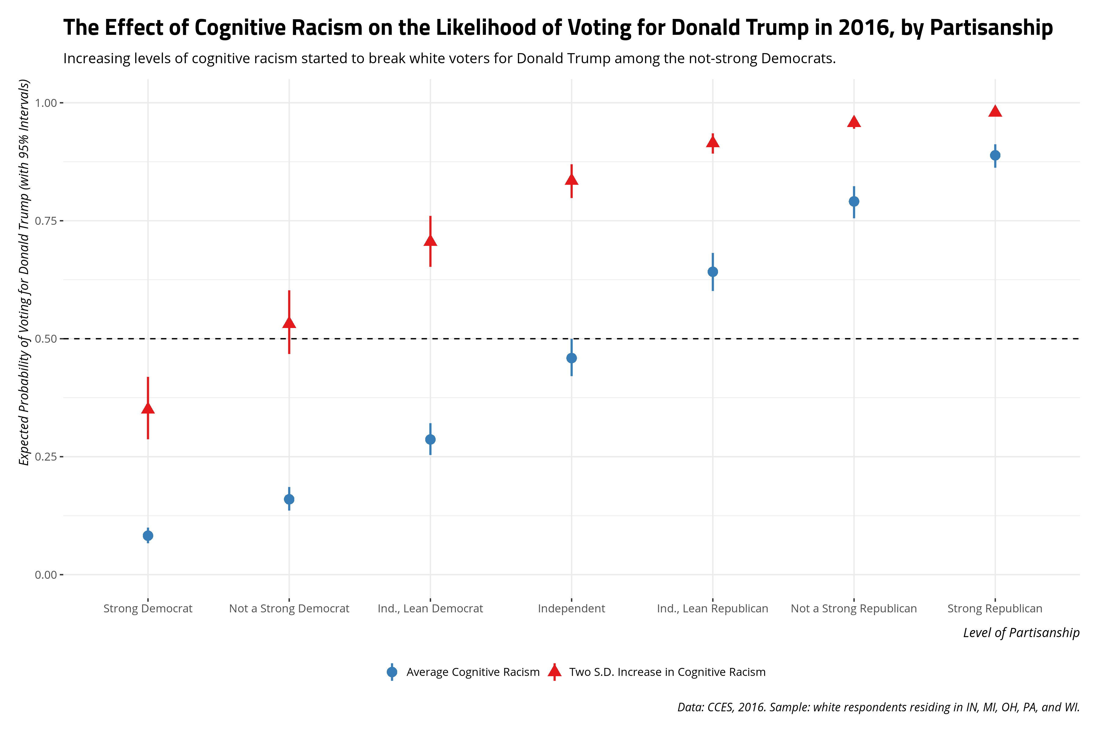
The substantive takeaway a graph like this communicates would square well with my 2017 analysis. Namely, racism’s effect on the vote choice in 2016 seems to be asymmetric. Increasing levels of racism saw Democrats start to break for Donald Trump, which we see again in this sample of white respondents in five Midwestern states. However, decreasing levels of cognitive racism (the mean, in this application) did not break Republicans for Hillary Clinton (or some other candidate). Namely, Republicans seem to be more steadfast in their partisanship than Democrats and perhaps it looks like it was Donald Trump’s racial appeals that were enough to get Democrats to start switching their votes. Given the margin of the vote in some of these states, ignoring voter suppression in Wisconsin for the moment, that could have been the difference.
At the very least, it’s a story you can tell by doing some post-estimation simulation from a multivariate normal distribution using the regression model’s parameters. That’s more the point of this post: the method less the substance. Yet, the method is the vehicle to tell the substance (i.e. the story). I offer this, mostly for my grad-level methods class, on how to do this in their own research, but share it publicly for anyone else interested in doing post-estimation simulation from a multivariate normal distribution for their own research.
-
{arm}has aselect()function that will conflict with theselect()function in{dplyr}. ↩
Disqus is great for comments/feedback but I had no idea it came with these gaudy ads.