How to Adjust for Economic Indicators for Inflation (and Index Them)

- Swedes love their coffee; fortunately for them, coffee as commodity is a lot cheaper than it was.
I’m writing this out of necessity so that I can try to avoid the discomfort of a student presenting a time series in nominal terms in order to understand changes in price. It will also give me something to which I can point when a student emails me asking about how to adjust something for inflation or index it like they see typically presented with time series data. It won’t answer what is a proper reference point for adjusting for inflation; it’ll only illustrate how it’s done.
The Data
The primary data I’ll be using for this post come from the recent release of {stevedata}. commodity_prices is a monthly data set from Jan. 1960 to Dec. 2022 on prices for select commodities that interest me: oil, coffee, tea, and sugar. The data come by way of the World Bank’s “pink sheet” and should be broadly useful for pedagogical instruction on a variety of fronts (like data gathering/pivoting, cointegration, differencing, autocorrelation, and many more). You can get a snapshot of the data here.
commodity_prices
#> # A tibble: 756 × 11
#>    date       oil_brent oil_dubai coffee_arabica coffee_robustas tea_columbo
#>    <date>         <dbl>     <dbl>          <dbl>           <dbl>       <dbl>
#>  1 1960-01-01      1.63      1.63          0.941           0.697       0.930
#>  2 1960-02-01      1.63      1.63          0.947           0.689       0.930
#>  3 1960-03-01      1.63      1.63          0.928           0.689       0.930
#>  4 1960-04-01      1.63      1.63          0.930           0.685       0.930
#>  5 1960-05-01      1.63      1.63          0.92            0.691       0.930
#>  6 1960-06-01      1.63      1.63          0.912           0.697       0.930
#>  7 1960-07-01      1.63      1.63          0.916           0.691       0.930
#>  8 1960-08-01      1.63      1.63          0.929           0.699       0.930
#>  9 1960-09-01      1.63      1.63          0.923           0.703       0.930
#> 10 1960-10-01      1.63      1.63          0.924           0.707       0.930
#> # ℹ 746 more rows
#> # ℹ 5 more variables: tea_kolkata <dbl>, tea_mombasa <dbl>, sugar_eu <dbl>,
#> #   sugar_us <dbl>, sugar_world <dbl>
First Things First: Getting Inflation Adjustment Data
The data in commodity_prices are helpfully all demarcated in U.S. dollars, but these dollars are nominal (i.e. recorded at that particular moment in time). Nominal prices do not reflect greater accessibility to the dollar that’s come by way of central bank policies that promote yearly inflation rates (ideally 2%), meaning nominal prices over time often mislead someone about how they should understand an asset’s true worth over time. Perhaps our most cynical Boomers can truly think of what it was like when “[INSERT FOOD ITEM HERE] used to cost a dollar”, but most of us can’t and a 1955 dollar is no longer worth a 2023 dollar. There are instances when it makes to sense to look at nominal values, prominently in the debt/GDP comparison or perhaps when there are cross-unit comparisons for which the nominal price for each unit is still valid for understanding price differences. No matter, over-time comparisons should use so-called “real” (i.e. inflation-adjusted) values in order to be honest under most circumstances.
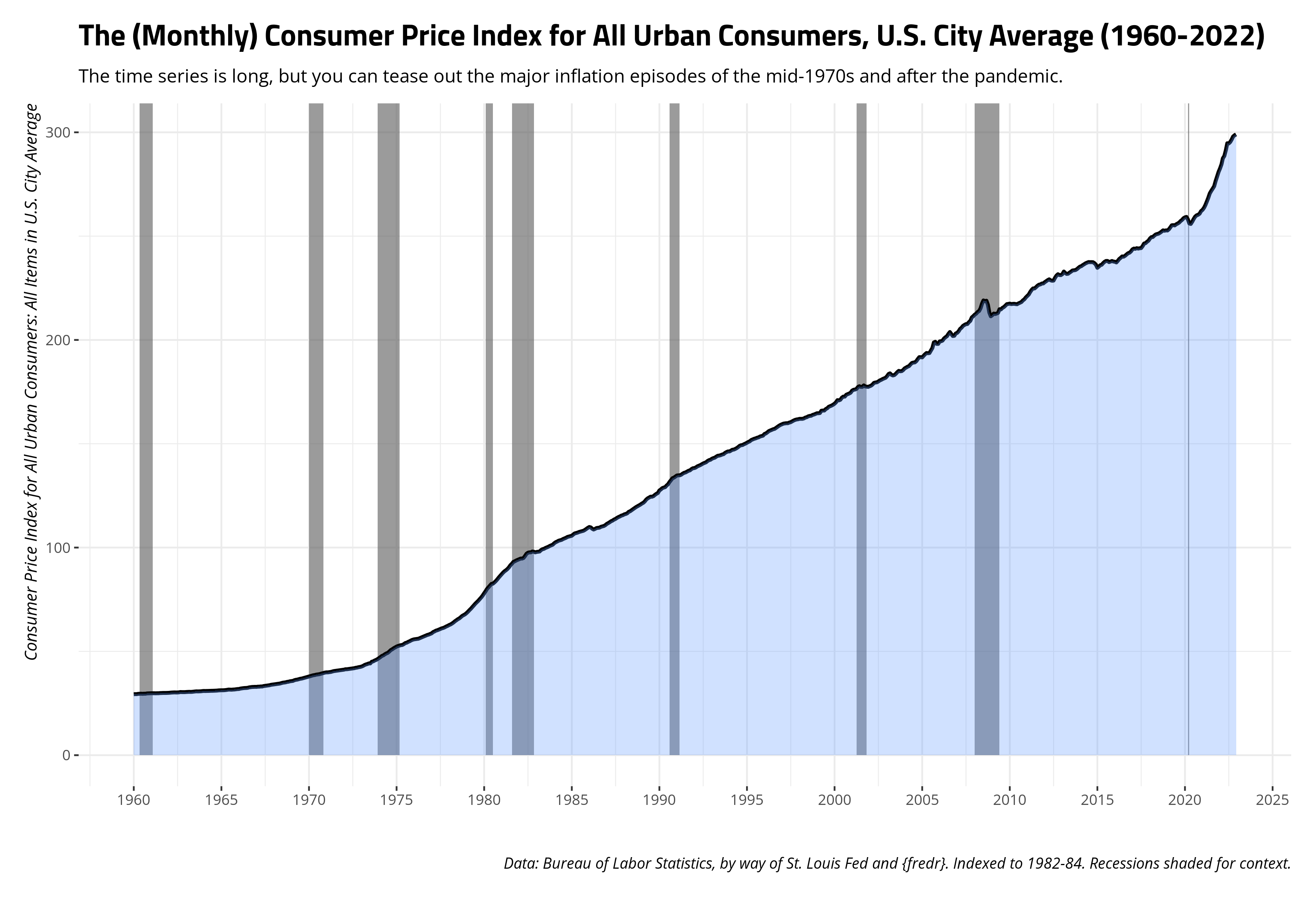
The decision about which adjustment to use may depend on the commodity and the comparison. The Bureau of Labor Statistics, which maintains these indices, also has more focused price indexes for things like food and recreation, and even different city/regional indices. The most common and all-encompassing, however, is the consumer price index for all urban consumers. This index covers about 93% of the American population and is kind of a “default” price index. You can see it here, on the Federal Reserve Bank of St. Louis’ website for economic data (FRED).
You can also use the wonderful {fredr} package to get these data through the FRED’s API, though you’d want to read how to set that up and get an API key. You can get the base data with the basic command below, though code I suppress for presentation will create the summary graph you see here.
CPI <- fredr(series_id = "CPIAUCSL",
               observation_start = as.Date("1960-01-01")) %>%
  rename(cpiu = value) %>%
  filter(year(date) <= 2022)

CPI
#> # A tibble: 756 × 5
#>    date       series_id  cpiu realtime_start realtime_end
#>    <date>     <chr>     <dbl> <date>         <date>
#>  1 1960-01-01 CPIAUCSL   29.4 2023-09-30     2023-09-30
#>  2 1960-02-01 CPIAUCSL   29.4 2023-09-30     2023-09-30
#>  3 1960-03-01 CPIAUCSL   29.4 2023-09-30     2023-09-30
#>  4 1960-04-01 CPIAUCSL   29.5 2023-09-30     2023-09-30
#>  5 1960-05-01 CPIAUCSL   29.6 2023-09-30     2023-09-30
#>  6 1960-06-01 CPIAUCSL   29.6 2023-09-30     2023-09-30
#>  7 1960-07-01 CPIAUCSL   29.6 2023-09-30     2023-09-30
#>  8 1960-08-01 CPIAUCSL   29.6 2023-09-30     2023-09-30
#>  9 1960-09-01 CPIAUCSL   29.6 2023-09-30     2023-09-30
#> 10 1960-10-01 CPIAUCSL   29.8 2023-09-30     2023-09-30
#> # ℹ 746 more rows
Choosing and Making a Benchmark for an Inflation Adjustment
The decision against which to benchmark your prices is up to you, I’m sure. For illustration’s sake, I like to adjust prices to the most current dollars. For both our commodity prices data and the consumer price index data (as of writing), that’s December 2022. The consumer price index data themselves benchmark against what appears to be an amalgam of all months from 1982 to 1984. If I understand correctly, that decision was made sometime in 1988 based on experimental weights it had deployed across 1982 to 1984. I think the choice is ultimately yours, but the underlying arithmetic isn’t hard. For a value of \(x\) at time point \(t\), with some benchmark of \(x_b\), the formula is \(\frac{x_t}{x_b}*100\).
I’m going to primarily focus on just the benchmark to Dec. 2022 since I like thinking in current dollars, but here’s how you might make two other benchmarks. For example, the last() function in the code below isolates the last recorded value of the consumer price index (i.e. Dec. 2022), but the first() function isolates the first recorded value of the consumer price index (i.e. Jan. 1960). Alternatively, I can filter the data to just 1990 and get the mean of those consumer price indices if I wanted to benchmark to average 1990 dollars. In all cases, though, creating a benchmark against which to adjust for inflation is a simple matter of dividing the consumer price index over the benchmark and multiplying it by 100.
CPI %>%
  filter(lubridate::year(date) == 1990) %>%
  summarize(mean = mean(cpiu)) %>% pull() -> mean1990

CPI %>%
  select(date, cpiu) %>%
  mutate(last = last(cpiu),
         first = first(cpiu),
         mean1990 = mean1990,
         bench_first = (cpiu/first)*100,
         bench_last = (cpiu/last)*100,
         bench_1990 = (cpiu/mean1990)*100) -> CPI

CPI
#> # A tibble: 756 × 8
#>    date        cpiu  last first mean1990 bench_first bench_last bench_1990
#>    <date>     <dbl> <dbl> <dbl>    <dbl>       <dbl>      <dbl>      <dbl>
#>  1 1960-01-01  29.4  299.  29.4     131.        100        9.82       22.5
#>  2 1960-02-01  29.4  299.  29.4     131.        100.       9.84       22.5
#>  3 1960-03-01  29.4  299.  29.4     131.        100.       9.84       22.5
#>  4 1960-04-01  29.5  299.  29.4     131.        101.       9.88       22.6
#>  5 1960-05-01  29.6  299.  29.4     131.        101.       9.89       22.6
#>  6 1960-06-01  29.6  299.  29.4     131.        101.       9.90       22.7
#>  7 1960-07-01  29.6  299.  29.4     131.        101.       9.88       22.6
#>  8 1960-08-01  29.6  299.  29.4     131.        101.       9.90       22.7
#>  9 1960-09-01  29.6  299.  29.4     131.        101.       9.90       22.7
#> 10 1960-10-01  29.8  299.  29.4     131.        101.       9.95       22.8
#> # ℹ 746 more rows
Cool. That was it; we got our benchmarks. Let’s join them into our commodity prices data frame so that we can start adjusting things for inflation. Notice that the left_join() here is joining by exact date (which is practically a year-month). Make sure your consumer price index data and benchmarks correspond with the temporal unit in the data frame of interest.
commodity_prices %>%
  left_join(., CPI %>% select(date, bench_first:bench_1990))  -> commodity_prices

commodity_prices
#> # A tibble: 756 × 14
#>    date       oil_brent oil_dubai coffee_arabica coffee_robustas tea_columbo
#>    <date>         <dbl>     <dbl>          <dbl>           <dbl>       <dbl>
#>  1 1960-01-01      1.63      1.63          0.941           0.697       0.930
#>  2 1960-02-01      1.63      1.63          0.947           0.689       0.930
#>  3 1960-03-01      1.63      1.63          0.928           0.689       0.930
#>  4 1960-04-01      1.63      1.63          0.930           0.685       0.930
#>  5 1960-05-01      1.63      1.63          0.92            0.691       0.930
#>  6 1960-06-01      1.63      1.63          0.912           0.697       0.930
#>  7 1960-07-01      1.63      1.63          0.916           0.691       0.930
#>  8 1960-08-01      1.63      1.63          0.929           0.699       0.930
#>  9 1960-09-01      1.63      1.63          0.923           0.703       0.930
#> 10 1960-10-01      1.63      1.63          0.924           0.707       0.930
#> # ℹ 746 more rows
#> # ℹ 8 more variables: tea_kolkata <dbl>, tea_mombasa <dbl>, sugar_eu <dbl>,
#> #   sugar_us <dbl>, sugar_world <dbl>, bench_first <dbl>, bench_last <dbl>,
#> #   bench_1990 <dbl>
Now let’s start adjusting for inflation.
The Price of Coffee, Nominal and Real
I want to start with the price of coffee, which is a commodity I like talking about for a variety of reasons. For one, I love coffee and I drink a lot of it (perhaps too much of it). Two, I live in a country that may love it and drink it more than me. There’s an entire culture around it, and the name for this culture (“fika”) is inverse to its centerpiece: coffee. Third, I think it’s a very interesting case of the worsening terms of trade for developing countries. In other words, the world is drinking more and more coffee, but we consumers in rich countries end up paying cheaper prices in light of increased demand. Coffee markets are competitive and the machinery required to mass produce coffee cluster on oligopolies, which raises prices for developing countries that export coffee to the same markets from which they buy expensive machinery to harvest the coffee. It’s kind of a development trap.
Here is the nominal price of arabica and robustas coffee over the course of the data, expressed in $/kg averages given by the International Coffee Organization. If you’re curious, arabica is generally what you drink but is more sensitive to pests and weather issues. Robustas is generally regarded as “not as flavorful” as arabica, but is more robust to pests and weather issues. It’s also what (I think?) the Vietnamese typically drink and the coffee that you’d use for “coffee-scented” things (e.g. soaps, candles). Both are enjoyable to drink and I’m sure blended together in several cases for the coffee you’d buy to consume. Long story short, expect both prices to travel together, but expect the price of arabica to be generally higher and to be more sensitive to disruptions or other issues. Fancier code for making the graphs is suppressed for presentation.
commodity_prices %>%
  select(date, coffee_arabica, coffee_robustas) %>%
  gather(var, val, -date)
#> # A tibble: 1,512 × 3
#>    date       var              val
#>    <date>     <chr>          <dbl>
#>  1 1960-01-01 coffee_arabica 0.941
#>  2 1960-02-01 coffee_arabica 0.947
#>  3 1960-03-01 coffee_arabica 0.928
#>  4 1960-04-01 coffee_arabica 0.930
#>  5 1960-05-01 coffee_arabica 0.92
#>  6 1960-06-01 coffee_arabica 0.912
#>  7 1960-07-01 coffee_arabica 0.916
#>  8 1960-08-01 coffee_arabica 0.929
#>  9 1960-09-01 coffee_arabica 0.923
#> 10 1960-10-01 coffee_arabica 0.924
#> # ℹ 1,502 more rows
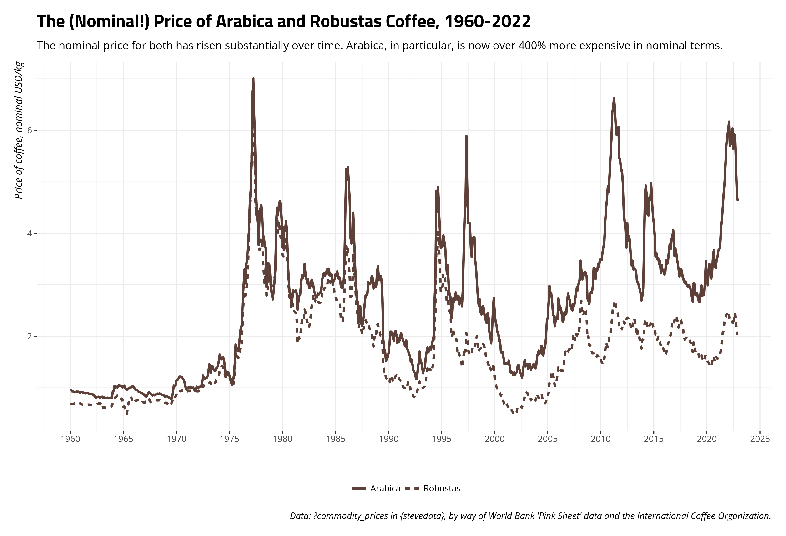
The data show obvious fluctuations. For example, that spike you see in the mid-1970s is a function of the “big frost” in Brazil, which wiped out as much as half of all coffee harvests in the country (which is then(?) and certainly now the world’s largest exporter of coffee). That effect seems to ripple into the late 1970s as well before prices stabilized. In nominal terms, coffee is way more expensive now than it was in Jan. 1960. The price of robustas has risen about 194% and the price of arabica has risen over 400% from what it was at the start of the series. However, that’s nominal terms. What if we wanted to adjust these to inflation (let’s say: Dec. 2022 dollars)? It’d be as simple as this.
commodity_prices %>%
  select(date, coffee_arabica, coffee_robustas, bench_last) %>%
  mutate(real_arabica = (coffee_arabica/bench_last)*100,
         real_robustas = (coffee_robustas/bench_last)*100)
#> # A tibble: 756 × 6
#>    date       coffee_arabica coffee_robustas bench_last real_arabica
#>    <date>              <dbl>           <dbl>      <dbl>        <dbl>
#>  1 1960-01-01          0.941           0.697       9.82         9.58
#>  2 1960-02-01          0.947           0.689       9.84         9.63
#>  3 1960-03-01          0.928           0.689       9.84         9.44
#>  4 1960-04-01          0.930           0.685       9.88         9.42
#>  5 1960-05-01          0.92            0.691       9.89         9.30
#>  6 1960-06-01          0.912           0.697       9.90         9.21
#>  7 1960-07-01          0.916           0.691       9.88         9.27
#>  8 1960-08-01          0.929           0.699       9.90         9.38
#>  9 1960-09-01          0.923           0.703       9.90         9.32
#> 10 1960-10-01          0.924           0.707       9.95         9.28
#> # ℹ 746 more rows
#> # ℹ 1 more variable: real_robustas <dbl>
Let’s update our graph now.
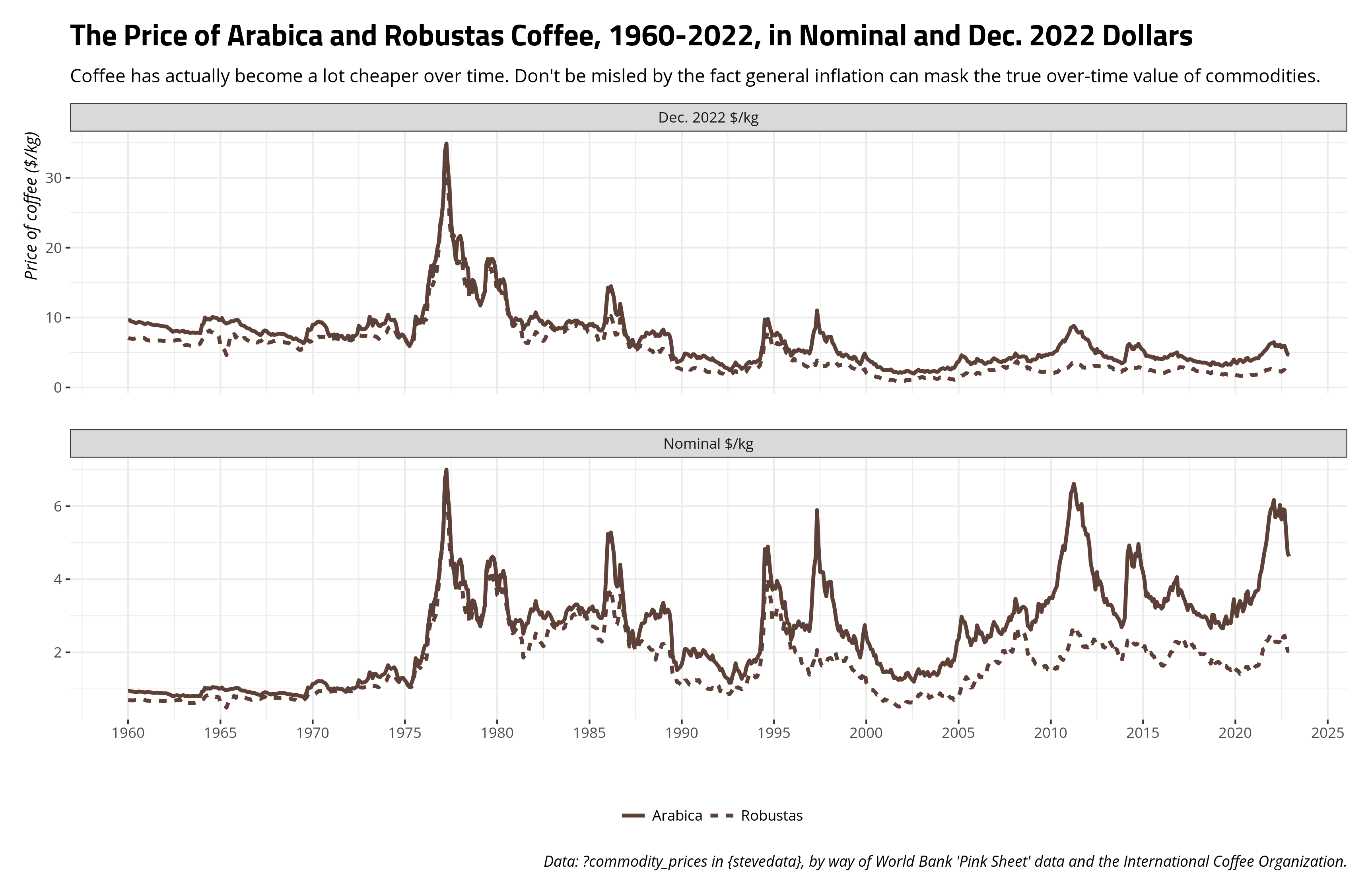
Notice the y-axis has changed in adjusting for the changing value of the dollar, but now we get a fundamentally different takeaway about the price of coffee over time. It’s in fact become a lot cheaper over time. In Dec. 2022 dollars, a kilogram of arabica coffee cost about $9.55 in Jan. 1960. In Dec. 2022, it cost about $4.63 to get a kilogram of coffee. The price has basically been cut in half over the past 60+ years even as the world is drinking more and more coffee. Again, I think it’s an interesting case of the worsening terms of trade.
Converting a Real Price to an Index
It depends on the story you want to tell, and the audience to whom you intend to tell it, but it might make sense to convert an inflation-adjusted price to an index in order to better tell a story about the change in a commodity price over time as it pertains to some benchmark. Let’s use the price of Brent crude oil as an illustration. Oil is an interesting commodity. It’s traded outright in dollars per barrel, which is already kind of amusing to think about. Further, Brent oil is one of several oil commodities. The extent to which Americans think about oil, they think of just “oil” and only really notice it when they pay for gasoline. Their mind immediately races to the Middle East, though most American oil to be consumed is produced and shipped regionally (i.e. we’re fortunate to have two oil-rich countries as neighbors; ❤️ u Canada and Mexico. The U.S. also has a long-running oil commodity you could trade (West Texas Intermediate). Think of Brent as the “British oil”, if you will, as it was originally produced from the Brent oilfield in the North Sea. It’s also in about two-thirds of all oil contracts, which effectively makes it the most popular marker of oil. There are different oil markers, and even the Dubai crude oil in this same data frame, but the sensitivity of the price of oil to truly anything makes the price for one highly cointegrate with other oil prices. For example, robustas and arabica prices correlate at around .79. Brent and Dubai oil prices correlate at .999. You could use the Brent oil price as an honest gauge of the global price of oil, given this kind of cointegration and the centrality of Brent to all oil contracts.
It’s not a stretch to say oil has increased in price over time. It would certainly look like a time series that lost its mind when the price is communicated in nominal terms. You could also easily spot some things in the data. You could easily pick out the Arab oil embargo following the Yom Kippur War, the market tightness coinciding with the Iranian revolution and the onset of the Iran-Iraq war, the so-called “oil glut” in the mid-1980s, the “energy crisis” that coincided with the Great Recession, and, more recently, the pandemic weirdness.
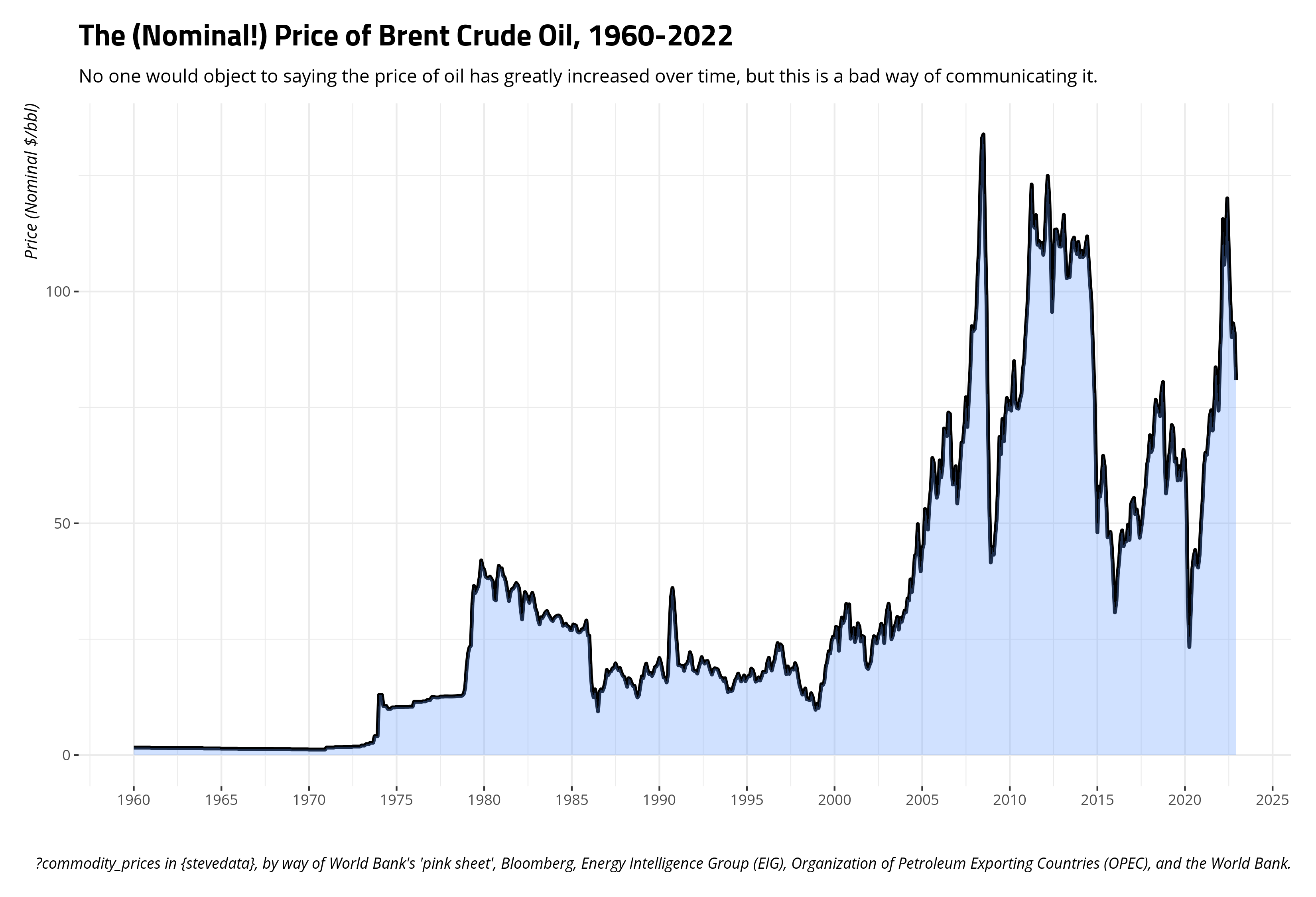
Right now, $100/bbl is the kind of benchmark for Americans losing their minds about the price of crude. However, that’s just a large nominal number we use now that has no real significance other than what we give it. The series opens at $1.63/bbl in Jan. 1960, but $100/bbl now should not be interpreted necessarily as a 6,000 percent increase from the Jan. 1960 price. You should adjust for inflation if you want a better gauge of just how much oil prices have changed over time.
commodity_prices %>%
  mutate(real_brent = (oil_brent/bench_last)*100)
#> # A tibble: 756 × 15
#>    date       oil_brent oil_dubai coffee_arabica coffee_robustas tea_columbo
#>    <date>         <dbl>     <dbl>          <dbl>           <dbl>       <dbl>
#>  1 1960-01-01      1.63      1.63          0.941           0.697       0.930
#>  2 1960-02-01      1.63      1.63          0.947           0.689       0.930
#>  3 1960-03-01      1.63      1.63          0.928           0.689       0.930
#>  4 1960-04-01      1.63      1.63          0.930           0.685       0.930
#>  5 1960-05-01      1.63      1.63          0.92            0.691       0.930
#>  6 1960-06-01      1.63      1.63          0.912           0.697       0.930
#>  7 1960-07-01      1.63      1.63          0.916           0.691       0.930
#>  8 1960-08-01      1.63      1.63          0.929           0.699       0.930
#>  9 1960-09-01      1.63      1.63          0.923           0.703       0.930
#> 10 1960-10-01      1.63      1.63          0.924           0.707       0.930
#> # ℹ 746 more rows
#> # ℹ 9 more variables: tea_kolkata <dbl>, tea_mombasa <dbl>, sugar_eu <dbl>,
#> #   sugar_us <dbl>, sugar_world <dbl>, bench_first <dbl>, bench_last <dbl>,
#> #   bench_1990 <dbl>, real_brent <dbl>
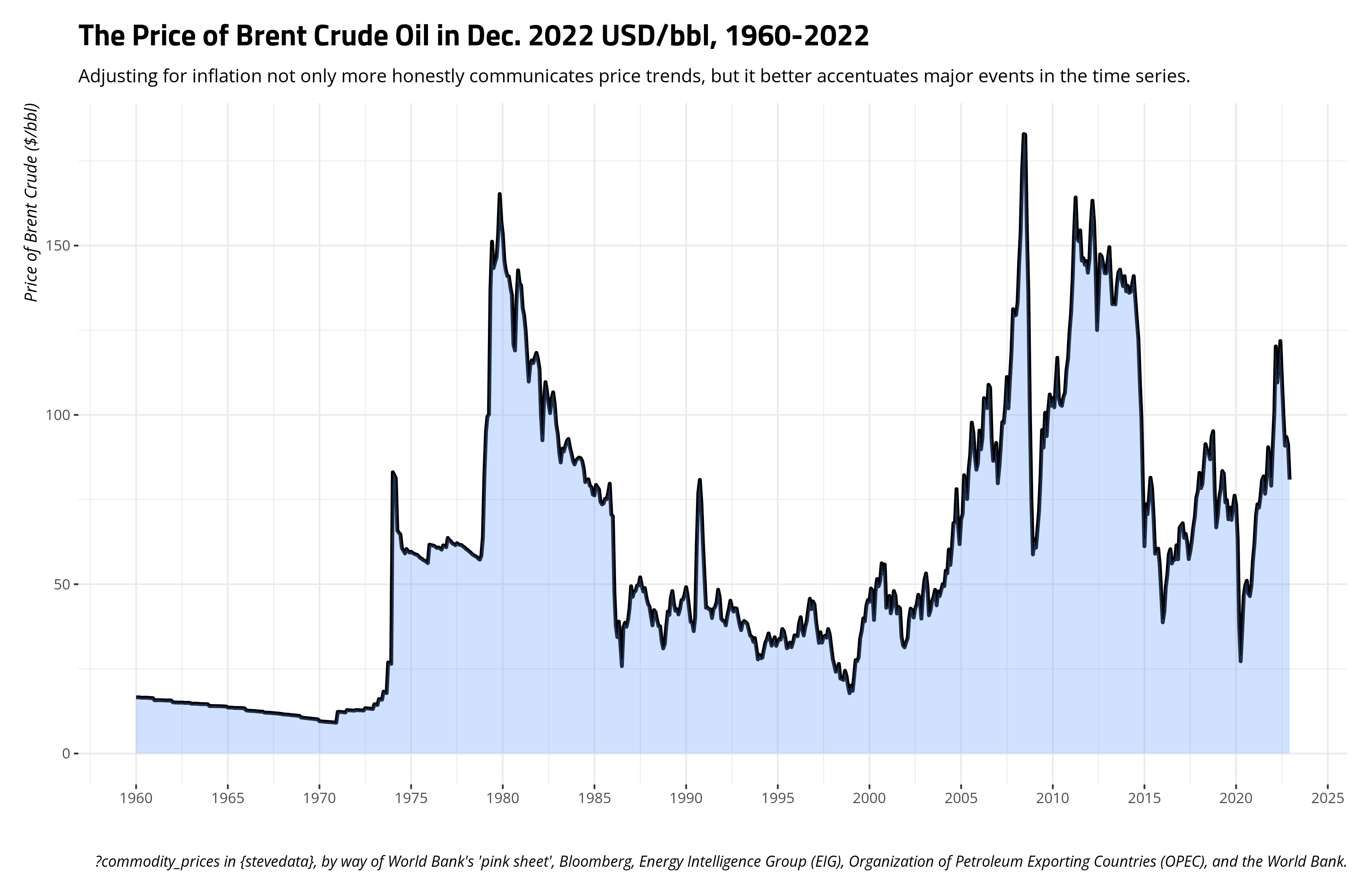
The benefit of adjusting this time series for inflation is two-fold. For one, it’s obviously more honest. The price of oil right now is easily twice the price it was in the late 1970s, at least in nominal terms, but that kind of comparison drastically understates just how rough that period was in the mid-to-late 1970s (i.e. Boomers have a point to complain that period sucked if you needed a car to get places). Adjusted for inflation, the price of oil during the 2007/2008 energy crisis is about what it was during the worst stretches of the late 1970s. Second, it better identifies all these major events in the time series that had discernible effects on the price of oil at the time. It even identifies some that were concealed by the scale of the time series in nominal terms. For example, the Iraqi invasion of Kuwait on August 1990 basically increased the price of oil over 50% from July 1990. By October 1990, the price basically doubled from what it was in July. That got lost in the scale in nominal terms, given the inflation of the dollar.
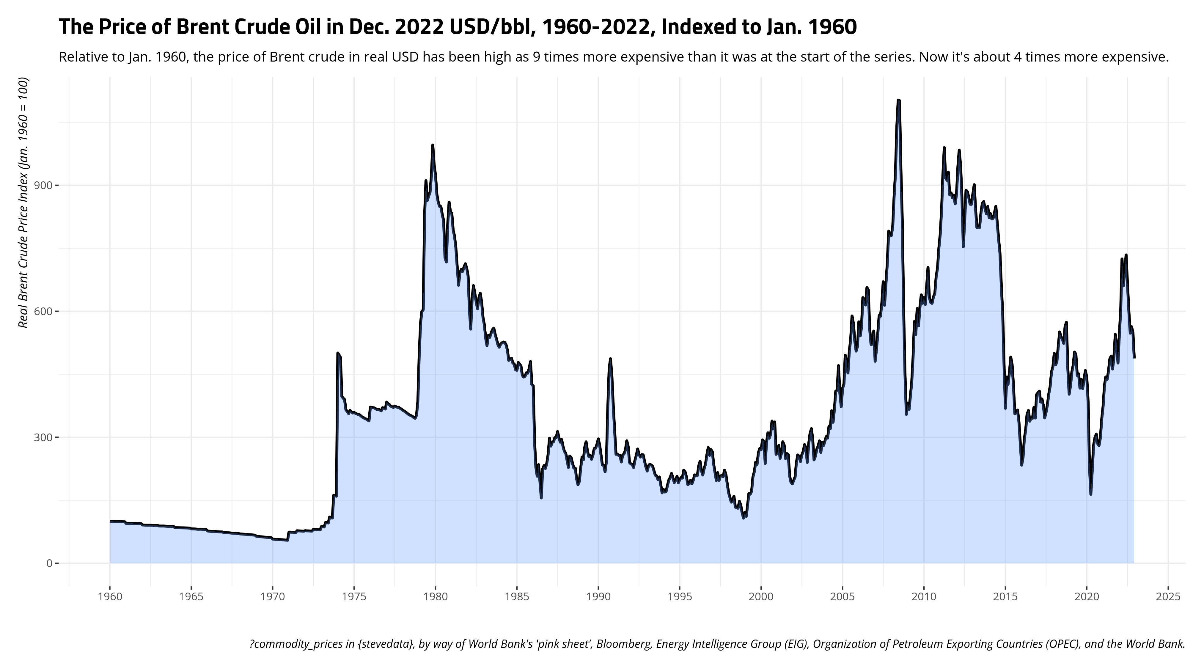
However, one potential limitation of presenting prices in a time series like this is that it puts more effort on the reader to understand changes in relative price over time. Using Dec. 2022 dollars, I can see that the price of Brent was $16.3/bbl. Come Dec. 2022, that price is $80.9/bbl. You can say that’s almost a 5-fold increase, or that the price has increased almost 400% from the start of the series in real terms. However, that makes a lay audience have to do some math that you might be able to (somewhat) do for them if you indexed the variables such that some point in time is a reference point. The logic here is basically the same to what we did creating our index for an inflation adjustment. Here, let’s make the referent to be Jan. 1960, and the index prices communicate a change relative to the start of the series.
commodity_prices %>%
  mutate(real_brent = (oil_brent/bench_last)*100,
         index_brent = (real_brent/first(real_brent))*100)
#> # A tibble: 756 × 16
#>    date       oil_brent oil_dubai coffee_arabica coffee_robustas tea_columbo
#>    <date>         <dbl>     <dbl>          <dbl>           <dbl>       <dbl>
#>  1 1960-01-01      1.63      1.63          0.941           0.697       0.930
#>  2 1960-02-01      1.63      1.63          0.947           0.689       0.930
#>  3 1960-03-01      1.63      1.63          0.928           0.689       0.930
#>  4 1960-04-01      1.63      1.63          0.930           0.685       0.930
#>  5 1960-05-01      1.63      1.63          0.92            0.691       0.930
#>  6 1960-06-01      1.63      1.63          0.912           0.697       0.930
#>  7 1960-07-01      1.63      1.63          0.916           0.691       0.930
#>  8 1960-08-01      1.63      1.63          0.929           0.699       0.930
#>  9 1960-09-01      1.63      1.63          0.923           0.703       0.930
#> 10 1960-10-01      1.63      1.63          0.924           0.707       0.930
#> # ℹ 746 more rows
#> # ℹ 10 more variables: tea_kolkata <dbl>, tea_mombasa <dbl>, sugar_eu <dbl>,
#> #   sugar_us <dbl>, sugar_world <dbl>, bench_first <dbl>, bench_last <dbl>,
#> #   bench_1990 <dbl>, real_brent <dbl>, index_brent <dbl>
There are other time series out there that don’t look anywhere near as exciting or weird as the ones I present here. No matter, it’s often more honest to adjust prices for inflation in order to communicate differences in prices (certainly over time). It might also help the reader to index variables to communicate changes relative to a point in time. Here’s how you’d do it, when you should do it.
Disqus is great for comments/feedback but I had no idea it came with these gaudy ads.