A ggplot Calendar for Your Semester
- The {ggplot2} hex logo
It’s the start of the school year, which means it’s time for university professors to finish their syllabi for the upcoming semester. For most of us, it starts next week.
University syllabi are curious monsters. For one, they’re prone to bloat. Universities—understandably, by the way—mandate some important information be included in them. These range from the obvious information for students (i.e. when the class meets) to important university policy to communicate with students so that the university and its representatives (i.e. people like me) conform to relevant state and federal law. Over time, universities—again, understandably—have begun to see syllabi like contracts. Continuation in the course constitutes student acceptance with the terms of the “contract”, as oulined in the syllabus. This both informs the student and protects the faculty.
It does mean syllabi are getting progressively bigger and longer and the practical information students may want regarding the class schedule may get harder to find. It’s why, for the past two years or so, I’ve taken to modeling a calendar to be included in my R Markdown syllabi. It took me a few years to perfect this. Mostly: dates in R are clunky no matter {lubridate}’s efforts to make them more tractable. However, I think I finally got it in a way that’s both intuitive and not at all daunting. Here’s some code you can copy-paste-tweak for your own particular case.
First, here are the R packages you’ll want or at least that I’ll be using in this post.
library(tidyverse) # for all things workflow
library(lubridate) # for working with dates
library(stevemisc) # OPTIONAL: this is for my theme_steve_web() ggplot theme
First, look at your particular academic calendar and identify some important university dates of interest. For example, at my current employer, a general election Tuesday is typically a date for which students get a “fall break.” That is Nov. 3 in this upcoming semester. Further, students may receive a week break near the end of November for Thanksgiving. At the least, they’ll get that Wednesday, Thursday, and Friday. Let’s make a note of Thanksgiving break as well.
not_here_dates <- c(ymd(20201103),
              seq(ymd(20201123),ymd(20201127), by = "1 day"))
Then, identify some “due dates” for various assignments in the class. Here, let’s assume this class has exams on Oct. 1, Nov. 5, and a final exam on Dec. 11.
exam_dates <- c(ymd(20201001), ymd(20201105), ymd(20201211))
Next, let’s create a vector of dates coinciding with the start and end of the semester. At my current employer, the semester starts on Aug. 19 (Wednesday) and ends Dec. 4 (Friday). Technically, the university understands the final exam as occurring outside the normal “semester.”
semester_dates <- seq(ymd(20200819),ymd(20201204), by=1)
Now, let’s get to work on creating a data frame of dates. Here’s how I like to do it. First, I like to have a calendar that includes the entirety of the months in the semester. Thus, the semester may start Aug. 19 and end on Dec. 4, but I like a complete data frame that starts on Aug. 1 and ends on Dec. 31. This will help for creating an entry for the final exam as well.
Cal <- tibble(date = seq(ymd(20200801), ymd(20201231), by=1))
Thereafter, we’re going to create some identifying information for our dates and, importantly, take care to distinguish what is the start of the week versus what is the first day of the month. For example, it’s customary (in the United States) to treat a week as starting on Sunday though the first day of the month may be Saturday (as it was this month). Toward that end, I devised a week of the month function (wom()), available in {stevemisc}, that will treat the first day of the month as the first week of the month up until the first Sunday (unless Sunday was the start of the month). This will matter a great deal because the ggplot calendar ultimately treats the week number as the y-axis in a ggplot() call.
Cal %>%
  mutate(mon = lubridate::month(date, label=T, abbr=F), # get month label
         wkdy = weekdays(date, abbreviate=T), # get weekday label
         wkdy = fct_relevel(wkdy, "Sun", "Mon", "Tue", "Wed", "Thu","Fri","Sat"), # make sure Sunday comes first
         semester = ifelse(date %in% semester_dates, 1, 0), # is date part of the semester?
         exams = ifelse(date %in% exam_dates, 1, 0), # is it an exam?
         not_here = ifelse(date %in% not_here_dates, 1, 0), # is it a day off?
         day = lubridate::mday(date), # get day of month to add later as a label
         # Below: wom() is in {stevemisc}
         week = wom(date)) -> Cal
Now, let’s create some categories. In this case, our class meets Tuesdays and Thursdays for a semester starting on Aug. 19 (Wednesday) and ending on Dec. 4 (Friday). Two of those Thursdays will have an exam due. There’s a final exam that happens (technically) outside the regular semester (Dec. 11). I’ve no doubt I could make these repeated ifelse() commands to be a more generic dplyr::case_when() but I’ll note I’ve never taken the time to sit down and learn its peculiarities. No matter, this part will be where you want to invest the most time to make sure you’re getting this right for your particular case.
Cal %>%
  mutate(category = NA,
         category = ifelse(semester == 1, "Semester", category),
         category = ifelse(semester == 1 & wkdy %in% c("Tue", "Thu"), "Class Day", category),
         category = ifelse(exams == 1, "Exams", category),
         category = ifelse(is.na(category) | (semester == 1 & not_here == 1), "NA", category)) -> Cal
The final thing to do here is to make the damn calendar. At its core, a ggplot calendar is a faceted tile plot. The first few commands are fairly straightforward, but pay careful attention to how I adjust the scales manually to suppress some redundant information (i.e. it’s not important that there are other days in the semester for the sake of the class, nor is it important to highlight dates outside the semester in the calendar.
Cal %>%
  ggplot(.,aes(wkdy, week)) +
  # custom theme stuff below
  theme_steve_web() +
  # geom_tile and facet_wrap will do all the heavy lifting
  geom_tile(alpha=0.8, aes(fill=category), color="black") +
  facet_wrap(~mon, scales="free_x", ncol=3) +
  # fill in tiles to make it look more "calendary" (sic)
  geom_text(aes(label=day),family="Open Sans") +
  # put your y-axis down, flip it, and reverse it
  scale_y_reverse(breaks=NULL) +
  # manually fill scale colors to something you like...
  scale_fill_manual(values=c("Class Day"="steelblue",
                             "Semester"="lightsteelblue",
                             "NA" = "white", # I like these whited out...
                             "Exams"="indianred4"),
                    #... but also suppress a label for a non-class semester day
                    breaks=c("Class Day","Exams")) +
  labs(fill = "", x="", y="",
       title = "A Hypothetical Semester Calendar for Your Particular Class",
       subtitle = "Customize this to make it yours.",
       caption = "Notable dates: Fall Break (Nov. 3... please vote), Thanksgiving Break (Nov. 23-27)")
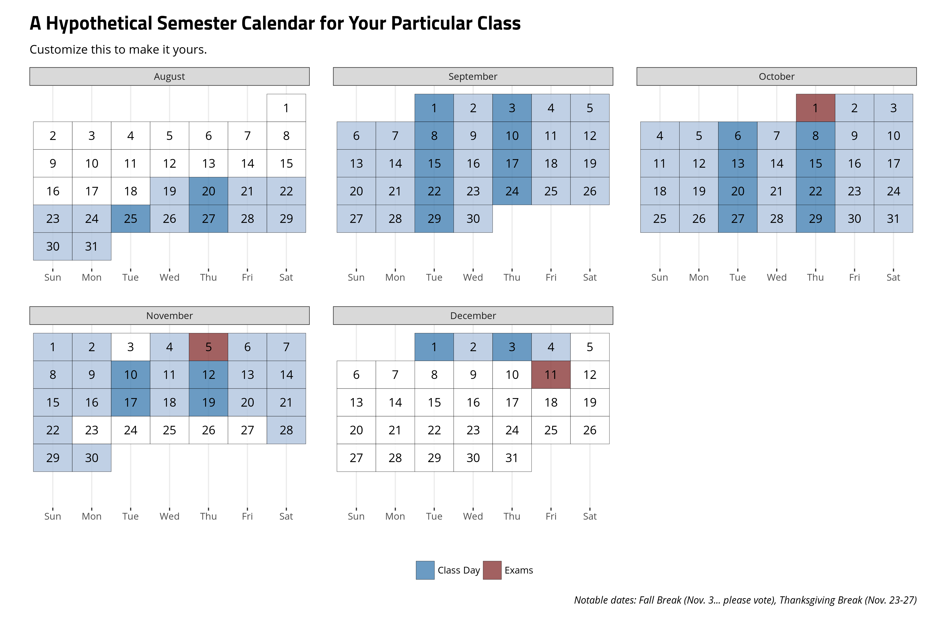
Make this code yours as you see fit, but I think your students may benefit from the including a semester calendar to help them internalize important dates. It’s deceptively not a lot of code.
Disqus is great for comments/feedback but I had no idea it came with these gaudy ads.