Illustrate Some Correlation Limitations and Fallacies in R
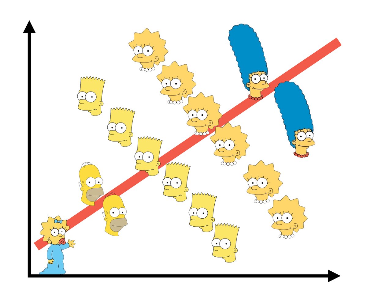
- The Simpsons Paradox, not to be confused with Simpson's paradox (HT: @fMRI_guy).
Last updated: 3 May 2022. {stevedata} now has these data sets (and more) that I use for pedagogical instruction. I changed some things in this post to account for that.
I’m teaching a grad-level methods class this semester that is heavier on applied data analysis for a public policy audience than my undergraduate class, which is more focused on boilerplate research design stuff for political science. It is in part a chore in as much as it’s a new prep. The emphasis on causal inference is more narrow/focused now than it was when I was learning related material in graduate school (and certainly for a different purpose).
It’s also a blessing because it’s giving me some opportunity to rethink/retool how I teach this stuff for a wide audience. Along the way, I’m compiling some instructional tools into an R package, {stevedata}, that is now available on CRAN. My goals here are multiple. First: disseminate sample data sets for in-class instruction of these topics of interest to both my students and researchers/teachers who would like a handy package for methods instruction. Second, I’m also trying to teach my students, by example, how to code some things within a {tidyverse} workflow. Every class I teach this semester has a Tuesday lecture/discussion with a Thursday lab, where students learn to implement the week’s topics in R.
This week is all about association and causality, even though the lab session will focus more on some associational techniques like correlation along with a discussion of where correlation analysis can go awry. Here are some of the applications, starting with first a list of packages I’ll be using in this workflow.
library(tidyverse) # you should know what this is
library(stevemisc)
library(stevedata)
library(ggpmisc)
library(ggrepel)
library(knitr)
library(kableExtra)
Anscombe’s Quartet
Francis J. Anscombe’s (1973) famous quartet is a go-to illustration for how simple associational analyses, even linear regression, can mislead the researcher if s/he is not taking care to actually look at the underlying data. Here, Anscombe created four data sets, each with 11 observations and two variables (x and y). All four quartets have the same mean for x and y, the same variance for x and y, the same regression line (y-intercept and slope for x), the same residual sum of squares, and the same correlation. However, they look quite differently.
The anscombe data come default in R, but {stevedata} has a modified (for ease of calculation) version of the same data as the quartets data.
data("anscombe") # from datasets


quartets %>%
  group_by(group) %>%
  summarize_all(list(mean = mean, sd = sd)) %>%
  kable(., format="html",
        table.attr='id="stevetable"',
        caption = "The Means and Standard Deviations from Anscombe's Quartet",
        col.names = c("Group", "Mean (X)", "Mean (Y)",
                      "Standard Deviation (X)",  "Standard Deviation (Y)" ),
        align=c("lcccc"))
| Group | Mean (X) | Mean (Y) | Standard Deviation (X) | Standard Deviation (Y) |
|---|---|---|---|---|
| Quartet 1 | 9 | 7.500909 | 3.316625 | 2.031568 |
| Quartet 2 | 9 | 7.500909 | 3.316625 | 2.031657 |
| Quartet 3 | 9 | 7.500000 | 3.316625 | 2.030424 |
| Quartet 4 | 9 | 7.500909 | 3.316625 | 2.030578 |
However, a scatterplot (with overlaying regression line) will show that each quartet looks quite different from the other even if they have the identical mean, standard deviation, regression line, and correlation. Quartet 1 has a fairly strong, positive relationship between x and y, even if there is some random noise. Quartet 2 has a clear curvilinear relationship that is not neatly captured by a single regression line. Quartet 3 is otherwise a perfect positive relationship up until that lone outlier. Quartet 4 is almost a perfect zero relationship between x and y until that one outlier (the eighth observation in the quartet) makes it seem like a positive relationship exists when there isn’t one.
quartets %>%
  ggplot(.,aes(x, y)) +
  theme_steve_web() +
  facet_wrap(~group) + geom_point() +
   geom_smooth(method = "lm", se=TRUE, formula = y ~ x) +
  stat_poly_eq(formula = y ~ x,
               eq.with.lhs = "italic(hat(y))~`=`~",
               aes(label = paste(..eq.label.., "~~~~~(",..rr.label..,")", sep = "")),
               geom = "label_npc", alpha = 0.33, fill="#619cff",
               size=3,
               parse = TRUE) +
  labs(x = "",
       y = "",
       title = "Anscombe's Quartet, Visualized",
       subtitle = "Anscombe's quartet emphasizes the importance of exploratory data analysis beyond the simple descriptive statistics.",
       caption = "Source: Anscombe (1973).")
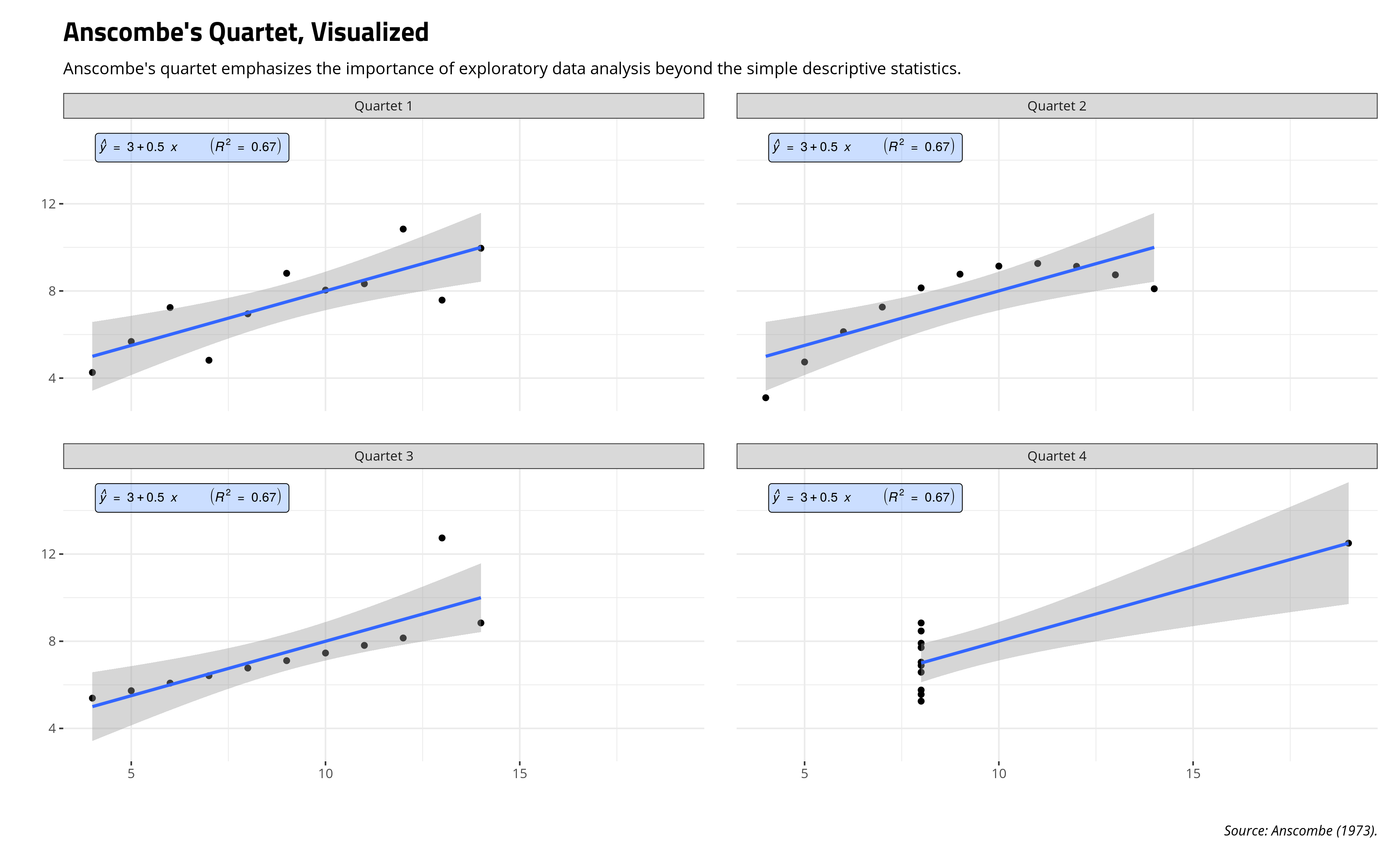
Basically: look at your data. Look at your model too.
Simpson’s Paradox
Simpson’s paradox is a well-known problem of correlation in which a correlation analysis, almost always done in a bivariate context, may reveal a relationship that is reversed upon the introduction of some third variable. Every stylized case I’ve seen of Simpson’s paradox conceptualizes the third factor as some kind of grouping/category effect (certainly of interest to me as a mixed effects modeler), even if this may not be necessary to show a Simpson reversal.
One of the classic pedagogical cases of a Simpson’s paradox is from Deborah Lynne Guber’s (1999) study of public school expenditures and SAT performance in 1994-95 across all 50 states. There are other cases I’ve seen of a Simpson reversal, incidentally most involving education, but these data were readily available and are part of my {stevedata} package as the Guber99 data frame.
Guber tackles a troubling correlation at the state-level in these data from 1994-95. Namely, states that spend more (per pupil) on students appear to have lower total SAT scores to show for it. The correlation between the two variables in the data is -0.381.
Guber99 %>%
  ggplot(.,aes(expendpp, total)) +
  theme_steve_web() +
  geom_point() + geom_smooth(method = "lm") +
  geom_text_repel(aes(label=state), family="Open Sans") +
  annotate("label", y=1085, x=9,
         label=paste("Pearson's R = ", round(cor(Guber99$expendpp, Guber99$total),3)),
          size=3.5, family="Open Sans") +
  labs(title = "The Correlation Between Student Expenditures and Total SAT Scores in 50 States, 1994-95",
       subtitle = "The data suggest a negative correlation: more spending leads to lower SAT scores.",
       caption = "Source: Guber (1999).",
       x = "Current Expenditure per Pupil in Public Elementary and Secondary Schools",
       y = "Average Total SAT Score")
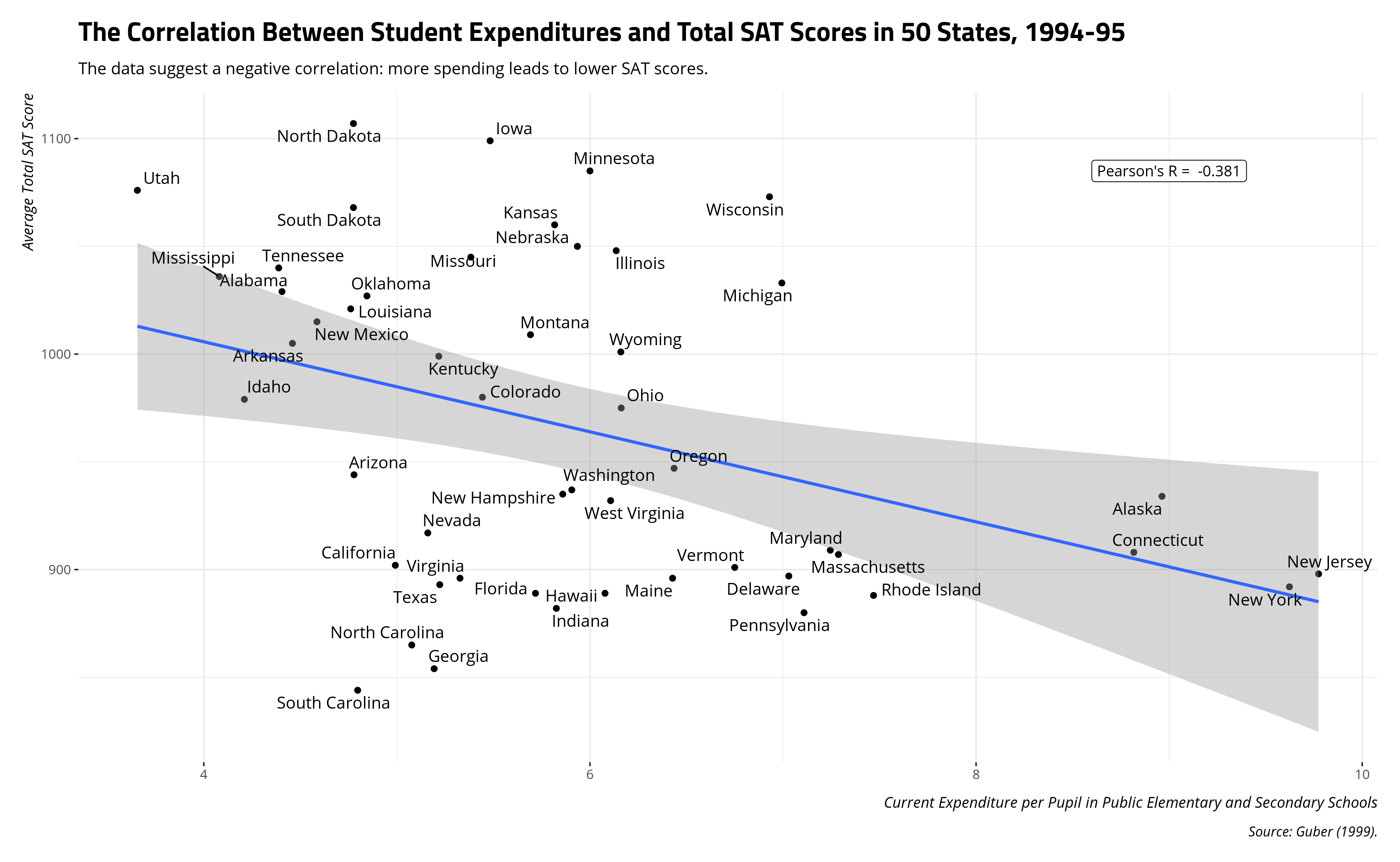
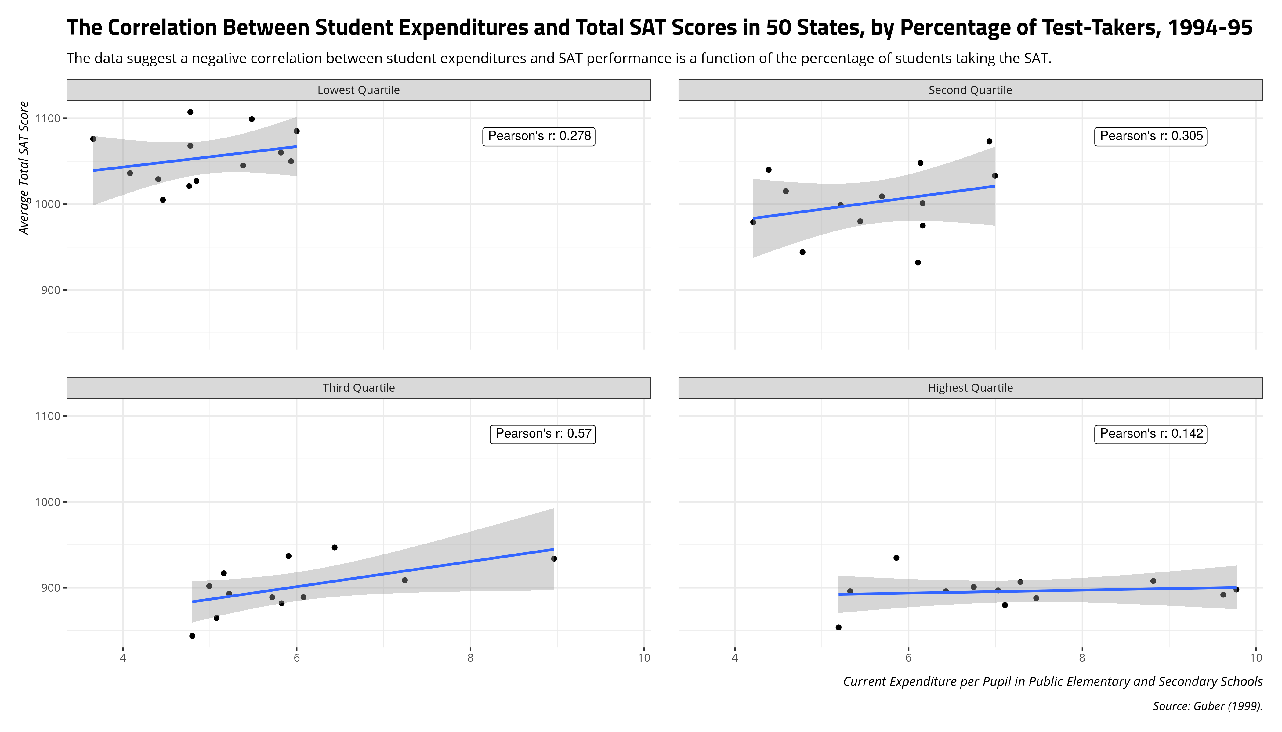
However, this naive negative correlation masks that a confounding variable changes the relationship between student expenditures and SAT scores. In Guber’s case, this is the percentage of the state with students taking the SAT. Per Guber, one likely culprit here is that SAT test-taking is more ubiquitous in wealthier, more populous, and spendier (sic) states like New York and Connecticut. In states where SAT test-taking is not as common, some combination of the ACT as test-taking alternative and self-selection (i.e. the best, most motivated students in some of these states take the SAT to go to college out of their states) is enough to reverse the relationship between student expenditures and total SAT score.
A few lines in R and some arbitrary quartile cuts will emphasize what’s happening here.
Guber99 %>%
  # create quick-and-dirty quartiles for perc of state taking SAT
  mutate(group = as.factor(ntile(perctakers, 4))) %>%
  mutate(group = forcats::fct_recode(group,
                                         "Lowest Quartile" = "1",
                                         "Second Quartile" = "2",
                                         "Third Quartile" = "3",
                                         "Highest Quartile" = "4")) -> Guber99

Guber99 %>%
  group_by(group) %>%
  summarize(r = round(cor(expendpp, total), 3)) %>%
   kable(., format="html",
        table.attr='id="stevetable"',
        caption = "The Correlation Between Student Expenditures and SAT Score, by Percentage of State Taking SAT",
        col.names = c("SAT Test-Taker Percentage Quartile", "Pearson's r"),
        align=c("l","c"))
| SAT Test-Taker Percentage Quartile | Pearson's r |
|---|---|
| Lowest Quartile | 0.278 |
| Second Quartile | 0.305 |
| Third Quartile | 0.570 |
| Highest Quartile | 0.142 |
A graph will also show this as well.
# Faceted annotations can be a pain...
Guber99 %>%
  group_by(group) %>%
  summarize(r = cor(expendpp, total),
            label = paste0("Pearson's r: ", round(r, 3))) -> Correlations


Guber99 %>%
  ggplot(.,aes(expendpp, total)) +
  theme_steve_web() +
  geom_point() + geom_smooth(method = "lm")  +
  facet_wrap(~group) +
  geom_label(size    = 3.5, data  = Correlations,
    mapping = aes(x = 9.5, y = 1100, label = label),
    hjust   = 1.05, vjust   = 1.5) +
  labs(title = "The Correlation Between Student Expenditures and Total SAT Scores in 50 States, by Percentage of Test-Takers, 1994-95",
       subtitle = "The data suggest a negative correlation between student expenditures and SAT performance is a function of the percentage of students taking the SAT.",
       caption = "Source: Guber (1999).",
       x = "Current Expenditure per Pupil in Public Elementary and Secondary Schools",
       y = "Average Total SAT Score")
Basically: think long and hard about grouping effects in your data since they can confound inferences you may want to make from bivariate correlations.
Ecological Fallacy
The ecological fallacy is one of the classic limitations about correlation about which we have long known. Namely: inferences and correlations at the individual-level need not be equivalent at the group-level.
We have W.S. Robinson (1950) to thank for this classic cautionary tale. His case concerns illiteracy rates from the 1930 Census, later cleaned and amended by Grotenhuis et al. (2011), and included in my {stevedata} package as the illiteracy30 data frame.
It’s not too problematic to note that literacy rates in the U.S. cluster on race and immigrant status, certainly by the early 20th century when Robinson conducted this analysis. The explanations here are multiple, for which a summary of which Europeans migrated to the U.S. and why will illustrate the issue. The unequal allocation of public goods (like education) on race—certainly during the Jim Crow era—will add further background. It should be unsurprising that there were higher illiteracy rates for those 10 years old or above among non-white, non-native-born people in the U.S. relative to the white, native-born population in the U.S.
illiteracy30 %>%
  summarize_if(is.numeric, sum) %>%
  gather(var) %>%
  mutate(category = c("Total Population", "Total Population",
                      "Native White", "Native White",
                      "White, Foreign/Mixed Parentage","White, Foreign/Mixed Parentage",
                      "Foreign-Born White", "Foreign-Born White",
                      "Black", "Black")) %>%
  mutate(literacy = rep(c("Total", "Illiterate"), 5)) %>%
  group_by(category) %>%
  mutate(prop = round(value/max(value), 3)) %>%
  filter(literacy != "Total") %>%
  select(category, prop) %>%
  kable(., format="html",
        table.attr='id="stevetable"',
        caption = "Illiteracy Rates in the 1930 U.S. Census",
        col.names = c("Group", "Proportion of Population 10 Years or Older That is Illiterate"),
        align=c("l","c"))
| Group | Proportion of Population 10 Years or Older That is Illiterate |
|---|---|
| Total Population | 0.043 |
| Native White | 0.018 |
| White, Foreign/Mixed Parentage | 0.006 |
| Foreign-Born White | 0.099 |
| Black | 0.163 |
However, there is interesting variation in the data by level of analysis. Consider the case of interest to Robinson for the foreign-born population (evidently recorded as “foreign-born white” in the Census data). Clearly, the foreign-born population are more likely to be illiterate. Almost 10% of the foreign-born white population is illiterate relative to 4% of the total population (and 1.8% of the native-born white population). In a comparison of states, the correlation between the percentage of the state population that is foreign-born and the percentage of the foreign-born in the state that is illiterate is .188 but the correlation between the percentage of the state that is foreign-born and the percentage of the overall state that is illiterate is -.524. These are two very different correlations at two different levels, which makes sense when you understand where immigrants tended to settle when they arrived in the U.S.
illiteracy30 %>%
  mutate(foreignp = fbwhite/pop,
         illiterate = pop_il/pop,
         fbilliterate = fbwhite_il/fbwhite) %>%
  select(state, foreignp, illiterate, fbilliterate) %>%
  gather(group, value, 3:4) %>%
  mutate(group = ifelse(group == "illiterate", "% of Overall State That Is Illiterate",
                        "% of Foreign-Born in State That Is Illiterate")) -> Summaries

# Faceted annotations can be a pain...
Summaries %>%
  group_by(group) %>%
  summarize(r = cor(foreignp, value),
            label = paste0("Pearson's r: ", round(r, 3))) -> Correlations


Summaries %>%
  ggplot(.,aes(foreignp, value)) +
  theme_steve_web() +
  facet_wrap(~group) +
  geom_label(size    = 3.5, data  = Correlations,
    mapping = aes(x = .28, y = .18, label = label),
    hjust   = 1.05, vjust   = 1.5) +
  geom_point() + geom_smooth(method="lm")  +
  scale_x_continuous(labels = scales::percent) +
  scale_y_continuous(labels = scales::percent) +
  labs(title = "The Ecological Fallacy of Foreign-Born American Residents and Illiteracy Rates from the 1930 Census",
       subtitle = "Generally: immigrants settled in areas of economic opportunity, which is where literacy rates were higher. This explains the different correlations first observed by Robinson (1950).",
       caption = "Source: 1930 U.S. Census. See also: Robinson (1950), Grotenhuis et al. (2011).",
       x = "Percentage of the State That Is Foreign Born",
       y = "")
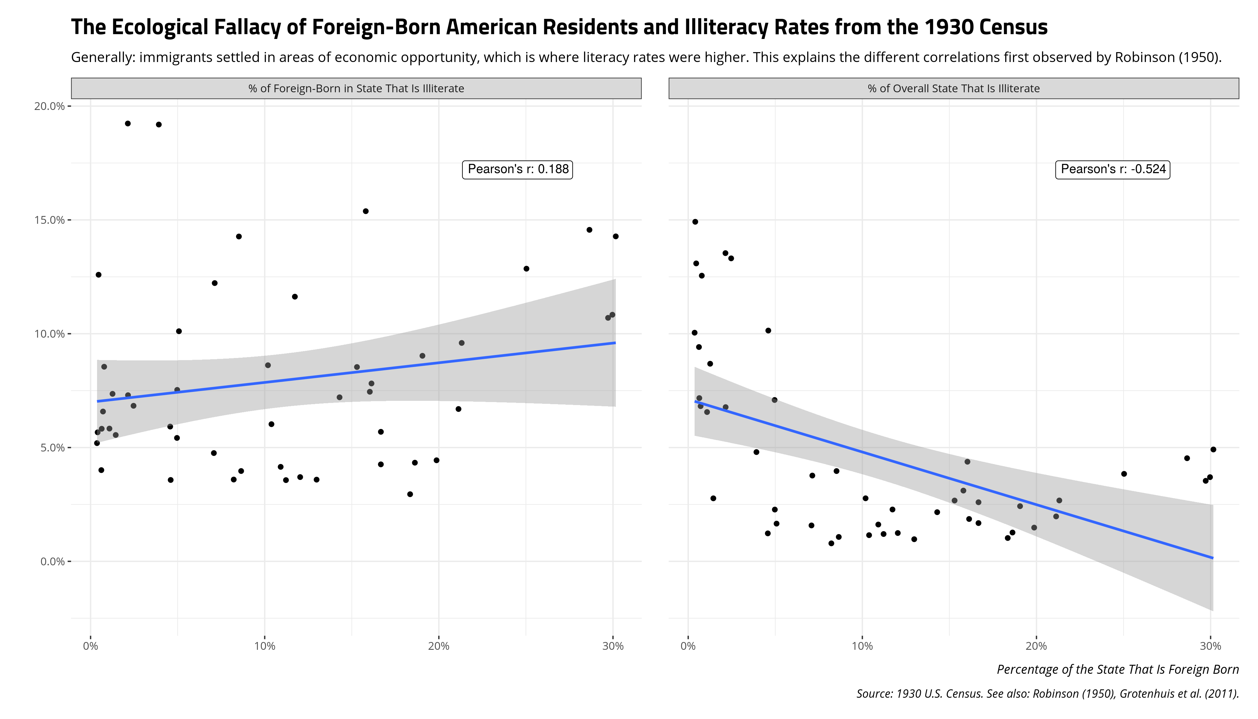
Basically: be mindful of your unit of analysis. Ecological correlations are not substitutes for individual correlations.
Disqus is great for comments/feedback but I had no idea it came with these gaudy ads.