Make Sense of Your Interactions with Simulated Quantities of Interest, by Way of {simqi}

- Joonkook Hwang addresses the UN Security Council, re: North Korea (29 May 2024).
I am writing this in Seoul, where I’m currently 1) having the time of my life and 2) on a research excursion where I was invited to give a quick methods lecture to some students at Ewha Woman’s University. I think the students dug the talk? It was super simple, mostly focusing on how to think about dummy variables and interactions. The example that I gave focused on voting alignment with South Korea in the UN General Assembly. I promised the students a write-up of the presentation on my blog, which is what will come here. The presentation I gave didn’t include anything about simulating quantities of interest, but it’s a new wrinkle I’ll add here for advertising my {simqi} package. The core of the talk was about how to make sense of dummy variables and interactions. Post-estimation simulation certainly does that.
Here are the R packages I’ll be using in this post.
library(tidyverse)    # for most things
library(stevedata)    # forthcoming 1.6.0, for data
library(stevethemes)  # for default theme
library(modelsummary) # for the regression table
library(modelr)       # for prediction grids
library(simqi)        # forthcoming 0.2.0, for simulation
library(kableExtra)   # for other tables

theme_set(theme_steve()) # default theme...
Let’s get going.
A Discussion of the Data
The data are rok_unga, which is forthcoming in {stevedata}. This is a simple data set for exploring the correlates of dyadic foreign policy similarity with South Korea from 1991 to 2020. There’s an obvious panel component to this data set, though the analysis in question will focus on just a single year of 2015.
You can preview the data here:
rok_unga
#> # A tibble: 6,095 × 17
#>    ccode1 ccode2 iso3c  year agree v_agree  kappa   ip1   ip2   ipd gdppc1
#>  *  <dbl>  <dbl> <chr> <dbl> <dbl>   <dbl>  <dbl> <dbl> <dbl> <dbl>  <dbl>
#>  1    732      2 USA    1991 0.169   0.368 0.0592 0.506  3.01  2.50 10274.
#>  2    732      2 USA    1992 0.203   0.411 0.0871 0.551  3.04  2.49 10799.
#>  3    732      2 USA    1993 0.222   0.452 0.118  0.573  2.99  2.42 11425.
#>  4    732      2 USA    1994 0.358   0.523 0.174  0.568  3.06  2.49 12359.
#>  5    732      2 USA    1995 0.288   0.461 0.120  0.520  3.22  2.70 13411.
#>  6    732      2 USA    1996 0.355   0.520 0.179  0.613  3.21  2.60 14332.
#>  7    732      2 USA    1997 0.329   0.562 0.174  0.590  3.04  2.45 15074.
#>  8    732      2 USA    1998 0.328   0.588 0.176  0.733  2.84  2.11 14198.
#>  9    732      2 USA    1999 0.313   0.582 0.147  0.590  2.70  2.11 15714.
#> 10    732      2 USA    2000 0.312   0.541 0.122  0.639  2.68  2.04 16996.
#> # ℹ 6,085 more rows
#> # ℹ 6 more variables: gdppc2 <dbl>, v2x_polyarchy1 <dbl>, v2x_polyarchy2 <dbl>,
#> #   xm_euds1 <dbl>, xm_euds2 <dbl>, capdist <dbl>
I’m going to do some light recoding based on the information in the data set. For one, the measure of dyadic foreign policy similarity I’ll use in this analysis is the percent voting alignment/agreement based on all votes for South Korea and other states in the data. However, these are calculated as proportions; multiplying them by 100 returns the more familiar percentages.1 I’m going to use the GDP per capita and Xavier Marquez’ extended “UDS” scores to create so-called “weak links” of GDP per capita and democracy. If the other state’s GDP per capita and measure of democracy is greater than South Korea, then the “weak link” is South Korea. If the opposite is true, the “weak link” is the other state. Whereas South Korea is a democratic and relatively prosperous state since it has been in the United Nations as a voting member, both measures are higher for “more democracy” and “more wealth” in the dyad.2 Finally, I’m going to use the wb_groups data, another recent addition in {stevedata}, to identify states that are in East Asia & the Pacific. If the other state is in that group, as is South Korea, it’s a 1. Otherwise, it’s a 0.
wb_groups %>% filter(wbgn == "East Asia & Pacific") %>% pull(iso3c) -> eap_codes

wb_groups %>% filter(wbgn == "East Asia & Pacific") %>% pull(name)
#>  [1] "American Samoa"            "Australia"
#>  [3] "Brunei Darussalam"         "Cambodia"
#>  [5] "China"                     "Fiji"
#>  [7] "French Polynesia"          "Guam"
#>  [9] "Hong Kong SAR, China"      "Indonesia"
#> [11] "Japan"                     "Kiribati"
#> [13] "Korea, Dem. People's Rep." "Korea, Rep."
#> [15] "Lao PDR"                   "Macao SAR, China"
#> [17] "Malaysia"                  "Marshall Islands"
#> [19] "Micronesia, Fed. Sts."     "Mongolia"
#> [21] "Myanmar"                   "Nauru"
#> [23] "New Caledonia"             "New Zealand"
#> [25] "Northern Mariana Islands"  "Palau"
#> [27] "Papua New Guinea"          "Philippines"
#> [29] "Samoa"                     "Singapore"
#> [31] "Solomon Islands"           "Taiwan, China"
#> [33] "Thailand"                  "Timor-Leste"
#> [35] "Tonga"                     "Tuvalu"
#> [37] "Vanuatu"                   "Vietnam"
# ^ for context, though it's clear not at all of these states are in the UN.

rok_unga %>%
  mutate(agree100 = agree*100,
         mindem = ifelse(xm_euds2 > xm_euds1, xm_euds1, xm_euds2),
         mingdppc = log(ifelse(gdppc2 > gdppc1, gdppc1, gdppc2)),
         eap = ifelse(iso3c %in% eap_codes, 1, 0)) -> Data
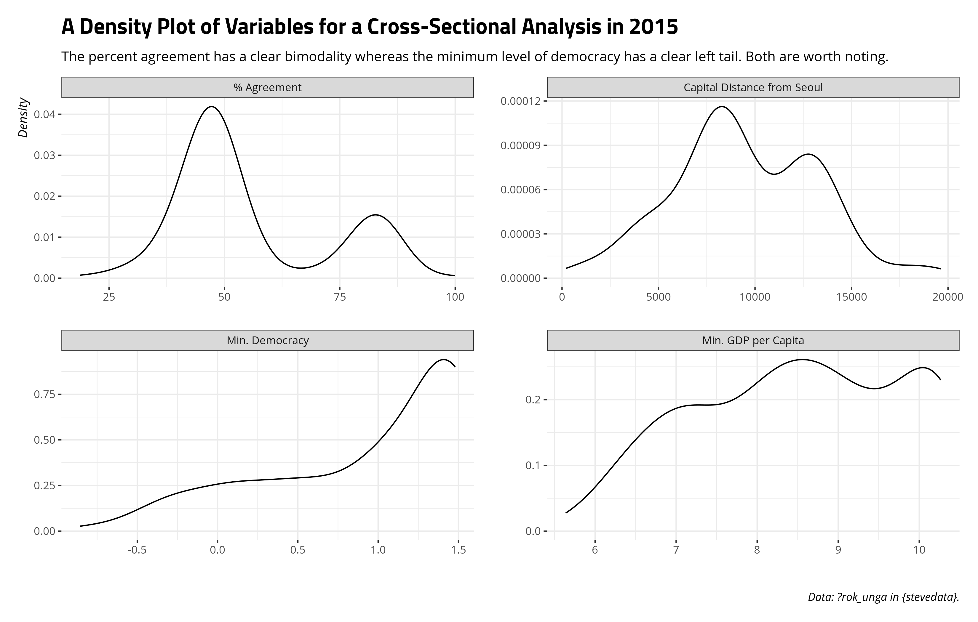
The analysis will subset to 2015, based on my cherry-picking something with a significant interaction that least gives me something to talk about. We can get an idea of what our data “look like” for such a simple cross-sectional analysis, ignoring the East Asia & the Pacific dummy. The bimodality in the dependent variable and the left skew in the democracy variable are worth noting and would be problematic for serious use, though this exercise is more about understanding interactions.
Data %>%
  filter(year == 2015) %>%
  select(agree100, mindem, mingdppc, capdist) %>%
  setNames(c("% Agreement", "Min. Democracy", "Min. GDP per Capita",
             "Capital Distance from Seoul")) %>%
  gather(var, val) %>%
  ggplot(.,aes(val)) +
  facet_wrap(~var, scales='free') +
  geom_density() +
  labs(title = "A Density Plot of Variables for a Cross-Sectional Analysis in 2015",
       subtitle = "The percent agreement has a clear bimodality whereas the minimum level of democracy has a clear left tail. Both are worth noting.",
       x = "", y = "Density",
       caption = "Data: ?rok_unga in {stevedata}.")
Two Simple Linear Models
Here are two simple linear models regressing the percentage agreement variable on the minimum level of democracy in the dyad, the minimum GDP per capita in the dyad, the capital distance (from Seoul), and this simple dummy variable identifying whether the other state is in East Asia & the Pacific (EA/P).3 The first model is one without interactions. The second model interacts the minimum level of democracy the EA/P dummy variable.
M1 <- lm(agree100 ~ mindem + mingdppc + capdist + eap,
         subset(Data, year == 2015))

M2 <- lm(agree100 ~ mindem*eap + mingdppc + capdist,
         subset(Data, year == 2015))
A regression table, by way of {modelsummary}, follows.
| Model 1 | Model 2 | |
|---|---|---|
| Min. Democracy | 13.516*** | 15.085*** |
| (1.548) | (1.686) | |
| Min. GDP per Capita | 3.671*** | 3.454*** |
| (0.728) | (0.727) | |
| Capital Distance | −0.002*** | −0.002*** |
| (0.000) | (0.000) | |
| Other State in East Asia/Pacific (EA/P) | −18.362*** | −11.333** |
| (2.791) | (4.192) | |
| Min. Democracy*EA/P | −7.735* | |
| (3.471) | ||
| Intercept | 35.394*** | 35.663*** |
| (6.880) | (6.809) | |
| R2 Adj. | 0.525 | 0.535 |
| Num.Obs. | 191 | 191 |
| + p < 0.1, * p < 0.05, ** p < 0.01, *** p < 0.001 |
The model output suggests that South Korea is generally in greater alignment in the UN General Assembly with more democratic states and with wealthier states. The further the state’s capital is from Seoul, the less agreement there is. This has an intuitive interpretation. States that are closer together might have shared issues or shared preferences that could manifest in greater alignment in the UN General Assembly. An argument toward that end might be underspecified, but it at least makes sense. It would also need to be squared with the dummy variable communicating whether a state is an EA/P state like China or Australia. If it is, the result from Model 1 suggests being an EA/P state coincides with an estimated decrease of 18.362 percentage points in agreement from the baseline of states not in this region (e.g. Canada, Brazil, Sweden, South Africa). Those “baseline” states are observed when the EA/P variable is 0, meaning they’re in the y-intercept as a reference group.
What about Model 2, though? Model 2 interacts the EA/P dummy variable with the minimum level of democracy variable. If you do this, everything you interact requires some care in interpretation. Get used to thinking of 0 here, because you’re going to need it.
We’ll start with the minimum level of democracy variable. Because of the interaction, this no longer communicates a neat effect that partials out everything else in the model. Instead, it’s been interacted with the EA/P variable. When the EA/P variable is 0 (i.e. the other state is a state like Botswana and not Papua New Guinea), a one-unit increase in the minimum-level of democracy variable coincides with a change in 15.085 percentage points in agreement. The democracy variable in question approximates a normal distribution, so a one-unit increase implies a change of about 34% across the range of plausible democracy scores. However, that effect is for states that aren’t EA/P.
Now, let’s turn our attention to the EA/P dummy variable. That is no longer the simple comparison of EA/P states versus non-EA/P states. Instead, it’s the comparison of EA/P states and non-EA/P states when the minimum level of democracy variable is 0. Here, we get kind of lucky given the distribution of this variable. When the minimum level of democracy variable is 0, this is the estimate’s way of communicating that it is 50/50 whether the observation in question is a democracy. This one such reason why I love the Unified Democracy Scores approach to modeling democracy. It returns a latent estimate where 0 is a 50/50 judgement call on classifying a state as a democracy. However, observe that caveat, same as it was above. That coefficient of -11.333 is the difference between EA/P states and non-EA/P states when the minimum level of democracy is 0.
Finally, there is the interaction. Additional care is required in interpreting the interaction term because what exactly it tells you will depend on the inputs for anything you’re doing. It will also depend critically on the question you’re asking. In this simple case, the EA/P variable is a dummy whereas the minimum level of democracy variable is continuous. As a technical matter, the interaction term says that when the democracy variable is 1 and the other state is an EA/P state, knock off -7.735 percentage points from the estimated agreement. As a substantive matter, eyeballing this interactive effect with the coefficient for the minimum level of democracy suggests the democracy effect is much weaker for EA/P states and voting alignment with South Korea than it is for states outside EA/P.
Making Sense of the Interaction (Two Ways)
If you, the researcher, believe that two things interact in some way to influence the outcome, it’s imperative on you, the researcher, to understand what exactly the interaction is communicating. Make it make sense to the reader and two you as well. There are two ways of doing this. If you’re a true beginner, you’ll want to do some basic model predictions based on the data inputs and model outputs. As you prepare something for presentation, you’ll want something that provides estimates of uncertainty around the prediction. There are several ways of doing the latter, but we will be simulating that with {simqi}. Post-estimation simulation is awesome. Seriously.
Predicting Estimates, Based on Model Output
If you’re a beginner, do yourself a favor and get acclimated with the interaction by way of the predict() function on a hypothetical prediction grid. Toward that end, you should also get comfortable with the data_grid() function in {modelr}.
Here’s what the code below will do, to be followed with a fancier table afterward. First, data_grid() takes the data (Data) and an optional argument of the model (.model = M2) and will return a hypothetical prediction grid that, by default, gives you the median value (for numeric inputs) or mode (for categorical inputs) for anything that appears in the model. However, it will allow you to add or change other stuff. Here, we’ll allow eap to take on values of 0 or 1 and allow the mindem variable to also take on values of 0 and 1. Minimum GDP per capita and capital distance will be held fixed at their median. Thereafter, we’re going to get fitted values of the agreement variable with the predict() function, supplying the argument to predict the values of y based on the newdat grid we created. Thereafter, diff1 will the first difference of minimum democracy (i.e. among the EA/P states). diff2 will be the differences between EA/P and non-EA/P states among the two democracy values supplied. The interaction can be seen as the difference of those two differences, if you will.
Data %>%
  data_grid(.model = M2,
            eap = c(0,1),
            mindem = c(0, 1)) -> newdat

newdat
#> # A tibble: 4 × 4
#>     eap mindem mingdppc capdist
#>   <dbl>  <dbl>    <dbl>   <dbl>
#> 1     0      0     8.35   8872.
#> 2     0      1     8.35   8872.
#> 3     1      0     8.35   8872.
#> 4     1      1     8.35   8872.

newdat %>%
  mutate(pred = predict(M2, newdata = newdat)) %>%
  mutate(diff1 = pred - lag(pred), .by=eap) %>%
  mutate(diff2 = pred - lag(pred), .by=mindem) %>%
  mutate(int1 = diff1 - lag(diff1, 2),
         int2 = diff2 - lag(diff2)) %>%
  data.frame
#>   eap mindem mingdppc  capdist     pred     diff1     diff2      int1      int2
#> 1   0      0 8.353048 8871.827 45.21120        NA        NA        NA        NA
#> 2   0      1 8.353048 8871.827 60.29604 15.084839        NA        NA        NA
#> 3   1      0 8.353048 8871.827 33.87830        NA -11.33290        NA        NA
#> 4   1      1 8.353048 8871.827 41.22806  7.349762 -19.06798 -7.735077 -7.735077
| EA/P | Min. Dem. | Min. GDPPC | Min. Dist | Est. % Agree | First Diff. of Min. Dem. | First Diff of EA/P | Interaction |
|---|---|---|---|---|---|---|---|
| 0 | 0 | 8.353 | 8871.827 | 45.211 | |||
| 0 | 1 | 8.353 | 8871.827 | 60.296 | 15.085 | ||
| 1 | 0 | 8.353 | 8871.827 | 33.878 | -11.333 | ||
| 1 | 1 | 8.353 | 8871.827 | 41.228 | 7.350 | -19.068 | -7.735 |
This approach is certainly tedious, but may it introduce the beginners to the underlying math.
Simulate Quantities of Interest to Make Sense of Your Interaction
If it can be simulated, it should be simulated. You could just as well ask for standard errors/confidence intervals by way of predict(), but where is the fun in that…
For presentation, you’ll want to give yourself flexibility to communicate what the interaction says about the full relationship. To do that, we return to data_grid(), but this time ask for a sequence of 100 numbers for the mindem variable that corresponds with the range of its minimum to maximum. We will further toggle the eap variable to be 0 or 1. Thereafter, we’ll use a new R package of mine—{simqi}—to simulate predicted values of the outcome variable across some number of simulations. sim_qi() in this package takes the model (M2) and an optional but heavily suggested “newdata” data frame (newdat). It then runs 1,000 simulations (the default, but can be changed by the nsim argument) about what the predicted values would be. You could optionally ask for the newdata frame back for easier post-processing (return_newdata = TRUE).
Data %>%
  data_grid(.model = M2,
            eap = c(0,1),
            mindem = seq_range(mindem, 100))  -> newdat

newdat
#> # A tibble: 200 × 4
#>      eap mindem mingdppc capdist
#>    <dbl>  <dbl>    <dbl>   <dbl>
#>  1     0  -1.76     8.35   8872.
#>  2     0  -1.72     8.35   8872.
#>  3     0  -1.69     8.35   8872.
#>  4     0  -1.65     8.35   8872.
#>  5     0  -1.62     8.35   8872.
#>  6     0  -1.58     8.35   8872.
#>  7     0  -1.55     8.35   8872.
#>  8     0  -1.51     8.35   8872.
#>  9     0  -1.48     8.35   8872.
#> 10     0  -1.44     8.35   8872.
#> # ℹ 190 more rows

set.seed(8675309)

Sims <- sim_qi(M2, nsim = 100, newdata = newdat, return_newdata = TRUE)
Sims
#> # A tibble: 20,000 × 6
#>        y   sim   eap mindem mingdppc capdist
#>    <dbl> <int> <dbl>  <dbl>    <dbl>   <dbl>
#>  1  13.2     1     0  -1.76     8.35   8872.
#>  2  13.8     1     0  -1.72     8.35   8872.
#>  3  14.4     1     0  -1.69     8.35   8872.
#>  4  15.0     1     0  -1.65     8.35   8872.
#>  5  15.6     1     0  -1.62     8.35   8872.
#>  6  16.2     1     0  -1.58     8.35   8872.
#>  7  16.8     1     0  -1.55     8.35   8872.
#>  8  17.4     1     0  -1.51     8.35   8872.
#>  9  18.0     1     0  -1.48     8.35   8872.
#> 10  18.6     1     0  -1.44     8.35   8872.
#> # ℹ 19,990 more rows
What you do with this is entirely up to you, and there are any number of ways of extracting interesting information from this model. This is typically the first way I’d do it for a situation like this. For these 100 simulations, I’ll summarize them and return the mean, 5th percentile, and 95th percentile to create a 90 percent interval around the simulated estimate. Importantly, I will do this by unique values of democracy and the EA/P dummy variable. Next, I’ll use {ggplot2} to plot the ribbon corresponding with the 90% interval and the line corresponding with the simulated mean. What emerges from that will help better clarify what the interaction is ultimately saying.
Sims %>%
  summarize(mean_y = mean(y),
            lwr = quantile(y, .05),
            upr = quantile(y, .95),
            .by = c(eap, mindem)) %>%
  mutate(eap = ifelse(eap == 1, "East Asia & the Pacific", "Other State")) %>%
  ggplot(., aes(mindem, mean_y, ymin=lwr, ymax=upr, linetype = eap,
                color=eap, fill=eap)) +
  geom_ribbon(alpha=.1) +
  geom_line() +
  labs(title = "Simulated Agreement with South Korea in 2015, by Democracy and East Asia & the Pacific",
       subtitle = "Higher values of democracy coincide with greater alignment, but the effect is stronger outside East Asia & the Pacific.",
       x = "Minimum Level of Democracy",
       y = "% Agreement with South Korea",
       linetype = "", color = "", fill = "")
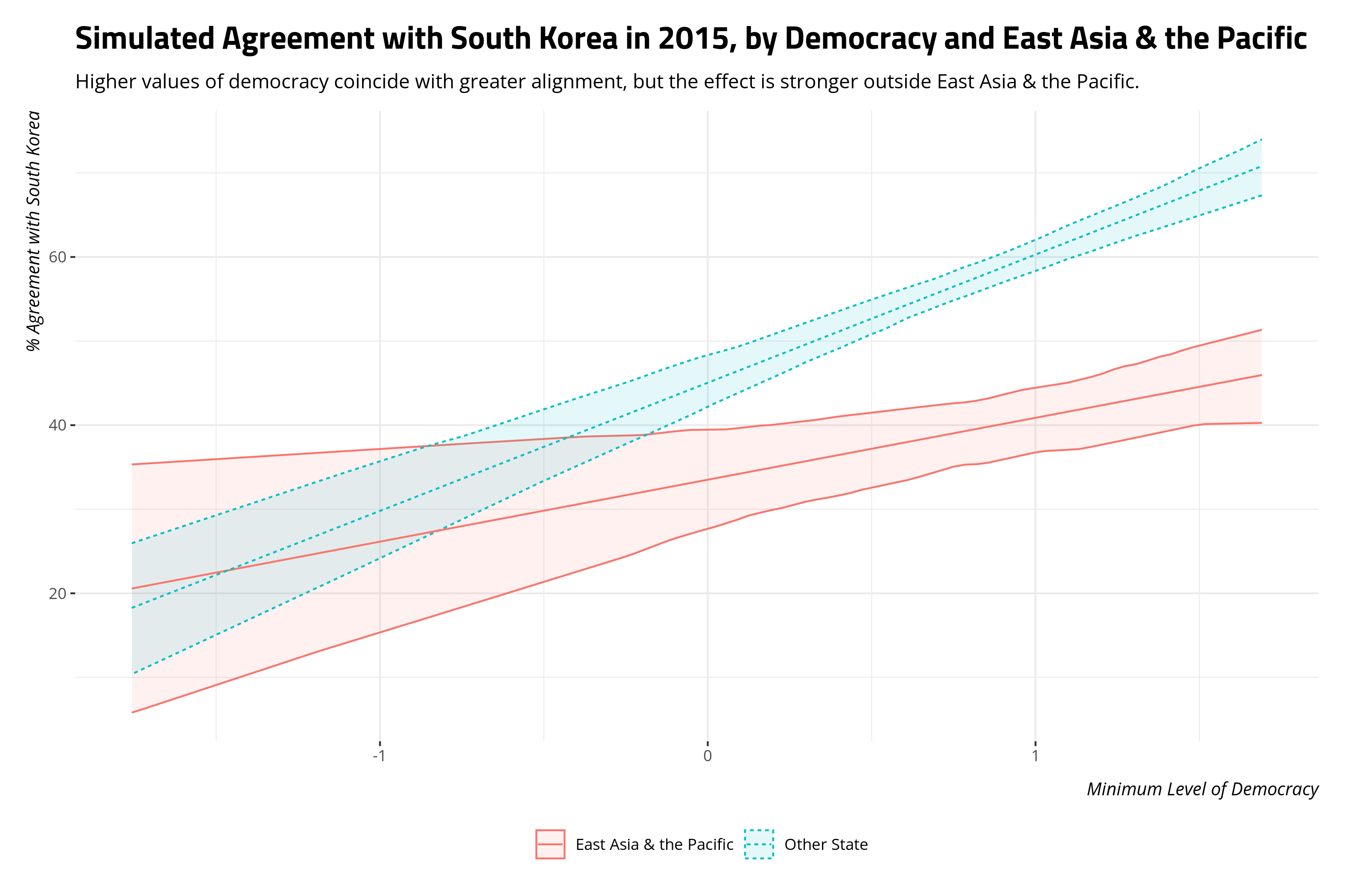
Earlier in this post, I suggested that eyeballing the coefficients tells me the democracy effect is weaker for EA/P states than it is for non-EA/P states, but I couldn’t quite see what the effect “looks like.” Here’s what it looks like. Generally, there is modest increase in voting alignment with South Korea for more democratic states in EA/P. However, that increase pales in comparison to what it is for non-EA/P states. Simulating it and getting the estimates of uncertainty to boot bring that into greater relief.
Conclusion
There’s a lot to be said about model criticism that I haven’t said here. The goal was to introduce students to thinking about dummy variables and interactions. Dummy variables are straightforward. They create comparisons between (or among) groups where something is a baseline observation absorbed into the y-intercept. In Model 1, Indonesia and Fiji would be in the EA/P group whereas states like Algeria and Portugal would be in the y-intercept. Interactions require some care, and it’s definitely implied that both variables being interacted have plausible 0s. If they do, the coefficients in the regression model make sense. They would make even more sense if you simulated quantities of interest to better clarify what the interactive effect “looks like”. Perhaps simulation is not strictly necessary, but it’s certainly flexible.
-
I am fully aware that any serious analysis of foreign policy similarity would not use such a measure. Ideal point distances (a la Bailey et al., 2017) and Cohen’s \(\kappa\) (a la Häge, 2011) are available for your consideration. However, this is fine for teaching students about methods around something a bit more accessible than weighted correlation measures and item response theory. ↩
-
Such a weak-link measure is common in democratic peace scholarship, though one wonders about its suitability when the dyad-year data set is not universal. Here,
ccode1is always South Korea. It’s fine for the intended purpose, though. ↩ -
I did not belabor the capital distance variable in the previous section because no recoding was necessary. It is a bit awkward that placement in the EA/P category certainly implies something about this capital distance variable. Then again, EA/P is a big region. ↩
Disqus is great for comments/feedback but I had no idea it came with these gaudy ads.